Have you ever noticed that a class can answer the same question in many different ways? Some children like apples, some like bananas, and some like grapes. When we collect all of those answers, we have something exciting to study: data. Data helps us count, sort, and talk about what we find out.
When we work with data, we look for patterns. We can see which group has the most, which has the fewest, and how many answers there are altogether. This helps us understand information in a clear way.
Data is information we collect. A data point is one piece of information, like one child's answer. A category is a group with the same kind of data, like apples, bananas, or grapes.
If \(6\) children answer a question, then there are \(6\) data points. Each child gives one answer, so each answer counts as one piece of data.
We can collect data by asking a question, looking around the room, or counting objects. For example, we might ask, "What pet do you have?" Then we sort the answers into groups like cats, dogs, and fish.
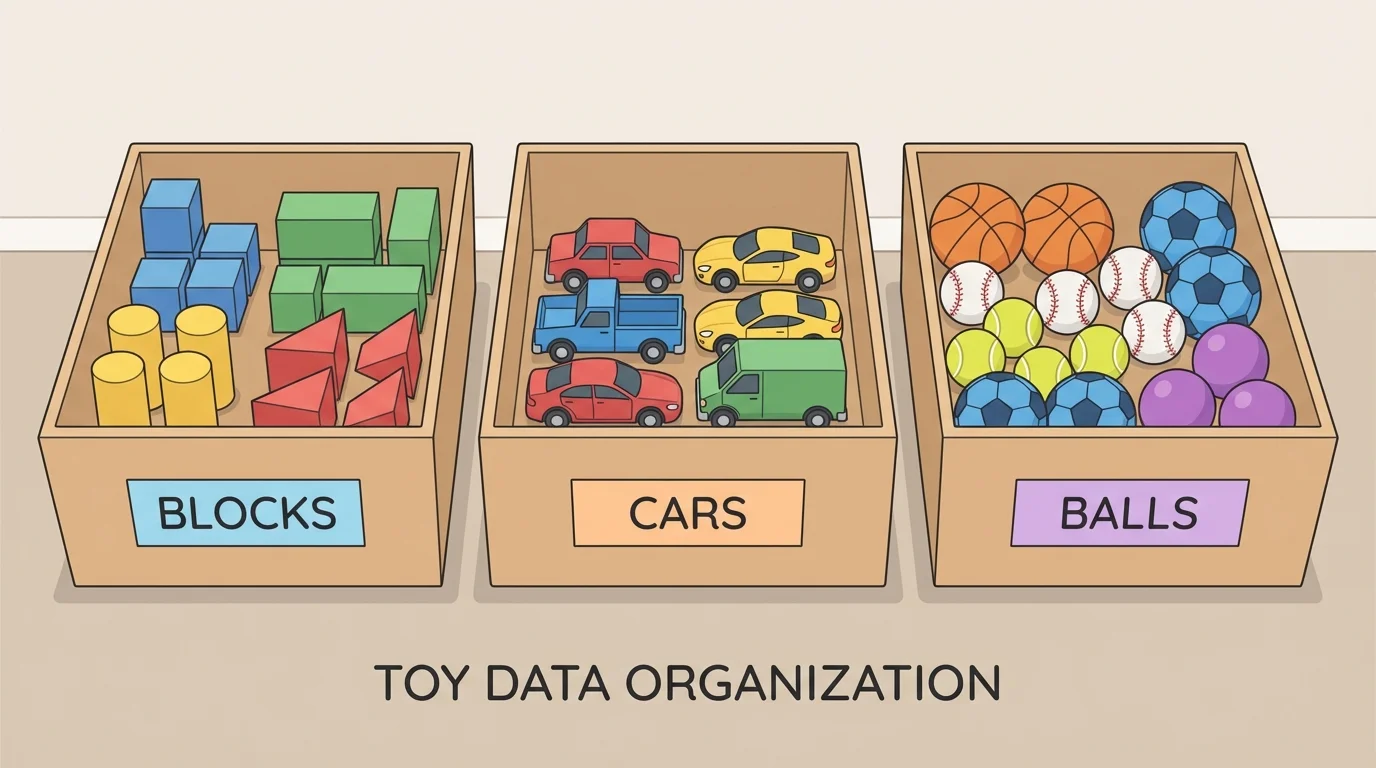
It is easier to understand data when we put it into groups, as [Figure 1] shows. If we mix everything together, it is hard to tell how many of each kind there are. If we sort the data, we can count each group carefully.
Sometimes we sort data into up to \(3\) categories. For example, toy choices could be blocks, cars, and balls. Each toy belongs in one group. After sorting, we count how many are in each category.
Suppose a class sorts favorite pets. The answers are cats, dogs, and fish. If \(4\) children choose cats, \(3\) choose dogs, and \(2\) choose fish, then we have \(3\) categories and \(9\) data points total because \(4 + 3 + 2 = 9\).
Remember that when we count objects in groups, each object is counted one time. Careful counting helps us get correct data.
Every category should have a clear name. Good labels help us read the data. If the labels are pets, then each answer must match one of those pet groups.
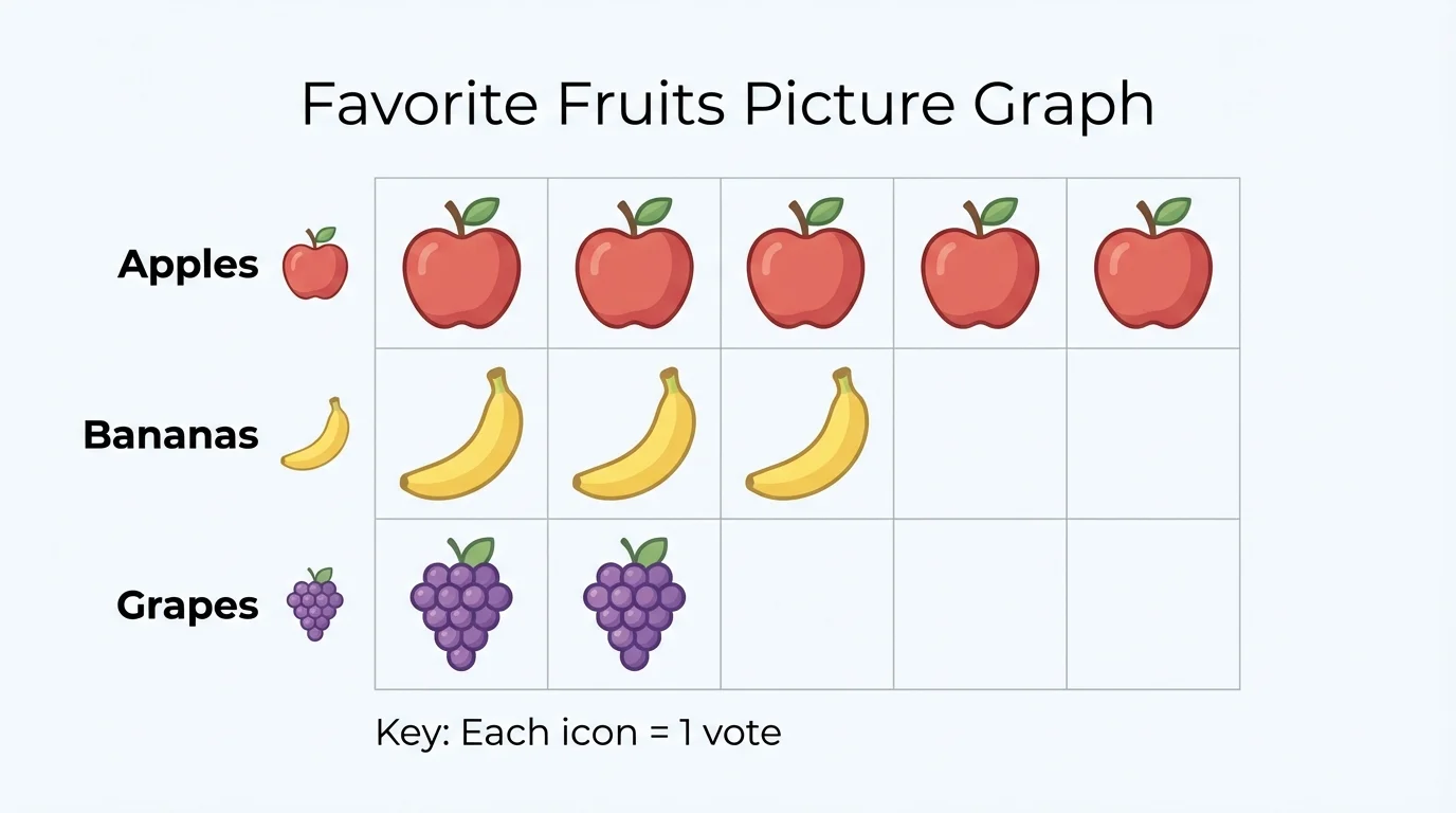
We can show data in a table or a graph. A simple graph makes the counts easy to see, and [Figure 2] helps us notice which category has more or less right away.
One way to organize data is with a table.
| Category | Count |
|---|---|
| Apples | \(5\) |
| Bananas | \(3\) |
| Grapes | \(2\) |
Table 1. A table showing favorite fruits in three categories.
Another way is a picture graph. If one picture stands for one choice, then \(5\) apples mean \(5\) children chose apples. This kind of graph is easy to read because we can count the pictures.
We can also use bars. A longer bar means a greater count. A shorter bar means a smaller count. Later, when we compare groups, the graph helps us see the difference quickly.
People use data every day. Schools use it to count lunches, stores use it to see what people buy, and meteorologists use it to count sunny and rainy days.
Whether we use a table, a picture graph, or a bar graph, the job is the same: organize the data so we can understand it.
[Figure 3] Once the data is organized, we can ask questions about it. We can ask, "How many in each category?" "How many data points are there in all?" and "How many more or fewer are in one category than another?"
To find the total, we add all the category counts. If cats are \(4\), dogs are \(3\), and fish are \(2\), then the total is \(4 + 3 + 2 = 9\).
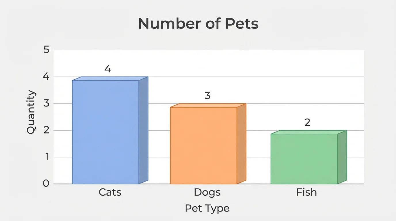
To find how many are in each category, we read the count for that group. Cats have \(4\). Dogs have \(3\). Fish have \(2\).
To find how many more one category has than another, we subtract. If cats have \(4\) and fish have \(2\), then cats have \(4 - 2 = 2\) more than fish. If dogs have \(3\) and cats have \(4\), then dogs have \(1\) less than cats because \(4 - 3 = 1\).
More and less means comparing two counts. We look at both numbers and find the difference. The difference tells us how much bigger or smaller one category is than another.
When we look back at the graph in [Figure 2], we can quickly see that apples are the most and grapes are the fewest. Visual models help our eyes notice these differences.
Let's solve some data questions step by step.
Example 1: Favorite colors
A class chooses favorite colors: red \(= 3\), blue \(= 5\), yellow \(= 2\).
Step 1: Find how many are in each category.
Red has \(3\), blue has \(5\), and yellow has \(2\).
Step 2: Find the total number of data points.
Add all the counts: \(3 + 5 + 2 = 10\).
Step 3: Compare two categories.
How many more students like blue than yellow? Subtract: \(5 - 2 = 3\).
The class has \(10\) data points, and blue has \(3\) more than yellow.
This example shows that we can answer different questions from the same set of data.
Example 2: Lunch choices
Students choose lunch: pizza \(= 4\), sandwich \(= 4\), salad \(= 1\).
Step 1: Find the total.
\(4 + 4 + 1 = 9\).
Step 2: Find how many chose sandwich.
The sandwich category has \(4\).
Step 3: Compare pizza and sandwich.
\(4 - 4 = 0\), so they are the same.
Step 4: Compare pizza and salad.
\(4 - 1 = 3\), so pizza has \(3\) more than salad.
There are \(9\) data points, and pizza and sandwich are equal.
Sometimes one category is not more or less. Sometimes the counts are equal, and the difference is \(0\).
Example 3: Weather days
For one week, the weather is sunny \(= 3\), rainy \(= 2\), cloudy \(= 2\).
Step 1: Count each category.
Sunny has \(3\), rainy has \(2\), cloudy has \(2\).
Step 2: Find the total number of days counted.
\(3 + 2 + 2 = 7\).
Step 3: Find how many fewer rainy days there are than sunny days.
\(3 - 2 = 1\).
So there are \(7\) days in all, and there is \(1\) fewer rainy day than sunny day. The bars in [Figure 3] work in the same way when we compare heights.
Data is all around us. A teacher might count favorite books. A family might count red, yellow, and green apples in a bowl. A class might count how students get to school: bus, car, or walk.
When we organize data, we can make smart choices. If most students choose apples for snack, the class knows apples are popular. If \(6\) students walk and \(2\) ride bikes, then walking is more common than riding bikes by \(6 - 2 = 4\).
We can also use data to notice patterns over time. If a week has more sunny days than rainy days, we can tell what kind of weather happened most often.
"Numbers can tell a story when we sort and read them carefully."
Reading data is like reading a little story made of counts. We collect the information, sort it into categories, and then answer questions about what we see.