A company can have a higher average salary than another company does and still pay most workers less. That sounds impossible at first, but it happens because a few extremely high salaries can change the average a lot. This is exactly why statisticians do not stop at one number. To understand data well, we compare the whole distribution: what the data looks like, where it tends to fall, and how much it varies.
Whenever you compare data sets, you are usually trying to answer a real question. Which basketball player is more consistent? Which machine makes parts with less variation? Which class scored better on a test? Which city has more predictable daily temperatures? A good answer must say more than "one number is bigger." It must describe the overall pattern.
In statistics, a set of values forms a distribution. A distribution is not just the list of values; it is the pattern made by the values. Two data sets can have similar averages but very different shapes. They can have the same median but different spread. They can look similar until one extreme value changes the interpretation.
Shape describes the overall form of a distribution, such as whether it is symmetric or skewed.
Center describes a typical value in the data, often measured with the mean or median.
Spread describes how far the data values vary from one another, often measured with range, interquartile range, or standard deviation.
Outlier is a value far from the rest of the data.
When comparing two distributions, the strongest statistical arguments usually discuss all three features: shape, center, and spread. If needed, they also mention outliers because unusual values can affect both calculations and conclusions.
A useful comparison often begins by noticing that data sets can differ in several ways at once, as [Figure 1] illustrates. For example, one group may have a higher typical value, or a distribution may be more tightly packed or may have a long tail caused by a few unusually large values.
Shape asks: what form does the distribution take? Is it balanced, lopsided, clustered, or does it have gaps?
Center asks: what is a typical value? If you had to choose one number to represent the data, what would it be?
Spread asks: how much do the values vary? Are they tightly grouped or widely scattered?
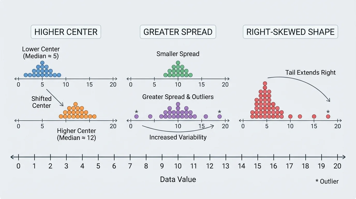
These features work together. Suppose two runners have the same average race time. If one runner's times are all close together and the other runner's times vary widely, they are not equally consistent. A single measure of center would hide that difference.
The shape of a distribution is the visual pattern formed by the data. Some common possibilities appear in [Figure 2]. Shape matters because it can reveal how the data is generated and whether a measure like the mean gives a fair picture.
A distribution is symmetric when the left and right sides are roughly balanced. Heights of large groups of people are often close to symmetric. A distribution is right-skewed when it has a long tail on the high end. Household incomes often look right-skewed because a small number of people earn much more than most others. A distribution is left-skewed when the long tail is on the low end.
You should also look for clusters, which are groups of values close together, and gaps, where few or no values appear. Another useful idea is modality. A distribution with one clear peak is called unimodal; one with two peaks is bimodal. Bimodal data can mean the data actually contains two different groups mixed together, such as commute times for students who walk to school and students who ride a bus.
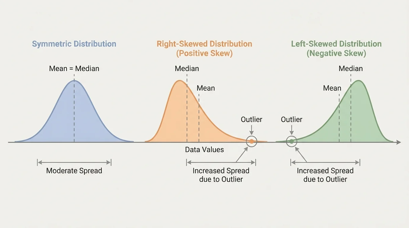
Shape can influence interpretation. In a strongly skewed distribution, the mean may be pulled toward the long tail, while the median stays closer to the middle of the data. That is why shape and center should be discussed together, not separately.
Professional sports analysts often compare not just a player's average performance but the shape of the distribution of performances. A player with occasional huge games and many weak games can have the same average as a player who performs steadily every game.
Later, when we compare box plots and numerical summaries, the patterns in Figure 2 help explain why two data sets with similar medians may still behave very differently.
The center of a distribution is a typical or middle value. The two most common measures of center are the mean and the median.
The mean is the arithmetic average:
\[\textrm{mean} = \frac{\textrm{sum of data values}}{\textrm{number of data values}}\]
The median is the middle value when the data is ordered from least to greatest. If there is an even number of values, the median is the average of the two middle values.
The mean uses every value, which makes it useful but also sensitive to extreme data points. The median depends on position rather than exact size, so it is more resistant to outliers. In roughly symmetric distributions with no extreme outliers, the mean and median are often close. In skewed distributions, they may differ noticeably.
Choosing mean or median
Use the mean when the distribution is fairly symmetric and you want a measure that includes every value. Use the median when the distribution is skewed or contains outliers, especially when you want a better picture of a "typical" value. For income, home prices, and waiting times, the median is often more informative than the mean.
For example, if five students spend \(10, 12, 13, 14, 51\) minutes on homework, the mean is \(\dfrac{10+12+13+14+51}{5} = \dfrac{100}{5} = 20\), while the median is \(13\). Most students are near \(13\), not \(20\), so the median better represents the typical time.
The spread of a distribution tells how much the values vary. Two data sets can have the same center but different spread, which means one is much more predictable than the other.
One simple measure is the range, found by subtracting the minimum value from the maximum value:
\[\textrm{range} = \textrm{maximum} - \textrm{minimum}\]
Range is easy to calculate, but it depends only on the two extreme values. If one outlier changes, the range can change a lot.
A more resistant measure is the interquartile range, or IQR. The IQR measures the spread of the middle half of the data:
\[\textrm{IQR} = Q_3 - Q_1\]
Here, \(Q_1\) is the first quartile and \(Q_3\) is the third quartile. Because the IQR ignores the most extreme \(25\%\) on each side, it is much less affected by outliers than the range.
Another important measure, especially in higher-level statistics, is standard deviation. Standard deviation describes how far values typically lie from the mean. A small standard deviation means values tend to stay near the mean; a large standard deviation means they are more spread out. For this topic, it is most important to understand its meaning, not just the formula.
If a data set is skewed or contains outliers, the median and IQR are often a better pair than the mean and standard deviation. If the data is roughly symmetric without outliers, the mean and standard deviation are often very useful together.
A single outlier can completely change the story told by a data set. That is why strong statistical interpretations always check for unusually large or unusually small values before making conclusions.
An outlier can affect center by pulling the mean toward itself. It usually has much less effect on the median. An outlier can also affect spread by increasing the range and often increasing the standard deviation. It may have little or no effect on the IQR if it lies outside the middle half of the data.
Consider the data sets \(4, 5, 5, 6, 6\) and \(4, 5, 5, 6, 20\), shown in [Figure 3]. In the first set, the mean is \(\dfrac{26}{5} = 5.2\). In the second set, the mean is \(\dfrac{40}{5} = 8\). The median in both sets is \(5\). One value changed, and suddenly the mean moved much more than the median.
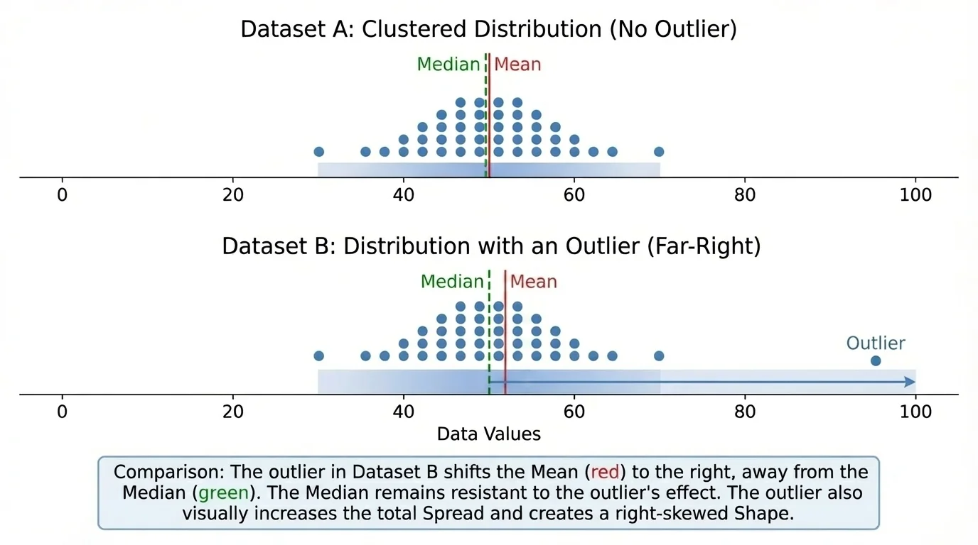
This is why median and IQR are called resistant measures: they resist being changed too much by outliers. Mean and standard deviation are not resistant, meaning extreme values can influence them strongly.
When reading a graph, always check the scale first. A distribution can look more or less spread out depending on the horizontal axis, so comparisons should only be made when the displays use compatible scales.
When data are displayed with box plots, possible outliers often appear beyond the whiskers. That visual clue matters because, just as we saw with the shifted mean in [Figure 3], one extreme point may make an average seem more typical than it really is.
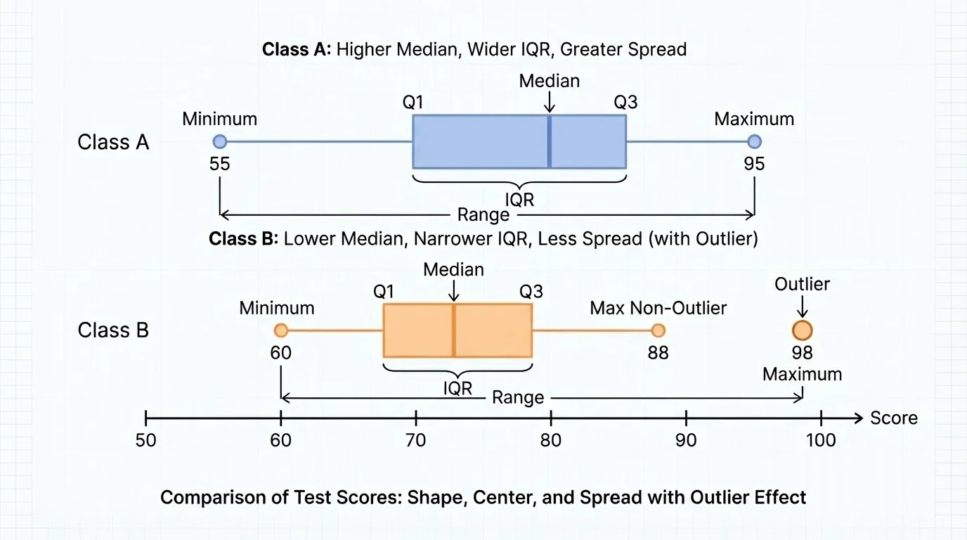
Good statistical comparisons are written in complete sentences and tied to the real situation. Graphs such as box plots make this easier. For example, [Figure 4] shows how two box plots can reveal differences in center, spread, and possible outliers at the same time.
Suppose Class A and Class B both take the same quiz. A weak comparison would be: "Class A did better because its average was higher." A stronger comparison would be: "Class A has a higher median score, so its typical student scored higher. However, Class B has a smaller IQR, so its scores are more consistent."
Notice that this kind of statement names a measure, tells how the distributions differ, and explains what that means in context. The context matters. In manufacturing, less spread often means better quality control. In creative performance, a larger spread may mean more risk but also more extreme success.
Here are examples of strong contextual statements:
Using shape, center, spread, and outliers together prevents oversimplified conclusions. The side-by-side box plots in [Figure 4] make that clear because a single glance can show whether one group is higher, more variable, or influenced by an unusual value.
Worked comparisons help turn ideas into habits. In each example, notice that the best interpretation includes both calculation and context.
Worked Example 1: Comparing mean and median with an outlier
Two small online shops record the number of daily orders over five days.
Shop A: \(18, 19, 20, 21, 22\)
Shop B: \(18, 19, 20, 21, 40\)
Step 1: Find the center of Shop A.
The mean is \(\dfrac{18+19+20+21+22}{5} = \dfrac{100}{5} = 20\).
The median is the middle value, so it is \(20\).
Step 2: Find the center of Shop B.
The mean is \(\dfrac{18+19+20+21+40}{5} = \dfrac{118}{5} = 23.6\).
The median is still the middle value, so it is \(20\).
Step 3: Interpret the results.
Both shops have the same median, so their typical day is similar. Shop B has a larger mean because one unusually high day increases the average.
Conclusion: Shop B's higher mean does not mean it usually gets more orders. The outlier changes the average.
This example shows why one summary statistic is not enough. If you only compared means, you would miss that the typical day is actually the same in both shops.
Worked Example 2: Comparing spread with range and IQR
Two students record the number of minutes they practice piano each week.
Student P: \(30, 32, 35, 36, 37, 38, 40\)
Student Q: \(20, 25, 35, 36, 37, 47, 52\)
Step 1: Find the range of each data set.
For Student P, range \(= 40 - 30 = 10\).
For Student Q, range \(= 52 - 20 = 32\).
Step 2: Find the quartiles and IQR.
Student P has median \(36\). Lower half: \(30, 32, 35\), so \(Q_1 = 32\). Upper half: \(37, 38, 40\), so \(Q_3 = 38\). Thus \(\textrm{IQR} = 38 - 32 = 6\).
Student Q has median \(36\). Lower half: \(20, 25, 35\), so \(Q_1 = 25\). Upper half: \(37, 47, 52\), so \(Q_3 = 47\). Thus \(\textrm{IQR} = 47 - 25 = 22\).
Step 3: Interpret.
Both students have the same median practice time, \(36\) minutes. But Student Q has much greater spread, shown by both the larger range and the larger IQR.
Conclusion: Student P practices more consistently, while Student Q's practice times vary much more.
Notice that equal medians do not mean equal distributions. Spread can change the whole interpretation.
Worked Example 3: Writing a comparison from context
Two machines cut metal rods. Their lengths, in centimeters, are measured.
Machine A: \(49.9, 50.0, 50.0, 50.1, 50.0, 50.1, 49.9\)
Machine B: \(49.6, 50.0, 50.4, 49.8, 50.2, 49.7, 50.3\)
Step 1: Compare centers.
Both machines are centered near \(50.0\) centimeters. Their medians are very close to \(50.0\).
Step 2: Compare spread.
Machine A ranges from \(49.9\) to \(50.1\), a range of \(0.2\).
Machine B ranges from \(49.6\) to \(50.4\), a range of \(0.8\).
Step 3: Interpret in context.
Since both machines are centered near the target length, accuracy is similar. But Machine A has much smaller spread, so it is more precise and more reliable for producing uniform rods.
Conclusion: In manufacturing, the machine with less spread is often preferred, even if centers are similar.
That final conclusion matters because in many real systems, consistency is just as important as being correct on average.
These ideas appear everywhere. In medicine, doctors compare distributions of recovery times, not just average recovery time. A treatment with the same median recovery but much less spread may be more predictable. In economics, income distributions are often strongly right-skewed, which is why median income is frequently reported alongside or instead of mean income.
In environmental science, monthly rainfall data may include outliers caused by storms. In engineering, a machine part with a mean size close to the target can still fail quality standards if the spread is too large. In education, teachers compare test scores by looking at median achievement and variability, not only at averages.
| Situation | Most useful center | Most useful spread | Why |
|---|---|---|---|
| Household income | Median | IQR | Income is often right-skewed with high outliers |
| Heights of students | Mean | Standard deviation | Data is often roughly symmetric |
| Manufactured part lengths | Mean or median | Range, IQR, or standard deviation | Consistency is critical |
| Waiting times at a clinic | Median | IQR | A few long waits can distort the mean |
Table 1. Examples of which measures of center and spread are often most useful in different contexts.
Statistical reasoning becomes powerful when you connect the numbers to the question being asked. The "best" measure depends on the shape of the data and whether outliers are present.
One common mistake is comparing only the means and ignoring shape or spread. Another is saying one group is "better" without explaining what "better" means in context. A higher center is not always better; sometimes smaller spread is more valuable.
Another mistake is treating an outlier as if it should automatically be removed. Outliers should be examined carefully. Sometimes they are recording errors. Sometimes they are the most important part of the data, such as a dangerous heat spike, a major flood, or a sudden equipment failure.
A final mistake is using statistical words without interpretation. Saying "the IQR is larger" is incomplete. Better is: "The IQR is larger, so the middle half of the data is more spread out, which means values are less consistent." Statistics is not just computation; it is communication.
"A graph is worth a thousand calculations if it helps you ask the right question."
Strong statistical comparisons combine visual evidence, numerical summaries, and context. When you describe shape, center, spread, and the effect of outliers, you move from merely reading data to actually understanding it.