What do your monthly data plan, a car's fuel efficiency, and a small business's profit all have in common? They can all be described using equations in two or more variables — and their behavior becomes much clearer when you draw a graph 📈.
Being able to turn words into algebra, and then into graphs, is a powerful skill: it lets you predict outcomes, compare options, and explain patterns you see in real life.
Many everyday situations involve two changing quantities. For example:
Each of these can be described by an equation like \(y = mx + b\), where \(x\) and \(y\) stand for different quantities. When we introduce more variables, we can model even richer situations, like mixing ingredients or splitting costs among several people.
To write good equations, you need to control the language you use.
Variable, parameter, and constant are key ideas:
In a pay model where you earn 12 dollars per hour plus a bonus of 10 dollars, the equation might be \(P = 12h + 10\). Here, \(h\) is a variable (hours), \(P\) is a variable (pay), while \(12\) and \(10\) are constants for this job. If you compare to a different job, those constants might change; then we treat them like parameters that can vary from one scenario to another.
When we graph these equations in a coordinate system, we typically place one variable on the horizontal axis and the other on the vertical axis. Choosing which variable goes where is part of modeling.
Translating words into equations is a core modeling skill. A helpful process is:
Common language patterns and their algebra translations include:
| Words | Algebra |
|---|---|
| "total cost is 5 dollars per ticket times number of tickets" | \(C = 5t\) |
| "starts at 20 and increases by 3 each day" | \(A = 20 + 3d\) |
| "difference between twice the number and 7" | \(2n - 7\) |
Example of creating an equation in two variables (no graph yet):
A gym charges a monthly fee plus a fee per class. Suppose the monthly fee is 25 dollars and each class is 4 dollars. Let \(m\) be the number of classes you attend in a month, and \(C\) be the total monthly cost.
The equation is \(C = 25 + 4m\). Now you have a relationship between two variables: \(m\) and \(C\).
Most introductory relationships between two quantities can be modeled with a linear equation in two variables. Two common forms are:
In \(y = mx + b\):
In \(Ax + By = C\), the intercepts are easy to find:
Graphically, the x-intercept and y-intercept are where the line crosses the axes, as shown in [Figure 1]. These points have special meanings in real-world problems, often representing when one quantity is zero.
Rewriting between forms is important, because each form highlights different information. For example, starting with standard form \(2x + 3y = 12\), we can solve for \(y\):
\(3y = -2x + 12\) so \(y = -\dfrac{2}{3}x + 4\).
Now it is clear the slope is \(-\dfrac{2}{3}\) and the y-intercept is \(4\).
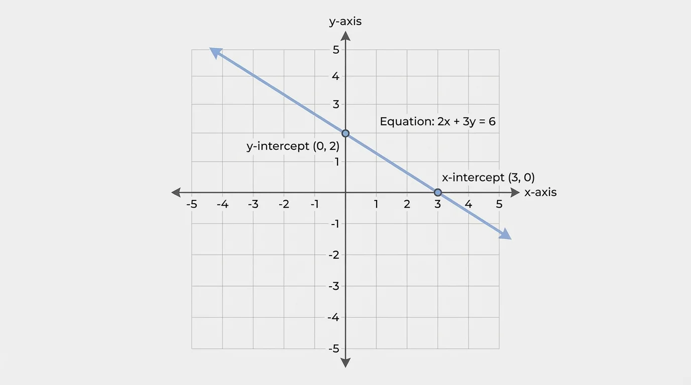
Later, when comparing different relationships, you can quickly see which one increases faster by comparing slopes, and where they start by comparing intercepts, just as the intercepts are seen clearly in [Figure 1].
When you build a graph, the goal is to make the relationship easy to read and interpret — not just to plot points. A well-made graph has:
Suppose your variables are time in hours and distance in kilometers. A good label for the horizontal axis might be "time \(t\) (hours)" and for the vertical axis "distance \(d\) (km)", like the axes shown in [Figure 2].
Choosing scales means deciding how much each grid step on an axis represents. If time goes from 0 to 10 hours, a scale of 1 hour per grid line makes sense. If distance goes from 0 to 500 km, maybe 50 km or 100 km per grid line works better than 1 km per line.
Once the axes and scales are set:
Always check that the line matches your expectations: if the slope is positive, the line should slant upward from left to right; if negative, it should slant downward.
Good labels and scales, like in [Figure 2], help anyone reading your graph understand what each point and line actually means in the real situation.
We now walk through several full examples, from context to equation to graph. One of them will compare two situations side by side, and we will interpret their graphs as in [Figure 3] 🙂.
Example 1: Earning Money from a Part-Time Job
You get paid 9 dollars per hour for tutoring, plus a fixed 15-dollar transport stipend each week. Let \(h\) be the number of hours you tutor in a week, and \(E\) be your total weekly earnings.
Step 1: Identify variables and relationship
Variables: \(h\) (hours), \(E\) (earnings). You earn 9 dollars for each hour: that is \(9h\). You also get 15 dollars regardless of hours.
Step 2: Write the equation
\(E = 9h + 15\).
Step 3: Make a small table of values
Choose easy values for \(h\):
| \(h\) | \(E\) |
|---|---|
| 0 | \(E = 9(0) + 15 = 15\) |
| 2 | \(E = 9(2) + 15 = 33\) |
| 5 | \(E = 9(5) + 15 = 60\) |
Final relationship:
\(E = 9h + 15\)
Step 4: Graph interpretation
The point \((0, 15)\) is the y-intercept: it means you earn 15 dollars even if you tutor 0 hours (your stipend). The slope \(9\) means your earnings increase by 9 dollars for each extra hour.
This example shows how the intercept and slope of a line have direct real-world meanings.
Example 2: School Club Fundraising — Standard Form and Intercepts
A school club sells T-shirts and hoodies to raise money. Each T-shirt sells for 8 dollars and each hoodie for 20 dollars. The club wants to make exactly 400 dollars. Let \(t\) be the number of T-shirts and \(h\) the number of hoodies.
Step 1: Identify equation
Income from T-shirts: \(8t\). Income from hoodies: \(20h\). Total income: 400 dollars.
Equation: \(8t + 20h = 400\).
Step 2: Find intercepts
x-intercept style (\(t\)-intercept): set \(h = 0\), then \(8t = 400\) so \(t = 50\). This point \((50, 0)\) means 50 T-shirts and 0 hoodies.
y-intercept style (\(h\)-intercept): set \(t = 0\), then \(20h = 400\) so \(h = 20\). This point \((0, 20)\) means 0 T-shirts and 20 hoodies.
We now know two points on the line.
Step 3: Graph the line
On a coordinate plane with horizontal axis \(t\) (T-shirts) and vertical axis \(h\) (hoodies), plot \((50, 0)\) and \((0, 20)\), then draw a straight line through them.
Every point with whole-number coordinates on this line represents a different combination of T-shirts and hoodies that gives exactly 400 dollars in sales.
Final equation:
\[8t + 20h = 400\]
Notice how this example focuses on intercepts, which are easy to graph and interpret, like the intercepts displayed in [Figure 1].
Example 3: Comparing Two Phone Data Plans
Plan A charges 10 dollars per month plus 5 dollars per gigabyte of data. Plan B charges no monthly fee but 8 dollars per gigabyte. Let \(g\) be the number of gigabytes you use in a month, and \(C\) be the monthly cost.
Step 1: Write equations for both plans
Plan A: \(C_A = 10 + 5g\).
Plan B: \(C_B = 8g\).
Step 2: Identify slopes and intercepts
Plan A: slope \(5\), y-intercept \(10\).
Plan B: slope \(8\), y-intercept \(0\).
We expect Plan A to start higher but increase more slowly, while Plan B starts at 0 but increases faster. Their graphs, like the ones in [Figure 3], should intersect at some point.
Step 3: Find where the cost is the same
Set \(C_A = C_B\): \(10 + 5g = 8g\).
Subtract \(5g\) from both sides: \(10 = 3g\).
So \(g = \dfrac{10}{3} \approx 3.33\).
Substitute back to find the common cost: \(C_B = 8g = 8 \cdot \dfrac{10}{3} = \dfrac{80}{3} \approx 26.67\).
The two lines intersect at \(\left(\dfrac{10}{3}, \dfrac{80}{3}\right)\).
Final system:
\[C_A = 10 + 5g, \quad C_B = 8g\]
Step 4: Interpret the graphs
For less than about 3.33 gigabytes, Plan A is cheaper (even though it has a monthly fee), because its slope is lower. For more than about 3.33 gigabytes, Plan B becomes more expensive since the per-gigabyte rate is higher. On the graph, the cheaper plan at any data usage level is the line that lies lower on the coordinate plane.
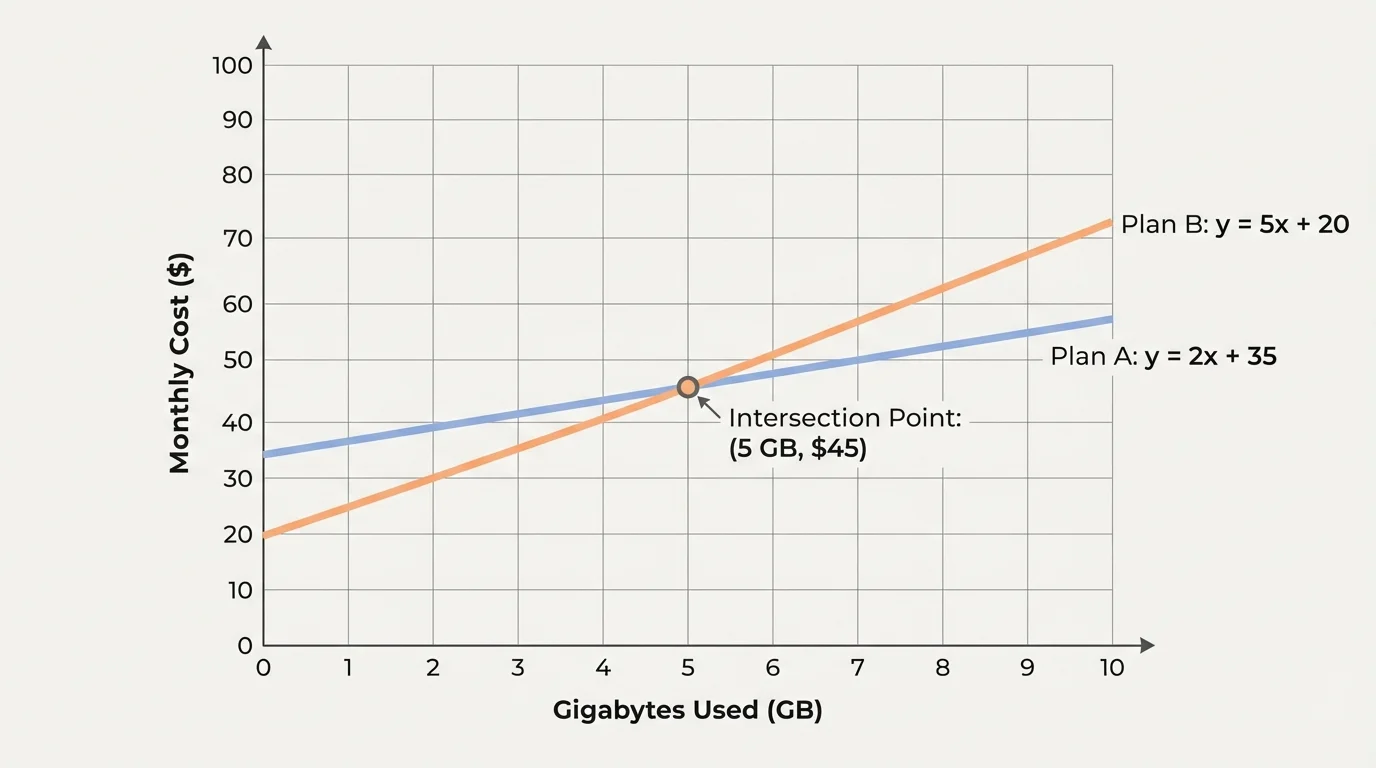
When you compare real options like this, a graph like the one in [Figure 3] lets you see the "break-even" point at a glance.
Sometimes two variables are not enough. Consider a shipping company that charges based on weight, distance, and number of packages. One simple model could be
\[C = 0.5w + 0.2d + 3n\]
where \(C\) is total cost, \(w\) is total weight in kilograms, \(d\) is distance in kilometers, and \(n\) is the number of packages.
This equation has three-dimensional structure: each variable you change affects the total cost. Graphing this exactly in ordinary 2D is difficult, but you can:
In algebra, an equation like \(Ax + By + Cz = D\) represents a plane in 3D space. Systems of several such equations describe intersections of planes — lines or points in 3D. Even if you cannot draw them easily, the idea that each equation is a geometric object helps you understand solutions.
Equations in two or more variables are everywhere 🔍.
In all these cases, graphs help you see trade-offs: how increasing one quantity forces a change in another to stay within a budget, keep a total fixed, or reach a target.
When creating and graphing equations in multiple variables, students often fall into similar traps:
Checking units, labels, and the meaning of intercepts against your original story is a reliable way to catch mistakes.
Linear equations in many variables are the foundation of powerful tools like linear programming, which businesses use to maximize profit or minimize cost under many constraints at once.
Graphs and equations you are learning now are the same language used in those advanced optimization methods.