A graph can be misleading in a subtle way. Two data sets may both look as if a line fits them, yet one is truly linear and the other is hiding a curve. The tool that helps expose the difference is the residual. Residuals let us move beyond "that line looks adequate" and ask a sharper question: how far off are the predictions, and is there a pattern in those errors?
When we collect paired data such as hours studied and test scores, speed and stopping distance, or time and temperature, we often plot the points on a scatter plot. A function that fits the data is a rule that gives predicted values close to the observed data values. If the relationship appears roughly straight, a linear function may be reasonable. If the data bend, level off, or grow quickly, another type of function may fit better.
To judge fit, we compare two values for each data point: the observed value, which comes from the actual data, and the predicted value from the model. If the predictions are consistently close, the model is useful. But being "close" is not enough by itself. We also care whether the errors are random or whether they show a pattern.
A scatter plot displays pairs of quantitative data as points. Earlier work with scatter plots focused on direction, form, and strength: positive or negative association, linear or non-linear shape, and whether points cluster tightly or loosely around a trend.
A model can have small errors overall and still be the wrong shape. For example, a line through curved data may miss low values on both ends and overshoot in the middle. Looking only at the original scatter plot does not always make this obvious. Residuals are designed to reveal exactly that kind of hidden structure.
A predicted value is the output from the model for a given input. The residual plot helps us compare observed and predicted values point by point, and as [Figure 1] shows, each residual is the vertical distance from a data point to the graph of the model.
The basic formula is
\[r = y - \hat{y}\]
That is, residual = observed value − predicted value.
If the residual is positive, the actual point lies above the model. If the residual is negative, the actual point lies below the model. A residual of exactly \(0\) means the model predicts that data point perfectly.
Suppose a model predicts \(y = 18\) when \(x = 4\), but the actual data value is \(20\). Then the residual is \(20 - 18 = 2\). If the actual value were \(16\), the residual would be \(16 - 18 = -2\).
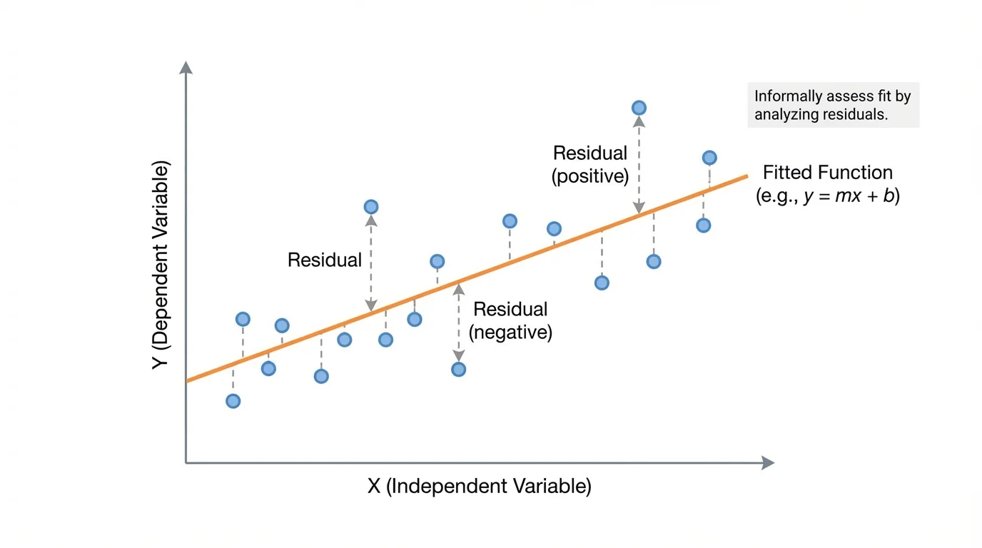
A residual plot places the input values, usually \(x\), on the horizontal axis and the residuals on the vertical axis. Instead of graphing the original \(y\)-values, we graph how far each point is from the model. A horizontal line at \(0\) is especially important because it represents perfect prediction.
A residual is the difference between an observed data value and the value predicted by a model. A residual plot is a graph of input values against residuals, used to judge whether a model fits data appropriately.
Residual plots are powerful because they simplify the question of fit. Rather than asking whether the original graph "looks close," we ask whether the residuals are scattered around \(0\) without a clear pattern.
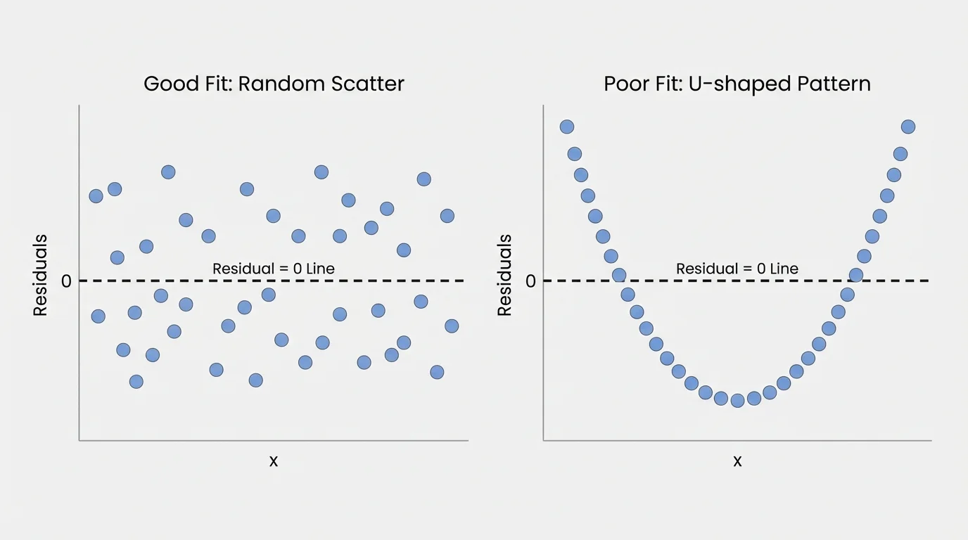
Residual plots often reveal what the original scatter plot hides, and [Figure 2] highlights the key comparison: random scatter around \(0\) usually supports the model, while a visible shape suggests the model is missing something.
If a function fits well informally, the residuals should have no strong pattern. They should be spread above and below \(0\) in a fairly random way. This does not mean every residual is tiny, but it does mean the model is not consistently wrong in one direction for certain ranges of \(x\).
Several common residual patterns matter:
When the residual plot forms a clear arch, a U-shape, or any repeated structure, that is evidence that the model is not capturing the relationship well. A good model leaves behind only random noise, not a picture.
This is why residuals are especially useful when comparing two possible functions. A model with points closer to \(0\) and with less pattern in the residual plot is generally the better fit.
Professional scientists and economists use the same basic idea when checking models. Even highly advanced statistical software often begins with a simple visual question: do the residuals look random, or do they reveal a missed pattern?
Consider data relating study time \(x\) in hours to quiz score \(y\): \((1, 62)\), \((2, 68)\), \((3, 73)\), \((4, 79)\), and \((5, 84)\). Suppose the model is
\[y = 5.5x + 57\]
We want to compute residuals and decide whether the line fits well.
Worked example 1
Step 1: Find predicted values.
For \(x = 1\), predicted \(y = 5.5(1) + 57 = 62.5\).
For \(x = 2\), predicted \(y = 5.5(2) + 57 = 68\).
For \(x = 3\), predicted \(y = 5.5(3) + 57 = 73.5\).
For \(x = 4\), predicted \(y = 5.5(4) + 57 = 79\).
For \(x = 5\), predicted \(y = 5.5(5) + 57 = 84.5\).
Step 2: Compute residuals using observed minus predicted.
At \(x = 1\), residual \(= 62 - 62.5 = -0.5\).
At \(x = 2\), residual \(= 68 - 68 = 0\).
At \(x = 3\), residual \(= 73 - 73.5 = -0.5\).
At \(x = 4\), residual \(= 79 - 79 = 0\).
At \(x = 5\), residual \(= 84 - 84.5 = -0.5\).
Step 3: Interpret the residuals.
The residuals are all very close to \(0\), and there is no clear curved or systematic pattern. The line fits the data well.
A reasonable informal conclusion is that the linear model is a good fit.
In this example, not every point lands exactly on the line, but the errors are small and patternless. That is often what "a good fit" looks like in real data.
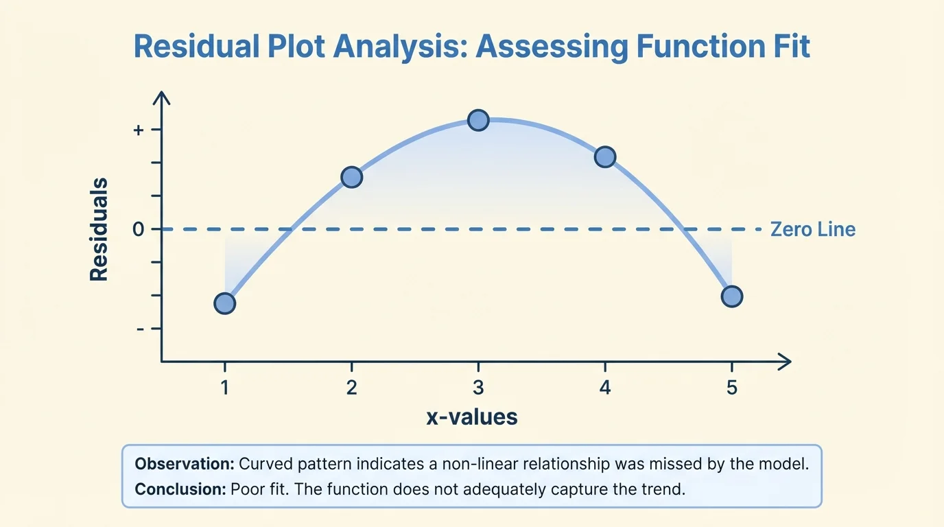
Now consider data that grow in a curved way: \((1, 3)\), \((2, 8)\), \((3, 11)\), \((4, 12)\), \((5, 11)\). A straight line might still seem plausible at first glance, but as [Figure 3] demonstrates, the residuals can expose the mismatch.
Suppose we test the linear model
\(y = 2x + 3\)
Worked example 2
Step 1: Find predicted values.
For \(x = 1\), predicted \(y = 2(1) + 3 = 5\).
For \(x = 2\), predicted \(y = 2(2) + 3 = 7\).
For \(x = 3\), predicted \(y = 2(3) + 3 = 9\).
For \(x = 4\), predicted \(y = 2(4) + 3 = 11\).
For \(x = 5\), predicted \(y = 2(5) + 3 = 13\).
Step 2: Compute residuals.
At \(x = 1\), residual \(= 3 - 5 = -2\).
At \(x = 2\), residual \(= 8 - 7 = 1\).
At \(x = 3\), residual \(= 11 - 9 = 2\).
At \(x = 4\), residual \(= 12 - 11 = 1\).
At \(x = 5\), residual \(= 11 - 13 = -2\).
Step 3: Interpret the pattern.
The residuals are negative, then positive, then negative again: \(-2, 1, 2, 1, -2\). This creates a curved pattern rather than random scatter.
The line is not a good model for these data, even if the original scatter plot might have looked somewhat close.
The residual pattern tells us that the data rise and then fall relative to the line. That suggests a non-linear model, possibly a quadratic function, would fit better.
Later, when you compare a quadratic model to the line, you would expect the quadratic model's residuals to look more random and stay closer to \(0\).
Suppose a company tracks temperature \(x\) and electricity use \(y\). Two models are proposed:
Model A: \(y = 4x + 20\)
Model B: \(y = 0.2x^2 - 8x + 120\)
Assume the scatter plot bends slightly rather than following a straight trend. Which model is better?
Worked example 3
Step 1: Examine the residual behavior instead of only the original graph.
If Model A produces residuals like \(-5, -1, 3, 4, 1, -3\), the residuals show a curved pattern from negative to positive back to negative.
Step 2: Compare with Model B.
If Model B produces residuals like \(1, -1, 0, 2, -2, 0\), the residuals stay near \(0\) and appear more randomly scattered.
Step 3: Draw a conclusion.
Model B is the better fit because its residuals have less pattern and smaller overall size.
When comparing models informally, the better model usually leaves behind smaller, more random residuals.
This example shows an important idea: the "best" model is not the one that simply looks impressive or has a more complicated formula. It is the one whose errors behave most like random scatter.
Residuals do more than test whether data are linear or curved. They can also point out unusual observations. A single residual far from \(0\) may mean one data point does not follow the trend. That point might be the result of measurement error, a special event, or a genuinely unusual case.
An outlier can affect how a model is chosen, especially when the data set is small. If one point is far from all the others, it may pull a line upward or downward and change the residuals for many points. This is one reason analysts inspect both the scatter plot and the residual plot, not just one of them.
Residuals also help us notice when variability changes. If points in the residual plot spread out more and more as \(x\) increases, predictions may be less reliable for large values of \(x\). That does not automatically make the model useless, but it tells us to be cautious.
Why randomness matters
A good model captures the systematic part of a relationship, meaning the overall trend or shape. After that trend is removed, the leftover errors should mostly be random variation. If the leftovers still form a pattern, then the model has not captured all the structure in the data.
This idea connects directly back to [Figure 2]: a random cloud around \(0\) means the model has explained the main pattern, while a shape in the residuals means some structure remains unexplained.
Residual analysis appears in many fields that rely on quantitative data. In sports science, a model might predict sprint time from training hours. Residuals can show whether the relationship is really linear or whether gains level off after heavy training. In economics, a model might predict spending from income, while residuals may reveal that the pattern changes at higher income levels.
In environmental science, researchers may model pollution level as a function of traffic volume. If the residuals form a curve, that might suggest weather conditions, road layout, or time of day also matter. In engineering, a model predicting material stress from applied force may show increasing residual spread, warning that uncertainty grows under higher loads.
Medical researchers also use residuals. For example, a model relating dosage to response may appear reasonable until residuals reveal that the effect levels off. That could suggest a different kind of function and lead to safer, more accurate predictions.
"All models are wrong, but some are useful."
— George Box
This famous idea does not mean models are flawed. It means every model is a simplification. Residuals help us decide whether a simplification is useful enough for the question we are asking.
One very common mistake is subtracting in the wrong order. The residual is observed minus predicted, not predicted minus observed. Reversing the order changes the sign and can lead to incorrect interpretation.
Another mistake is confusing the original scatter plot with the residual plot. In the original plot, the vertical axis is the observed \(y\)-value. In a residual plot, the vertical axis is the error relative to the model. A point at height \(3\) in a residual plot means the model underpredicted by \(3\), not that the actual \(y\)-value is \(3\).
Students also sometimes assume that any model with some residuals above and some below \(0\) must be good. That is not enough. The key question is whether there is a pattern. The curved residuals from the earlier example still include positive and negative values, but they clearly indicate poor fit.
A good habit is to use both views together. Look at the original scatter plot to understand the overall relationship, then use the residual plot to check whether the chosen function leaves a random set of errors. As we saw in [Figure 1], each residual measures vertical error from the model, and as seen again in [Figure 3], the arrangement of those errors can reveal the wrong functional form.
Another good habit is to be cautious with very small data sets. A few points may not be enough to reveal a reliable residual pattern. Informal assessment is valuable, but it works best when paired with careful judgment.
| Residual behavior | What it suggests |
|---|---|
| Small, random scatter around \(0\) | The model is a reasonable fit |
| Curved pattern | A different function type may fit better |
| Mostly positive residuals | The model often underpredicts |
| Mostly negative residuals | The model often overpredicts |
| One very large residual | Possible outlier |
| Spread increases with \(x\) | Error variability changes across the data |
Table 1. Common residual patterns and the conclusions they often support.
Informal residual analysis is about reasoning, not memorizing a single rule. You are looking for evidence that the model captures the data's shape without leaving behind a visible structure in the errors.