Have you ever voted for your favorite snack, pet, or game? When many people answer the same question, the results can look messy at first. But a graph turns that pile of answers into a picture we can read quickly. A graph helps us see which group has more, which has less, and how many there are altogether.
Data is information that we collect. We can collect data by asking questions, counting objects, or observing what we see. For example, if a class asks, "Which fruit do you like best?" and students choose apples, bananas, grapes, or oranges, the answers are data.
When we sort data into groups, the groups are called categories. In a fruit survey, the categories might be apples, bananas, grapes, and oranges. Each answer belongs in one category.
Data means information that has been collected.
Category means a group used to sort data.
Scale means the counting numbers shown on a graph. A single-unit scale counts by 1.
Graphs help us organize data so it is easier to understand. Instead of reading many separate answers, we can look at a graph and quickly tell what the class likes most or least.
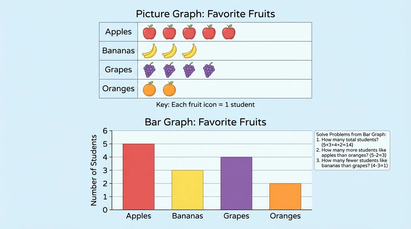
A picture graph and a bar graph can show the same data in different ways, as [Figure 1] shows. Both kinds of graphs need a clear title and category labels so the reader knows what the graph means.
In a picture graph, small pictures or symbols stand for the data. If one picture stands for one student, then 85 pictures mean 85 students. A key tells what each picture is worth.
In a bar graph, rectangles called bars show the data. The length or height of each bar tells how many are in that category. In this lesson, we use a single-unit scale, so the graph counts by 1, like 0, 1, 2, 3, 4, 5.
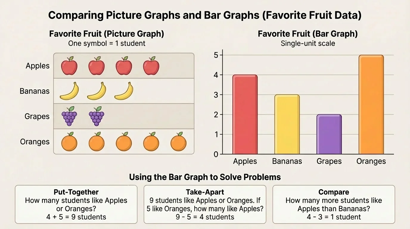
A good graph is neat and accurate. If the data says bananas were chosen by 86 students, then the picture graph should show 86 symbols or pictures, and the bar graph should have a bar reaching 86.
To make a picture graph, we start with a small set of data and match each count to a row of symbols, as [Figure 2] illustrates. Suppose a class survey shows these favorite fruits: apples 4, bananas 6, grapes 3, and oranges 5.
First, write a title such as Favorite Fruits. Next, list the four categories: apples, bananas, grapes, and oranges. Then choose a symbol, such as a small circle or fruit picture, and write a key. The key might say: 1 picture = 1 student.
Now draw the pictures in each row. Apples get 4 pictures, bananas get 6 pictures, grapes get 3 pictures, and oranges get 5 pictures. Put the pictures in straight rows so they are easy to count.
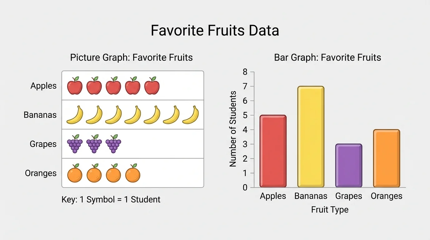
If every picture is worth 1, counting is simple. Later, some picture graphs may use one picture to stand for more than one object, but here we are using one picture for one item so the graph matches the data exactly.
When we look back at [Figure 2], we can quickly tell that bananas is the largest category because its row has the most pictures. Grapes is the smallest category because its row has the fewest pictures.
A bar graph uses bars instead of pictures, and each step on the scale counts by 1, as [Figure 3] shows. We can use the same fruit data: apples 4, bananas 6, grapes 3, and oranges 5.
First, write a title. Then draw one side line and one bottom line for the graph. Write the categories along the bottom. Along the side, write the numbers 0, 1, 2, 3, 4, 5, 6. This side is the scale.
Next, draw one bar for each category. The top of each bar should stop at the correct number. The apples bar stops at 4, the bananas bar stops at 6, the grapes bar stops at 3, and the oranges bar stops at 5. Make sure the bars have equal width and do not lean.
Bar graphs are useful because the bar lengths are easy to compare. Looking at [Figure 3], we can see right away that the bananas bar is taller than the apples bar, and the grapes bar is shorter than the oranges bar.
What makes a graph easy to read
A graph is easiest to read when it has a title, category labels, a correct scale, and careful counting. In a picture graph, the key must match the pictures. In a bar graph, the bars must stop at the right number on the scale.
Even a small mistake can change the answer. If a bar stops at 85 instead of 86, the graph does not match the data. That is why checking matters.
A bar graph gives us number clues that help us solve problems, as [Figure 4] illustrates. We can answer three common kinds of questions: put-together, take-apart, and compare.
A put-together problem asks for a total. We combine two or more categories. A take-apart problem asks what is left or how many remain after removing some. A compare problem asks how many more or how many fewer.
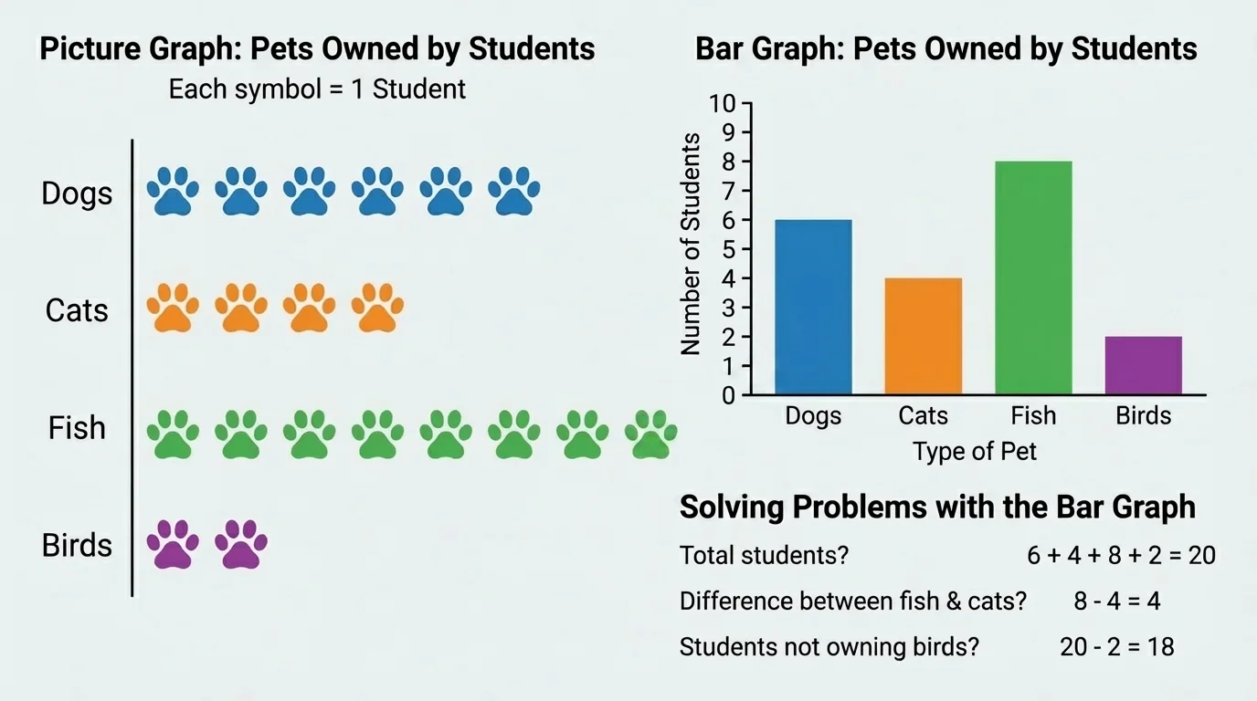
Suppose a pet graph shows dogs 5, cats 3, fish 4, and birds 2. If we want to know how many students chose dogs and cats, we add: \(5 + 3 = 8\). If we want to know how many more students chose dogs than birds, we subtract: \(5 - 2 = 3\).
When reading a bar graph, find the category first. Then look at where the top of the bar meets the scale. That number is the count for that category. After that, decide whether to add or subtract.
Later, when we look again at [Figure 4], we notice that compare questions are really about the distance between two bar heights. The farther apart the tops of the bars are, the greater the difference.
Worked example 1: Draw a picture graph from data
A class counts favorite pets: dogs 4, cats 2, fish 3, birds 1.
Step 1: Write the title and categories.
Title: Favorite Pets. Categories: dogs, cats, fish, birds.
Step 2: Choose a key.
Use 1 picture = 1 student.
Step 3: Draw each row of pictures.
Dogs get 4 pictures, cats get 2 pictures, fish get 3 pictures, and birds get 1 picture.
The finished picture graph shows \(4 + 2 + 3 + 1 = 10\) students in all.
This example shows that a picture graph is really another way to display the same counts. We are not changing the data. We are only showing it clearly.
Worked example 2: Read a bar graph and solve a put-together problem
A bar graph shows favorite recess games: tag 5, jump rope 4, soccer 3, and drawing 2. How many students chose tag and jump rope?
Step 1: Read the two categories from the graph.
Tag is 5. Jump rope is 4.
Step 2: Add the counts.
\(5 + 4 = 9\)
Step 3: State the answer.
9 students chose tag and jump rope.
The answer is 9.
A put-together problem asks for a total, so adding makes sense. If the question asks for two groups together, we join the amounts.
Worked example 3: Read a bar graph and solve a compare problem
A bar graph shows books read this month: Maya 6, Leo 4, Ana 5, and Eli 3. How many more books did Maya read than Eli?
Step 1: Read the counts.
Maya read 6 books. Eli read 3 books.
Step 2: Compare by subtracting.
\(6 - 3 = 3\)
Step 3: State the answer.
Maya read 3 more books than Eli.
The answer is 3.
Even though this question asks "how many more," it can also be thought of as finding the difference between two bar heights.
Worked example 4: Solve a take-apart question with one category removed
A bar graph shows snacks brought for a picnic: apples 7, crackers 5, cheese sticks 4, and raisins 2. How many snacks are there if we count apples, crackers, and cheese sticks but not raisins?
Step 1: Read the categories we need.
Apples 7, crackers 5, cheese sticks 4.
Step 2: Add those categories.
\(7 + 5 + 4 = 16\)
Step 3: State the answer.
There are 16 snacks when raisins are not counted.
The answer is 16.
Sometimes take-apart problems can be solved by finding a total first and then removing one part. For this data set, the total is \(7 + 5 + 4 + 2 = 18\), and then \(18 - 2 = 16\). Both ways give the same answer.
Graphs are everywhere. Teachers use them to show class votes. Coaches can use them to count how many baskets players make. Families can use them to track chores. Scientists use bigger graphs when they study weather and animals, but the idea is the same: collect data, organize it, and read it carefully.
If a class tracks the weather for four days, the categories might be sunny, rainy, windy, and cloudy. A graph makes it easy to see which kind of weather happened most often. If students survey favorite lunch choices, a graph shows which lunch was chosen by the most students.
Even very large studies start with simple counting. A graph you make in class uses the same idea as graphs adults read in newspapers, science reports, and sports scores.
That is one reason graphs matter so much. They help us turn information into something we can understand at a glance.
One common mistake is forgetting the title. Without a title, the reader may not know what the graph is about. Another mistake is mixing up the categories. Always put each count in the correct place.
Some students count the bars incorrectly. Remember to look at the scale on the side of the bar graph. If the top of a bar reaches 4, then that category has 4, not 5. In a picture graph, count each symbol carefully and check the key.
Another mistake is answering the wrong kind of question. If the problem asks "how many in all," you usually add. If it asks "how many more" or "how many fewer," you usually subtract. Think about what the question wants before you solve.
You already know how to count, add, and subtract within small numbers. Graphs use those same math skills in a new way. First read the graph, then choose the operation that matches the question.
With practice, graphs become powerful tools. They help us organize information, spot patterns, and answer questions clearly and correctly.