If you ask a whole class, "How many minutes did you read last night?" you probably will not get one single answer. You might get answers like \(10\), \(15\), \(20\), \(20\), \(35\), and \(60\). This variation is what makes statistics interesting: when we collect real data, the answers usually vary. The important goal is not just to look at one number, but to understand the whole set of answers.
A statistical question is a question that expects different answers from different people or objects. For example, "What is the shoe size of students in this class?" is statistical because students will have different shoe sizes. But "How many days are in a week?" is not statistical because there is only one correct answer: \(7\).
When we gather answers to a statistical question, we create a set of data. The data may be about lengths, times, scores, temperatures, or many other things. Because the values vary, we need a way to describe the entire set. That description is called the distribution of the data.
Distribution means how the data values are spread out and arranged. A distribution can be described by its center, its spread, and its overall shape.
Thinking about all three parts matters. Two data sets can have the same middle value but still be very different. One set might be packed closely together, while another might be spread far apart. One set might be balanced, while another has one unusual value far away from the rest.
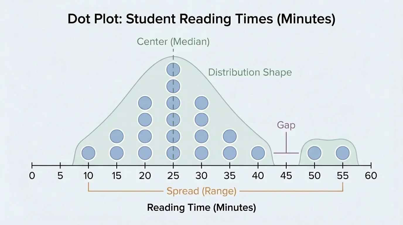
A distribution tells us what values appear in the data and how often they appear. It is not just the list itself. It is the pattern made by the data, as [Figure 1] shows when the values are arranged on a dot plot. A dot plot helps us see where most data values are, how far they stretch, and whether there are gaps or unusual values.
Suppose \(10\) students report the number of books they read this month: \(1, 2, 2, 3, 3, 3, 4, 4, 5, 8\). The distribution shows that most students read between \(2\) and \(4\) books, while one student read \(8\) books. That \(8\) stands out because it is much larger than most of the other values.
We can describe a distribution with words, numbers, and graphs. A graph helps us see the shape. Numbers such as the mean, median, and range help us describe the center and spread. Good statistical thinking uses both the picture and the numbers.
Another way to think about a distribution is to ask three questions: What is a typical value? How much do the values vary? What pattern do the values make? These three questions lead directly to center, spread, and shape.
When you order numbers from least to greatest, it becomes much easier to find the middle, compare distances, and notice patterns. Ordered data is very helpful in statistics.
The center of a distribution is a value that describes what is typical or what is in the middle of the data. Two common ways to describe center are the mean and the median.
The mean is the arithmetic average. To find it, add all the data values and divide by the number of values. If the data are \(4, 6, 8\), then the mean is \(\dfrac{4+6+8}{3} = \dfrac{18}{3} = 6\).
The median is the middle value when the data are listed in order. If there is an odd number of data values, the median is the one right in the middle. If there is an even number of data values, the median is the mean of the two middle values.
For the data \(2, 3, 5, 8, 9\), the median is \(5\), because \(5\) is the middle number. For the data \(2, 3, 5, 8\), the median is \(\dfrac{3+5}{2} = 4\).
The center helps answer the question, "What is a typical value?" But one center number does not tell the whole story. Two data sets can have the same mean or median but still look very different.
Mean and median can tell slightly different stories. The mean uses every value in the data set, so one very large or very small value can pull it away from the rest of the data. The median depends on the middle position, so it is often less affected by extreme values. That is why statisticians often look at both.
The spread of a distribution tells how much the data vary. Are the values close together, or are they far apart? A simple measure of spread is the range.
To find the range, subtract the smallest value from the largest value. If the data are \(3, 4, 6, 8, 10\), then the range is \(10 - 3 = 7\).
A small range means the data are packed more closely together. A large range means they are more spread out. But just like center, the range alone does not tell everything. A set of data might have the same range as another set but be arranged very differently inside that range.
When describing spread, it also helps to notice clusters and gaps. A cluster is a group of values close together. A gap is an interval where there are no data values. These features help us understand the distribution more clearly.
The overall shape of a distribution tells what the graph looks like as a whole, and [Figure 2] makes these differences easy to notice. Some data sets are roughly balanced on both sides of the center. Others have most values on one side and a long tail on the other side.
If a distribution looks balanced, we often say it is roughly symmetric. For example, the values \(2, 3, 4, 4, 4, 5, 6\) are centered around \(4\), with values spreading in a fairly even way on both sides.
Some distributions are skewed. A right-skewed distribution has a longer tail on the right side, often caused by a few large values. For example, \(1, 2, 2, 2, 3, 3, 9\) has most values near the low end, but \(9\) stretches the data to the right.
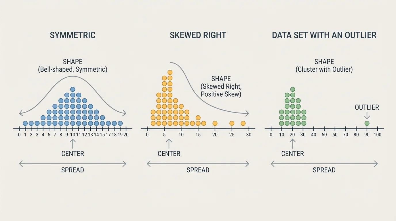
Another important feature is an outlier, which is a value far away from the rest of the data. In the set \(5, 6, 6, 7, 7, 8, 25\), the value \(25\) is an outlier. Outliers can strongly affect the mean and also change the shape of the distribution.
When you describe shape, you should look for ideas such as symmetric, skewed, clustered, gapped, or having an outlier. These words help turn a graph into a meaningful explanation.
Professional sports teams use distributions when studying player performance. Two players might have the same average score, but one may be very consistent while the other has scores that swing wildly from game to game.
Now let's describe complete distributions using center, spread, and shape together.
Solved Example 1: Number of pets owned by \(7\) students
The data are \(0, 1, 1, 2, 2, 3, 7\).
Step 1: Find the center.
The median is the middle value. Since there are \(7\) data values, the fourth value is the median: \(2\).
The mean is \(\dfrac{0+1+1+2+2+3+7}{7} = \dfrac{16}{7} \approx 2.29\).
Step 2: Find the spread.
The smallest value is \(0\) and the largest value is \(7\), so the range is \(7 - 0 = 7\).
Step 3: Describe the shape.
Most values are between \(0\) and \(3\), but \(7\) is much larger than the rest. The distribution is right-skewed and has a possible outlier at \(7\).
A strong description is: the center is about \(2\), the spread is \(7\), and the shape is right-skewed with one unusually large value.
This example shows why we should not stop at the mean. The mean is about \(2.29\), but that does not show how unusual the \(7\) is.
Solved Example 2: Quiz scores out of \(10\)
The scores are \(6, 7, 7, 8, 8, 8, 9, 9\).
Step 1: Find the median.
There are \(8\) values, so the median is the mean of the fourth and fifth values. Both are \(8\), so the median is \(\dfrac{8+8}{2} = 8\).
Step 2: Find the mean.
First add the values: \(6+7+7+8+8+8+9+9 = 62\).
Then divide by \(8\): \(\dfrac{62}{8} = 7.75\).
Step 3: Find the spread and describe the shape.
The range is \(9 - 6 = 3\).
The values are close together, so the spread is small. The scores are clustered around \(8\) and are roughly symmetric, with no obvious outlier.
This distribution has a center near \(8\), small spread, and a fairly balanced shape.
Compared with the pets example, this data set is much more tightly packed. That means the quiz scores are more consistent.
Solved Example 3: Daily temperatures in degrees
The temperatures are \(68, 70, 70, 71, 72, 85\).
Step 1: Find the median.
There are \(6\) values, so use the middle two: \(70\) and \(71\).
The median is \(\dfrac{70+71}{2} = 70.5\).
Step 2: Find the mean.
Add the values: \(68+70+70+71+72+85 = 436\).
Divide by \(6\): \(\dfrac{436}{6} \approx 72.67\).
Step 3: Find the range and interpret.
The range is \(85 - 68 = 17\).
Most temperatures are in the low \(70\)s, but \(85\) is much higher. The mean is pulled upward by that large value, so the median may better describe a typical day.
This distribution has a center around \(70.5\) to \(72.67\), a spread of \(17\), and a right-skewed shape because of the high temperature.
As we saw earlier in [Figure 2], one unusual value can change the look of a graph and also affect the mean. That is why center, spread, and shape belong together.
Statistics becomes especially powerful when we compare groups. A graph helps us compare groups quickly. Suppose Class A has scores \(6, 7, 8, 8, 8, 9, 10\), and Class B has scores \(4, 6, 8, 8, 8, 10, 12\).
[Figure 3] Both classes have a median of \(8\). But their spreads differ. Class A has range \(10 - 6 = 4\), while Class B has range \(12 - 4 = 8\). So both classes are centered at the same place, but Class B's scores are more spread out.
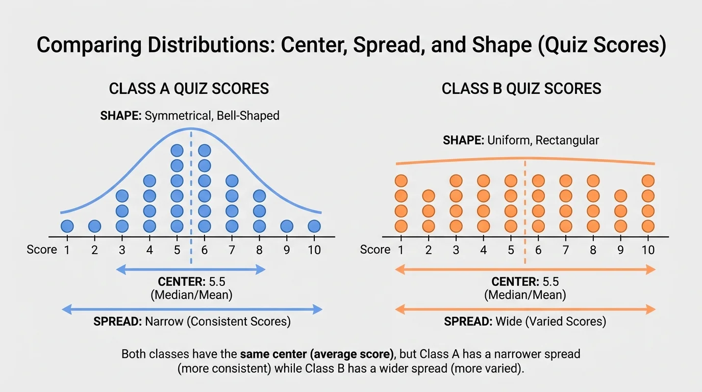
This means Class A's scores are more consistent. Class B has the same typical score, but there is more variation from student to student.
Sometimes two groups can have similar spread but different centers. For example, if one soccer team usually scores \(1\) or \(2\) goals per game and another usually scores \(3\) or \(4\), the second team has a higher center even if both teams vary by about the same amount.
When comparing distributions, good language sounds like this: "Both groups have a center near \(8\), but one group has greater spread," or "One group is more symmetric, while the other has an outlier."
Distributions appear everywhere. Schools may look at the distribution of test scores to see whether most students understood a topic. Weather scientists study distributions of temperatures or rainfall. Doctors track distributions of heart rates or heights. Video game designers study the distribution of how long players spend on a level.
In all of these cases, relying on just one number can hide important information. A class average score of \(80\) could come from students all scoring near \(80\), or from some students scoring near \(100\) and others near \(60\). The average alone cannot show that difference.
The same idea from [Figure 1] matters in real life: seeing how values are arranged tells us much more than simply knowing one answer. Patterns in the data help people make better decisions.
Why distributions matter for fairness and decisions. If a principal compares two classes using only average scores, the conclusion may be incomplete. One class may have a tight cluster showing steady understanding, while another may have a wide spread showing that some students need much more help. Describing the distribution gives a clearer and fairer picture.
One common mistake is thinking that the mean always tells the whole story. It does not. A mean can be affected by one very large or very small value.
Another mistake is describing only the center and ignoring the spread. Two data sets with center \(10\) are not automatically alike. One could have values from \(9\) to \(11\), while another could have values from \(1\) to \(19\).
A third mistake is forgetting to look at shape. If a data set has a gap or an outlier, that feature may be important. In a science experiment, an outlier might mean an unusual result or even a measurement error. In a sports record, it might show an amazing performance.
Good statistical descriptions sound complete. They mention a typical value, how much the data vary, and what the graph looks like overall.
"Numbers tell a story, but only if we look at all of them together."
Whenever you collect data to answer a statistical question, think of the data as a whole distribution. Ask yourself: Where is the center? How much spread is there? What is the shape? Those three ideas help you understand what the data is really saying.