A class can collect a lot of numbers in just one day: quiz scores, the number of books read, heights of bean plants, or how many minutes students spend practicing a sport. But a list of numbers by itself can be hard to understand. A good graph turns that list into a picture, and suddenly patterns appear. You can spot where most values are, where the data spreads out, and whether any value seems far away from the rest.
Numerical data is data made of numbers that represent counts or measurements. For example, the numbers of goals scored in games, the lengths of leaves in centimeters, or the ages of pets are all numerical data.
When we study data, we often look at its distribution. The distribution is the way the data values are spread out. A distribution helps answer questions like these: Where are most of the values? Are the values close together or far apart? Are there any gaps? Is there an unusually large or small value?
Many data displays place values on a number line. This is useful because a number line keeps the numbers in order from least to greatest. Then we can see how often values occur and how spread out the data is.
Numerical data is information given by numbers, such as counts or measurements.
Distribution is the overall pattern of the data, including where the values cluster, how they spread out, and whether there are gaps or extreme values.
Three important ways to display numerical data on a number line are dot plots, histograms, and box plots. Each one shows the same data in a different way, and each one helps us notice different features.
A dot plot places each data value as a dot above a number line, as shown in [Figure 1]. If a value appears more than once, the dots stack above that number. This makes it easy to see exact values and how often each value occurs.
Suppose the numbers of pages read by students in one evening are: \(8, 10, 10, 11, 12, 12, 12, 13, 15, 15, 16\). On a dot plot, one dot goes above \(8\), two dots go above \(10\), one dot goes above \(11\), three dots go above \(12\), and so on. You can quickly tell that \(12\) pages is a common value.
Dot plots are especially helpful when the data set is not too large and when you want to see each exact number. You can notice clusters, which are groups of values close together. You can also notice a gap, which is a part of the number line where no data values appear.
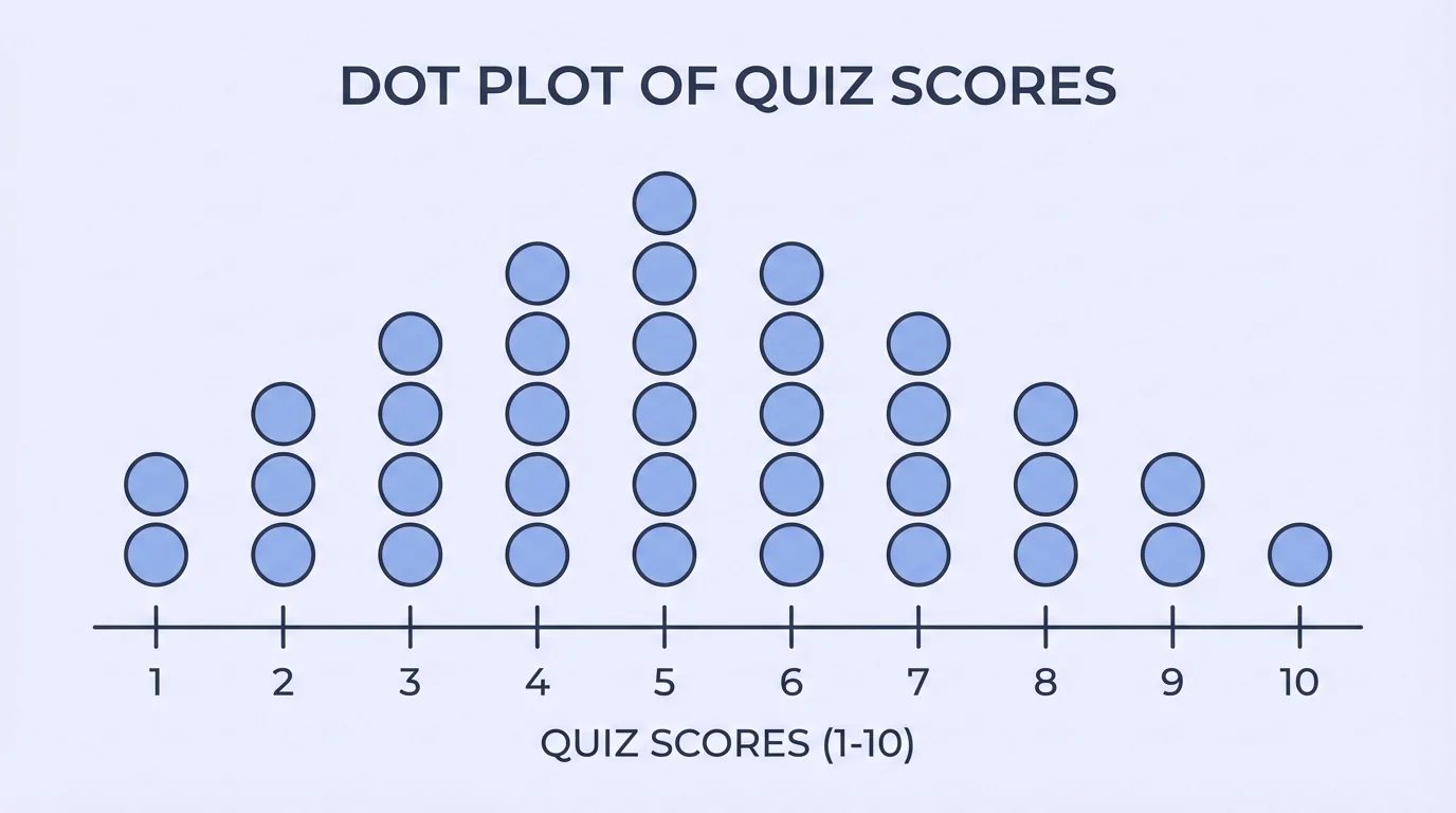
A dot plot can also help you find the middle of the data and compare the smallest and largest values. If one dot is far from the rest, that value may be an outlier, or an unusual value compared with the others.
For example, if most students ran between \(6\) and \(9\) laps, but one student ran \(15\) laps, the \(15\) would stand alone on the dot plot. That does not mean it is wrong, but it does mean we should pay attention to it.
Solved example: making and reading a dot plot
The shoe sizes of \(10\) students are \(4, 5, 5, 5, 6, 6, 7, 7, 7, 8\).
Step 1: Put the values in order.
They are already in order: \(4, 5, 5, 5, 6, 6, 7, 7, 7, 8\).
Step 2: Count how many times each value appears.
Size \(4\): \(1\) time, size \(5\): \(3\) times, size \(6\): \(2\) times, size \(7\): \(3\) times, size \(8\): \(1\) time.
Step 3: Place stacked dots over the number line.
The tallest stacks are over \(5\) and \(7\), so those are the most common values.
Step 4: Describe the distribution.
The data is grouped from \(4\) to \(8\). There are no gaps. The values \(5\) and \(7\) occur often, and the spread is from \(4\) to \(8\).
This dot plot shows exact values clearly, which is one reason dot plots are useful for smaller data sets.
Later, when we compare displays, we will see that dot plots often show more detail than other graphs because every individual value is visible. As in [Figure 1], the stacked dots make repeated values easy to spot right away.
A histogram groups numerical data into intervals and shows how many values fall in each interval, as seen in [Figure 2]. Instead of showing every exact value, a histogram shows ranges such as \(0–5\), \(6–10\), or \(11–15\).
In a histogram, the bars touch because the intervals connect on the number line. This is different from a bar graph for categories, where the bars are separated by gaps. Histograms are for numerical data that has been grouped into equal-width intervals.
Suppose the heights of plants, in centimeters, are: \(12, 13, 14, 14, 15, 17, 18, 19, 19, 20, 21, 23\). We could group them into intervals: \(10–14\), \(15–19\), and \(20–24\). Then we count how many values fall into each interval.
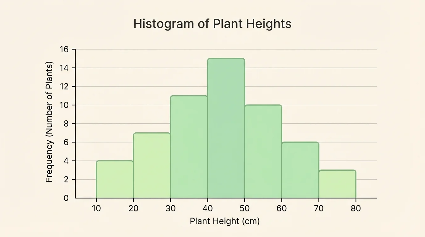
Here, \(10–14\) has \(4\) values, \(15–19\) has \(5\) values, and \(20–24\) has \(3\) values. The tallest bar is the middle interval, so most plant heights are between \(15\) and \(19\) centimeters.
Histograms are useful when there are many data values. They make the overall shape of the distribution easier to see. You can quickly notice where the data is concentrated and whether the graph seems balanced or uneven.
Remember that a number line keeps values in order. Histograms still use that idea, but instead of marking each single value, they group values into intervals of equal size.
When reading a histogram, ask: Which interval has the greatest frequency? Which has the least? Are the bars bunched together in one area, or spread across many intervals? Those questions help describe the distribution.
As with the plant-height graph in [Figure 2], histograms are especially strong when exact values matter less than the overall shape and grouping of the data.
A box plot gives a quick summary of a data set using five important values, as shown in [Figure 3]. These values are the minimum, lower quartile, median, upper quartile, and maximum.
The median is the middle value of an ordered data set. The lower quartile is the middle of the lower half of the data, and the upper quartile is the middle of the upper half. The box in a box plot stretches from the lower quartile to the upper quartile. A line inside the box marks the median. Lines called whiskers reach out to the minimum and maximum values.
Because a box plot uses only five summary values, it does not show every single data point. But it is excellent for seeing where the middle half of the data lies and how spread out the data is.
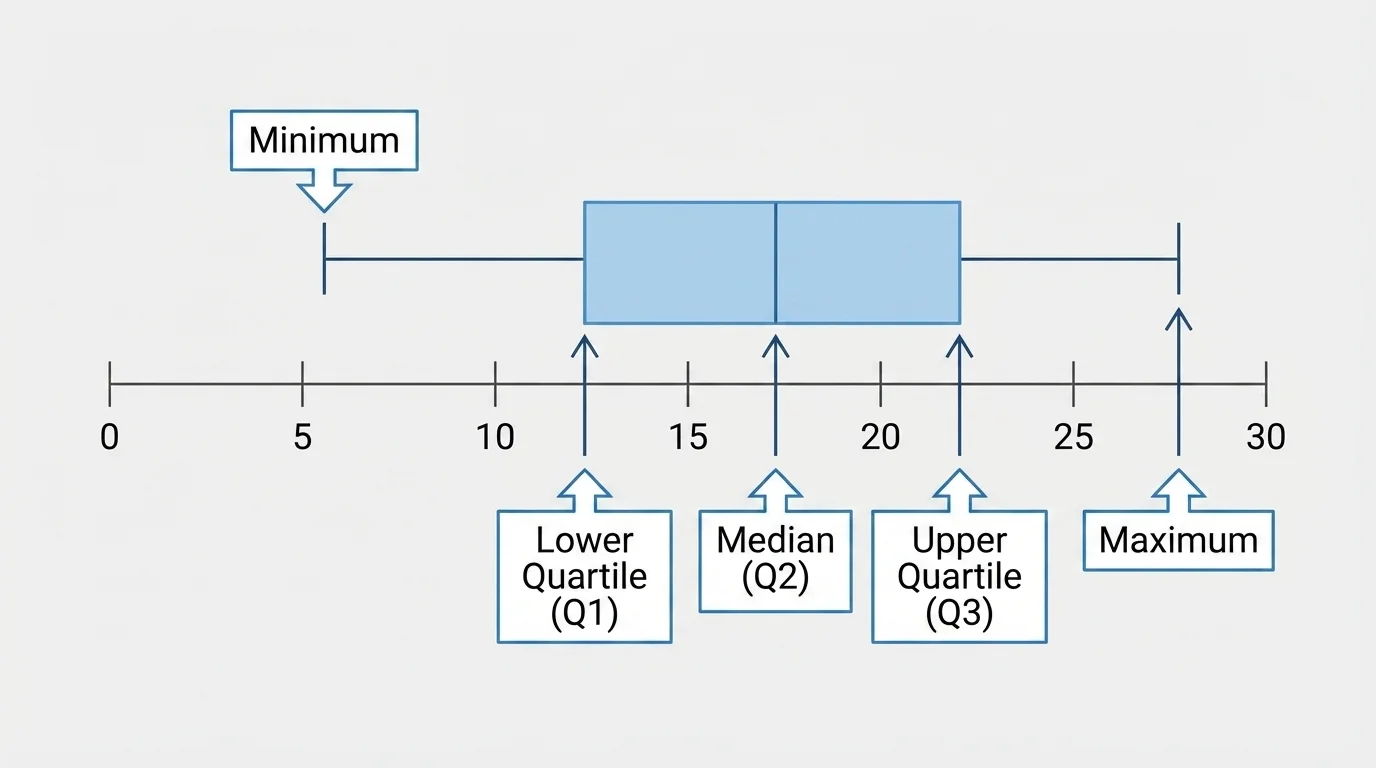
Suppose the ordered data is \(2, 4, 5, 7, 8, 10, 12, 13, 15\). The minimum is \(2\), the maximum is \(15\), and the median is \(8\). The lower half is \(2, 4, 5, 7\), so the lower quartile is halfway between \(4\) and \(5\), which is \(4.5\). The upper half is \(10, 12, 13, 15\), so the upper quartile is halfway between \(12\) and \(13\), which is \(12.5\).
These five numbers create the box plot. The box goes from \(4.5\) to \(12.5\), with a line at \(8\). The whiskers extend to \(2\) and \(15\).
Why box plots are powerful
Box plots help you compare data sets quickly because they focus on position and spread. If one box plot has a longer box, then the middle half of that data is more spread out. If the median is closer to one side of the box, the data may not be evenly balanced.
Box plots are often used when comparing two or more groups, such as test scores for two classes or daily temperatures in two cities. Since the same number line can hold several box plots, differences are easy to see.
The five-number summary in [Figure 3] also helps you describe spread without listing every value, which is useful when data sets are large.
Dot plots, histograms, and box plots all show numerical data on a number line, but they do not show exactly the same information.
| Display | What it shows best | Best use |
|---|---|---|
| Dot plot | Exact values and how often each value occurs | Small or medium data sets |
| Histogram | Grouped data and overall shape | Larger data sets |
| Box plot | Five-number summary and spread of the middle half | Comparing data sets quickly |
Table 1. Comparison of three ways to display numerical data on a number line.
If you want to know the exact number of students who got a score of \(7\), a dot plot is best. If you want to see how many scores fall between \(70\) and \(79\), a histogram works well. If you want to compare the middle scores of two classes, a box plot is very useful.
The same data set can sometimes be shown in all three forms. A dot plot may reveal the actual repeated values, like the stacked pattern in [Figure 1]. A histogram may make the overall grouping clearer, like the intervals in [Figure 2]. A box plot may summarize the same data with just five values, as in [Figure 3].
When describing a distribution, there are several features to look for. One is center, which tells where the data is roughly in the middle. Another is spread, which tells how far apart the data values are. You can also look for clusters, gaps, and possible outliers.
For example, if test scores are \(60, 61, 62, 63, 85, 86, 87\), there is a gap between \(63\) and \(85\). That gap suggests two groups of scores. If daily temperatures are \(71, 72, 72, 73, 73, 74, 95\), the \(95\) stands far from the others and may be an outlier.
Weather scientists, doctors, and sports analysts all use data displays to spot patterns quickly. A graph can reveal a trend in seconds that would take much longer to notice in a list of numbers.
The spread of a data set can sometimes be described by the difference between the maximum and minimum. This is called the range. For the temperatures \(71, 72, 72, 73, 73, 74, 95\), the range is \(95 - 71 = 24\).
A larger range means the data is more spread out. But range uses only two values, so a box plot can give a fuller picture by showing the middle half of the data too.
The best way to understand these displays is to build and interpret them from real numbers.
Solved example: creating a histogram
The numbers of minutes students read are \(5, 8, 9, 10, 12, 12, 14, 15, 16, 18, 20, 21\). Use intervals of width \(5\): \(5–9\), \(10–14\), \(15–19\), \(20–24\).
Step 1: Count the values in each interval.
In \(5–9\): \(5, 8, 9\), so frequency \(= 3\).
In \(10–14\): \(10, 12, 12, 14\), so frequency \(= 4\).
In \(15–19\): \(15, 16, 18\), so frequency \(= 3\).
In \(20–24\): \(20, 21\), so frequency \(= 2\).
Step 2: Draw bars for the intervals.
The bar heights are \(3, 4, 3, 2\).
Step 3: Interpret the histogram.
The interval \(10–14\) has the greatest frequency, so most students read between \(10\) and \(14\) minutes.
The histogram shows the shape of the reading-time distribution more clearly than a plain list.
Notice that the histogram does not show exactly how many students read for \(12\) minutes unless we go back to the data list. That is one trade-off of grouping values into intervals.
Solved example: finding the five-number summary for a box plot
Use the ordered data set \(3, 4, 6, 7, 9, 11, 13, 14, 16, 18, 20\).
Step 1: Find the median.
There are \(11\) values, so the median is the \(6\)th value, which is \(11\).
Step 2: Find the lower quartile.
The lower half is \(3, 4, 6, 7, 9\). Its middle value is \(6\), so the lower quartile is \(6\).
Step 3: Find the upper quartile.
The upper half is \(13, 14, 16, 18, 20\). Its middle value is \(16\), so the upper quartile is \(16\).
Step 4: Identify minimum and maximum.
Minimum \(= 3\), maximum \(= 20\).
Step 5: State the five-number summary.
The five-number summary is \(3, 6, 11, 16, 20\).
This summary is used to draw the box plot.
From this box plot, we can tell that the middle half of the data lies between \(6\) and \(16\). That tells us more about the spread in the center of the distribution.
Solved example: deciding which display is best
A school records the exact number of pets owned by \(14\) students: \(0, 1, 1, 1, 2, 2, 2, 3, 3, 4, 4, 4, 5, 8\).
Step 1: Ask whether exact values matter.
Yes. We may want to know exactly how many students have \(4\) pets or whether anyone has an unusual number.
Step 2: Choose the display.
A dot plot is the best choice because it shows each exact value and makes the \(8\) easy to notice as an unusual value.
Step 3: Explain why the other displays are less helpful here.
A histogram would group values and hide some exact counts. A box plot would summarize the data, but it would not show that three students have exactly \(4\) pets.
The best graph depends on the question you are trying to answer.
These graphs are not just for math class. Coaches may use dot plots to look at points scored per game. Scientists may use histograms to study the lengths of insects or the rainfall in different weeks. Doctors and health researchers often use box plots to compare blood pressure data for different groups.
At school, a teacher might collect quiz scores and use a dot plot to see whether many students missed questions of similar difficulty. A gardener might use a histogram to study plant growth. A principal might compare attendance data from several classes with box plots.
Whenever people need to make sense of many numbers, data displays help them see patterns, ask better questions, and make better decisions.
"Numbers tell a story when we organize them well."
That is why learning to read and create graphs matters. A graph is more than a picture. It is a tool for thinking about data carefully and clearly.