Two teams can have different average scores, but that does not always mean one team is clearly better. If one team's scores are all tightly grouped and the other team's scores are spread out widely, the comparison becomes more interesting. Statistics helps us make sense of this. Instead of asking only, "Which average is bigger?" we also ask, "How much do the two groups overlap?" and "Is the difference in averages large compared with the usual variation within each group?"
When we compare two groups, we want to look at the whole picture. A single number, such as a mean, gives useful information, but it does not tell us everything. A graph can show whether the data points from two groups are mixed together a lot or mostly separated. Then a measure of variability helps us decide whether the difference between the centers is small or noticeable.
A distribution is the way data values are spread out. For example, if we list the number of books read by students in two classes, the distributions may have similar averages but very different shapes or spreads. One class may have most students close to the average, while the other class may have some very low and very high values.
The center of a distribution is a value that represents a typical data point. In grade 7, we often use the mean as a center. The variability tells how much the data values differ from one another. A group with low variability is more tightly clustered. A group with high variability is more spread out.
Center is a typical value for a distribution, often the mean. Variability describes how spread out the data are. Visual overlap means how much the values from two distributions lie in the same region on a graph. Mean absolute deviation is the average distance of the data values from the mean.
To compare two populations informally, we often use these ideas together: compare the centers, compare the variability, and look at the overlap. If the variability of the two groups is similar, then the difference between the centers becomes easier to interpret.
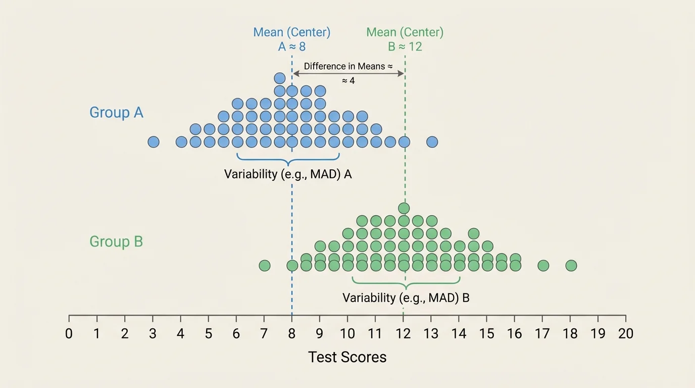
A dot plot is especially helpful because each dot represents one data value. When two dot plots are placed on the same scale, we can inspect how much the values mix together. A small amount of visual overlap suggests that the groups are more clearly different, as shown in [Figure 1]. If the dots from the two groups are heavily mixed together, the difference between the groups is less noticeable.
Suppose Group A has scores mostly between \(70\) and \(82\), while Group B has scores mostly between \(78\) and \(90\). The two groups overlap between about \(78\) and \(82\), but many of their values are separated from each other. That tells us there is some overlap, but also some separation.
If the two distributions have similar spreads, then visual comparison becomes more meaningful. For example, if both groups spread out by about the same amount, and one center is clearly to the right of the other, then the higher-centered group tends to have larger values. Later, when we compare the difference in centers to variability, we are putting a number on the same idea we notice in the graph.
However, graphs do not need to show perfect separation for us to say the difference is noticeable. Real data often overlap. In fact, many real-world groups overlap a lot. A comparison is still useful if one group tends to be higher overall, even when some individual values are mixed together.
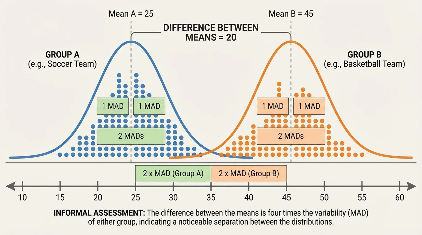
Once we know the center of each group, we can find how far apart they are. This center gap can be compared to spread, as shown in [Figure 2]. If the means are \(85\) and \(79\), then the difference between the centers is \(85 - 79 = 6\).
That number by itself is not enough. A difference of \(6\) could be huge in one situation and tiny in another. To decide, we compare \(6\) to a measure of variability such as the mean absolute deviation, often shortened to mean absolute deviation, or MAD.
If both groups have MADs of about \(3\), then the center difference is about \(2\) times the variability because \(6 \div 3 = 2\). That means the centers are separated by about two MADs. Informally, that suggests a noticeable difference between the groups.
If the center difference is about equal to one MAD, then the separation is smaller. If the center difference is less than one MAD, the groups may overlap quite a bit. If the center difference is around two MADs or more, the separation is often easier to notice on a dot plot.
Comparing center difference to variability
An informal comparison often uses this idea: divide the difference between the centers by a measure of variability. If the result is small, the groups are not very separated. If the result is larger, the groups are more distinct. This is not a strict rule with exact cutoffs. It is a way to reason about data using both center and spread.
In symbols, the idea is:
\(\textrm{difference in centers} \div \textrm{variability}\)
For example, if the means differ by \(8\) and the MAD is about \(4\), then \(8 \div 4 = 2\). The center difference is about two times the variability.
MAD tells us the average distance from the mean. To compute it, first find the mean. Then find the distance of each data value from the mean. Add those distances and divide by the number of data values.
The formula is
\[MAD = \frac{\textrm{sum of absolute deviations from the mean}}{\textrm{number of data values}}\]
For example, consider the data set \(4, 6, 6, 8, 11\). The mean is \((4 + 6 + 6 + 8 + 11) \div 5 = 35 \div 5 = 7\). The distances from the mean are \(|4-7| = 3\), \(|6-7| = 1\), \(|6-7| = 1\), \(|8-7| = 1\), and \(|11-7| = 4\). Their sum is \(3 + 1 + 1 + 1 + 4 = 10\). So the MAD is \(10 \div 5 = 2\).
Remember that an absolute value measures distance from zero, so it is always nonnegative. In MAD, absolute value is important because deviations below the mean and above the mean should not cancel each other out.
When comparing two distributions in this lesson, we often use the fact that the two groups have similar variability. That means their MADs are close enough that one shared rough value can be used for an informal comparison.
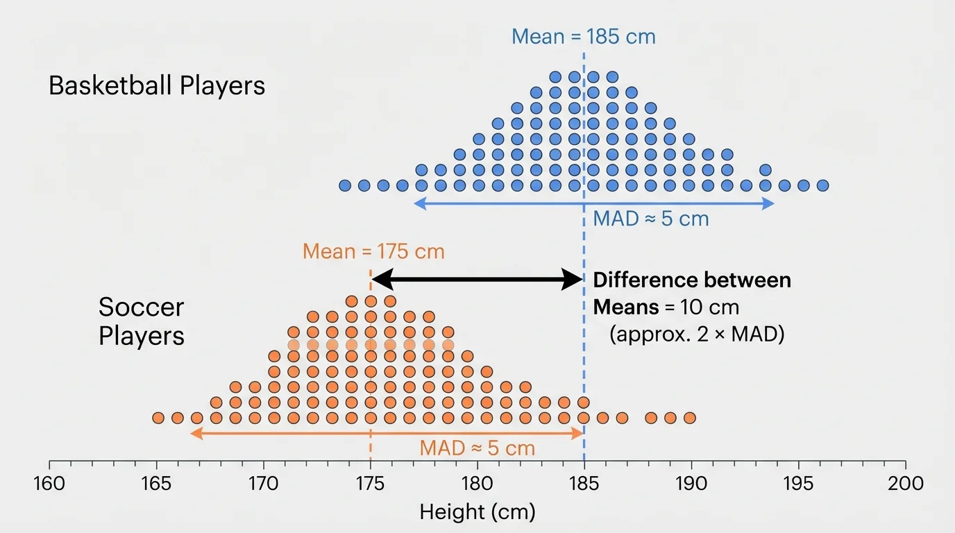
Sports data give a strong example because the idea of "average" versus "spread" matters in real decisions. In the basketball-and-soccer situation, the centers are separated enough to be noticeable in [Figure 3], but there is still some overlap because not every basketball player is taller than every soccer player.
Worked example 1: Comparing team heights
The mean height of basketball players is \(182 \textrm{ cm}\), and the mean height of soccer players is \(172 \textrm{ cm}\). Each team has a MAD of about \(5 \textrm{ cm}\).
Step 1: Find the difference between the centers.
\(182 - 172 = 10\)
Step 2: Compare this difference to the variability.
\(10 \div 5 = 2\)
Step 3: Interpret the result.
The mean height difference is about \(2\) times the variability.
This suggests the two distributions are noticeably separated. On a dot plot, we would expect some overlap, but also a clear shift upward for the basketball team.
Notice what makes this comparison meaningful: the center difference is not looked at alone. A difference of \(10 \textrm{ cm}\) matters because the usual variation within a team is only about \(5 \textrm{ cm}\).
Now let's compare two class quiz results. This kind of reasoning is common in school data, where two classes may have different averages but also different consistency.
Worked example 2: Comparing quiz scores
Class A has mean quiz score \(84\), and Class B has mean quiz score \(80\). Both classes have a MAD close to \(4\).
Step 1: Find the difference in means.
\(84 - 80 = 4\)
Step 2: Compare the difference to MAD.
\(4 \div 4 = 1\)
Step 3: Interpret the result.
The means differ by about one MAD.
This suggests the distributions are somewhat different, but not strongly separated. On a dot plot, we would expect a good amount of overlap.
Here, one class does have the higher mean, but the difference is only about as large as the usual distance of scores from the mean. So the difference exists, but it may not look dramatic on the graph.
Worked example 3: Comparing daily temperatures
City X has mean afternoon temperature \(27 \textrm{ ^\circ C}\), and City Y has mean afternoon temperature \(25 \textrm{ ^\circ C}\). Both cities have a MAD of about \(3 \textrm{ ^\circ C}\).
Step 1: Find the center difference.
\(27 - 25 = 2\)
Step 2: Compare with the variability.
\(2 \div 3 \approx 0.67\)
Step 3: Interpret the ratio.
The center difference is less than one MAD.
This suggests the two temperature distributions overlap a lot. Even though City X is warmer on average, the difference is not very large compared with the daily variation.
That last example is important because it shows why averages can be misleading without variability. A mean difference of \(2\) sounds meaningful until we notice that temperatures often vary by about \(3\) from day to day.
There is no single exact sentence that always fits every graph, but some informal interpretations are useful. If the difference in centers is much smaller than the variability, the distributions usually overlap heavily. If the difference is around one variability unit, the separation may be visible but modest. If the difference is around two variability units or more, the separation is often noticeable.
| Difference in centers compared to MAD | Likely informal interpretation |
|---|---|
| \(\textrm{less than }1\) | A lot of overlap; weak separation |
| \(\textrm{about }1\) | Some visible difference; moderate overlap |
| \(\textrm{about }2\textrm{ or more}\) | Noticeable separation; less overlap |
Table 1. Informal interpretations of how the center difference compares with mean absolute deviation.
These are not strict rules. Real data can be uneven, skewed, or have unusual values. Still, this comparison gives a strong informal way to decide whether a difference between populations seems meaningful. The basketball and soccer graph in [Figure 3] fits the "about two MADs" idea, so the shift between centers stands out even though some heights overlap.
Professional analysts in sports, medicine, and science often compare a difference to the amount of natural variation in the data. That basic idea starts with the same reasoning used here: a difference matters more when it is large compared with the usual spread.
Also, similar variability matters. If one group has a much larger spread than the other, comparisons become harder. In this lesson, we focus on groups with similar variabilities so that the center difference can be judged more fairly.
This kind of comparison appears in many real situations. A coach might compare sprint times of two training groups. A doctor might compare average recovery times for two treatments. A school might compare reading scores from two classes. In each case, looking only at the average can hide how much the individual values vary.
Suppose two medicine groups differ by \(1\) day in average recovery time. If recovery times usually vary by about \(5\) days, then a \(1\)-day difference is small compared with the variability. But if the usual variation is only about \(0.5\) day, then a \(1\)-day difference is large. The same center difference can have very different meanings depending on spread.
Scientists also use graphs to see whether data from two populations overlap. The visual idea from [Figure 1] applies far beyond school examples: overlap helps us judge whether groups are clearly different or mostly similar.
One common mistake is saying one group is "better" just because its mean is greater. That is incomplete. You should ask whether the difference is large compared with the variability.
Another mistake is focusing only on overlap and forgetting the centers. Two distributions may overlap, but one can still have a clearly higher center. Overlap does not mean "no difference." It means some values from the groups lie in the same region.
A third mistake is comparing groups with very different variability as if the same simple interpretation always works. The method in this lesson is strongest when the variabilities are similar. The center-gap picture in [Figure 2] helps explain why: the same distance between means looks different depending on the typical spread around each mean.
Good statistical thinking combines graphs, center, and variability. When you say that one distribution is noticeably higher than another, you should be able to support that claim in two ways: with what the graph shows and with how the difference in centers compares to variability.