Two runners can both look fast, but the one who covers more distance each second is actually moving faster. Mathematics gives us a powerful way to compare that movement: a graph can show speed, and an equation can show speed, even if they look completely different at first. Once you understand proportional relationships, you can compare a line on a graph to an equation like \(d = 6t\) and decide which object is really moving faster.
Many real situations involve one quantity changing at a constant rate with another. If a car travels at a steady speed, distance depends on time. If you earn a fixed hourly wage, money depends on hours worked. If you buy fruit at the same price per pound, total cost depends on weight. In each case, the relationship can often be described by a single number: the amount of change for every \(1\) unit. That number is the key to the whole lesson.
In algebra, that constant amount is called the unit rate. On a graph, the same idea appears as slope. For proportional relationships, these are not separate ideas. They describe the same constant relationship in two different ways.
You already know how to read ordered pairs like \((2, 6)\), how to plot points on a coordinate plane, and how to recognize a ratio such as \(\dfrac{6}{2} = 3\). This lesson builds on those ideas and connects them to lines and equations.
A strong understanding here helps with later algebra because linear equations, graphs, and functions all depend on seeing how quantities change together.
A proportional relationship is a relationship between two quantities in which one quantity is always a constant multiple of the other. If \(y\) is proportional to \(x\), then the relationship can be written as
\(y = kx\)
Here, \(k\) is the constant of proportionality. It tells how much \(y\) changes for each \(1\) unit of \(x\).
Proportional relationship: a relationship that can be written in the form \(y = kx\), where \(k\) is a constant.
Constant of proportionality: the fixed number \(k\) in \(y = kx\). It is also the unit rate.
Unit rate: the amount of one quantity for every \(1\) unit of another quantity.
For example, if a bicycle travels \(12\) miles in \(2\) hours at a constant speed, then the unit rate is \(\dfrac{12}{2} = 6\) miles per hour. The equation is \(d = 6t\), where \(d\) is distance and \(t\) is time.
Every proportional relationship has two important features. First, the ratio \(\dfrac{y}{x}\) stays constant as long as \(x \neq 0\). Second, the graph passes through the point \((0,0)\), called the origin, because when \(x = 0\), we get \(y = k(0) = 0\).
A proportional relationship can be represented in several ways: a table, a graph, an equation, or a verbal description. As [Figure 1] shows, these forms all describe the same pattern: corresponding values of \(x\) and \(y\) maintain a constant ratio, and the graph is a straight line through the origin.
Suppose a plant grows at a steady rate of \(3\) centimeters per week. Then the relationship between height increase \(h\) and time \(w\) can be shown in a table:
| Weeks \((w)\) | Height increase \((h)\) |
|---|---|
| \(0\) | \(0\) |
| \(1\) | \(3\) |
| \(2\) | \(6\) |
| \(3\) | \(9\) |
| \(4\) | \(12\) |
Table 1. A proportional relationship where height increase is \(3\) centimeters per week.
The equation is \(h = 3w\). If you graph the points \((0,0)\), \((1,3)\), \((2,6)\), and \((3,9)\), they lie on one straight line. That straight line tells you the rate stays constant.
If a graph does not pass through the origin, then the relationship is not proportional. A line can still be linear without being proportional. For example, \(y = 3x + 2\) is linear, but not proportional, because when \(x = 0\), \(y = 2\), not \(0\).
This distinction matters. In a proportional relationship, the constant of proportionality completely determines the graph. Once you know \(k\), you know the unit rate, the slope, and the equation.
One idea, many forms
In a proportional relationship, the table shows a constant ratio, the equation shows the constant multiplier \(k\), and the graph shows a straight line through the origin. These are not separate topics. They are three views of the same mathematical relationship.
Later, when you compare two situations, you may need to move between these forms quickly. A graph might show one object's motion, while an equation gives another object's motion. Your job is to extract the same quantity from each representation: the unit rate.
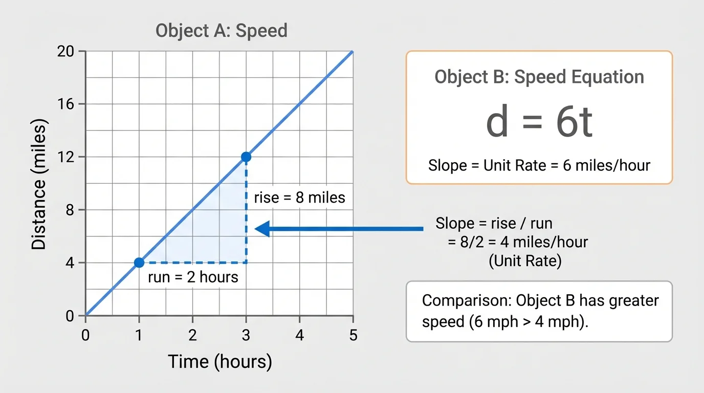
On a graph, the line's steepness is called slope, and in a proportional relationship it tells exactly how much \(y\) increases for each increase of \(1\) in \(x\), as [Figure 2] illustrates with a rise-and-run triangle.
Slope is often written as
\[m = \frac{\textrm{rise}}{\textrm{run}}\]
In words, slope compares the vertical change to the horizontal change. If you move \(1\) unit to the right and \(4\) units up, the slope is \(\dfrac{4}{1} = 4\).
For a proportional relationship written as \(y = kx\), the slope is \(k\). That means
\[\textrm{slope} = \textrm{unit rate} = \textrm{constant of proportionality}\]
Suppose a delivery drone travels \(8\) kilometers in \(1\) minute, \(16\) kilometers in \(2\) minutes, and \(24\) kilometers in \(3\) minutes. The equation is \(d = 8t\). The slope of the graph is \(8\), and the unit rate is also \(8\) kilometers per minute.
When the horizontal axis represents time and the vertical axis represents distance, slope means speed. A steeper line means more distance per unit of time, so it represents a greater speed.
Be careful: "steeper" only makes sense if the scales on the axes are comparable and clearly labeled. Always read the axis numbers before comparing lines.
Airplanes, elevators, internet downloads, and even heartbeat monitors can all be analyzed with rates. Engineers and scientists often read slope from graphs to understand how quickly something changes.
Another useful way to find slope on a proportional graph is to choose any point \((x,y)\) on the line, not the origin, and compute \(\dfrac{y}{x}\). Because the relationship is proportional, that ratio stays the same at every point on the line.
Suppose the equation is \(y = 5x\). We want to graph it and identify the unit rate.
Worked example
Step 1: Identify the constant of proportionality.
In \(y = 5x\), the value of \(k\) is \(5\).
Step 2: Make a few ordered pairs.
If \(x = 0\), then \(y = 5(0) = 0\), so one point is \((0,0)\).
If \(x = 1\), then \(y = 5(1) = 5\), so another point is \((1,5)\).
If \(x = 2\), then \(y = 5(2) = 10\), so another point is \((2,10)\).
Step 3: Plot the points and draw the line.
The points lie on a straight line through the origin.
Step 4: Interpret the unit rate.
The graph rises \(5\) units for every \(1\) unit to the right, so the slope is \(5\).
The unit rate is \(5\), and the slope is also \(5\).
This example shows the basic pattern of every proportional graph: start at the origin, then use the unit rate to locate more points.
Suppose a graph contains the points \((0,0)\) and \((4,12)\) on a proportional line. What is the unit rate?
Worked example
Step 1: Use slope as rise over run.
The rise is \(12\) and the run is \(4\).
Step 2: Compute the ratio.
\(\dfrac{12}{4} = 3\)
Step 3: Interpret the meaning.
For each increase of \(1\) unit in \(x\), \(y\) increases by \(3\).
The unit rate is \(3\), so the equation is \(y = 3x\).
You could also use the point \((2,6)\) if it is on the same line, and you would still get \(\dfrac{6}{2} = 3\). That consistency is a sign that the relationship is proportional.
Notice how this matches what we saw earlier in [Figure 1]: once a line goes through the origin and keeps a constant steepness, one ratio can describe the whole relationship.
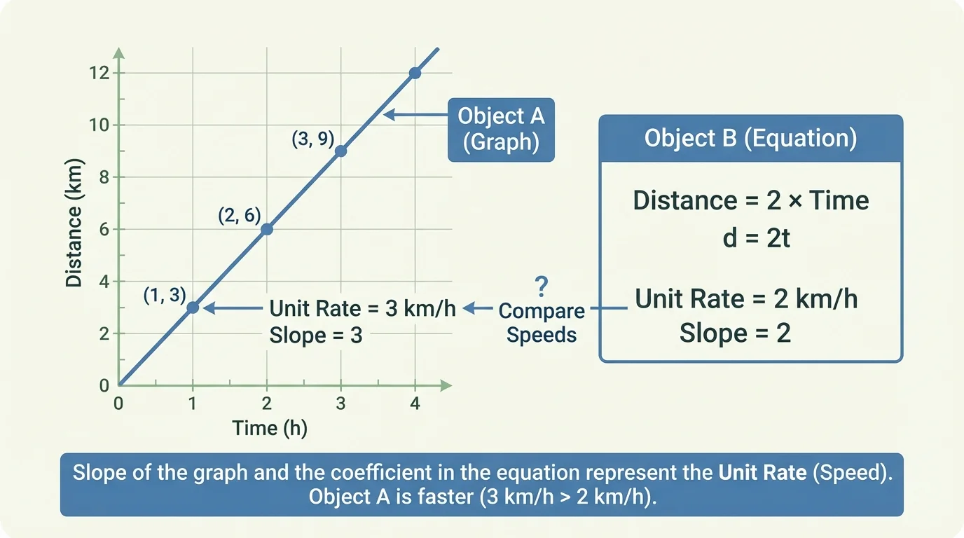
Sometimes two relationships are shown in different forms, but they can still be compared directly. As [Figure 3] emphasizes, the key is to find the unit rate in each representation and then compare those rates.
You might compare a graph to an equation, a table to a verbal description, or a graph to another graph. Even though the representations look different, the process stays the same:
First, find the unit rate of each relationship.
Second, make sure the units match.
Third, compare the values.
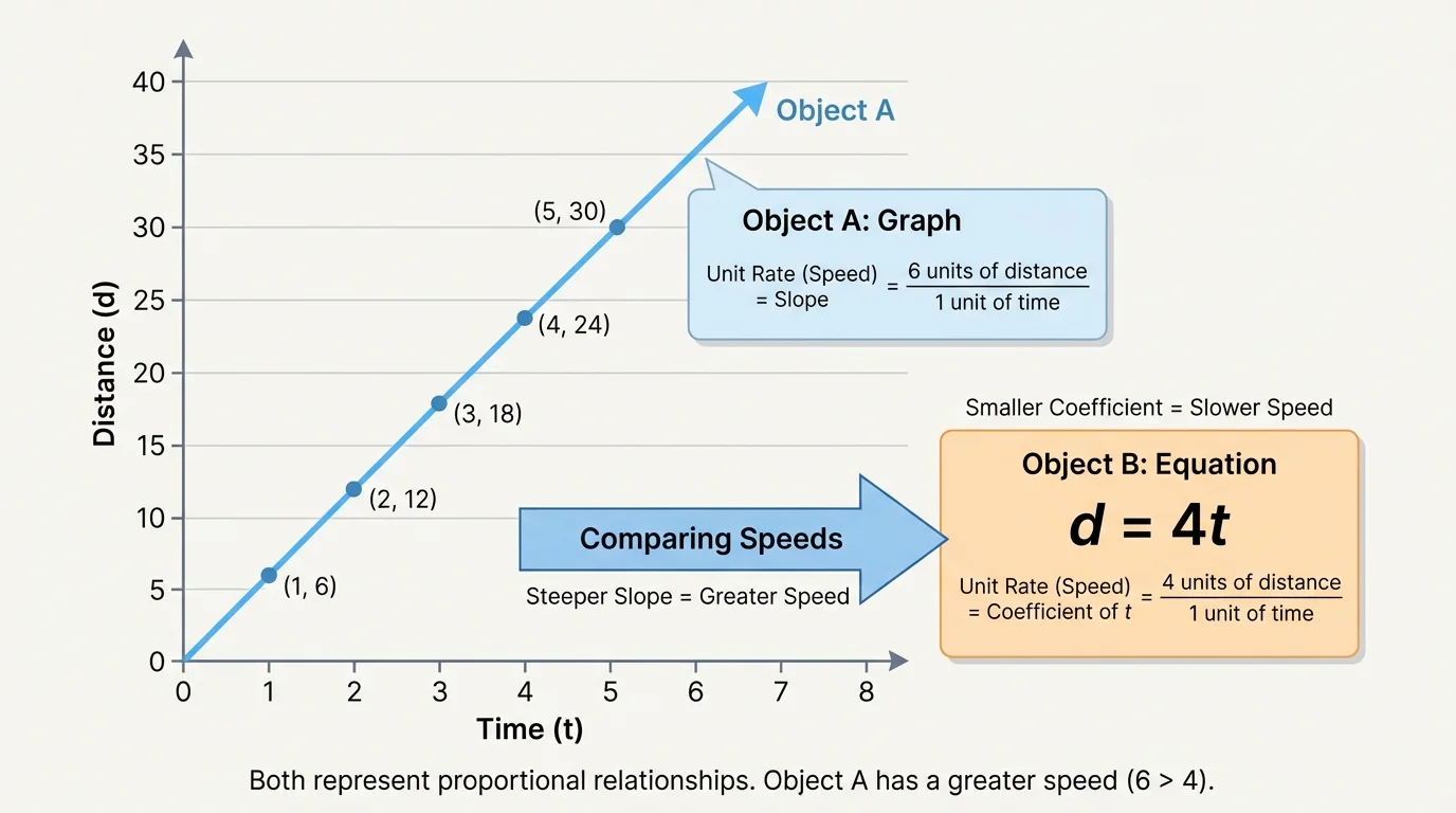
For distance-time situations, the unit rate tells speed. A larger speed means the object covers more distance in the same amount of time. On a graph, that appears as a steeper line. In an equation like \(d = 4t\), the coefficient \(4\) is the speed.
If one object's graph has slope \(3.5\) and another object's equation is \(d = 4t\), then the second object is faster because \(4 > 3.5\).
Comparing across representations
A graph hides the unit rate inside the slope of the line. An equation shows the unit rate as the coefficient of the variable. A table shows the unit rate as the constant ratio of output to input. To compare relationships, uncover that same number in each form.
This is one of the most useful skills in algebra: recognizing the same structure even when the information is presented differently.
Object A is represented by a graph that passes through \((0,0)\) and \((5,20)\). Object B is represented by the equation \(d = 3t\), where \(d\) is distance in meters and \(t\) is time in seconds. Which object has the greater speed?
Worked example
Step 1: Find the speed of Object A from the graph.
Use slope: \(\dfrac{20}{5} = 4\).
So Object A travels at \(4\) meters per second.
Step 2: Find the speed of Object B from the equation.
In \(d = 3t\), the coefficient of \(t\) is \(3\).
So Object B travels at \(3\) meters per second.
Step 3: Compare the speeds.
Since \(4 > 3\), Object A is faster.
Object A has the greater speed.
This kind of comparison appears often in science, sports, and engineering. A graph may come from measurements, while an equation may come from a model. Mathematics lets you compare them fairly.
Suppose Store A sells granola bars at the rate shown in the table, and Store B uses the equation \(c = 1.75n\), where \(c\) is cost and \(n\) is number of bars.
| Bars \((n)\) | Cost at Store A |
|---|---|
| \(2\) | \(\$3.00\) |
| \(4\) | \(\$6.00\) |
| \(6\) | \(\$9.00\) |
Table 2. Cost data for Store A, showing a constant price per bar.
For Store A, the unit rate is \(\dfrac{3}{2} = 1.5\), so the cost is \(\$1.50\) per bar. For Store B, the unit rate is \(\$1.75\) per bar because the coefficient in \(c = 1.75n\) is \(1.75\). Store B is more expensive per bar.
The same reasoning works whether the context is money, distance, mass, electricity use, or water flow.
One common mistake is assuming that any straight line shows a proportional relationship. That is not true. The line must pass through the origin. If it does not, then the relationship is linear but not proportional.
Another mistake is reversing rise and run. Slope is \(\dfrac{\textrm{rise}}{\textrm{run}}\), not \(\dfrac{\textrm{run}}{\textrm{rise}}\). If the line goes through \((0,0)\) and \((2,10)\), the slope is \(\dfrac{10}{2} = 5\), not \(\dfrac{2}{10}\).
A third mistake is forgetting to check units. A speed of \(6\) miles per hour cannot be directly compared with \(3\) meters per second unless you convert units first.
Also remember what we saw with the slope triangle in [Figure 2]: the slope measures vertical change for each horizontal change. That interpretation keeps the graph connected to the real situation.
"The most important step in comparing relationships is to find the rate in each one."
If your answer seems strange, check whether your graph passes through the origin, whether your ratio is simplified correctly, and whether your units make sense.
Proportional graphs and unit rates appear everywhere. In transportation, a steady speed creates a proportional distance-time relationship. In manufacturing, a machine that produces \(40\) parts each minute can be modeled by \(p = 40t\). In wages, earning \(\$18\) per hour can be written as \(m = 18h\). In each case, the coefficient tells the unit rate, and the graph's slope tells the same story.
Sports analysts compare players using rates such as yards per carry or points per minute. Internet providers compare download rates. Scientists compare population growth over short constant intervals. Nurses monitor IV fluids with a rate such as milliliters per hour. A graph makes the rate visible, while an equation makes it easy to calculate.
Professional race timing systems often collect data many times each second. When that data is graphed, coaches can study the slope of the graph to see whether an athlete speeds up, slows down, or stays at a steady pace.
Whenever one quantity changes at a constant rate with another, proportional reasoning helps you model, graph, and compare the situation.
And when you compare different forms, as in [Figure 3], you are really asking one question: which relationship has the greater unit rate?