A graph can tell a whole story without using many words. A runner speeds up, a phone battery drains, the temperature rises after sunrise, or the cost of a taxi increases as distance increases. When you look at a graph, you are not just seeing points and lines. You are seeing how one quantity changes as another quantity changes. Learning to describe that change is one of the most useful skills in algebra because it connects mathematics to real life.
A function shows a relationship between an input and an output. On a graph, the horizontal axis usually represents the input, often called the independent variable, and the vertical axis usually represents the output, often called the dependent variable. If the input is time, then the output might be distance, temperature, cost, or height.
When you analyze a graph qualitatively, you focus on the shape and behavior of the graph instead of finding exact values from a formula. You ask questions such as: Is the graph going up or down? Is it straight or curved? Does it rise quickly or slowly? Does it stay flat for a while? These observations help you describe the relationship between the two quantities.
Qualitative analysis means describing how a graph behaves without focusing mainly on exact calculations. Increasing means the output gets larger as the input increases. Decreasing means the output gets smaller as the input increases. Constant means the output stays the same as the input changes. Linear means the graph is a straight line, while nonlinear means it is not a straight line.
For example, suppose a graph shows time on the horizontal axis and water in a tank on the vertical axis. If the graph rises, the tank is filling. If the graph falls, the tank is emptying. If the graph is flat, the amount of water is not changing. A graph gives meaning to the change.
One of the first things to notice on a graph is whether the function rises, falls, or stays flat as you move from left to right. As [Figure 1] shows, a single graph can have different behaviors in different intervals. You should always read a graph from left to right because that matches increasing values of the input.
If the graph goes upward as you move right, the function is increasing. If it goes downward as you move right, the function is decreasing. If it is horizontal, the function is constant on that interval.
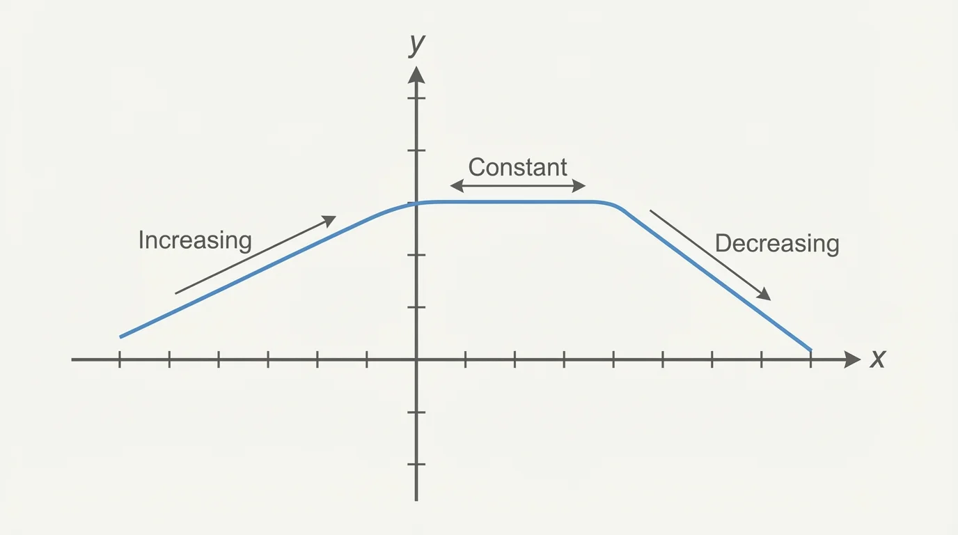
Notice that "increasing" does not mean the graph is above the axis. It only means the output values are getting larger as the input values increase. A graph can be below the axis and still be increasing. For example, the values could change from \(-5\) to \(-2\). Since \(-2\) is greater than \(-5\), the function is increasing there.
Similarly, a graph can be above the axis and decreasing. If the values change from \(10\) to \(6\), the output is getting smaller, so the function is decreasing.
When comparing outputs, think about number order. Larger means farther to the right on a number line. So \(-1\) is greater than \(-4\), even though both are negative.
A graph can also change behavior. It might increase for a while, then become constant, then decrease. In words, you might describe this as: "The quantity rises, stays the same for a period of time, and then falls." That kind of description is often more helpful than just listing points.
[Figure 2] Another key question is whether the graph is a straight line or not. This matters because the shape tells you whether the rate of change stays the same. A straight-line graph and a curved graph may both increase, but they describe different kinds of situations.
A linear relationship has a graph that is a straight line. This means the output changes by equal amounts over equal intervals of input. For example, if the cost of printing is \(\$0.10\) per page, then every additional page adds the same amount. That produces a line.

A nonlinear relationship does not have a straight-line graph. The graph may curve, bend, or change steepness. This means the output does not change by equal amounts over equal intervals of input. For example, the height of a ball thrown upward changes in a curved way because it rises, slows down, reaches a peak, and then falls.
Think about driving. If a car travels at a steady speed of \(60\) miles per hour, the graph of distance versus time is linear. Every hour adds the same distance. But if traffic causes the car to speed up and slow down, the graph becomes nonlinear because the distance is no longer changing at a constant rate.
Straight line versus changing rate
A straight line means a constant rate of change. A curved graph means the rate itself is changing. This is why two graphs can both go upward but still represent very different situations. One may grow steadily, while the other may start slowly and then rise faster, or start fast and then level off.
Later, when you compare examples, remember that the shape of the graph gives information even when no equation is shown. The graph itself is evidence.
When you describe a graph, it helps to notice important features besides just increasing or decreasing. One feature is interval, which is a section of the graph between two input values. A function may behave one way on one interval and another way on a different interval.
Another feature is maximum or minimum. A maximum is a highest point, and a minimum is a lowest point, at least in the part of the graph you are studying. If a graph increases and then decreases, it has a peak. If it decreases and then increases, it has a valley.
You should also pay attention to steepness. A steeper graph means the output is changing more quickly compared with the input. For instance, if the temperature rises sharply between \(8\) a.m. and \(10\) a.m., the graph over that interval is steeper than during a slow warming period.
Intercepts can matter too. The y-intercept tells you the output when the input is \(0\). In a real-world situation, this often represents the starting amount. A taxi fare graph might start above \(0\) because there is a starting fee before any distance is traveled.
| Graph Feature | What to Look For | What It Can Mean |
|---|---|---|
| Increasing | Graph rises left to right | Output gets larger |
| Decreasing | Graph falls left to right | Output gets smaller |
| Constant | Horizontal part | Output stays the same |
| Linear | Straight line | Constant rate of change |
| Nonlinear | Curve or changing shape | Changing rate of change |
| Maximum/Minimum | Highest or lowest point | Peak or valley in the situation |
Table 1. Common graph features and what they mean in words.
The graph in [Figure 1] is useful again here because it shows that one graph can include multiple features at once: a rising interval, a constant interval, and a falling interval.
Good graph descriptions are clear and organized. Start by naming the quantities on the axes. Then describe what happens as the input increases. Mention whether the function increases, decreases, or stays constant, and say whether the graph is linear or nonlinear.
For example, suppose a graph shows the height of a plant over several weeks. A strong verbal description could be: "At first, the plant's height increases slowly. Then it increases more quickly. Later, the growth levels off." This tells not only that the plant grows, but also how the growth changes over time.
Here is another example. Suppose a graph shows the amount of money in a savings jar over time. If the graph rises steadily in a straight line, you might say: "The amount of money increases at a constant rate." If the graph rises in steps, you might say: "The amount stays the same for periods of time and then increases suddenly when more money is added."
Many real-world graphs are not perfectly smooth lines. Data from weather, sports, and business often have pauses, jumps, and changes in direction, so describing the pattern matters just as much as calculating values.
A strong description does not need every coordinate. It focuses on the relationship between the quantities. That is why words such as steadily, quickly, slowly, levels off, and drops sharply are useful when they match the graph.
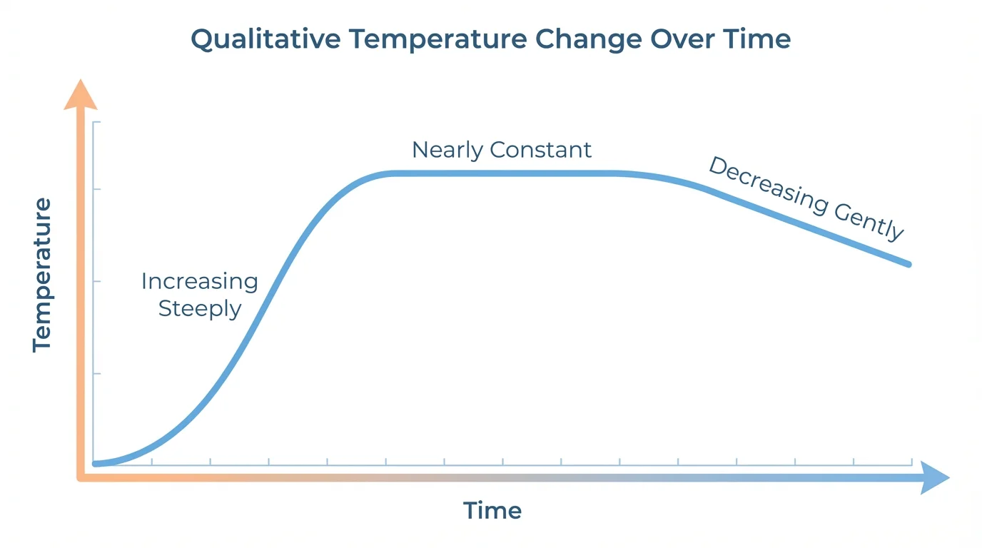
Sometimes you must work in the opposite direction: instead of describing a graph, you create one from words. This is a powerful skill because it shows you understand how graph features match real situations. As [Figure 3] shows, phrases like "rises quickly," "stays about the same," and "falls slowly" can be translated directly into the shape of a graph.
To sketch a graph from a description, first identify the two quantities. Decide what goes on the horizontal axis and what goes on the vertical axis. Then list the behaviors in order. For example, if a description says, "The temperature rises quickly after sunrise, stays nearly constant at midday, then decreases slowly in the evening," the graph should have three parts in that order.
The first part should go upward steeply. The second part should be almost flat. The third part should slope downward gently. The exact numbers may not matter unless the description gives them. What matters most is the shape and order of the changes.
When sketching, keep the graph consistent with the story. If a quantity cannot be negative, such as time or height above the ground in some contexts, your sketch should reflect that. If the description says a quantity starts at a certain value, the graph should begin there.
Later, when checking your sketch, compare it back to the words. The graph in [Figure 3] matches the verbal description because the steep rise, flat middle, and gentle fall appear in the correct sequence.
Worked examples are where these ideas become practical. Read the graph behavior carefully, and turn what you notice into mathematical language and everyday language.
Example 1: Describe the behavior of a graph
A graph of distance from home versus time rises from \(0\) to \(10\) minutes, stays flat from \(10\) to \(15\) minutes, and then falls from \(15\) to \(20\) minutes.
Step 1: Identify each interval.
From \(0\) to \(10\), the graph rises, so the function is increasing.
From \(10\) to \(15\), the graph is horizontal, so the function is constant.
From \(15\) to \(20\), the graph falls, so the function is decreasing.
Step 2: Interpret the meaning.
Increasing distance from home means the person is moving away from home.
Constant distance means the person has stopped for a while.
Decreasing distance means the person is returning home.
Step 3: Write a verbal description.
The person travels away from home, waits in one place, and then returns toward home.
This example shows how the shape of a graph gives meaning to a situation.
Notice that no equation was needed. The graph alone provided the information.
Example 2: Decide whether a relationship is linear or nonlinear
A graph of height versus time for a plant curves upward at first and then becomes less steep.
Step 1: Look at the shape.
The graph is not a straight line. It bends, so it is not linear.
Step 2: Interpret the rate of change.
Because the steepness changes, the height is not increasing by equal amounts over equal time intervals.
Step 3: State the conclusion.
The relationship is nonlinear.
A clear verbal description is: "The plant grows, but not at a constant rate."
This is the same idea seen earlier in [Figure 2], where a curve represents a changing rate rather than a steady one.
Example 3: Sketch from a verbal description
Sketch a graph for this situation: "A cyclist starts at a park, rides steadily farther away for \(30\) minutes, rests for \(10\) minutes, and then rides back faster than before."
Step 1: Identify the axes.
Let the horizontal axis be time and the vertical axis be distance from the park.
Step 2: Sketch the first part.
"Rides steadily farther away" means distance increases at a constant rate, so draw an upward straight line.
Step 3: Sketch the rest period.
"Rests" means the distance does not change, so draw a horizontal segment for \(10\) minutes.
Step 4: Sketch the return trip.
"Rides back faster" means distance decreases, and it decreases more quickly than before, so draw a downward line that is steeper than the first upward line.
The completed sketch rises linearly, stays flat, and then drops linearly with greater steepness on the return.
That final steep downward segment matters. It shows not only that the cyclist returns, but that the return happens at a faster rate.
Example 4: Describe a graph with a maximum
A graph of a ball's height above the ground rises, reaches a highest point, and then falls.
Step 1: Describe the first interval.
As time increases at first, the height increases.
Step 2: Identify the key feature.
The highest point is a maximum. It represents the greatest height reached by the ball.
Step 3: Describe the second interval.
After the maximum, the height decreases as the ball falls back down.
A good verbal description is: "The ball rises, reaches its greatest height, and then falls." The graph is nonlinear because the path is curved.
In many situations, a maximum or minimum tells an important part of the story, such as the hottest time of day or the highest speed reached during a race.
Graphs are used in science, sports, economics, and technology because they reveal relationships quickly. A doctor may look at a graph of heart rate over time. A coach may study a graph of speed during a race. A business may graph profit versus time. In each case, the graph helps people notice trends and make decisions.
Suppose a streaming app shows battery percentage versus time. If the graph drops quickly at first and then more slowly, the battery is draining fast early and then stabilizing. If the graph is a straight line downward, the battery is losing charge at a constant rate. That difference can matter when diagnosing a problem.
Weather graphs are another strong example. The graph in [Figure 3] connects closely to how daily temperature often behaves: a morning rise, a midday leveling, and an evening decrease. Meteorologists use these patterns to understand changing conditions.
Travel graphs are especially common. A graph of distance versus time can show whether a vehicle is moving steadily, stopped, or returning. If the graph is steeper, the vehicle is traveling faster. If it is flat, the vehicle is stopped. These ideas are central whenever functions are used to model relationships between quantities.
"Graphs are not just pictures. They are descriptions of change."
Once you learn to read graph behavior, you can understand information much faster. You stop seeing lines and curves as decorations and start seeing them as mathematical stories.