A music app can track how many minutes a person practices each week, and a teacher can record that student's score. A fitness watch can record hours of sleep, while a runner's race time gives another measurement. When two measurements belong to the same person, object, or event, we can place them together and look for a pattern. That is exactly what scatter plots are for: they help us see whether two quantities seem connected.
Many questions in science, sports, and everyday life involve two quantities at once. Does more study time go with higher quiz scores? Do taller plants usually have more leaves? Do hotter days lead to more ice cream sales? These questions involve pairs of measurements, not just one list of numbers.
When we collect one measurement from each item, we have univariate data. When we collect two measurements from each item and compare them, we have bivariate data. A scatter plot is one of the best tools for making sense of bivariate data because it turns a table of values into a picture of a relationship.
Points on a coordinate plane are written as ordered pairs. In \(x, y\), the first number tells how far to move horizontally, and the second number tells how far to move vertically.
For example, if a student studied for \(3\) hours and scored \(85\) on a quiz, that pair can be written as \((3, 85)\). Another student might have studied for \(1\) hour and scored \(72\), giving the pair \((1, 72)\). A whole set of pairs can be plotted as dots, and the full picture often tells us more than any single number can.
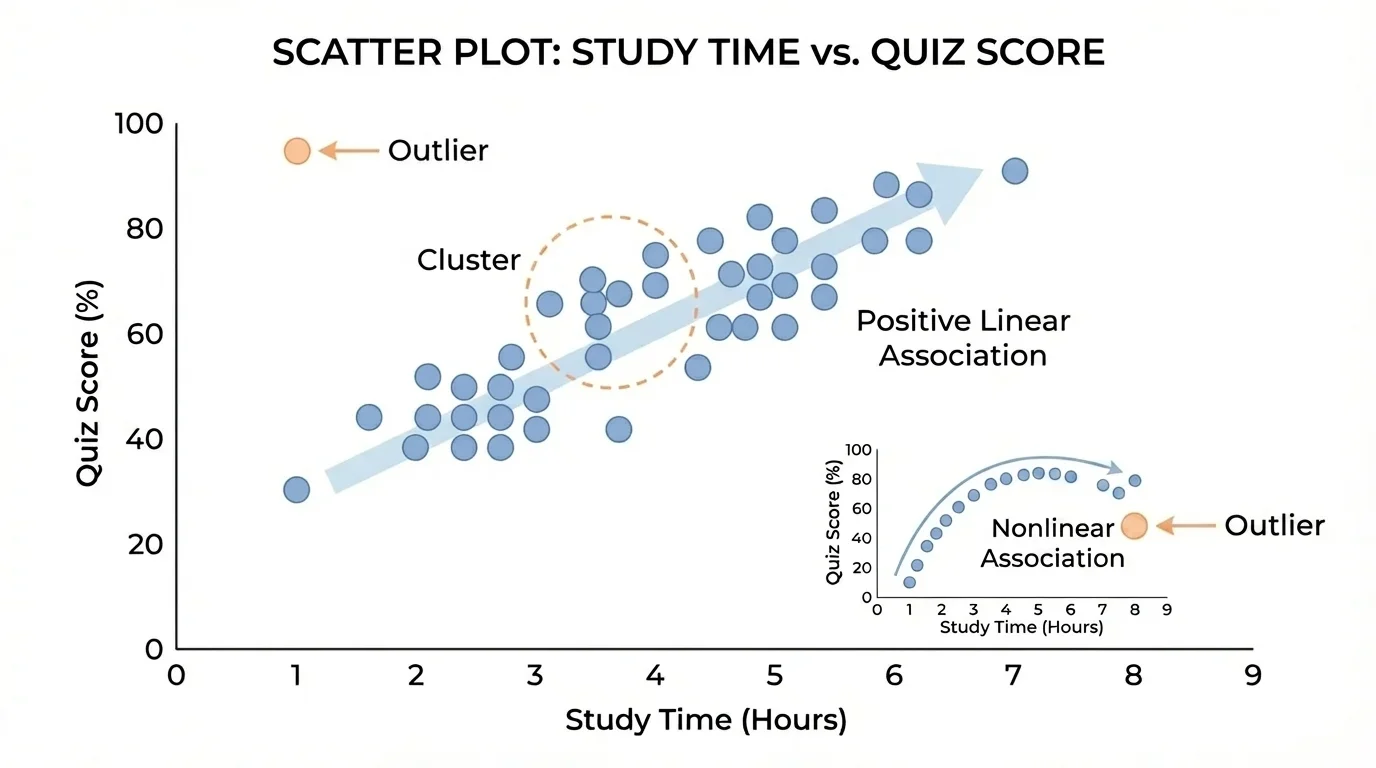
A scatter plot is a graph that displays pairs of numerical data as points on a coordinate plane. Each point stands for one case, such as one student, one plant, one city, or one game, as [Figure 1] shows when study time is paired with quiz score. The horizontal axis usually represents one variable, and the vertical axis represents the other.
The two variables should be connected in a meaningful way. If we are studying quiz performance, we might place study time on the horizontal axis and quiz score on the vertical axis. If we are studying exercise, we might place hours of exercise per week on one axis and resting heart rate on the other.
Each point is an ordered pair \((x, y)\). The \(x\)-coordinate tells the horizontal position, and the \(y\)-coordinate tells the vertical position. If a point is at \((4, 90)\), that means the case has a value of \(4\) for the horizontal variable and \(90\) for the vertical variable.
Scatter plots are different from line graphs. In a line graph, points are often connected because the order matters, such as over time. In a scatter plot, the points are usually not connected. We are interested in the pattern made by the whole collection of points.
Association describes a relationship between two quantities in bivariate data. If changes in one quantity tend to go along with changes in the other, the data show an association.
Cluster is a group of points that lie close together on a scatter plot.
Outlier is a data point that lies far away from the general pattern of the other points.
When a scatter plot is finished, we do not just read single points. We step back and look at the overall shape. Are points rising from left to right? Falling? Forming a curved pattern? Grouping into clusters? One unusual point can also matter a lot.
To make a good scatter plot, begin with a table of paired data. Suppose we record study hours and quiz scores for \(6\) students.
| Student | Study hours \(x\) | Quiz score \(y\) |
|---|---|---|
| A | \(1\) | \(68\) |
| B | \(2\) | \(74\) |
| C | \(3\) | \(78\) |
| D | \(4\) | \(83\) |
| E | \(5\) | \(88\) |
| F | \(6\) | \(92\) |
Table 1. Paired data showing study hours and quiz scores for six students.
Here is the usual process for constructing the graph correctly.
Step 1: Decide which variable goes on each axis. Often the variable that might help explain or predict the other is placed on the horizontal axis. In this case, study hours go on the horizontal axis and quiz score goes on the vertical axis.
Step 2: Choose a scale that fits all the data. Since study hours go from \(1\) to \(6\), the horizontal axis should include at least that range. Since scores go from \(68\) to \(92\), the vertical axis should include those values too.
Step 3: Label both axes clearly, including what each quantity means. Good labels help the graph make sense immediately.
Step 4: Plot each ordered pair carefully: \((1, 68)\), \((2, 74)\), \((3, 78)\), \((4, 83)\), \((5, 88)\), and \((6, 92)\).
Step 5: Look for the overall pattern instead of connecting the points. In this data set, the points tend to rise from left to right, suggesting that more study time is associated with higher quiz scores.
Scientists use scatter plots constantly. A medical researcher might compare hours of sleep with attention level, while an ecologist might compare rainfall with plant growth.
A poor choice of scale can hide or exaggerate a pattern. For example, if the vertical axis jumps by huge amounts, the relationship may look flatter than it really is. If the scale is too narrow, points can look more spread out than they should. A good scatter plot is honest as well as accurate.
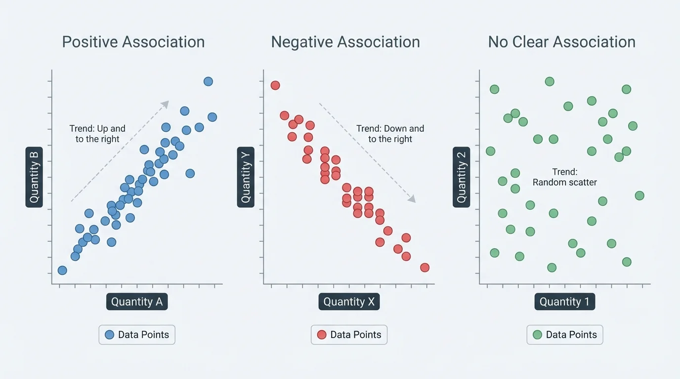
The real power of a scatter plot appears when we interpret its shape. Instead of reading one point at a time, we examine the whole cloud of points, and [Figure 2] makes this easier by comparing different kinds of patterns. The most important ideas are positive association, negative association, clustering, linear association, nonlinear association, and sometimes no clear association.
Positive association means that as one quantity increases, the other tends to increase too. If students who practice more tend to score higher, the scatter plot rises from left to right.
Negative association means that as one quantity increases, the other tends to decrease. For example, if more absences from practice are connected with fewer goals scored over a season, the scatter plot tends to fall from left to right.
No clear association means the points do not show an obvious upward or downward trend. They may look scattered randomly with no consistent pattern.
A cluster is a part of the graph where many points bunch together. Clusters can suggest that many cases behave similarly. For example, in a graph of height and arm span for students, most points might gather around a middle range because many students are close in size.
A linear association happens when the points lie close to a straight-line pattern. They do not have to be exactly on one line, but they should roughly follow a line. If hours spent training increase and lap times improve at a nearly steady rate, the pattern may be linear.
A nonlinear association happens when the pattern follows a curve instead of a straight line. For example, a child's height and age may increase quickly at some stages and more slowly at others, forming a curved pattern rather than a line.
It is important to remember that a scatter plot shows an association, not proof that one variable causes the other. Ice cream sales and sunscreen use may both rise on hot days. That does not mean sunscreen use causes ice cream sales. A third factor, temperature, affects both.
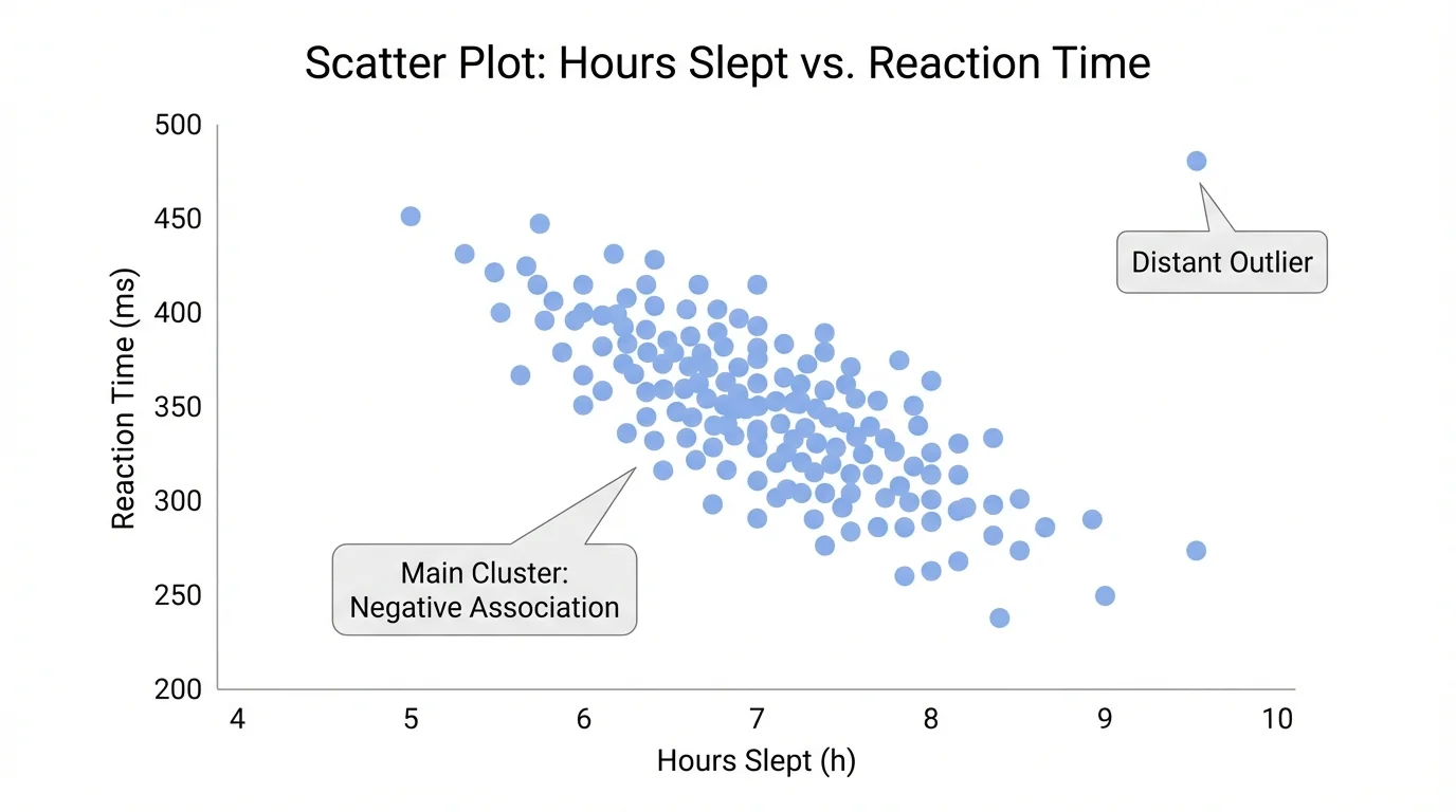
Sometimes one point does not fit the rest of the data. An outlier sits far from the overall pattern and can stand apart from a cluster, as [Figure 3] illustrates. Outliers deserve attention because they may represent an error, a rare event, or an important exception.
Suppose a graph shows study hours and quiz scores, and most students fit an upward trend. If one student studied \(6\) hours but scored only \(50\), that point would be far below the general pattern. Maybe the student was sick during the quiz. Maybe the score was entered incorrectly. Or maybe the student studied inefficiently. The graph alone does not tell us why, but it alerts us to ask questions.
Outliers can affect how we describe a graph. A data set might seem strongly positive until one unusual point changes the picture. That is why careful interpretation matters.
Earlier, [Figure 1] showed a fairly steady upward arrangement of points. If one new point were added far below the others, the association would still be positive overall, but we would need to mention the outlier in our description.
Describing a scatter plot clearly means mentioning more than one feature. A strong answer often includes direction, form, and unusual features. For example: "The scatter plot shows a positive linear association with one outlier" or "The points form two clusters and no clear overall trend."
That kind of description is stronger than simply saying, "The graph goes up," because it tells more about the data's structure.
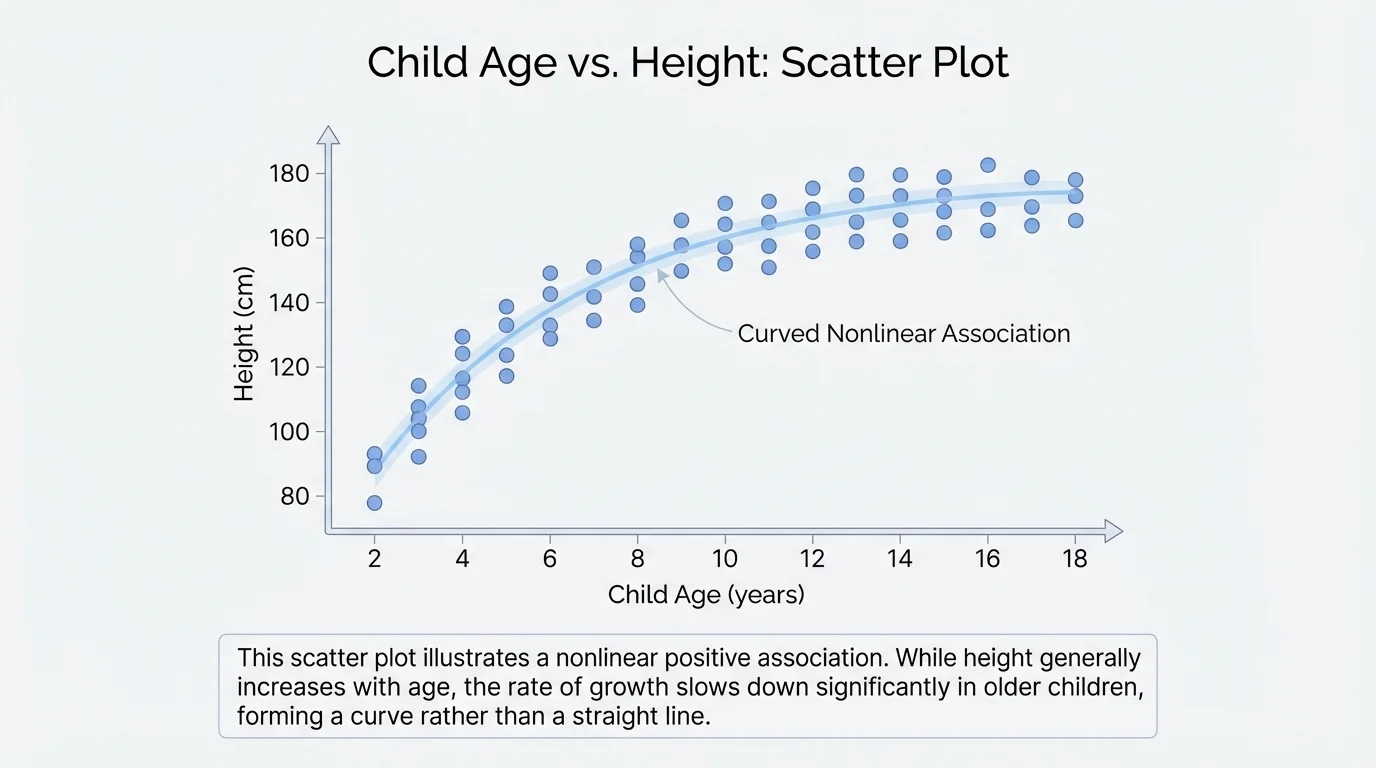
Now let's use specific data sets to build and interpret scatter plots. Not all data create the same kind of pattern, and [Figure 4] later in this section shows a case where a curved pattern gives more information than a straight-line view.
Worked example 1: Constructing a scatter plot from a table
A class records the outside temperature and the number of bottles of water sold at the school store.
| Temperature \(x\) | Bottles sold \(y\) |
|---|---|
| \(60\) | \(18\) |
| \(65\) | \(22\) |
| \(70\) | \(28\) |
| \(75\) | \(34\) |
| \(80\) | \(39\) |
Table 2. Paired data relating temperature to bottles of water sold.
Step 1: Identify the variables.
The horizontal axis is temperature, and the vertical axis is bottles sold.
Step 2: Write the ordered pairs.
The points are \((60, 18)\), \((65, 22)\), \((70, 28)\), \((75, 34)\), and \((80, 39)\).
Step 3: Plot the points and look for a pattern.
As \(x\) increases from \(60\) to \(80\), \(y\) increases from \(18\) to \(39\).
The scatter plot shows a positive association. Warmer days tend to go with more bottles of water sold.
This example is realistic because stores and event planners often study weather-related data. Scatter plots help them notice trends quickly.
Worked example 2: Interpreting a negative association
A coach records the number of practice sessions missed and the number of free throws made in a test.
| Sessions missed \(x\) | Free throws made \(y\) |
|---|---|
| \(0\) | \(19\) |
| \(1\) | \(18\) |
| \(2\) | \(16\) |
| \(3\) | \(14\) |
| \(4\) | \(12\) |
Table 3. Paired data relating missed practices to free throw performance.
Step 1: Read how the variables change together.
As the number of missed sessions increases from \(0\) to \(4\), the number of free throws made decreases from \(19\) to \(12\).
Step 2: Determine the direction of association.
One variable goes up while the other goes down, so the association is negative.
Step 3: Describe the form.
The values change in a fairly steady way, so the points would likely form a roughly straight pattern.
The data suggest a negative linear association between missed practices and free throw performance.
Notice that this does not prove missing practice causes lower performance in every case, but it does show a pattern worth investigating.
Worked example 3: Identifying an outlier
A scientist compares hours of sunlight and tomato plant height.
| Sunlight hours \(x\) | Plant height in cm \(y\) |
|---|---|
| \(4\) | \(18\) |
| \(5\) | \(22\) |
| \(6\) | \(27\) |
| \(7\) | \(31\) |
| \(8\) | \(35\) |
| \(8\) | \(12\) |
Table 4. Paired data for sunlight and tomato plant height, including one unusual value.
Step 1: Look for the main pattern.
Most points suggest that more sunlight goes with taller plants.
Step 2: Check for any point far from the others.
The point \((8, 12)\) is much lower than expected compared with the nearby point \((8, 35)\).
Step 3: Describe the graph.
The scatter plot shows a positive association with one outlier.
The point \((8, 12)\) is an outlier. It may represent a measurement error or a plant with a special problem such as disease.
Examples like this are common in experiments because real data are not always neat. One unusual result can lead to new questions.
Worked example 4: Recognizing a nonlinear association
A health researcher records age and average running speed for children. At younger ages, speed increases quickly, but later the increase slows down.
Step 1: Think about the shape of the points.
If the increase is fast at first and then slower, the points will not lie close to one straight line.
Step 2: Name the type of association.
The variables still increase together, so the association is positive, but the form is curved rather than linear.
Step 3: State the conclusion.
The scatter plot shows a positive nonlinear association.
This kind of pattern appears in growth, motion, and many natural processes.
As shown by [Figure 4], data about age and growth often bend into a curve rather than following a straight-line path. That is why it is important to ask not just whether the graph goes up or down, but also whether it looks linear or nonlinear.
Scatter plots are useful because the world is full of paired data. In sports, teams compare practice hours and shooting accuracy. In health, researchers compare exercise time and heart rate. In environmental science, scientists compare temperature and electricity use, rainfall and crop growth, or distance from a pollution source and air quality readings.
Businesses also use scatter plots. A manager might compare advertising time and product sales. A delivery company might compare package weight and shipping time. These graphs help people make decisions because they show trends, exceptions, and groups of similar cases.
In school, scatter plots can support fair questions. If a class compares homework time and test scores, students should remember that many factors may be involved: sleep, stress, study methods, and prior knowledge. A graph can suggest a pattern, but thoughtful interpretation is still necessary.
"The purpose of a graph is not just to display numbers, but to help us see relationships."
That idea matters because data are most powerful when they become understandable. A well-made scatter plot turns a list into a story about how two quantities move together.
One common mistake is mixing up the axes. If the variables are reversed, the graph still shows the same set of pairs, but it may become harder to read if the labels do not match the question clearly.
Another mistake is forgetting that each point represents one case. A point is not just a spot on paper. It stands for one student, one day, one plant, or one object with two measured values.
A third mistake is making a claim that is too strong. If a scatter plot shows a positive association, that does not automatically mean one variable causes the other. Earlier, [Figure 2] displays overall direction, but direction alone does not prove cause and effect.
It is also important to describe the pattern completely. A strong interpretation might say, "There is a positive linear association with a cluster near \((4, 80)\) and one outlier," instead of simply saying, "The graph goes up."
When reading a scatter plot, helpful questions include these: What does each axis measure? What does one point represent? Is the association positive, negative, or unclear? Does the pattern look linear or nonlinear? Are there clusters or outliers? These questions lead to better mathematical thinking.