Amazing patterns can appear when numbers are graphed. For example, if you compare hours of practice and free-throw accuracy in basketball, or outside temperature and ice cream sales, the points often do not land randomly. They may line up in a way that suggests a trend. One of the most useful ideas in statistics is that a straight line can often model a relationship between two quantities, even when the data are not perfectly lined up.
When we study two numerical variables together, we are working with bivariate data. The word bivariate means "two variables." Each piece of data comes as an ordered pair, such as \(2, 65\) or \(5, 82\). The first number might represent study time in hours, and the second number might represent a quiz score.
These pairs help us ask questions such as: As one quantity increases, does the other usually increase too? Does it decrease? Or is there no clear pattern? Looking at bivariate data helps us move beyond single numbers and start noticing relationships.
On a coordinate plane, the horizontal axis is usually called the x-axis and the vertical axis is the y-axis. A point like \(3, 7\) means move \(3\) units right and \(7\) units up.
In statistics, the two variables often have meaning in a real situation. For instance, one variable might be a student's number of absences, and the other might be that student's final course grade. Because both numbers belong to the same person, each point on the graph tells one small story.
A scatter plot is a graph that displays pairs of data as points on a coordinate plane. Each point represents one object, person, or event. If the scatter plot compares study time and quiz score, then each point stands for one student.
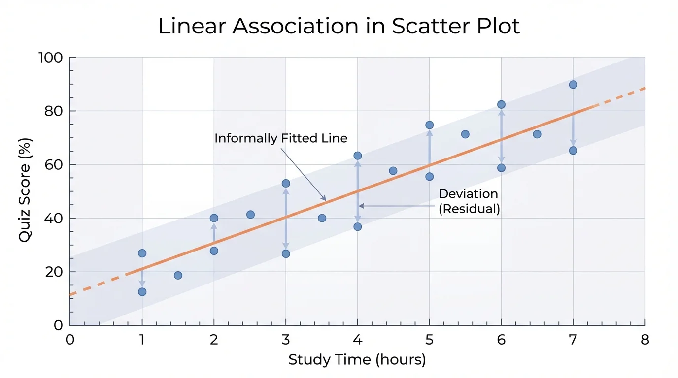
[Figure 1] To read a scatter plot, first identify what each axis represents. The variable on the horizontal axis is often treated as the explanatory variable, and the variable on the vertical axis is often treated as the response variable. Then look at the overall pattern made by the points, not just one point by itself.
Some scatter plots rise from left to right. Some fall from left to right. Others look more like a cloud with no clear direction. The pattern gives clues about the relationship between the two variables.
If a point is at \(4, 78\), it means that when the first variable is \(4\), the second variable is \(78\). In a study-time example, that would mean a student studied for \(4\) hours and scored \(78\).
Association describes a relationship between two variables. A positive association means that as one variable tends to increase, the other tends to increase. A negative association means that as one variable tends to increase, the other tends to decrease. No clear association means there is no obvious pattern.
Scatter plots are useful because our eyes are good at seeing patterns. A table of values can hold the same information, but the graph often makes the overall trend much easier to notice.
A linear association happens when the points in a scatter plot lie close to a straight line. They do not need to fall exactly on one line. Real data usually has some variation. But if the cloud of points looks roughly like a band around a straight line, then a straight-line model may make sense.
For example, suppose the data pairs are \(1, 52\), \(2, 58\), \(3, 64\), \(4, 70\), and \(5, 74\). These points rise as \(x\) increases. They are not perfectly lined up, but they suggest a positive linear association. A line such as \(y = 6x + 46\) would be a reasonable model because it follows the trend of the data.
A negative linear association works the other way. If a car gets farther from a starting point while the amount of fuel left in the tank decreases, the scatter plot may slope downward from left to right. In that case, a straight line with negative slope may model the pattern.
Why straight lines are so useful
Straight lines are simple, easy to read, and often good enough to describe real patterns. Even when data is messy, a line can show the overall direction and rate of change. This makes it easier to estimate values, compare trends, and make predictions within a reasonable range.
Not every relationship is linear. If points curve upward more and more steeply, level off, or form another shape, then a straight line may not be the best choice. Before fitting a line, we should first decide whether the scatter plot actually suggests a linear pattern.
To fit a line informally means to draw or imagine a line that seems to follow the trend of the data. This is sometimes called drawing a line of best fit by eye. You do not need an exact formula first. You are using the graph to make a reasonable model.
[Figure 2] When fitting a line by eye, try to place the line through the middle of the data cluster. The points should be somewhat balanced, with about as many points above the line as below it. The line should match the general direction of the data and not be pulled too strongly by one unusual point.
If the scatter plot has an upward trend, your line should slope upward. If the plot has a downward trend, your line should slope downward. A good informal line does not need to pass through every point. In fact, if the line tries to touch too many points, it may miss the overall pattern.
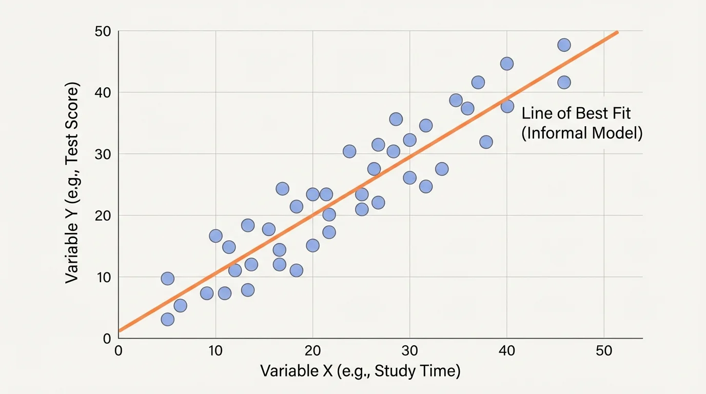
One helpful idea is to imagine the points forming a long narrow cloud. Your line should pass through the center of that cloud. If most of the points end up far on one side, the line probably needs to be adjusted.
Sometimes students think the line must connect the dots. That is not what happens in a scatter plot. The points are separate observations, not parts of one path. The line is a model of the overall relationship, not a path from one point to the next.
After drawing a line, the next question is whether the model is a good one. A model fit tells how well the line represents the data and helps show the difference between a strong fit and a weak fit. We judge this informally by looking at the distances between the points and the line.
[Figure 3] If most points lie close to the line, the fit is strong. If the points are spread far away from the line, the fit is weaker. The closer the points are, the more useful the line is for describing the relationship.
Suppose two scatter plots both slope upward. In one graph, the points almost hug the line. In the other, the points are much more scattered. Both graphs suggest a positive linear association, but the first graph has a better fit because the line matches the data more closely.
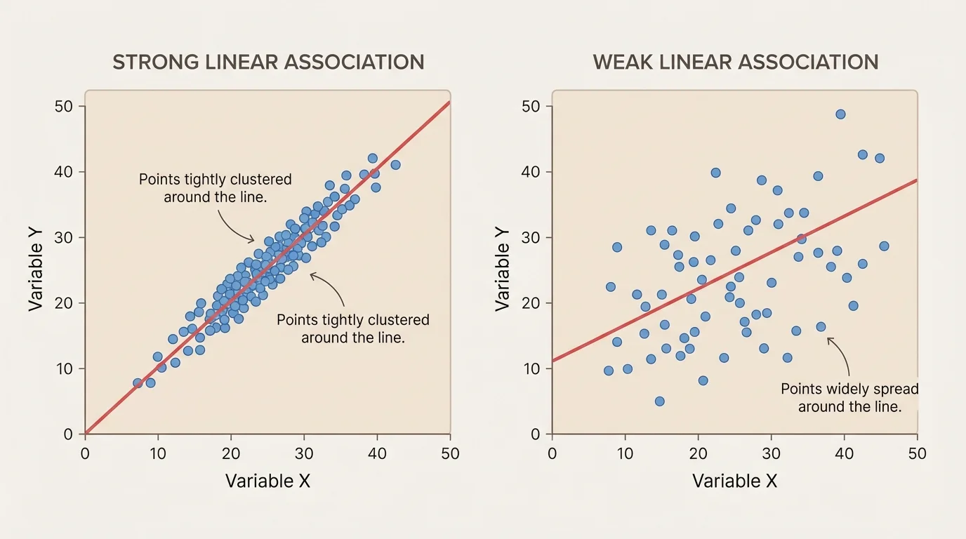
When points are close to a line, predictions from the line are usually more trustworthy, at least for values within the range of the data. When points are far from the line, predictions become less certain.
Weather scientists, economists, and sports analysts all use graphs to look for patterns, but they also know that even a useful model is not perfect. Real-world data almost always has some scatter because life is messy.
Another thing to watch for is an outlier, which is a point far from the overall pattern. An outlier can make a line look less accurate, and sometimes it can change where you would draw the line. That is why it is important to notice unusual points before deciding how well the model fits.
The best way to understand this topic is to walk carefully through examples and explain each decision.
Worked example 1
A scatter plot shows the relationship between hours spent reading and score on a vocabulary quiz. The points generally rise from left to right. What kind of association does the graph suggest?
Step 1: Look at the direction of the pattern.
If the points rise from left to right, then larger \(x\)-values tend to go with larger \(y\)-values.
Step 2: Decide whether the pattern is roughly straight.
If the points form a band that is close to a straight path, the association is linear.
Step 3: Name the relationship.
The scatter plot suggests a positive linear association.
This means students who spend more time reading tend to score higher on the quiz.
Notice that "tend to" is important. Statistics describes patterns in data, not perfect rules for every single point.
Worked example 2
Consider these data pairs for weeks of training and number of push-ups completed: \((1, 12)\), \((2, 16)\), \((3, 19)\), \((4, 23)\), \((5, 27)\). Informally fit a line.
Step 1: Check the pattern.
As \(x\) increases from \(1\) to \(5\), \(y\) increases from \(12\) to \(27\). The pattern is increasing and looks close to linear.
Step 2: Estimate the slope.
From the first to the last point, \(y\) increases by \(27 - 12 = 15\) while \(x\) increases by \(5 - 1 = 4\). So a reasonable slope is about \(\dfrac{15}{4} = 3.75\), which is close to \(4\).
Step 3: Write a reasonable line.
Using slope about \(4\), a simple model is \(y = 4x + 8\).
Step 4: Check against the data.
For \(x = 1\), the line gives \(y = 4(1) + 8 = 12\). For \(x = 5\), the line gives \(y = 4(5) + 8 = 28\), which is close to \(27\).
A reasonable informal fit is: \[y \approx 4x + 8\]
This line is not the only acceptable answer. An informal fit allows some flexibility as long as the line matches the trend well.
Worked example 3
Two scatter plots both have downward-sloping lines. In Graph A, most points are within about \(1\) unit of the line. In Graph B, many points are \(4\) or \(5\) units away from the line. Which graph has the better fit?
Step 1: Compare closeness to the line.
Graph A has points much closer to its line than Graph B.
Step 2: Use the idea of scatter.
Smaller distances from the points to the line mean less scatter around the model.
Step 3: State the conclusion.
Graph A has the better model fit.
The line in Graph A represents the data more closely, so it is a stronger linear model.
The idea in [Figure 3] appears again here: the closeness of the points matters just as much as the direction of the trend.
Worked example 4
A student draws a line on an upward-trending scatter plot, but almost all the points are above the line. Is the line well placed?
Step 1: Recall the balance idea.
An informal line should pass through the middle of the data cluster.
Step 2: Check the point distribution.
If almost all points are above the line, then the line sits too low.
Step 3: Improve the fit.
Move the line upward until the points are more balanced above and below it.
No, the original line is not well placed because it does not go through the center of the pattern.
Straight-line models are used in many areas of life. In business, a company might compare hours of labor and number of items produced. In health, researchers might study the relationship between time spent exercising and resting heart rate. In school, teachers might compare homework completion and quiz performance.
Suppose a school nurse records the number of minutes students run and their heart rates afterward. If the scatter plot shows a roughly linear upward trend, a straight-line model can describe how heart rate tends to increase as running time increases. The points will not be perfectly lined up because people differ, but the line still gives a useful picture of the pattern.
In environmental science, a scatter plot might compare outside temperature and electricity use for air conditioning. If warmer days generally lead to higher electricity use, a positive linear model may help show that trend. As with the graph in [Figure 2], the model is useful because it captures the center of the pattern, not every small variation.
| Situation | Variable \(x\) | Variable \(y\) | Possible Association |
|---|---|---|---|
| Studying and test performance | Hours studied | Test score | Positive |
| Distance traveled and fuel left | Miles driven | Fuel remaining | Negative |
| Temperature and heating bill | Outside temperature | Heating cost | Negative |
| Practice time and skill level | Hours practiced | Performance measure | Positive |
Table 1. Examples of pairs of variables that may show positive or negative linear associations.
These models can help people estimate values. If a line fits the data well, you can use the trend to make a reasonable prediction for a value inside the range of the data. This should always be done carefully, because unusual conditions can make predictions less reliable.
Even though straight lines are powerful, they do not work for every situation. Some data curves, some data changes direction, and some data has no visible pattern. If the scatter plot does not look roughly straight, forcing a line onto it can be misleading.
Also, an association does not automatically mean one variable causes the other. If two quantities rise together, there may be another reason behind both of them. Statistics helps describe patterns, but it does not by itself prove cause and effect.
Outliers need extra attention too. A single unusual point can affect how you view the trend. Sometimes the outlier is the result of a measurement error. Sometimes it is a real but unusual event. Either way, it should not be ignored.
"A model is useful not because it is perfect, but because it helps us see the pattern."
When you look back at the scatter plot in [Figure 1], remember that the goal is not to find perfection. The goal is to describe the general relationship in a sensible way. A straight line is often a powerful tool for doing exactly that.