A surprising amount of design is really geometry in disguise. The shape of a ramp, the dimensions of a package, the spacing of columns on a website, and even the margins on a poster all depend on mathematical decisions. Designers rarely ask only, "What looks good?" They also ask, "Will it fit?", "Will it be safe?", and "Will it cost too much?" Geometry helps answer all of those questions.
When geometry is used in a practical setting, it becomes a tool for modeling. A model is a simplified mathematical version of a real situation. In design, geometric models connect measurements such as length, angle, area, volume, and ratio to real goals. A shipping company might want a box with a certain volume but the least material. A builder might need a staircase that rises to a platform without becoming too steep. A graphic designer might divide a page into columns that feel balanced and readable.
These problems are not solved by guessing. They are solved by turning real conditions into mathematical relationships. If a garden must cover at least \(24 \textrm{ m}^2\) and use no more than \(22 \textrm{ m}\) of fencing on three sides, geometry gives a way to test dimensions. If a poster has width-to-height ratio \(2:3\), geometry tells us how every part should scale.
Geometric modeling is the use of geometric shapes, measurements, and relationships to represent and solve real-world problems. A constraint is a condition that a design must satisfy, such as maximum area, fixed perimeter, safety limits, or a required ratio.
In many design problems, there is also a goal beyond merely "working." A design may need to minimize cost, maximize space, or use a pleasing proportion. That means geometry is often paired with decision-making.
A constraint limits the possible designs, as [Figure 1] shows in a simple dimension-based model. For example, a rectangular table might need to fit through a doorway, seat four people, and use less than a certain amount of wood. Each condition creates a boundary on what dimensions are possible.
To build a model, identify the variables. If a rectangle has length \(l\) and width \(w\), then perimeter is \(P = 2l + 2w\) and area is \(A = lw\). If the design requires no more than \(18 \textrm{ m}\) of border material, then \(2l + 2w \le 18\). If it must cover at least \(16 \textrm{ m}^2\), then \(lw \ge 16\). A valid design must satisfy both inequalities at the same time.
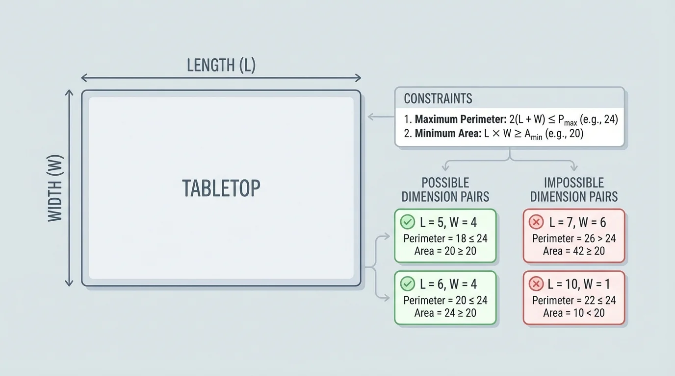
The set of all measurements that satisfy the conditions is called the feasible region. Even when no graph is drawn, the idea is important: some dimensions are allowed, and others are not. Good design happens inside that region.
Many real designs include several types of constraints at once:
To solve design problems, you need a reliable set of geometric relationships. The most common are area, perimeter, surface area, volume, the Pythagorean theorem, and similarity.
For rectangles and rectangular prisms, the following formulas appear often:
\(A = lw\)
\(P = 2l + 2w\)
\(V = lwh\)
\[SA = 2lw + 2lh + 2wh\]
For circles and cylinders, useful formulas include:
\(C = 2\pi r\)
\(A = \pi r^2\)
\[V = \pi r^2 h\]
Right triangles matter whenever a design has slanted supports, ramps, diagonal braces, or roof lines. The Pythagorean theorem states:
\[a^2 + b^2 = c^2\]
Similarity is useful when a design is scaled up or down but keeps the same shape. If two figures are similar and the scale factor is \(k\), then lengths multiply by \(k\), areas by \(k^2\), and volumes by \(k^3\). This is why doubling dimensions does not merely double material use.
Recall that a ratio compares two quantities by division. A proportion states that two ratios are equal. In design, ratios such as \(1:2\), \(3:5\), or \(8:13\) help keep parts of a shape or layout visually consistent.
One of the most important habits in geometric modeling is checking units. Length is measured in units such as meters or inches, area in square units such as \(\textrm{m}^2\), and volume in cubic units such as \(\textrm{m}^3\). Mixing these by accident can ruin a design.
Physical constraints come from the real world. A beam can only span so far. A poster must fit a standard print size. A box must hold an item without wasting material. Geometry translates these practical facts into equations or inequalities.
Suppose a shelf bracket forms a right triangle against a wall. If the horizontal support is \(30 \textrm{ cm}\) and the vertical support is \(40 \textrm{ cm}\), then the diagonal brace should be \(50 \textrm{ cm}\), because \(30^2 + 40^2 = 50^2\). A carpenter may use this relationship not because of school math alone, but because a triangle with those dimensions is rigid and dependable.
Other problems are about efficiency. Among shapes with the same area, some use less boundary material than others. Among containers with the same volume, some use less surface area. That difference matters in construction, packaging, and manufacturing because less material often means lower cost.
From shape to decision
A design problem usually has three parts: the shape being used, the measurements that can change, and the requirement being optimized. First identify the geometric relationships. Then apply the constraints. Finally compare valid options and decide which one best meets the goal, such as least cost or best proportion.
This approach is why geometry belongs not only in mathematics class, but also in engineering, architecture, product design, and visual communication.
A manufacturer wants to create an open-top box from a rectangular sheet of cardboard measuring \(20 \textrm{ cm}\) by \(14 \textrm{ cm}\). Squares of side length \(x\) are cut from each corner, and the sides are folded up. What value of \(x\) gives a box with volume \(192 \textrm{ cm}^3\)?
Worked example
Step 1: Write the dimensions of the folded box.
After cutting out squares of side \(x\), the new length is \(20 - 2x\), the new width is \(14 - 2x\), and the height is \(x\).
Step 2: Write a volume equation.
\[x(20 - 2x)(14 - 2x) = 192\]
Step 3: Test reasonable values of \(x\).
The cuts must satisfy \(0 < x < 7\), because the width \(14 - 2x\) must stay positive.
Try \(x = 2\): \(2(16)(10) = 320\).
Try \(x = 3\): \(3(14)(8) = 336\).
Try \(x = 4\): \(4(12)(6) = 288\).
Try \(x = 5\): \(5(10)(4) = 200\).
Step 4: Refine the search.
Try \(x = 5.2\): \(5.2(9.6)(3.6) = 179.712\).
Try \(x = 5\): volume is \(200\), which is close. Since \(x = 5.2\) gives a volume below \(192\), the solution lies between \(5\) and \(5.2\). So the solution is approximately \(x \approx 5.1\).
The cuts should be about \(5.1 \textrm{ cm}\) on each side.
This example shows an important design principle: not every mathematically possible formula result makes physical sense. The value of \(x\) must keep all dimensions positive, and the final box must still be practical to construct.
A ramp is a real design problem where geometry affects safety. As [Figure 2] illustrates, the ramp, ground, and vertical rise form a right triangle. Suppose a doorway is \(0.75 \textrm{ m}\) above the ground, and a regulation requires at least \(12 \textrm{ m}\) of horizontal run for each \(1 \textrm{ m}\) of rise. Find the minimum run and the approximate ramp length.
Worked example
Step 1: Use the slope requirement.
A ratio of \(12:1\) means
\[\textrm{run} = 12(0.75) = 9\]
So the minimum horizontal run is \(9 \textrm{ m}\).
Step 2: Use the Pythagorean theorem for the ramp length.
If the rise is \(0.75 \textrm{ m}\) and the run is \(9 \textrm{ m}\), then
\[c^2 = 9^2 + 0.75^2 = 81 + 0.5625 = 81.5625\]
Step 3: Find \(c\).
\[c = \sqrt{81.5625} \approx 9.03\]
The ramp should have a minimum run of \(9 \textrm{ m}\) and a sloped length of about \(9.03 \textrm{ m}\).
Notice something interesting: the sloped length is only slightly more than the run because the rise is small compared with the horizontal distance. That is exactly what makes the ramp gentle enough to use safely.
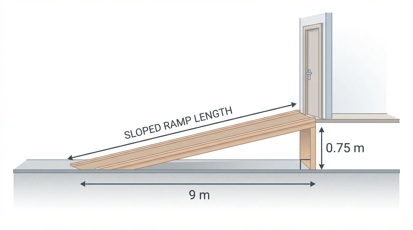
Later, if space is limited, a designer may need switchback ramps or landings. The same right-triangle reasoning still applies to each section, and the safety ratio from [Figure 2] remains the guiding constraint.
A community garden will be built next to a wall, so only three sides need fencing. The garden must have area \(96 \textrm{ m}^2\). What dimensions use the least fencing?
Worked example
Step 1: Define the variables.
Let \(x\) be the width perpendicular to the wall, and let \(y\) be the length along the wall. Then the area condition is \(xy = 96\).
Step 2: Write the amount of fencing needed.
Since only three sides are fenced, the total fencing is
\(F = 2x + y\)
Step 3: Substitute using the area condition.
From \(xy = 96\), we get \(y = \dfrac{96}{x}\).
So
\[F = 2x + \frac{96}{x}\]
Step 4: Test values to find a minimum.
If \(x = 4\), then \(y = 24\) and \(F = 8 + 24 = 32\).
If \(x = 6\), then \(y = 16\) and \(F = 12 + 16 = 28\).
If \(x = 8\), then \(y = 12\) and \(F = 16 + 12 = 28\).
If \(x = 10\), then \(y = 9.6\) and \(F = 20 + 9.6 = 29.6\).
Among these tested values, the least fencing is \(28 \textrm{ m}\), achieved by dimensions \(6 \textrm{ m} \times 16 \textrm{ m}\) or \(8 \textrm{ m} \times 12 \textrm{ m}\). More refined methods could identify the exact minimum, but geometric modeling already narrows the design effectively.
This kind of problem shows that a designer often compares several valid choices rather than expecting a single obvious answer from the start.
Geometry is not only about buildings and boxes. In visual design, as [Figure 3] shows, a typographic grid organizes text and images into repeated spatial relationships. A page may be divided into columns, margins, rows, and gutters, and these parts often follow ratios. The result is not just neatness. It improves readability, consistency, and visual rhythm.
A simple example is a page with outer margins larger than inner gutters so the eye can separate columns. Suppose a page is \(210 \textrm{ mm}\) wide and uses \(3\) equal columns with \(2\) gutters of \(10 \textrm{ mm}\) each. The total gutter width is \(20 \textrm{ mm}\), leaving \(210 - 20 = 190 \textrm{ mm}\) for columns. Each column is therefore \(\dfrac{190}{3} \approx 63.3 \textrm{ mm}\) wide.
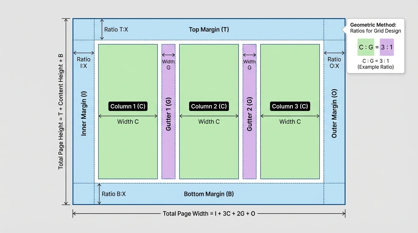
Ratios also help with hierarchy. A heading may be wider than a body-text column by a factor such as \(3:2\), or a margin system may use a repeated proportion such as \(2:3:5\) for inner margin, gutter, and outer margin. Because the parts are related proportionally, the layout feels intentional rather than random.
Many famous page and poster layouts rely on proportions inspired by repeated ratios, modular rectangles, or scaled grids. Designers often use geometry not because viewers notice the math directly, but because viewers sense the order it creates.
Unlike a decoration, a grid is a structure. It guides placement decisions the same way a framework guides a building. When content changes size, the grid allows the layout to stay coherent.
A designer is creating a poster that is \(60 \textrm{ cm}\) wide. The layout uses left margin : content area : right margin in the ratio \(1:4:1\). Find the width of each part.
Worked example
Step 1: Add the ratio parts.
The total ratio is \(1 + 4 + 1 = 6\) parts.
Step 2: Find the width of one part.
\[\frac{60}{6} = 10\]
So each ratio part is \(10 \textrm{ cm}\).
Step 3: Assign widths.
Left margin \(= 10 \textrm{ cm}\), content area \(= 40 \textrm{ cm}\), right margin \(= 10 \textrm{ cm}\).
The poster uses a centered content block with balanced margins: \(10 \textrm{ cm}, 40 \textrm{ cm}, 10 \textrm{ cm}\).
If the same ratio system is scaled to a width of \(90 \textrm{ cm}\), each part becomes \(15 \textrm{ cm}\), and the structure remains the same. This is a clear example of proportional reasoning in graphic design, and the repeated divisions in [Figure 3] reflect that idea.
Real design work rarely ends when one possible answer is found. A mathematically valid solution may still be expensive, awkward to build, hard to use, or visually unbalanced. That is why designers compare options.
Suppose two packages each hold volume \(1,000 \textrm{ cm}^3\). One is tall and narrow, the other closer to a cube. If the taller one has greater surface area, it may need more cardboard. If the more cube-like box stacks better on pallets, it may also reduce shipping costs. Geometry makes those comparisons visible.
A good mathematical model is also honest about its limits. It may ignore tiny material thickness, wind resistance, or printing bleed at first. Those simplifications are useful, but they should be recognized. A design model is not reality itself; it is a carefully chosen approximation of reality.
"Geometry is not just about shapes on paper; it is about making space, form, and function work together."
That idea explains why geometric design problems are so valuable. They train you to connect abstract relationships with practical decisions.
In architecture, geometry determines roof pitch, floor area, structural bracing, and efficient use of materials. In civil engineering, it helps design roads, bridges, drainage systems, and accessible paths. In manufacturing, it guides packaging dimensions, machine parts, and sheet-cutting patterns that reduce waste.
In digital media and publishing, grid systems control line length, whitespace, image placement, and alignment across pages or screens. In urban planning, geometric models estimate land use, park layouts, traffic circles, and pedestrian access. In sports design, geometry appears in the arcs of stadium roofs, the dimensions of courts, and even the sightlines that let spectators see clearly.
Whenever someone balances shape, measurement, purpose, and limitation, geometry is at work. The most successful designs are often the ones where the mathematics becomes almost invisible because the object feels natural, efficient, and well made.