A single viral clip can make a claim look obvious. A chart can make the same issue look more complicated. An interview can challenge both. In school, in public debate, and in everyday life, the hardest questions are rarely answered by one article, one statistic, or one speech. Strong thinkers know how to combine evidence from many places and in many forms, then decide what deserves trust.
To integrate sources means more than collecting them. It means connecting them, comparing them, and using them together to answer a question or solve a problem. If you are deciding whether a city should build more bike lanes, for example, you might use a news article, accident data, a map of traffic patterns, public comments from residents, and a video interview with transportation planners. Each source contributes something different, and none is complete on its own.
This skill also depends on strong listening. When people discuss an issue, they bring different experiences, assumptions, and priorities. A productive conversation does not just reward the loudest speaker or the first statistic mentioned. It follows collaborative guidelines so that a full range of positions is heard, evidence is examined fairly, and responses are evaluated for logic and support.
Most real problems are complex because they involve multiple causes, multiple effects, and different groups of people. A written editorial may argue that later school start times improve learning, but attendance records, sleep research, parent concerns, and bus schedules all matter too. If you rely only on the editorial, your conclusion may be persuasive but incomplete.
Different sources also answer different kinds of questions. A photograph can reveal conditions at a moment in time. A data table can show long-term trends. An interview can reveal how people experience a policy. A scientific report can explain mechanisms and methods. When students combine these forms carefully, they move from reacting to one piece of evidence toward building a fuller picture.
Source means any text, image, recording, dataset, speech, or other material that provides information.
Evidence is the information used to support a claim or conclusion.
Claim is a statement that argues something is true or should be done.
Synthesis is the process of combining information from multiple sources into a coherent understanding.
A complete answer does not always mean using the greatest number of sources. It means using the right sources. Five weak sources that repeat the same unsupported claim are less useful than two strong sources that provide reliable and complementary evidence.
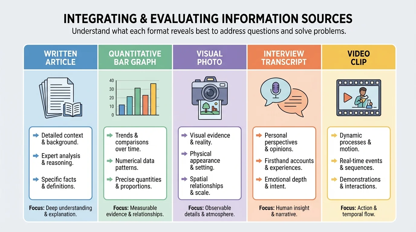
Information appears in many forms, and each form has strengths and limits, as [Figure 1] illustrates through a comparison of common media. Written sources such as articles, reports, and essays often provide context, explanation, and detailed reasoning. Visual sources such as maps, photographs, charts, and diagrams can reveal patterns and relationships quickly. Audio and video sources can communicate tone, emotion, and emphasis. Quantitative sources such as surveys, tables, and statistical summaries can measure scale, frequency, and change over time.
A student investigating air quality, for example, might read a health report, study a color-coded pollution map, examine daily particulate data, and listen to residents describe asthma symptoms. The report explains causes and effects. The map shows where pollution is concentrated. The numerical data help identify trends. The interviews reveal human impact.
Because different formats highlight different features, skilled readers ask what each source can and cannot show. A graph may show that pollution levels rose in one month, but it does not by itself explain why. A personal interview may be powerful and specific, but one person's experience does not automatically represent an entire community.
Some sources are primary sources, meaning they come directly from the event, speaker, or original data. Examples include speeches, eyewitness interviews, lab results, survey responses, and official records. Other sources are secondary sources, which analyze, interpret, or summarize primary materials. Both matter. Primary sources offer direct evidence, while secondary sources can provide context, comparison, and expert interpretation.
Digital life often mixes formats. A single webpage may include text, embedded video, a graph, and hyperlinks to reports. That makes integration even more important, because students must decide whether the different parts support one another or whether some are persuasive decoration rather than solid evidence.
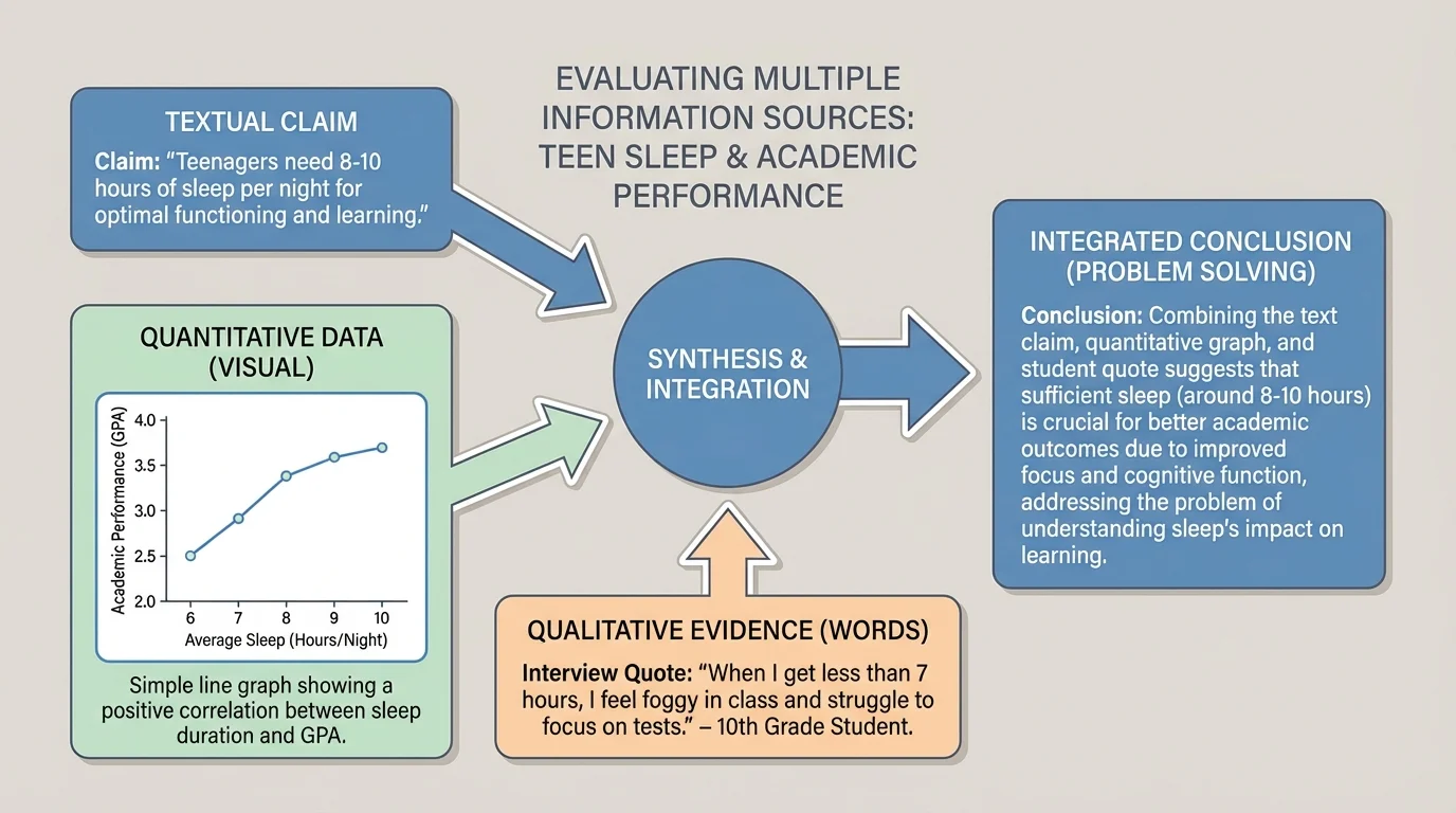
Strong analysis requires cross-media interpretation: the ability to move between words, visuals, and numbers without losing meaning. As [Figure 2] shows, one topic can appear as a claim in prose, a pattern in a graph, and a perspective in an interview. Skilled readers ask how these forms relate. Do they support the same conclusion? Do they focus on different aspects of the issue? Does one reveal a limitation in another?
Suppose a health article says that teens who sleep more perform better in school. A line graph of average sleep hours and GPA may show a positive relationship. An interview with students may reveal obstacles such as jobs, sports, or family responsibilities. None of these sources alone is enough. Together they suggest both a pattern and possible reasons behind it.
To interpret visuals, students should ask basic questions: What is being shown? What variables are compared? What labels, scales, or categories shape the message? What might be left out? A dramatic image may create a strong emotional reaction, but it still requires context. A graph may look convincing, but a compressed scale can exaggerate small differences.
To interpret quantitative information, look carefully at units, sample size, time span, and comparisons. If a survey reports that 70% of students prefer online resources, the important questions are who was surveyed, how many people responded, and how the question was phrased. Numbers feel precise, but they can still mislead when they are incomplete or poorly gathered.
Reading across media also means translating one form into another. If a chart shows that emergency room visits increase during heat waves, you should be able to express that trend clearly in words. If an article claims that a program reduced absences, you should be able to look for the numerical data that would support that claim. This movement between formats turns passive reading into active reasoning.
Many misleading graphics are not completely false. They often use real numbers but present them with distorted scales, missing context, or selective comparisons that guide the audience toward a quick conclusion.
That is why students should not treat visuals as simple decorations. A map, chart, image, or clip can function as evidence, but only when it is interpreted with the same care as a paragraph of text.
Not all sources deserve equal trust. A key part of analysis is checking credibility, or the degree to which a source is trustworthy and informed. Credibility depends on factors such as expertise, evidence, transparency, method, and accuracy. A university research report and an anonymous social media post may discuss the same issue, but they do not carry the same weight.
Students should also look for bias, which is a tendency to present information from a particular perspective or interest. Bias does not always mean a source is useless. An environmental advocacy group may have a clear viewpoint, yet still provide accurate data. The important question is whether the source acknowledges its perspective, supports claims with evidence, and avoids misrepresentation.
Another major standard is relevance. A source can be credible but still not useful for the specific question being asked. If you are evaluating whether a town should add cooling centers during summer heat waves, a reliable article about winter storm safety is not relevant enough, even if it is well researched.
Four questions for evaluating a source
Ask who created the source, why it was created, what evidence it uses, and how directly it addresses your question. These four questions help separate dependable evidence from material that is eye-catching but weak.
Reliability also involves corroboration. When several independent sources point to the same conclusion, confidence usually increases. If one report says a program improved graduation rates, check whether the school data, an external evaluation, and teacher interviews support that claim. Agreement does not guarantee truth, but unsupported isolation should raise caution.
| Source feature | What to examine | Why it matters |
|---|---|---|
| Author or creator | Expertise, role, organization | Helps judge knowledge and authority |
| Purpose | Inform, persuade, sell, entertain | Reveals possible motives and framing |
| Evidence | Data, examples, citations, methods | Shows whether claims are supported |
| Date | Publication or recording time | Determines whether information is current |
| Relevance | Connection to the question | Prevents distraction by unrelated facts |
Table 1. Key criteria for evaluating whether a source is useful and trustworthy.
When sources conflict, do not panic or choose the one you liked first. Conflicting sources are common, especially on public issues. Instead, compare the methods, evidence, context, and assumptions behind each one. Sometimes the conflict comes from different time periods, different definitions, or different populations being studied.
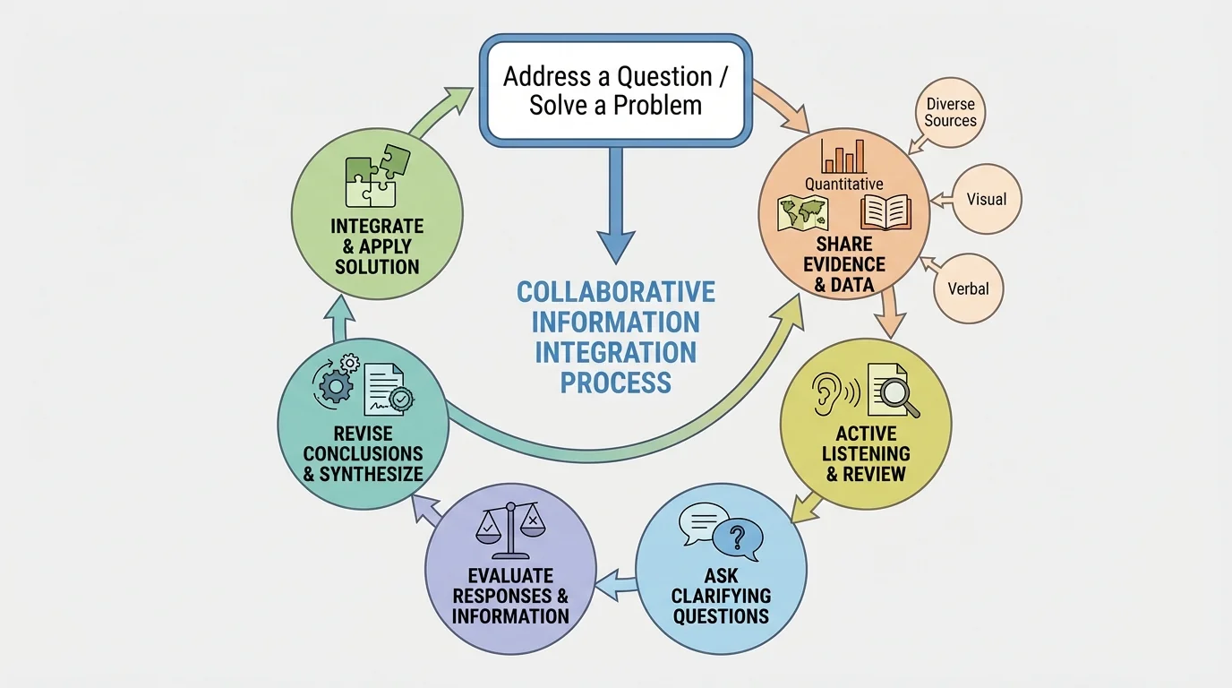
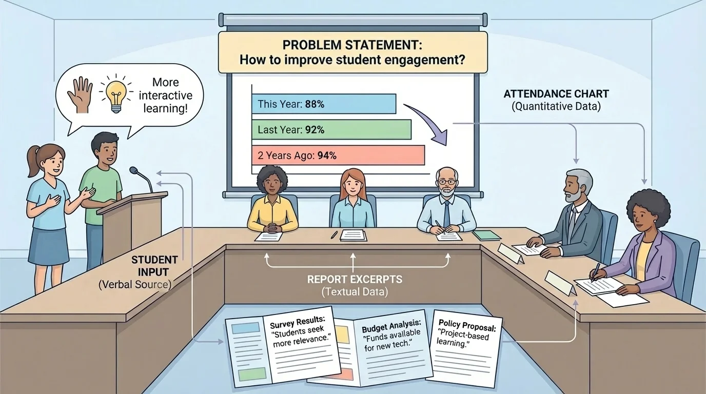
Integrating information is not just a silent reading skill. As [Figure 3] demonstrates in a structured conversation process, it becomes stronger in discussion, where ideas are tested against other people's evidence and reasoning. Collaborative guidelines matter because they create conditions in which multiple positions can be heard rather than ignored.
In effective discussion, participants listen actively, refer to evidence, avoid interrupting, and invite quieter voices into the conversation. They distinguish between disagreeing with a claim and dismissing a person. They ask clarifying questions such as: What source supports that point? How recent is that data? Does that example represent a larger trend? What perspective might be missing?
Hearing a full range of positions does not mean treating every opinion as equally supported. It means giving each position a fair hearing and then evaluating responses based on logic and evidence. If one speaker cites a study with a large sample and another relies only on a personal anecdote, those responses should not be weighed the same way.
This kind of discussion helps expose weak reasoning. For example, a student may claim that a policy failed because one friend disliked it. Another student might respond by comparing that anecdote with survey data from hundreds of participants. The group can then evaluate which response is more representative and better supported.
Later, when the group returns to the issue of weighing evidence, the discussion process remains useful because it emphasizes that listening is not passive. It is part of analysis. A careful listener tracks claims, notices missing evidence, and tests whether responses actually address the question under discussion.
"The test of a first-rate intelligence is the ability to hold two opposed ideas in mind at the same time and still retain the ability to function."
— F. Scott Fitzgerald
That idea matters here because strong thinkers can consider opposing positions without instantly collapsing into one side or the other. They can hold tension, compare evidence, and revise conclusions when stronger support appears.
Strong synthesis usually follows an intentional sequence rather than random note-taking. The overall process in [Figure 4] begins with a clear question and moves through collection, comparison, verification, and conclusion. Without a process, students often gather a pile of sources but never truly connect them.
Start by defining the question precisely. "Is technology good?" is too broad. "How does phone use during class affect attention and note quality in high school students?" is much more workable. A precise question helps you decide what kinds of evidence are relevant.
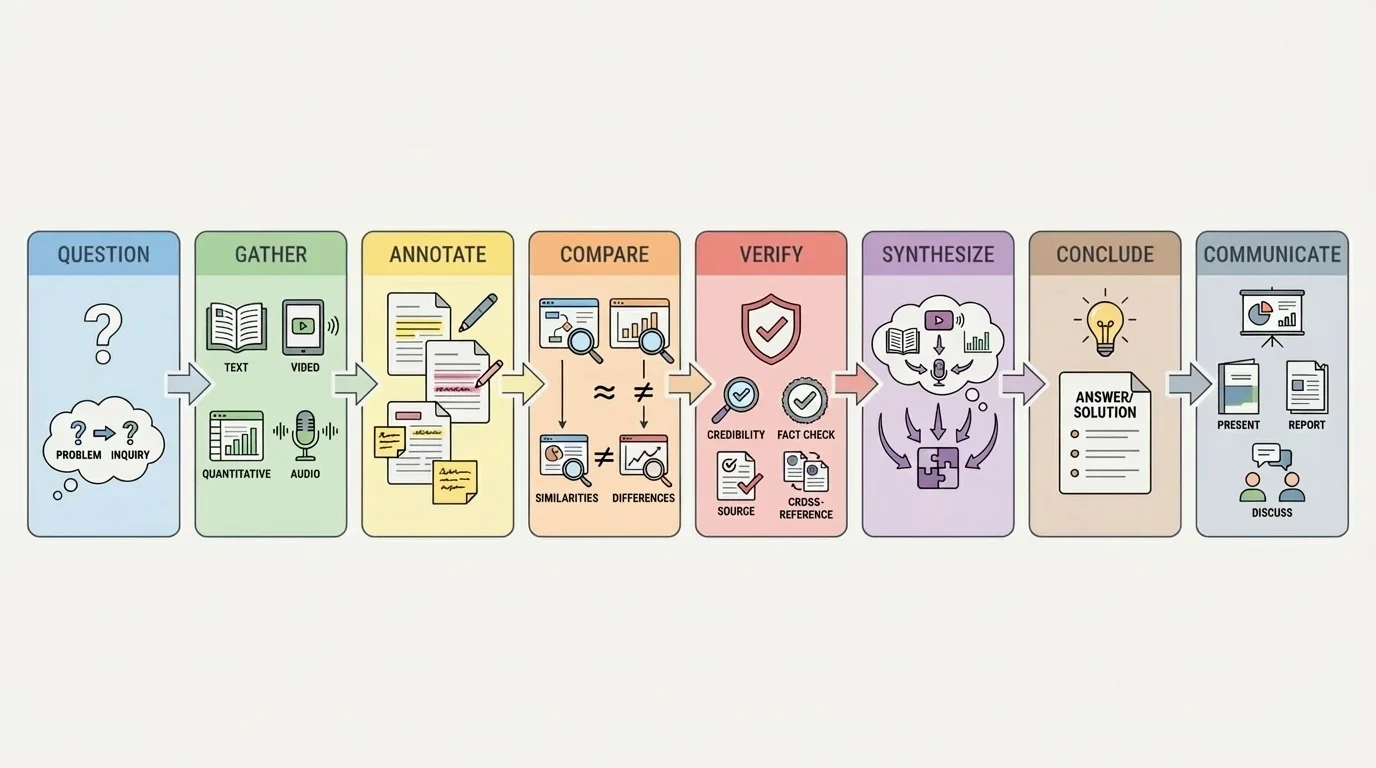
Next, gather varied sources. Try not to collect five versions of the same article. Look for different media and different perspectives: a research summary, a chart or dataset, a direct interview or speech, and a visual source when appropriate. Diversity of format can reveal complexity that repetition cannot.
Then annotate each source. Identify the main claim, strongest evidence, possible bias, and connection to your question. Mark places where the source agrees or conflicts with others. This prepares you for synthesis rather than simple summary.
After that, compare sources directly. Which claims overlap? Which sources provide causes, effects, examples, or counterarguments? Which sources seem strongest, and why? At this stage, students begin turning separate pieces of information into a network of ideas.
Then verify important points. If one statistic seems surprising, trace it back to its origin. If a quote is powerful, check whether it is used in context. If a graph appears dramatic, inspect the scale. Returning to [Figure 4], notice that verification comes before final conclusions because strong reasoning depends on tested evidence, not first impressions.
Finally, synthesize. This means writing or speaking a conclusion that answers the question and uses multiple sources together. The goal is not to list sources one after another. The goal is to show how they interact. A strong synthesis might say that attendance improved after a policy change, according to school records, while interviews suggest the change also reduced student stress, though transportation concerns remained for some families.
Case study: integrating sources about a community heat emergency plan
Question: Should the city open more cooling centers during extreme summer heat?
Step 1: Gather varied evidence
Use a weather graph showing rising heat-index days, hospital data on heat-related illness, a city budget report, and recorded testimony from residents in neighborhoods with limited air conditioning.
Step 2: Compare what each source contributes
The graph shows frequency, the hospital data shows health impact, the budget report shows practical constraints, and resident testimony shows who is most affected and why access matters.
Step 3: Evaluate strength and limits
Hospital records are strong for documented outcomes, while testimony is strong for lived experience but may not represent the whole population by itself. The budget report may be reliable for costs but not neutral about priorities.
Step 4: Form a conclusion
A well-supported response might argue that more cooling centers are justified because weather and health data show increasing risk, while resident testimony identifies access gaps that numbers alone do not reveal.
The conclusion is stronger because it does not rely only on emotion or only on statistics. It uses both human experience and measurable trends.
Consider a school board debating later start times. The issue cannot be answered responsibly by one article alone. As [Figure 5] makes clear, decision-makers may need attendance data, sleep research, parent comments, transportation maps, and student testimony all at once.
One source might show that first-period tardiness dropped after a schedule change. Another might report that teens biologically tend to fall asleep later than younger children. A bus-routing chart may reveal transportation complications. Student speakers may describe improved alertness, while some families raise concerns about after-school jobs or sports schedules.
To integrate these sources well, a student should not simply declare one side right. Instead, the student should weigh the evidence: Which outcomes are measured? Which concerns are logistical rather than educational? Which perspectives are strongly supported, and which require more data? That approach respects both evidence and the full range of positions.
A second example comes from environmental decision-making. Suppose a town is deciding whether to restrict lawn watering during drought. Reservoir level graphs, satellite images of shrinking water coverage, official policy documents, and interviews with farmers and residents may all matter. The graph shows trend severity. The images show visible environmental change. The policies outline legal options. The interviews reveal how restrictions would affect daily life and local business.
A third example involves public information during a disease outbreak. A reliable answer may require infection-rate charts, public health guidance, hospital capacity data, and spoken explanations from medical experts. A vivid online story about one patient may be emotionally powerful, but it should be integrated with broader data before it shapes policy or behavior.
When students revisit the school board example later, [Figure 5] still matters because it reminds us that public decisions are rarely based on one kind of evidence. Statistics, visuals, written reports, and live responses all compete for attention, and mature reasoning considers how they fit together.
One common mistake is cherry-picking, which means selecting only the evidence that supports a preferred conclusion while ignoring conflicting information. This weakens credibility because it turns research into confirmation instead of inquiry.
Another mistake is confusing correlation with causation. If two trends rise together, that does not automatically mean one caused the other. For example, if student laptop use and average grades both increase over the same years, many other factors may also be involved. Strong source integration asks whether the evidence actually proves a cause or merely shows an association.
Students also sometimes overvalue what is vivid. A dramatic image or emotional story may feel more convincing than a dataset. Yet strong reasoning balances emotional impact with representativeness. A single powerful anecdote can reveal an important issue, but it should not replace broader evidence.
From earlier reading work, remember that every source has an author, a purpose, and an audience. Those three ideas still matter when the source is a graph, a video clip, or a social media post.
Another pitfall is treating agreement as proof. Multiple websites may repeat the same incorrect claim because they all copied it from one weak source. Independent corroboration matters more than repetition.
This skill matters far beyond school. Citizens need it when evaluating campaign claims, public health announcements, and economic arguments. Workers use it when comparing reports, presentations, and performance data. Scientists and engineers use it when combining experimental results, visual models, and written analysis. Journalists use it when testing interviews against documents and records.
It also matters in a world flooded with media. Modern platforms deliver text, video, infographics, and sound bites in rapid succession. Without careful integration, people can mistake speed for truth. With careful integration, they can slow down, compare evidence, and make better judgments.
The most powerful habit is intellectual discipline: ask what the question is, what each source contributes, what each source leaves out, and how the pieces fit together. Students who develop that habit are not easily misled by polished visuals, confident voices, or isolated statistics. They learn to think with breadth, depth, and fairness.