A presentation can fail even when the research is excellent. That sounds unfair, but it is true: audiences do not automatically understand good ideas simply because those ideas are correct. They understand them when information is organized clearly, supported with trustworthy evidence, and delivered in forms they can follow. Strategic use of digital media matters because a speaker is not just sharing facts; a speaker is building understanding.
In modern presentations, digital tools are not decorations. They are part of the argument. A well-chosen graph can reveal a pattern faster than a paragraph can. A brief audio clip can make a witness testimony more immediate. A map, image, or simulation can help an audience visualize relationships that are difficult to explain through speech alone. When used well, media helps people see not only what you found, but also why it matters and how you know it is true.
Digital media includes any electronically created or displayed element used to communicate: text on slides, photographs, charts, audio, video, animations, hyperlinks, polls, and interactive models. The key word is strategic. Not every available feature improves a presentation. A strategic choice is one that serves the purpose, helps the audience, and strengthens the message.
A strong presentation usually combines three things: findings, reasoning, and evidence. Findings are the conclusions or results. Reasoning is the explanation that connects the evidence to those conclusions. Evidence is the support, such as data, quotations, observations, or examples. Digital media should make these three elements easier to grasp. If a slide, clip, or image does not improve understanding, it may be unnecessary.
Findings are the results or conclusions a presenter wants the audience to understand. Reasoning is the logical explanation that connects evidence to those findings. Evidence is the specific support, such as statistics, quotations, examples, observations, or experimental results, that makes a claim credible.
Think about a student presenting research on teen sleep deprivation. Reading several survey percentages aloud may cause the audience to lose track. But a simple chart showing average sleep hours by grade level can immediately reveal a trend. If the presenter then explains the causes and consequences of that trend, the audience receives not just information, but meaning.
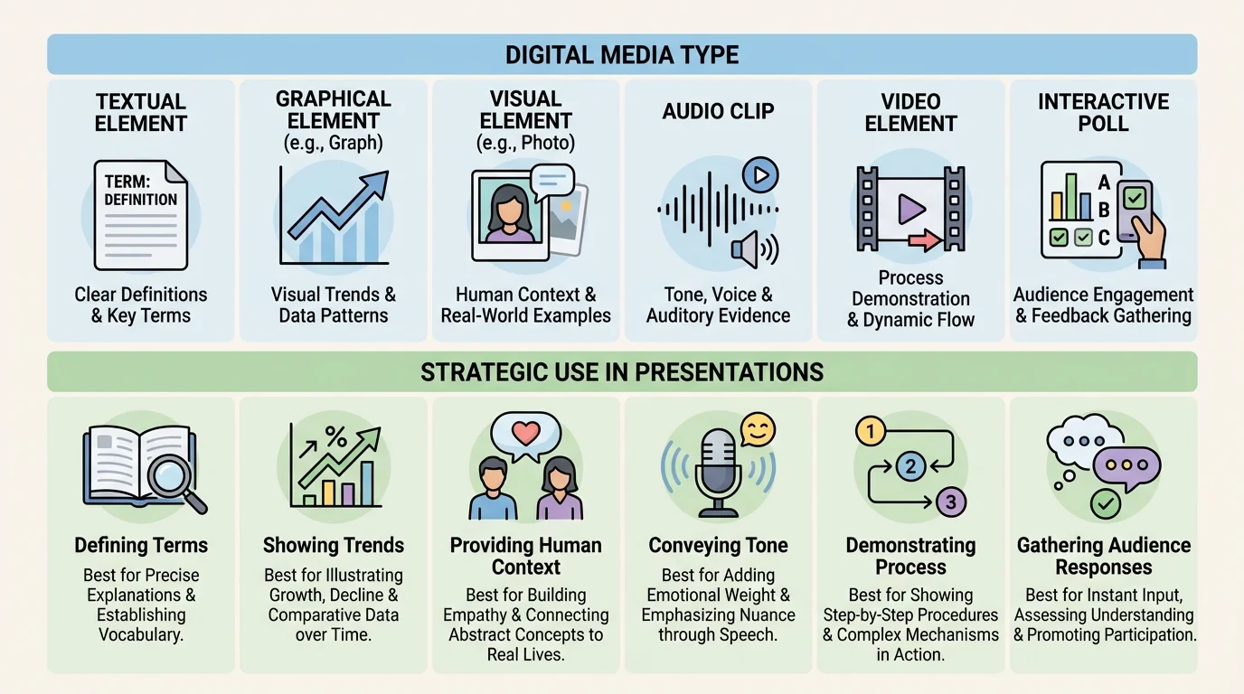
Different media formats do different jobs, and [Figure 1] illustrates that choosing the right format is really a matter of matching communication tools to communication goals. Text is useful for key terms, short quotations, and concise claims. Graphical elements such as charts and diagrams work well for patterns, comparisons, and processes. Photographs and visual images help audiences connect abstract ideas to real situations. Audio can highlight tone, voice, or sound-based evidence. Interactive elements, such as live polls or clickable maps, can increase participation and allow the audience to explore information actively.
Audience needs should guide the choice. If your audience must remember a sequence, a flowchart may be more effective than a dense paragraph. If your audience needs to compare categories, a table or bar chart may work best. If your audience needs emotional and human context, a carefully selected photograph or short interview clip can help.
Textual elements should be brief and purposeful. Slides are not essay pages. If a slide contains everything you plan to say, the audience has to choose whether to read or listen, and often does neither well. Text works best when it highlights the most important terms, states a central claim, or displays a short piece of quoted evidence that needs close attention.
Graphical elements are especially powerful when presenting data. A line graph can show change over time. A bar graph can compare groups. A diagram can break down a system into parts. However, graphics should simplify complexity, not hide it. If labels are missing, scales are misleading, or colors are confusing, a chart can distort evidence instead of clarifying it.
Visual images, including photos, maps, and infographics, can make a topic more concrete. For example, a presentation on coastal erosion becomes stronger when the audience sees before-and-after shoreline images rather than hearing only a verbal description. Yet visuals must be relevant. A dramatic image that is emotionally powerful but unrelated to the claim weakens academic credibility.
Audio and video should be used with discipline. A short clip can bring authenticity to a presentation on language, music, political speeches, or public testimony. But a clip that runs too long can turn the presenter into a spectator of their own presentation. The presenter still needs to interpret the clip, explain its significance, and connect it to the larger argument.
Interactive elements are most effective when they deepen thinking. A live poll before discussing public opinion data can reveal assumptions in the room. A clickable timeline can allow an audience to trace causes and effects. A simulation can demonstrate how a system changes under different conditions. These tools add interest, but their real value is that they turn the audience from passive receivers into active thinkers.
Strategic selection means asking one question: What medium helps this audience understand this idea most clearly? The best presenters do not start by asking what digital effects are available. They start by identifying the point they need to communicate, then choose the format that makes that point visible, audible, or interactive in the most useful way.
As you saw earlier in [Figure 1], no medium is automatically superior. A photograph cannot replace precise data, and a graph cannot replace human context. Effective presentations often combine formats so that each one contributes something different.
A presentation is shaped by who will hear it, where it will happen, and what decisions or understanding it should produce. A classroom presentation, a debate speech, a science fair explanation, and a community proposal may all use digital media, but they do not use it in exactly the same way. Context changes what counts as effective.
Credibility depends on accuracy and trustworthiness. If you include data, the source should be reliable and recent enough for the topic. If you include an image, you should know where it came from and whether it has been edited or taken out of context. If you use an expert quotation, you should identify who that person is and why their perspective matters. Digital media can increase authority, but only when the content itself is dependable.
One of the biggest mistakes students make is assuming that professional-looking design automatically creates trust. It does not. A sleek slide deck built on weak sources is still unconvincing. A credible presentation uses media to display accurate information, not to cover gaps in evidence.
Accessibility also matters. A presentation should be understandable to as many people as possible. That means using readable font sizes, strong color contrast, captions for video when possible, and descriptive language when explaining visuals aloud. If a graph is color-coded, labels should not rely only on color, because some audience members may not distinguish the colors clearly. If an audio clip contains important content, the speaker should summarize it verbally as well.
Meeting audience needs also means adjusting complexity. Presenting research to classmates may require explaining technical vocabulary. Presenting to a teacher or expert panel may require more detailed evidence and stronger methodological explanation. Strategic media use is not about making material flashy; it is about making material appropriately understandable.
People often remember visual patterns more easily than isolated spoken details, which is why a clear graph or diagram can stay in the mind long after exact wording fades. That memory advantage disappears, however, when the visual is cluttered or confusing.
Ethical use is another part of credibility. Presenters should avoid manipulating images, cropping quotations in misleading ways, or choosing graph scales that exaggerate small differences. Ethical communication means representing evidence honestly, even when the complete picture is more complicated than a simple slogan.
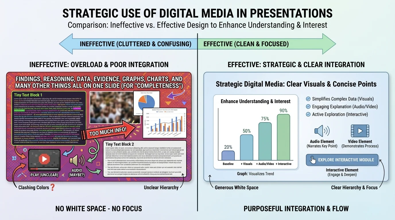
Good design is less about decoration than about thinking structure. As [Figure 2] shows, two slides can contain similar information but produce very different levels of understanding depending on layout, emphasis, and readability. Strong slide design creates a visual path for the audience: where to look first, what to connect next, and what to remember last.
Visual hierarchy is the arrangement of information by importance. Titles are larger than supporting details. Key numbers stand out more than background text. Important evidence appears in a prominent position rather than buried in a corner. Hierarchy helps the audience process information efficiently.
White space is the empty area around text and images. It is not wasted space. It improves readability by preventing crowding. A slide with fewer elements often communicates more effectively than one packed with every available fact. The goal is not to display everything you know; the goal is to help the audience understand what matters most.
Color should organize information, not overwhelm it. Use a limited palette and maintain contrast between text and background. Light gray text on a white background may look modern, but it is difficult to read from across a room. Bright colors can draw attention, but if everything is bright, nothing stands out.
Fonts should be readable and consistent. Overly decorative typefaces can reduce clarity, especially during oral presentations where the audience has only seconds to absorb a slide. Consistency also builds professionalism. If every slide changes style, the design itself becomes distracting.
Images should be large enough to matter and clear enough to interpret. Tiny pictures added merely to fill space do not help. If an image is central, explain it directly. Point out the feature the audience should notice. Otherwise, viewers may look at the same image and walk away with different interpretations.
Animation and transitions should be minimal and purposeful. A simple build that reveals points one at a time can direct attention. Spinning, bouncing, or dramatic transitions often pull attention away from content. In serious academic or professional contexts, restraint usually strengthens authority.
Later, when you evaluate your own slides, returning to [Figure 2] is useful because it reminds you that design quality is measured by comprehension, not by visual busyness. If an audience can identify the main point quickly and follow the evidence easily, the design is working.
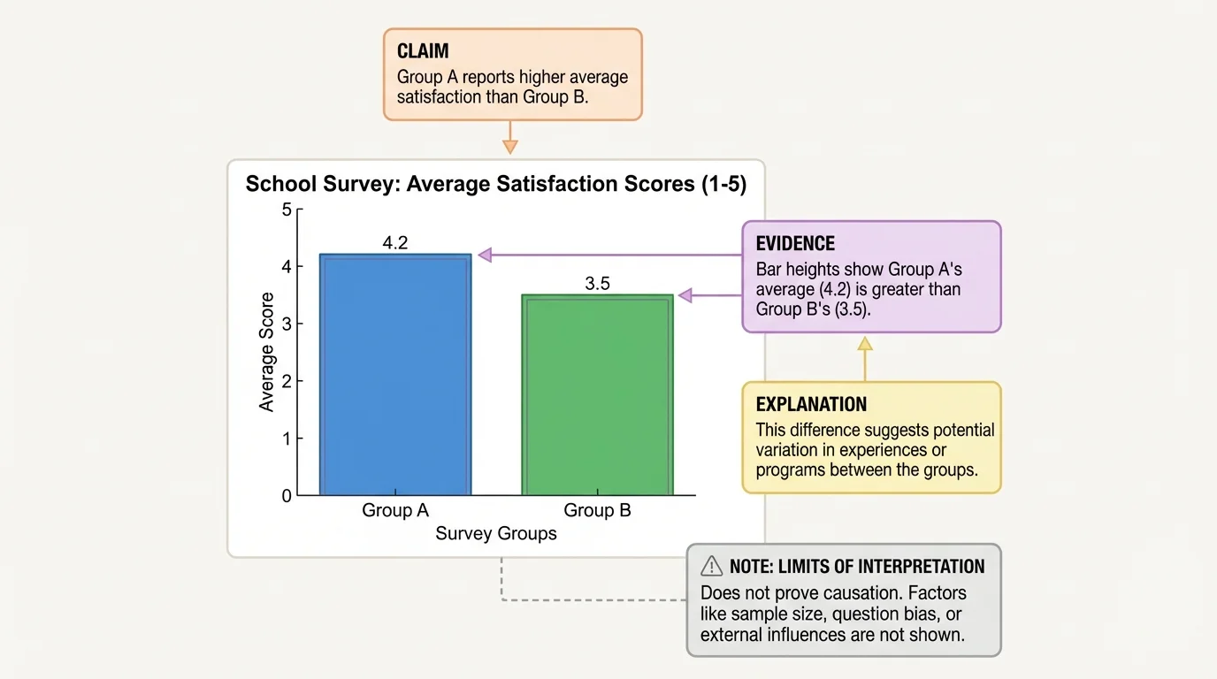
A chart on a screen is not an argument by itself, and [Figure 3] makes that clear by linking visual evidence to claim and explanation. Presenters often assume that if they show data, the audience will automatically understand what the data proves. In reality, audiences need guidance: what pattern should they notice, why does it matter, and what conclusion is justified?
This is where evidence integration becomes important. Evidence integration means combining data or sources with explanation so that the audience can follow the logic. A speaker might say, "This bar graph shows that students participating in after-school tutoring had higher course pass rates than those who did not. That difference suggests tutoring supports academic performance, though it does not prove tutoring is the only cause." That statement does three things: identifies the evidence, interprets it, and qualifies the claim responsibly.
When using statistics, be precise. If a survey included only one school, say so. If the sample size was limited, acknowledge that. If a trend is correlation rather than proof of causation, do not overclaim. Strong presenters understand that honesty about limits increases trust.
Quotations also require interpretation. A textual quote on a slide should usually be short enough for the audience to read quickly. Then the speaker should explain why it matters. For example, in a presentation about media bias, a short quote from a journalist about editorial decisions becomes useful only when the presenter connects that quote to a broader claim about how news framing affects public understanding.
Images function as evidence too, but they need context. A photo from a wildfire zone may support a point about environmental impact, but it does not replace climate data, policy analysis, or expert testimony. Visual evidence can be powerful because it is immediate, yet it should be paired with accurate explanation to avoid oversimplification.
Tables can also be effective when exact values matter more than broad visual patterns.
| Media Type | Best For | Risk if Misused |
|---|---|---|
| Short text | Key claims, terms, brief quotations | Too much reading reduces listening |
| Graph or chart | Patterns, comparisons, trends | Misleading scales or unclear labels distort meaning |
| Photo or visual image | Concrete context, human impact, setting | Emotional distraction or weak relevance |
| Audio or video clip | Tone, demonstration, authentic voice | Too long or insufficiently explained |
| Interactive element | Participation, exploration, decision-making | Novelty without substance |
Table 1. Comparison of common media choices, their best uses, and risks when they are used poorly.
As shown earlier in [Figure 3], the strongest media use connects a visible pattern to a spoken explanation. The audience should never have to guess what conclusion they are supposed to draw from evidence.
Case study: presenting findings from a school recycling audit
A student team wants to argue that the school should add more clearly labeled recycling bins.
Step 1: Present the finding
The team states that recyclable waste is being thrown away at a high rate in shared lunch areas.
Step 2: Show evidence in the right format
They use a bar graph comparing trash and recyclable materials collected from three locations, because comparison across locations is easier to grasp visually than through a spoken list of measurements.
Step 3: Add reasoning
The presenters explain that the cafeteria has the highest amount of misplaced recyclable material, which suggests confusion or limited access to clearly labeled bins.
Step 4: Add supporting visuals carefully
They include one photo of an existing bin area to show unclear signage, not a large set of repetitive images.
Step 5: Conclude with an appropriate recommendation
They propose adding labeled bins and testing the change for several weeks, showing that the evidence leads to a practical next step.
The media choices work because each one serves a distinct purpose: the graph shows the pattern, the photo provides context, and the spoken explanation connects the evidence to the recommendation.
This same principle applies across subjects. In science, a diagram of an apparatus should be paired with an explanation of the procedure and results. In history, a map should be paired with explanation of why location mattered. In literature, a quotation should be paired with analysis of language and theme.
Multimedia tools can make presentations more dynamic, but they require careful judgment. Audio and video are strongest when the exact sound or motion matters. A speech excerpt can reveal tone in a way that printed words cannot. A slow-motion sports clip can show mechanics of movement. A video of a chemistry demonstration can make a process visible when live demonstration is impractical or unsafe.
Length matters. A clip should usually be short enough that the presenter remains the central interpreter. If the audience watches an extended video, attention shifts away from the presenter's argument and toward the media itself. The clip should function like evidence, not like a substitute teacher.
Technical preparation is part of strategic use. Test sound levels, links, aspect ratios, and internet dependence before presenting. Have a backup plan in case a clip does not load. Professionalism includes being ready for failure points.
Interactive media can create strong engagement when aligned with purpose. A live poll can reveal current opinions before introducing research findings. An interactive map can help a speaker discuss regional differences. A clickable model can let an audience see how changing one variable affects a system. These tools work best when the audience learns something through participation that they would not learn as effectively through passive viewing.
Strong oral communication still depends on core speaking skills: clear pacing, eye contact, explanation, and responsiveness to the audience. Digital media supports the speaker; it does not replace the speaker.
If a presentation uses interactive features, transitions should be smooth. The speaker should explain what the audience is looking at, what action is expected, and what the result means. Without that guidance, interaction can feel confusing rather than meaningful.
One common mistake is media overload: too many images, too much text, too many colors, too many effects. Overload creates competition for attention. When everything is emphasized, nothing is clear.
Another mistake is using media that is only loosely connected to the claim. For example, inserting dramatic stock photos into a presentation on economic policy may create mood, but unless the visuals clarify a real point, they add little intellectual value. Relevance matters more than appearance.
A third mistake is failing to cite or identify sources. Presenters should be able to answer where a statistic came from, who created a chart, or when a photograph was taken. Even if full citations do not appear in large text on each slide, source information should be available in notes, a reference slide, or spoken attribution when appropriate.
A fourth mistake is reading directly from slides. This weakens delivery and reduces the value of oral presentation. Slides should support speaking, not duplicate it word for word. If a slide contains a quotation or data point, the presenter should guide the audience through it rather than simply reading it aloud.
Finally, presenters sometimes confuse entertainment with engagement. Interesting presentations are not necessarily loud, flashy, or overloaded with effects. They are engaging because they are clear, purposeful, and intellectually satisfying. The audience feels guided through an idea rather than buried under content.
"The purpose of visuals is not to decorate the truth, but to make the truth easier to see."
A useful self-check is to ask, for each slide or media element: What is this doing for my audience? If the answer is vague, the element may need revision or removal.
These skills matter far beyond school. In public health, presenters use charts, maps, and brief video clips to explain disease trends and prevention strategies. In business, teams use dashboards and visual models to persuade decision-makers. In engineering, diagrams and simulations help explain designs. In journalism, multimedia storytelling combines interviews, data visualization, and images to make complex issues understandable.
College and career settings increasingly expect people to communicate across media, not only through speech or writing alone. A strong presenter must be able to judge which format best suits the situation. Sometimes a simple graph is the best choice. Sometimes a short quote is enough. Sometimes an interactive model changes the entire quality of understanding.
The most effective digital presentations respect the audience's time and attention. They do not ask viewers to decode clutter or sort through irrelevant visuals. Instead, they make evidence visible, reasoning clear, and conclusions memorable. That is why strategic media use is a communication skill, not merely a technology skill.