Have you ever heard a bird call and known right away which animal someone was talking about? Or seen one strong picture that made a whole idea click in your mind? Presentations work that way too. A speaker can use words alone, but sometimes a well-chosen sound or picture helps the audience understand the main idea faster and remember it longer.
When you give a presentation, your job is not just to talk. Your job is to help other people learn. That is why strong presenters sometimes add media such as an audio recording or a visual display. These tools can make important ideas clearer, more interesting, and easier to follow. But they only help when they are used appropriately, which means in the right way, at the right time, and for the right reason.
Audio recording means recorded sound, such as a person speaking, an animal call, music, or a short interview clip.
Visual display means something the audience looks at to understand information better, such as a slide, chart, graph, photo, map, diagram, or video still.
Main idea is the most important point you want your audience to learn.
Theme is a big message or central meaning, often used in books, stories, and some informational presentations.
A presentation may be formal or informal. An informal presentation might be sharing your book report with your class. A formal presentation might be a researched report with note cards, slides, and clear speaking parts. In both cases, audio and visuals should support what you say. They are helpers, not the stars of the show.
People learn in different ways. Some understand best when they hear information. Others understand better when they see it. Many people learn best when they both hear and see important details. That is why adding media can make a presentation stronger.
Audio recordings can bring real sounds into the room. If you are presenting about rain forests, a short clip of rain-forest sounds helps your audience feel the setting. If you are presenting about a famous speech, a short recording of the speaker's voice can help listeners notice tone, emotion, and pace.
Visual displays help organize information. A chart can compare two animals. A map can show where a state is located. A photograph can show details that are hard to explain with words alone. A diagram can label parts of a plant or show steps in a process.
Media should deepen understanding
The best media answers a question for the audience: What does this sound like? What does this place look like? How are these things different? What happens first, next, and last? If the media does not answer an important question, it may not be needed.
Good presenters always keep the focus on the main idea. If your presentation is about how desert animals survive, every picture, chart, or sound should connect to that idea. A cute picture of a random pet lizard may be interesting, but if it does not help explain survival in the desert, it does not belong.
There are many kinds of media you can use in a presentation. Some are simple, and some are more advanced. What matters most is not how fancy they are. What matters is whether they help your audience understand.
Common audio recordings include recorded narration, a short interview, environmental sounds, music from a certain culture or time period, and sound effects that connect directly to the topic. Common visual displays include posters, slideshow slides, labeled drawings, photographs, charts, timelines, maps, and short video stills.
A poster with labels is a visual display. A slideshow with one picture and three key bullet points is a visual display. A bar graph showing favorite school lunches is a visual display. A short recorded phrase in another language during a presentation about world cultures is an audio recording.
Your brain can often remember information better when it is connected to both sound and sight. That is one reason teachers, scientists, and reporters often use pictures, maps, and recordings when they share information.
Even simple tools can be powerful. A hand-drawn diagram on chart paper can be just as helpful as a digital slide if it is neat, clear, and connected to the speaker's main point.
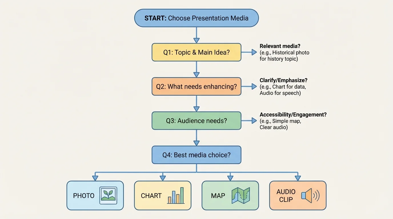
Before adding any media, a presenter should ask, "What do I most want the audience to understand?" That question guides every choice, as [Figure 1] shows through a path from topic to purpose to media choice. Start with the message, not with the sound clip or picture.
Next, think about the audience. What do they already know? What might confuse them? If your classmates already know what a frog looks like, you may not need several frog photos. But if you are explaining the frog life cycle, a labeled sequence of stages would be very helpful.
Then think about your purpose. Are you trying to explain, compare, persuade, or tell a story? If you are comparing two habitats, a chart may work best. If you are sharing the mood of a poem, a short audio recording of the poem being read aloud may help more than a chart.
A good rule is this: choose media that your audience needs, not media that simply looks exciting. A presentation can become distracting if it includes too many pictures, loud music, or unrelated videos. When the audience is busy noticing special effects, they may miss the important ideas.
Suppose you are giving a report on tornado safety. A simple diagram of where to shelter helps the audience. A short weather siren clip might also be useful if you are explaining warning sounds. But upbeat background music during the whole presentation would not help. It would likely make listening harder.
Choosing media for a topic
A student is presenting about the theme of teamwork in a novel.
Step 1: Identify the main idea.
The presentation explains how characters solve problems by working together.
Step 2: Pick media that supports that idea.
A chart comparing what each character contributes would help. A short quote read aloud could also help.
Step 3: Remove media that does not fit.
A random song the student likes does not explain teamwork, so it should not be added.
The best choices are the ones that directly support the theme.
As you make choices, ask yourself three quick questions: Does this match my topic? Does it help explain my main idea or theme? Will it make learning easier for my audience?
Strong presentations are planned. Media works best when it is part of the plan from the beginning instead of being added at the last minute.
First, write or say your main idea in one clear sentence. For example: "Ocean pollution harms sea animals and people can help reduce it." That sentence becomes the center of the presentation.
Next, choose two to four important supporting details. These might include causes, examples, facts, steps, or comparisons. Once you know your details, you can decide whether any of them need an audio recording or visual display.
Then put your ideas in order. Many presentations move from introduction to main points to ending. Media should also fit that order. A map near the beginning may help explain location. A chart in the middle may help compare facts. A final photo near the end may leave the audience with a strong memory.
Good speaking still matters even when you use media. You need a clear voice, a steady pace, and eye contact with your audience. Media adds support, but it does not replace strong speaking skills.
It also helps to plan transitions. A transition is a word or sentence that moves the audience from one idea to the next. For example, you might say, "Now that we know where hurricanes form, let's look at the damage they can cause." This tells listeners what comes next and prepares them for a new visual or audio clip.
Finally, practice with the media. Know exactly when to show the slide, hold up the chart, or play the recording. Practice prevents awkward pauses and helps the presentation feel smooth.
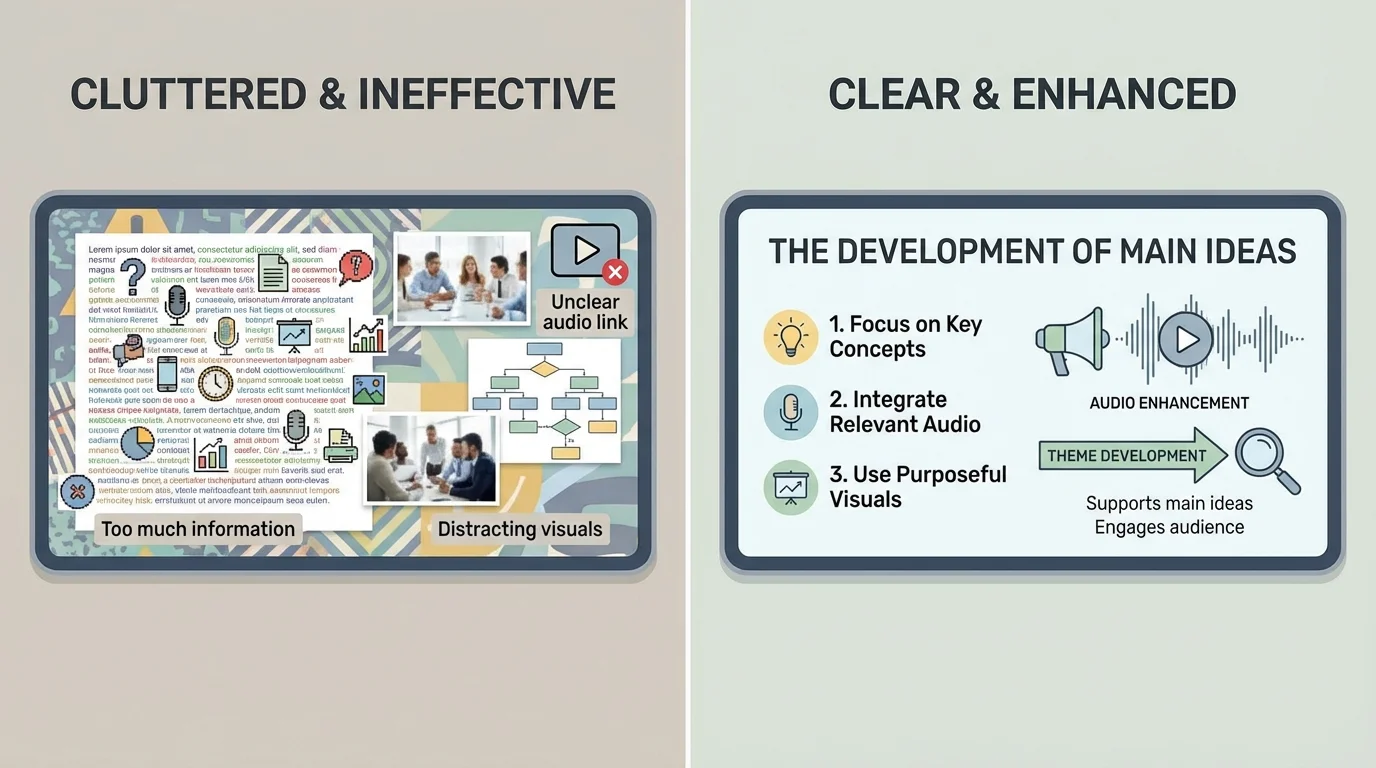
Good visuals are simple and easy to read quickly, as [Figure 2] makes clear by comparing a crowded slide with a clean one. Audience members should not have to squint, guess what a picture means, or search through too many words.
Use large, readable text. If your letters are tiny, people in the back may miss important information. Use short phrases instead of long paragraphs. Your audience came to listen to you, not to read a whole page on a slide.
Choose pictures that clearly connect to your topic. If you are talking about erosion, use a photo or diagram that shows land wearing away. If you are discussing animal camouflage, choose images where body colors or patterns help explain how the animal blends in.
Labels are important. A diagram is more helpful when key parts are named. A chart is stronger when each bar or section is clearly labeled. Color can help too, but it should organize information, not make the slide too busy.
Avoid overcrowding. One strong image is often better than five small ones. Three key bullet points are often better than ten full sentences. White space, the empty space around words and pictures, helps the eye focus on what matters.
Visual displays can also help show comparisons. A table is useful when information needs to be seen side by side.
| Type of visual | Best use | Example |
|---|---|---|
| Photo | Show what something looks like | A picture of a volcano |
| Diagram | Show parts or steps | Labeled parts of a flower |
| Chart | Compare information | Rainfall in different months |
| Map | Show location | Where the Rocky Mountains are |
| Timeline | Show events in order | Important events in a person's life |
Table 1. Common visual displays and the kinds of information they present best.
Later, when you revise your work, think back to [Figure 2]. If your slide looks crowded or confusing, remove extra words, shrink the number of images, or improve the labels so the most important idea stands out.
Audio can make a presentation feel alive, but it must be chosen carefully. A sound clip should teach something your speaking alone cannot teach as easily.
For example, a report about whales becomes stronger with a short whale call recording. A presentation about local history may become more powerful with a brief recording of an interview with a grandparent or community member. A report about poetry may improve when the audience hears the poem read with expression.
Keep audio clips short. Most of the time, a brief clip is enough. If a recording lasts too long, listeners may forget why they are hearing it. You should explain the purpose before you play it and discuss it after it ends.
Audio should add information, not noise
Ask what the recording teaches. Does it reveal mood, pronunciation, sound, emotion, or a real voice from a source? If not, it may only be decoration. Decorative sound can distract from the message.
Sound quality matters. If the clip is fuzzy, too quiet, or full of background noise, the audience may become confused. Volume matters too. If the sound is too loud, it can startle the audience. If it is too soft, people will not hear the important part.
Be careful with music. Music can sometimes set a mood, but in school presentations it should only be used when it truly supports the topic. For instance, traditional music may fit a presentation about a culture if you explain why it matters. Random background music during every slide usually makes listening harder.
It is also important to respect time. A presentation should still be mostly your voice and your ideas. The recording should support the presentation, not take over.
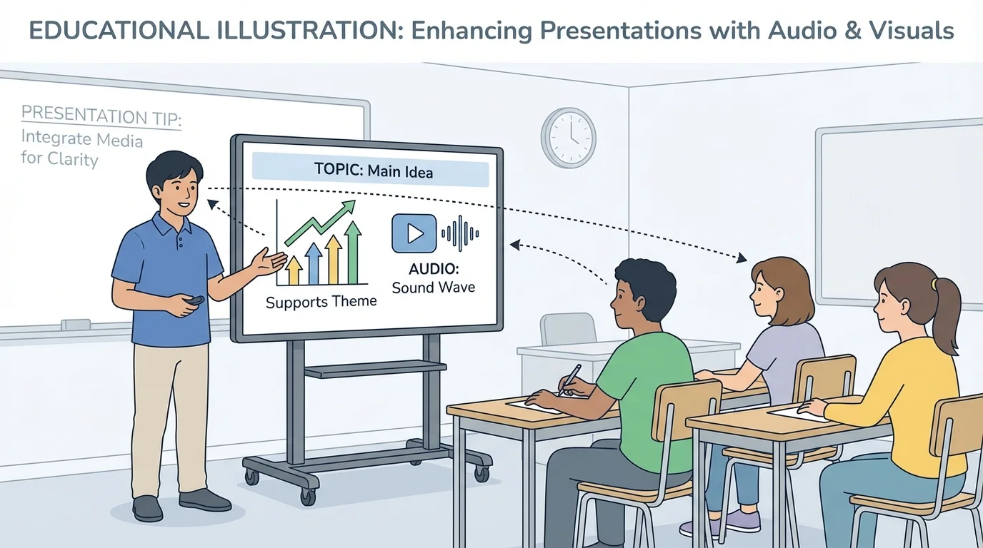
The speaker and the media should work together, as [Figure 3] illustrates in a classroom presentation where the student faces the audience and uses the screen at the right moment. A good presenter does not stare at the screen the whole time or turn completely away from the audience.
When showing a visual, give your listeners a moment to look. Point out the important part. You might say, "Notice the dark clouds moving toward the coast," or "This bar is taller because it shows the month with the most rainfall." Your words guide the audience's attention.
When playing audio, set it up first. Say what the audience is listening for. For example: "Listen for the difference between the wolf howl and the coyote call." Then play the clip. Afterward, explain how it connects to your main point.
Try not to read directly from your slide or poster. If the audience can read the exact same words you are saying, they may stop listening. Instead, use the visual as support and speak in your own words.
Practice timing. If you switch slides too quickly, the audience cannot study them. If you leave a visual on screen too long without talking about it, attention may drift. Smooth timing helps the whole presentation feel organized.
Later in your practice, return to the habits shown in [Figure 3]: face the audience often, use short glances at your media, and make your pointing or gestures purposeful. These actions show confidence and help listeners follow along.
Many presentation problems happen because students think more media automatically means a better presentation. That is not true. What matters is how well the media supports the main idea.
One common mistake is using too much text. A slide full of sentences can overwhelm the audience. A smarter fix is to use a title, a few keywords, and a picture or chart that matches your explanation.
Another mistake is choosing media because it is funny or flashy instead of helpful. A silly sound effect may get a laugh, but if it does not connect to your topic, it weakens the presentation. A better choice is a sound or image with a clear learning purpose.
Mistake and fix
A student is presenting about the water cycle.
Step 1: Problem
The student adds six slides with long paragraphs and a song playing in the background.
Step 2: Why it does not work
The audience has too much to read, and the music makes it hard to focus on the explanation.
Step 3: Better plan
Use one clear diagram of evaporation, condensation, precipitation, and collection, plus short labels. Remove the background music. If audio is used at all, add a short clip of rainfall only when explaining precipitation.
The improved version makes the scientific process much easier to understand.
A third mistake is not practicing with technology. Maybe the sound will not start, or the speaker forgets which slide comes next. The smart fix is simple: rehearse exactly as you plan to present.
Consider a student giving an animal report about bats. The main idea is that bats use sound in special ways. A short recording of bat calls would help the audience understand this fact. A labeled diagram of bat wings might also help explain how bats move. Both pieces of media support the topic directly.
Now think about a presentation on a state's history. A map can show where the state is located, and a timeline can show important events in order. If the student also includes a recording of a person telling a memory about living there, the audience gets both facts and human experience.
For a weather report, a chart comparing temperatures over a week can show patterns quickly. A brief storm sound might help only if the student is discussing weather warnings or identifying storms by sound. Otherwise, the chart may be enough.
For a book presentation, the student may explain a theme such as courage. A visual display with three scenes from the story can help show how the character changes. A short audio recording of an important line from the text, read with feeling, can highlight the theme if it is brief and clearly explained.
"The best presentation tools do not replace your ideas. They help your ideas shine."
Whether the presentation is formal or informal, the same rule stays true: choose media on purpose. If it helps the audience understand your message, use it. If it distracts from the message, leave it out.
As you prepare, think like both a speaker and a listener. Ask what your audience will hear, what they will see, and what they need in order to understand. This mindset helps you make thoughtful decisions instead of random ones.
A strong presentation is like a team. Your voice, your ideas, your audio clips, and your visual displays each have a job. When every part works together, the audience can follow the main idea clearly and remember it after the presentation ends.