A story can whisper, shout, sparkle, or feel mysterious before you even finish reading the first page. How? Not just through words. A shadowy picture, a bright splash of color, a dramatic pause in a narrator's voice, or a sad tune playing behind a poem can all change what the text means and how it feels. Strong readers learn to notice these choices because authors, illustrators, and designers use them on purpose.
When you read a book with illustrations, a graphic novel, or a digital presentation of a poem, you are reading more than sentences. You are also reading visual elements such as color, shape, size, facial expression, and layout. In digital texts, you may also notice multimedia elements such as sound, music, motion, and narration.
These features do not simply decorate a text. They help readers understand characters, setting, conflict, and theme. They can also make the text feel peaceful, exciting, funny, eerie, or beautiful. If a myth about a storm god is shown with jagged dark clouds and booming sound, the presentation gives extra power to the words. If the same myth is shown in soft pastel colors with gentle music, it creates a very different feeling.
Meaning is the idea or message a text communicates.
Tone is the author's or creator's attitude toward the subject, such as joyful, serious, playful, or gloomy.
Mood is the feeling a reader or viewer gets while experiencing the text.
Beauty in a text can come from artistic choices that make it vivid, moving, graceful, or memorable.
Sometimes words and media work together in an obvious way. A line in a poem may describe the moon, and the screen may show a silver moon glowing in a dark sky. Sometimes the media adds a new idea. A cheerful sentence may be paired with a worried face, letting readers know that something deeper is happening.
To analyze a text, you need to notice how different parts work together. An illustration can show details that words only hint at. A graphic novel uses panels, speech bubbles, captions, and art to tell the story. A digital presentation may include narration, music, transitions, and zooming images. Each choice affects what the audience understands.
Readers also look for symbols. A symbol is something that stands for a bigger idea. In a folktale, a glowing lantern may symbolize hope. In a graphic novel, a cracked crown in the background may symbolize lost power. Visual symbols help a text say more without adding many words.
Words and media work as a team. When you analyze a text with visuals or multimedia, ask two questions: What do the words say, and what do the nonword elements add? Sometimes the media repeats the words for emphasis. Sometimes it gives clues about feelings, setting, or theme that the words do not state directly.
A useful way to think about this is to treat every image or sound like evidence. If a character says, "I'm fine," but the picture shows slumped shoulders and dim gray colors, the visual evidence suggests sadness or worry. Good analysis explains how the visual or multimedia detail changes understanding.
Pictures in stories can reveal action and feeling very quickly, as [Figure 1] shows in a graphic novel sequence where panel size, shadows, and expressions guide the reader from curiosity to fear. A small panel may make a moment feel quick. A large panel may slow the reader down and make the moment feel important. Dark backgrounds can build suspense, while bright open spaces can create a lighter mood.
In a graphic novel, artists make many choices. They decide where characters stand, what details appear in the background, and how close or distant the point of view seems. A close-up of wide eyes can show fear. A distant view of a tiny person in a giant forest can show loneliness or danger. These artistic choices shape the meaning just as much as the dialogue does.
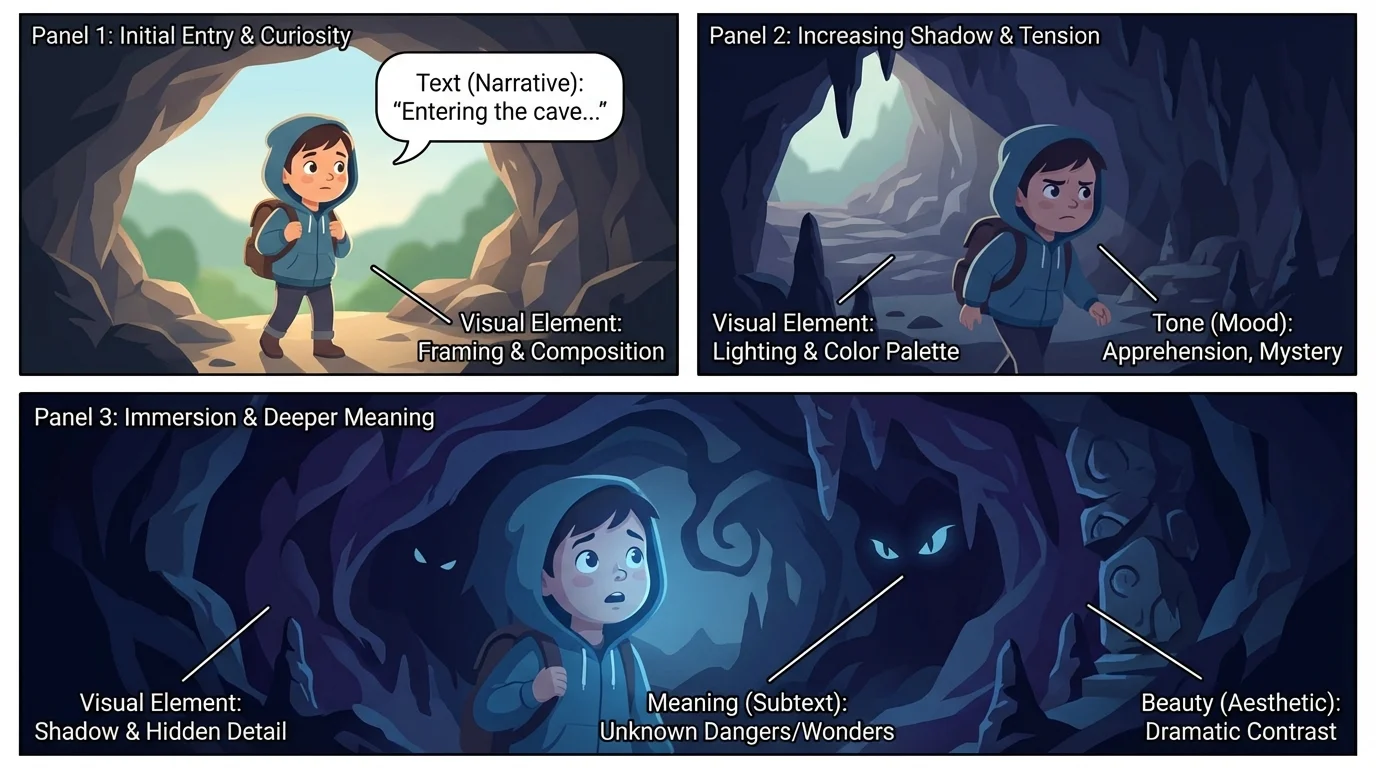
Think about a scene from a myth in which a hero enters a cave to meet a monster. If the cave is drawn with sharp rocks, black shadows, and tiny glowing eyes hidden in the dark, the illustration builds suspense. If the hero's face is set firmly and the light from a torch shines ahead, the image also suggests courage. Without those visuals, readers would still understand the words, but the experience would be less powerful.
Illustrations also help readers understand setting. In a folktale set in winter, white hills, bare trees, and a pale sky can make the world feel cold and quiet. If the same story later shows warm orange firelight inside a cottage, readers feel the safety of that space more deeply. The shift in color and light helps tell the story.
Another important feature is sequence. In a picture book or graphic novel, one image follows another. This order helps readers track time, action, and change. When a character's posture changes from confident to uncertain across several panels, the visuals show growth or struggle. Later, when that character stands tall again, the art completes a story of change.
Example: analyzing a graphic novel scene
A character opens a door in an old house.
Step 1: Notice the words.
The caption says, "Marta took a breath and pushed the door." These words show action, but not much about the room.
Step 2: Notice the visual details.
The panel uses dark green and gray colors. Dust floats in the air. Marta's hand is small in the frame, and the doorway looks huge.
Step 3: Explain the effect.
The visuals make the room seem frightening and mysterious. They add meaning by showing that Marta is stepping into something larger and more dangerous than she expected.
This analysis uses both the text and the art as evidence.
As the scene develops, the same visual clues still matter. When readers later interpret a dangerous discovery in the house, they can connect it back to the earlier shadows and scale choices we noticed in [Figure 1]. The artist prepares readers for the mood before the plot fully explains it.
[Figure 2] illustrates how sound and motion can shape the experience when a poem or story is presented digitally, with narration, background music, and changing images that deepen the tone. A calm voice may make a poem feel peaceful. A shaky voice may make the same lines feel nervous. Slow music can create sadness or wonder, while fast music can make a scene feel energetic or tense.
Pacing matters too. If images fade in slowly while a narrator pauses between lines, the audience has time to think and feel. If images flash quickly and the music grows louder, the audience may feel excitement or urgency. Movement, timing, and sound act almost like extra lines of the text.
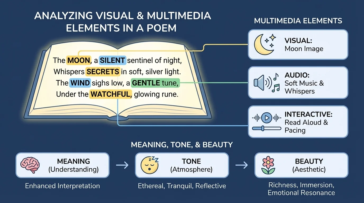
Consider a poem about nighttime. On a printed page, the words might already sound calm. In a multimedia version, soft piano music, a dark blue background, and a gentle voice can make the mood even more peaceful. If important words appear one at a time on the screen, the presentation can highlight their importance and make readers slow down.
Now imagine that same poem with thunder sounds, flashing white light, and a rushed voice. The words may not have changed, but the tone of the presentation feels more dramatic and uneasy. This is why readers and viewers must pay attention to how the text is performed and displayed, not only to what it says.
Movie makers and game designers use the same idea all the time. Music can make the exact same picture feel funny, scary, or heroic depending on the sounds chosen.
Narration can also help with understanding. A speaker may stress certain words, pause at important moments, or change expression. These choices guide the audience toward a certain interpretation. Later, if you explain why a multimedia presentation feels hopeful or tense, you should mention the voice, timing, and sound effects, not just the script.
A text's tone comes from choices. In written words, tone may come from word choice. In visual and multimedia texts, tone is also shaped by color, line, sound, movement, and style. Sharp angles and strong contrast can create a harsh or intense tone. Soft lines and glowing colors can create a gentle or magical tone.
Mood is closely connected, but it is not exactly the same. Tone belongs more to the creator's attitude; mood is the feeling the audience gets. For example, a storyteller may present a forest with respect and wonder, giving the text an admiring tone. The audience may then feel calm awe, which is the mood.
Beauty in a text is not only about something looking pretty. Sometimes beauty comes from a perfect match between form and meaning. A poem about rain may use soft repeated sounds in the words, silver-blue colors in the visuals, and gentle music in a presentation. Together, these parts create a graceful effect that feels beautiful because everything fits.
Example: beauty in a poem presentation
A short poem describes leaves falling in autumn.
Step 1: Look at the language.
The words are soft and flowing, describing leaves as "drifting" and "turning."
Step 2: Look at the visual choices.
The screen uses gold, red, and brown leaves moving slowly across a pale sky.
Step 3: Look at the sound.
Quiet string music plays in the background.
Step 4: Explain the beauty.
The words, colors, and music all work together to create a peaceful, elegant feeling. The beauty comes from the harmony among these choices.
Beauty can also come from contrast. A dark scene with one small bright light can be beautiful because it makes hope stand out. A plain black-and-white drawing can be beautiful because its simplicity focuses attention on emotion. Readers should be open to different kinds of artistic power.
[Figure 3] demonstrates that one of the best ways to understand visual and multimedia elements is to compare versions of the same text, such as a folktale presented as plain text, as an illustrated page, and as a digital version. The main events may stay the same, but each version can guide the audience differently.
Suppose a folktale tells of a girl who follows a fox through the woods. In a plain text version, readers imagine the woods for themselves. In an illustrated version, the artist may fill the forest with golden light, making the journey seem magical. In a multimedia version, rustling leaves and mysterious music may make the same journey feel more suspenseful.
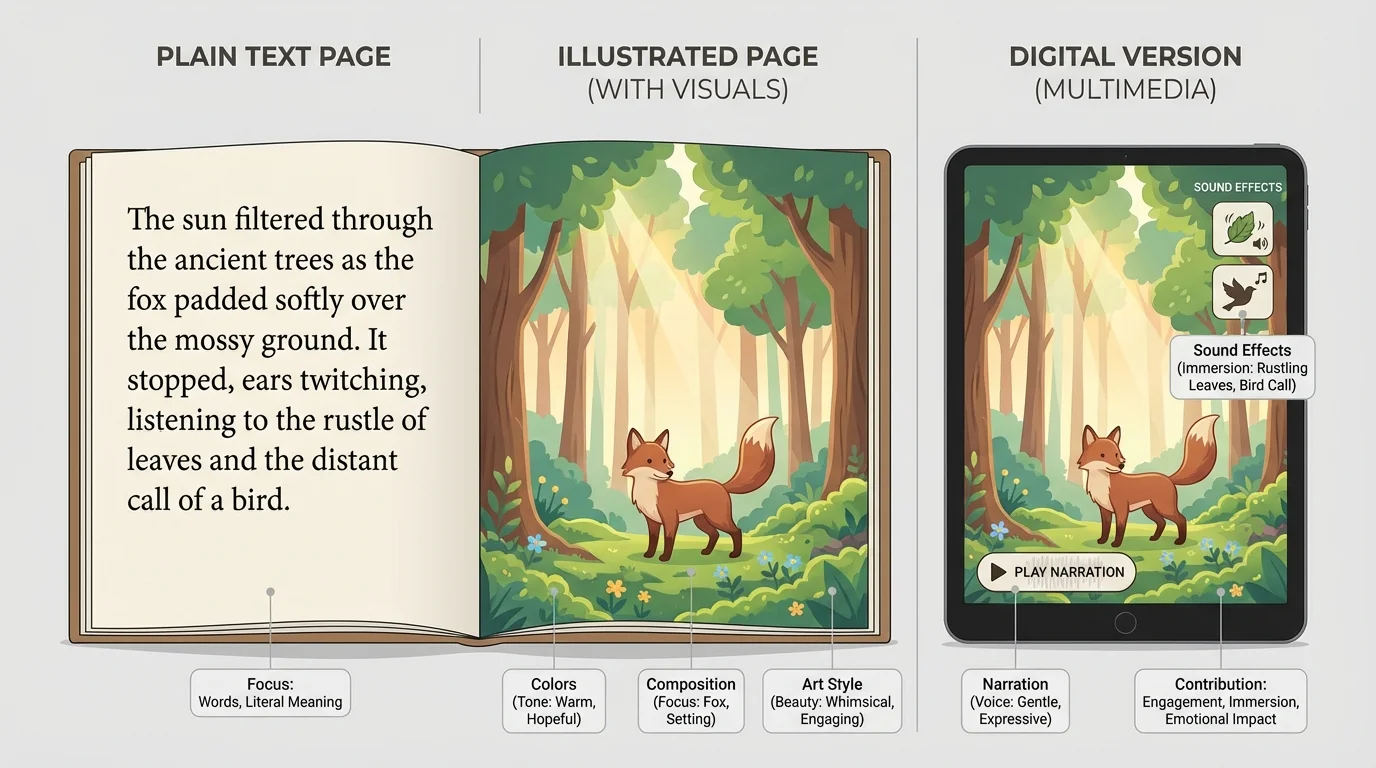
None of these versions is automatically better. Each one highlights different parts of the text. A plain version may leave more room for imagination. An illustrated version may clarify details. A multimedia version may strengthen feeling and atmosphere. Comparing them helps readers see how presentation influences meaning.
| Version | What it adds | Possible effect on the reader |
|---|---|---|
| Print text only | Focus on words and imagination | Reader creates personal mental images |
| Illustrated text | Shows setting, character expression, symbols | Reader notices visual clues quickly |
| Multimedia presentation | Adds voice, music, sound, movement | Reader feels stronger mood and pacing |
Table 1. Comparison of how different versions of the same text can shape understanding.
When students compare versions, strong answers explain both similarities and differences. You might say that all versions show the girl as brave, but the illustrated one uses bright light to make her seem hopeful, while the multimedia one uses low music to make her journey feel more dangerous. This kind of answer shows real analysis.
Later, if you return to the folktale comparison in [Figure 3], you can better explain why readers may react differently even when the words tell the same basic story. Presentation changes emphasis.
To analyze a text with visual or multimedia elements, slow down and observe carefully. Ask what you notice first. Is it a color? A sound? A facial expression? A pause in the narration? Then ask why that detail matters. How does it help tell the story, build the tone, or create beauty?
You can focus on a few major questions: What do the words say? What do the pictures or sounds add? How do the two parts work together? What feeling do they create? What details support that idea?
Good readers always use evidence. In a text with visuals or multimedia, evidence can come from the words, the images, the sounds, or the way the presentation is arranged.
Sometimes the media supports the words directly. Sometimes it adds a layer of meaning. Sometimes it even creates irony by showing something different from what the words say. For example, cheerful music played over a sad event may create a strange, unsettling effect. That contrast is part of the meaning.
Be careful not to make claims without proof. Instead of saying, "The picture is nice," say, "The warm yellow light and smiling faces create a welcoming mood." Instead of saying, "The music is cool," say, "The slow violin music makes the ending feel emotional and serious." Specific details lead to strong interpretations.
One common mistake is treating images like decorations. In literary works, they usually serve a purpose. Another mistake is focusing only on what is shown without explaining its effect. Saying "the background is dark" is only the first step. You must add, "which creates suspense and suggests danger."
A third mistake is ignoring the words. Visual and multimedia analysis should not replace reading. It should deepen reading. The strongest ideas connect both. If a myth describes a god as powerful and the image places the figure high above everyone else with lightning all around, the words and visuals support each other.
Interpretation needs connection. Noticing a detail is important, but analysis happens when you connect that detail to meaning, tone, mood, character, setting, or theme. Always move from "I see" to "This suggests."
Another mistake is assuming everyone will react in exactly the same way. Readers may respond a little differently, but good interpretations still rely on clear evidence. If you can point to the dark palette, cracked shapes, and low drumbeats, you have strong reasons for describing the tone as tense or ominous.
Consider three short examples. In a myth, a sea god may be shown rising from towering waves. The giant scale makes the god seem powerful. In a poem, a soft voice and slow pace may turn simple lines into something tender and reflective. In a graphic novel, a character's silence across several small panels may reveal worry more strongly than a speech bubble would.
These examples show an important truth: stories are not made only of words. They are also made of artistic choices. Colors, sounds, shapes, timing, and layout help readers understand what matters, what emotions are strongest, and what ideas should stay in the mind after the text ends.
When you learn to notice these elements, you become a sharper reader. You do not just follow a plot. You study how the text creates its full effect. That is how readers analyze meaning, recognize tone, and appreciate beauty across stories, folktales, myths, poems, and multimedia works.