Every day, you are surrounded by messages that want something from you. A video might want your attention. An ad might want your money. A speech might want your support. A graph might be designed to make you believe that a problem is getting bigger or smaller. The tricky part is that information does not always arrive as plain text. It may come as a chart, a photo, a podcast, a speech, a meme, or a short video. Strong readers and listeners do more than notice the message. They ask, Why was this presented this way, and what does the creator want me to think or do?
Being able to analyze information across different media helps you become a careful thinker. It helps you make better decisions, avoid being misled, and take part in discussions with confidence. This skill matters in school, but it also matters in real life when you hear campaign promises, watch product reviews, look at sports statistics, or scroll through social media.
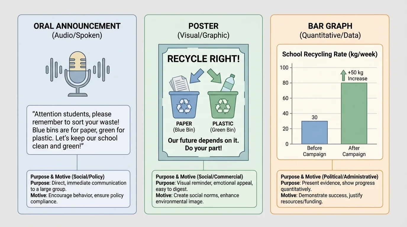
Suppose your school wants students to drink more water. The school could share that message in different ways: a morning announcement, a poster near the cafeteria, a chart showing how sugary drink use affects health, or a video with student interviews. Each version shares related information, but each one may affect you differently. One may feel serious. Another may feel exciting. Another may seem trustworthy because it uses numbers.
That is why analyzing information means looking at both what is being said and how it is being presented. The format influences the audience. A dramatic image can create emotion. A statistic can create authority. A speaker's tone can create trust or doubt.
Information appears in many forms, and the same idea can shift meaning when shown in different ways, as [Figure 1] demonstrates through one message presented as speech, poster, and graph. When you compare formats, pay attention to what each one makes easier to notice and what each one leaves out.
Visual information includes photographs, posters, diagrams, cartoons, maps, slides, and videos. Visuals often communicate quickly. A single image can create a strong feeling before you even read any words.
Quantitative information includes numbers, tables, charts, graphs, percentages, and survey results. These formats can make information seem exact and reliable, but they still require careful reading.
Oral information includes speeches, interviews, class presentations, podcasts, debates, and conversations. Oral messages depend heavily on tone, volume, pacing, and emphasis.
Many messages are actually multimedia, meaning they combine several formats at once. A news video, for example, may include spoken words, on-screen text, images, and graphs. When formats are combined, each part can strengthen the others.
Purpose is the reason a message is created. Motive is the deeper reason or goal behind it, such as making money, gaining support, helping others, or shaping opinions. Audience is the group of people the message is meant to reach.
Purpose and motive are related, but they are not exactly the same. A poster's purpose may be to persuade students to buy a snack. The motive behind that poster may be commercial, which means the seller wants to earn money. A speech about community cleanup may also persuade, but its motive may be social because it aims to improve the neighborhood.
When you analyze a message, one of the first questions to ask is, What is its purpose? Common purposes include informing, persuading, entertaining, warning, inspiring, and instructing.
A weather alert is mainly meant to warn. A documentary may be meant to inform. A campaign speech is often meant to persuade. A comedy video may entertain, but it can also influence opinions at the same time. Messages often have more than one purpose, so good analysis does not stop at the first obvious answer.
You can often figure out purpose by noticing clues. If a message includes many facts, definitions, or explanations, it may be trying to inform. If it uses emotional words, slogans, or repeated claims, it may be trying to persuade. If it uses humor, dramatic music, or surprising images, it may be trying to entertain while still delivering a message.
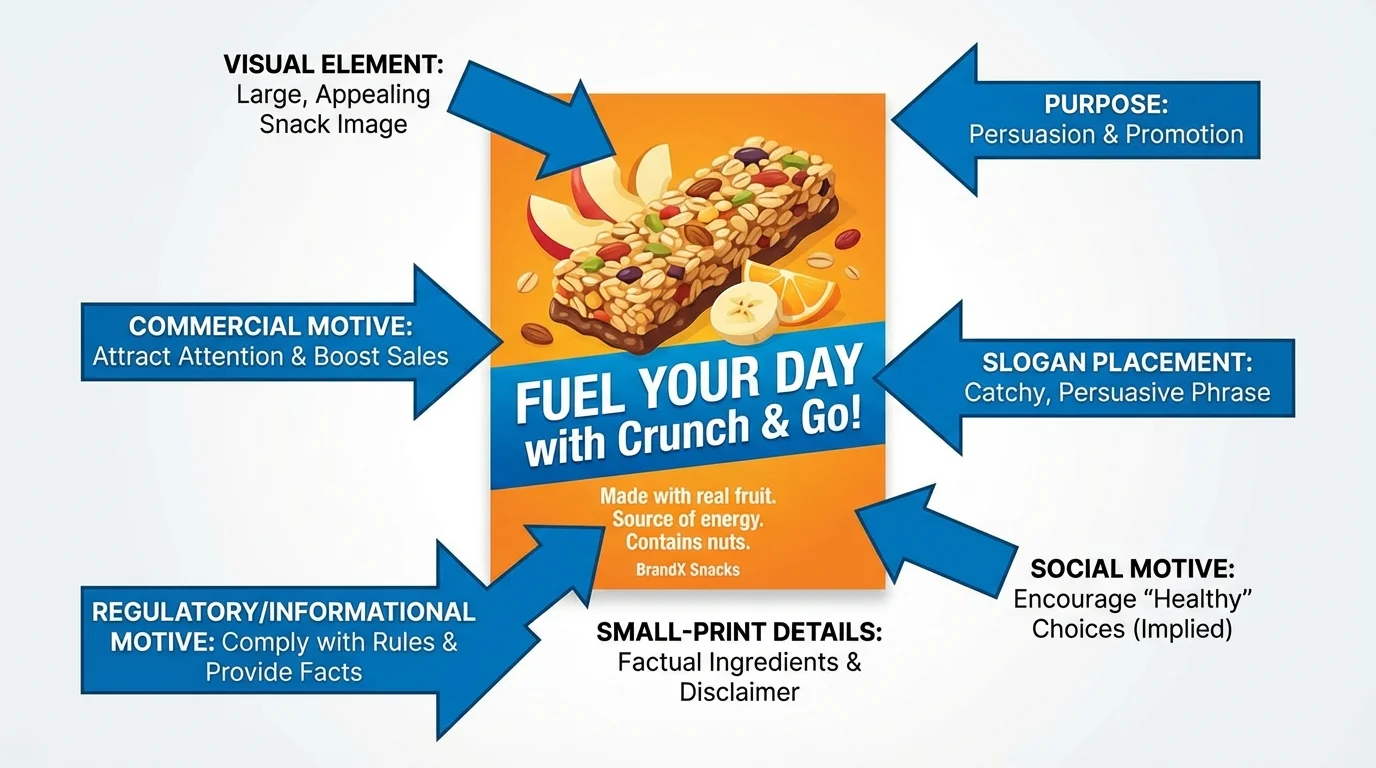
Visual messages can seem simple, but they are carefully designed. Choices about color, size, image angle, facial expressions, and layout all affect how viewers react, as [Figure 2] illustrates with a poster that guides the viewer's eyes and feelings. Looking closely at these choices helps you move beyond "I liked it" to a stronger explanation of how it works.
For example, a poster about healthy food might use bright green colors to suggest freshness and health. A fast-food ad might use close-up photos and warm colors to make food look delicious and exciting. The largest words on a poster usually show what the creator wants you to notice first. Small print may contain limits or important details that are easy to miss.
Images can also leave out context. A photo of a crowded beach might make a place look fun and popular, but it does not tell you whether the beach is usually crowded, whether the photo was taken during a holiday, or what happened outside the frame.
This is why visual analysis includes asking: What do I notice first? What feelings do the colors or images create? What details are emphasized? What details are hidden or missing?
Professional advertisers often test multiple versions of the same image or slogan to see which one gets the strongest reaction. Even tiny changes in color or wording can change how people respond.
Visuals can be powerful in school subjects too. In science, diagrams help explain systems. In history, maps help show movement and change. In health, infographics can make important facts easy to understand quickly. But even useful visuals should be checked for source, accuracy, and completeness.
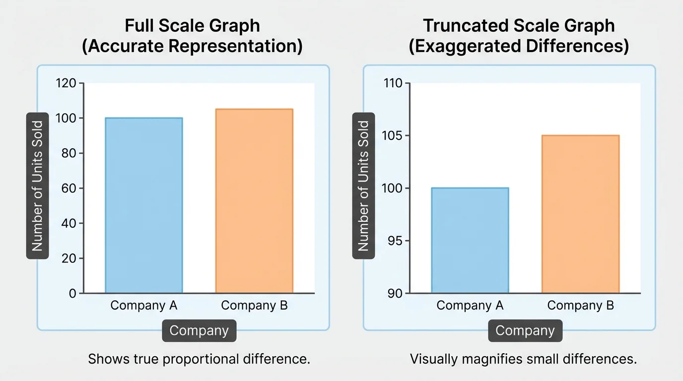
Numbers can feel solid and trustworthy, but quantitative information can still be presented in confusing or misleading ways, as [Figure 3] shows through graphs that display the same data differently. Careful readers ask not only what the numbers are, but also how they are framed.
Look closely at titles, labels, scales, and units. A graph with a vertical axis that begins above zero can make small differences look huge. A survey result may sound impressive if you are not told how many people were surveyed or who they were.
Suppose a headline says, "Test scores jumped by 50%." That sounds dramatic. But if the average score rose from \(40\) to \(60\), that is a gain of \(20\) points. The statement is not necessarily false, but the wording may be chosen to sound more exciting. Another report might say scores increased by \(20\) points. The same data can create different reactions depending on presentation.
Tables and graphs are useful because they help us compare information quickly. Still, they should be read with care.
| Question to Ask | Why It Matters |
|---|---|
| What do the labels say? | Labels tell what is actually being measured. |
| Does the graph scale start at zero? | A changed scale can exaggerate differences. |
| What are the units? | Units such as minutes, miles, or percent affect meaning. |
| How large is the sample? | A tiny sample may not represent a whole group. |
| Who collected the data? | The source may have a motive for presenting it a certain way. |
Table 1. Key questions for evaluating charts, graphs, and statistics.
When you return later to the graph examples, notice that the numbers themselves may stay the same while the visual impression changes. That is a reminder that data presentation matters almost as much as data selection.
Case study: Reading a sports statistic carefully
A student says, "Our team is way better because we scored twice as many points this week." That statement sounds convincing, but good analysis digs deeper.
Step 1: Check the actual numbers.
If the team scored \(10\) points last week and \(20\) this week, then yes, \(20\) is twice \(10\).
Step 2: Ask what changed.
Did the team play a weaker opponent? Did they have more time? Was the weather different?
Step 3: Consider what is missing.
Points scored are only one statistic. Defense, turnovers, and injuries also matter.
The statistic is useful, but it does not tell the whole story by itself.
Quantitative information becomes much stronger when it is paired with explanation. Numbers are not opinions, but the choice of which numbers to show can reveal a creator's purpose and motive.
Oral messages require careful listening because meaning is carried not only by words, but also by voice. A speaker can sound confident, doubtful, excited, worried, or sarcastic. The same sentence can mean different things depending on tone.
When listening to a speech, podcast, interview, or announcement, pay attention to tone, pacing, emphasis, and word choice. A calm speaker using evidence may seem trustworthy. A speaker who rushes, interrupts, or avoids questions may seem less reliable. That does not automatically make the speaker wrong, but it gives you clues to examine further.
Also think about credibility, which is how believable or trustworthy a source appears. Does the speaker know the topic well? Do they provide examples or evidence? Can their claims be checked? Are they sharing facts, opinions, or both?
In oral communication, repetition is often used to make ideas memorable. Political speeches, school assemblies, and advertisements repeat key phrases because repeated language sticks in the mind. Repetition can help people remember important information, but it can also push an audience toward agreement without giving enough evidence.
How listening and analysis work together
Listening closely means noticing both the message and the methods. Strong listeners track a speaker's main claim, the reasons given, and the emotional signals in the delivery. They also notice when a speaker avoids details, changes the subject, or uses loaded language to create a strong reaction.
Oral information often spreads quickly because it feels personal. A student recommendation, a public speech, or a video testimonial may feel more trustworthy than a printed chart because you hear a real voice. That is exactly why careful listeners pause and ask whether the speaker is informed, fair, and honest.
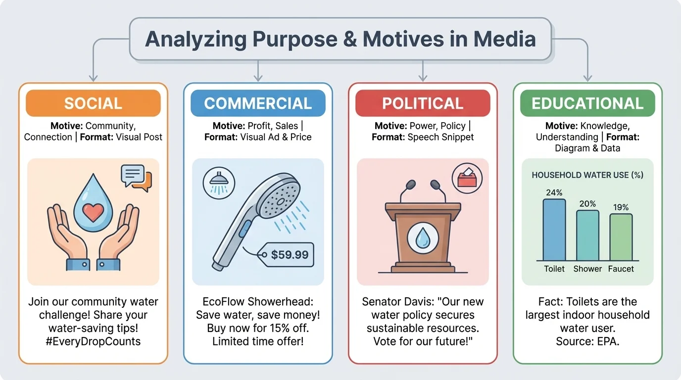
A message can have one topic but several possible motives, as [Figure 4] makes clear by showing different goals behind similar messages. Evaluating motive means asking, Why is this person or group presenting this information?
A social motive aims to influence behavior or attitudes for the good of a group or community. A campaign to reduce litter or encourage kindness may have a social motive. A commercial motive is about selling a product, service, or brand. A snack company's ad may include health language, but its main goal may still be sales. A political motive tries to gain support for an idea, policy, leader, or party.
Some messages also have educational motives, personal motives, or mixed motives. For example, a YouTuber reviewing a product might want to inform viewers, build an audience, and earn money at the same time. Motives are not always hidden in a sneaky way. Sometimes they are clear. But you should still identify them because motive influences what is emphasized and what is left out.
If you think back to the design choices discussed earlier in [Figure 2], you can see how motive shapes presentation. A commercial message may use bright colors and catchy slogans. A political message may use patriotic symbols or emotional stories. A social message may focus on fairness, safety, or community responsibility.
Case study: One topic, different motives
Consider the topic of energy drinks.
Step 1: A company advertisement says the drink helps you stay sharp and active.
The likely motive is commercial because the company wants people to buy the product.
Step 2: A health teacher explains that too much caffeine can affect sleep and heart rate.
The likely motive is educational or social because the goal is student well-being.
Step 3: A student influencer posts about a favorite brand while being paid by the company.
The post may seem personal, but there is also a commercial motive behind it.
The topic is the same, but the motives and methods are different.
Understanding motive does not mean rejecting everything. It means reading and listening with awareness. A commercial message may still contain true facts. A political message may raise an important issue. A social message may still leave out opposing views. Careful thinkers stay alert without assuming every message is false.
When you analyze information in any format, a short checklist can help. Ask: Who created this? Who is the audience? What is the purpose? What evidence is given? What emotions are being used? What may be missing?
Another important question is whether the source shows bias. Bias is a tendency to favor one side, idea, or group. Everyone has some point of view, but strong sources try to be fair and accurate. If a message only gives one side, ignores important facts, or uses loaded language, bias may be affecting the presentation.
You should also distinguish between fact and opinion. A fact can be checked. An opinion expresses a belief or judgment. A speaker might say, "The cafeteria serves pizza on Fridays." That is a fact if it can be verified. If the speaker says, "Friday pizza is the best lunch," that is an opinion. Both can appear in the same message, so careful analysis separates them.
Earlier reading skills still matter here. Summarizing, identifying main idea, finding evidence, and noticing point of view are all tools you use again when information appears in a graph, speech, image, or video.
Asking these questions helps you avoid quick reactions. Instead of saying, "This graph proves it," or "This video must be true," you learn to explain why a message seems strong or weak.
One of the best ways to understand purpose and motive is to compare messages about the same topic across formats. Imagine three sources about school start times: a principal's speech, a student-made infographic, and a company selling planners to help students manage mornings.
The principal's speech might use a calm tone and focus on scheduling, safety, and attendance. The infographic might use statistics and bright visuals to argue that later start times improve sleep. The company's ad might mention busy mornings to create a need for its product. All three discuss the same issue, but each selects information differently because each has a different purpose and motive.
This kind of comparison helps you see that information is not just a set of facts floating in space. It is shaped by choices. Those choices affect what people notice, remember, and believe.
Analyzing information becomes even stronger when you talk about it with others. In a collaborative discussion, students listen, build on ideas, and ask questions that deepen understanding. One classmate may notice a misleading graph scale. Another may notice emotional wording. Another may point out missing evidence.
Good discussion skills matter here. Listen without interrupting. Refer to specific evidence. Ask clarifying questions such as, "What makes you think the motive is commercial?" or "Which part of the graph seems misleading?" When you disagree, explain your reasoning respectfully.
Discussion is not just about speaking. It is also about adjusting your thinking when someone presents a stronger interpretation. If a classmate points to a detail you missed, that is not losing the argument. That is learning.
"The important thing is not to stop questioning."
— Albert Einstein
Careful discussion also protects against snap judgments. A single person may miss context, but a group can test ideas together. That is why listening is part of analysis, not separate from it.
Being a critical thinker does not mean being negative about everything. It means being alert, fair, and thoughtful. You do not have to reject a message just because it has a motive. Nearly every message has one. The goal is to understand the message more clearly.
As you work with visuals, numbers, and spoken information, keep returning to the same core ideas: purpose, audience, evidence, and motive. Notice how presentation affects response. Notice what is emphasized and what is missing. Notice whether the source deserves trust.
When you practice these habits, you become better at understanding the world around you. You become harder to mislead, better at discussion, and stronger at making evidence-based judgments in school and beyond.