A surprising truth about presentations is that people often remember the picture before they remember the sentence. Think about a weather report, a sports recap, or a science video: the map, chart, or image helps your brain organize what you hear. In a formal presentation, multimedia is not just decoration. It helps the audience understand your ideas faster, remember them longer, and see which points matter most.
When you present a topic, you usually want your audience to believe, learn, or understand something. Maybe your claim is that school gardens improve student health. Maybe your findings show that recycling at your school increased by a certain amount. Maybe your most important point is that one change can make a big difference. Multimedia components such as slides, images, audio clips, graphs, charts, and short videos can make those ideas clearer when they are chosen carefully.
Good presenters do not add visuals just because they can. They choose visuals that support the message. A strong visual helps the audience answer questions such as: What is the evidence? What changed? What matters most? What should I notice first?
A multimedia presentation uses more than one way to communicate. It may combine spoken words with pictures, charts, short video, sound, or text on slides. The goal is to help the audience understand information more clearly than words alone can.
Visuals are especially helpful because they can organize information quickly. A bar graph can show which category is largest. A timeline can show the order of events. A photograph can help the audience see a real problem or a real result. A short audio clip can let listeners hear a bird call, a speech, or the sound difference between quiet and noisy spaces.
Why visuals improve understanding
People take in information through both sight and hearing. When the spoken explanation and the visual support each other, the audience has two paths to understanding. This works best when the visual is simple, accurate, and directly connected to what the speaker is saying.
Multimedia also helps emphasize important information. If you say, "Our survey found that most students want later recess," that is useful. But if you show a graph where one bar is much taller than the others, the audience sees the difference immediately. The visual makes the main point stand out.
To use visuals well, you need to know what you are trying to support. A claim is a statement you want your audience to accept. For example, "Reading for 20 minutes a day improves vocabulary" is a claim. A claim should be backed by reasons and evidence.
Findings are the results of research, observation, surveys, interviews, or experiments. If students recorded how many books they finished over a month and compared that with time spent reading, the patterns they discovered would be findings.
A salient point is the part that matters most. It is the key idea the audience should remember. In a presentation with lots of information, multimedia helps highlight the salient point so it does not get lost.
Claim means a statement or position a speaker wants to prove.
Findings means the information or results discovered through research or observation.
Salient point means the most important detail or main takeaway.
Suppose a student presents the topic of sleep and school performance. The claim might be that middle school students need more sleep than many of them get. The findings might come from a sleep log or survey. The salient point might be that students who slept at least 8 hours reported feeling more focused in class. A simple chart would make that key finding much clearer than a long paragraph of numbers read aloud.
Presenters can choose from many kinds of media. Each kind has a special strength. A photo shows what something looks like. A chart compares amounts. A graph shows change or trends. A diagram explains parts or steps. A video captures movement or real-life action. Audio helps when hearing something matters. Physical objects, models, or posters can also work as visual supports in live presentations.
Slides are often used because they can hold several kinds of media together. One slide might include a title, a picture, and one important statistic. Another might show a graph with a short label. Slides should support the speech, not replace it.
Not every presentation needs every kind of media. In fact, using too many kinds at once can confuse the audience. A clear presentation usually uses only the media that truly help explain the topic.
Professional speakers often spend more time cutting extra material than adding new material. The strongest presentations are usually the clearest, not the busiest.
For example, a presentation about water pollution might use a map to show where the river is, a photo to show litter along the bank, and a graph to show changes in water quality over time. Those three visuals do different jobs, so each one earns its place.
Different kinds of evidence need different visual displays, as [Figure 1] shows through a comparison of visual choices. If you want the audience to compare amounts, a bar graph works well. If you want them to notice change across time, a line graph is often better. If you want to show the order of events, a timeline helps. If you want to explain how something is built or how a process works, a diagram may be best.
A good rule is this: choose the visual that makes the main idea easiest to notice. If your point is that one category is much larger than the others, a bar graph may be clearer than a table full of numbers. If your point is that a machine has several parts, a labeled drawing may be clearer than a paragraph of description.
Photographs are useful when seeing the real object or situation matters. They can create interest and give proof that something is real. But a photo should still connect to the message. A random picture that "looks nice" does not help clarify a claim.
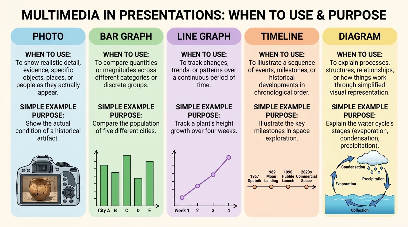
Think about a presentation on cafeteria waste. If the student wants to show that more plastic forks are thrown away than spoons or trays, a bar graph is a strong choice. If the student wants to show that waste changed from September to December, a line graph is better. If the student wants to explain what items can be composted, a labeled diagram or photo set may be best.
Later, when you are checking whether your evidence matches your purpose, [Figure 1] remains useful because it reminds you that visual displays are tools with different jobs. The right tool makes the message sharper.
| Visual Type | Best Use | Example |
|---|---|---|
| Photo | Show a real object, place, or condition | Litter near a stream |
| Bar graph | Compare categories | Favorite school lunch choices |
| Line graph | Show change over time | Weekly reading minutes across a month |
| Timeline | Show sequence or history | Steps in the civil rights movement |
| Diagram | Explain parts or process | How recycling is sorted |
| Audio clip | Let the audience hear evidence | Birdsong in different habitats |
| Short video | Show action or behavior | How a robot arm moves |
Table 1. A comparison of common visual types and the kinds of information they explain best.
The way a slide looks changes what the audience notices first, as [Figure 2] illustrates through the contrast between a cluttered slide and a focused one. If the slide is crowded with tiny text, wild colors, and too many images, the audience may stop listening and start trying to decode the screen. Good design guides attention instead of fighting for it.
Use short headings that state the point clearly. Instead of a title like "Data," write something more helpful, such as "Plastic bottle waste dropped after refill stations were added." That title already tells the audience what the evidence means.
Keep text limited. Slides are not scripts. If you place an entire paragraph on the screen and then read it word for word, the audience has to choose between reading and listening. Most of the time, a few words, labels, or bullet points are enough.
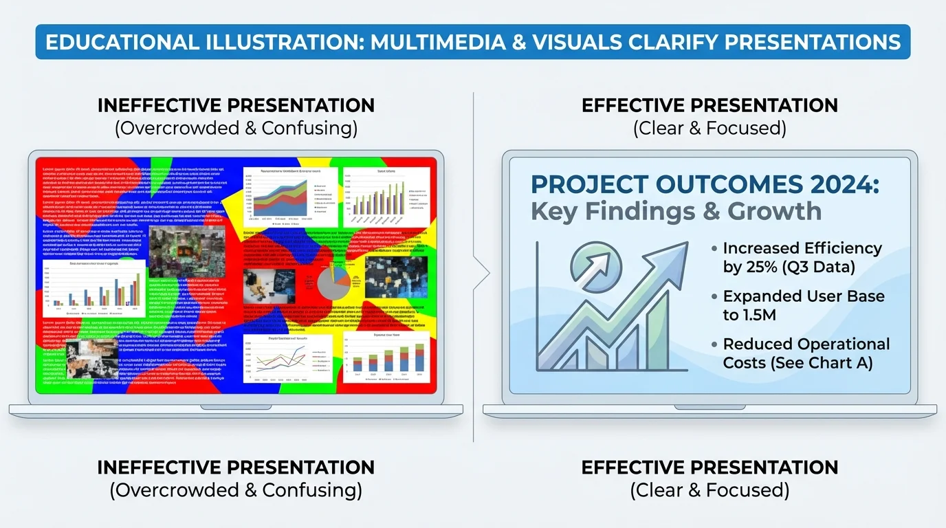
Readable design also matters. Use large fonts, clear labels, and strong color contrast. Dark text on a light background or light text on a dark background is easier to read than weak color combinations. Avoid backgrounds with busy patterns behind important text.
Honesty matters just as much as neatness. A graph should not trick the audience. Labels should be accurate. Images should match the facts. If a chart leaves out important information or uses distorted scale, it can mislead people even if it looks impressive. A presentation should make ideas clearer, not more confusing.
Example: improving a weak slide
A student creates a slide about school energy use with eight bullet points, two clip-art pictures, and a graph with no labels.
Step 1: Decide the main point.
The student chooses one clear idea: classroom lights are often left on when rooms are empty.
Step 2: Remove extra material.
The student cuts the eight bullet points down to three short points and removes decorative clip art.
Step 3: Fix the evidence.
The student adds labels to the graph and includes a photo of an empty classroom with lights on.
Step 4: Use a message title.
The title becomes "Empty classrooms waste electricity."
The slide now supports the speech instead of distracting from it.
When you review your slides later, [Figure 2] helps you remember an important question: does the design direct the viewer to the one idea that matters most?
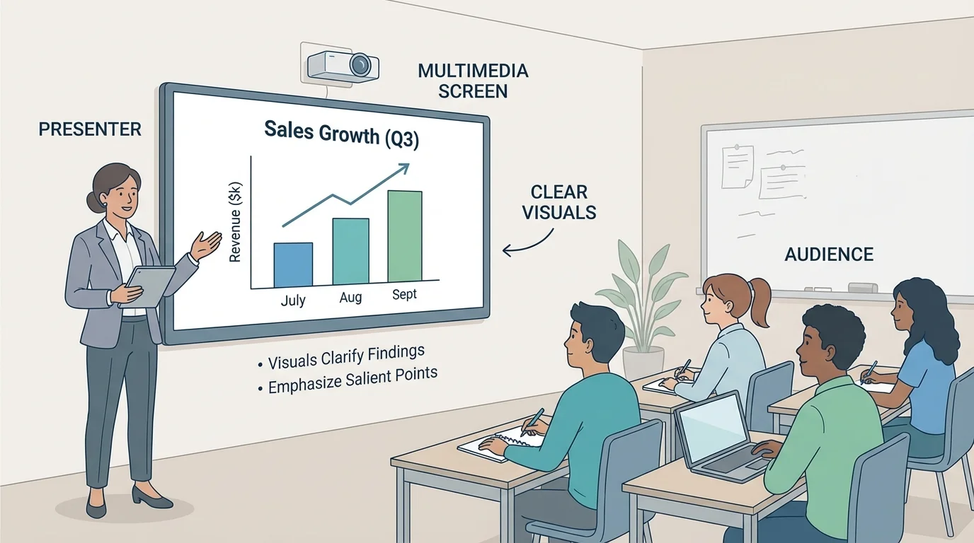
Even strong visuals can fail if the speaker uses them poorly. During a formal presentation, the speaker needs to balance the screen and the audience, as [Figure 3] shows. The audience came to hear you explain the ideas. The visual is support, not the star of the show.
Face the audience as much as possible. Glance at the screen if needed, but do not spend the whole time turned around reading from it. If you point to a graph or image, do it briefly and clearly. Then return your attention to the listeners.
Transitions matter too. Introduce a visual before or as it appears. Tell the audience what to look for. For example: "This graph compares the amount of food waste in each grade. Notice that seventh grade has the highest amount." That sentence prepares the audience to focus on the right detail.
Timing also matters. Do not leave a complicated visual on the screen too briefly. Give people time to look. At the same time, do not leave old slides up while you move to a new idea. Match the visual to the moment in your speech.
Technology should be checked before the presentation. Make sure videos play, audio volume works, and file types open correctly. If internet access is needed, test it ahead of time. Skilled speakers also have a backup plan, such as screenshots, printed notes, or a saved copy on another device.
Good delivery techniques still matter when media is involved: speak clearly, maintain eye contact, pace yourself, and use expression in your voice. Multimedia supports delivery; it does not replace it.
Later in the presentation, if you return to a chart or image to make a comparison, [Figure 3] still reminds you that your connection with the audience comes first. The best speakers guide attention without disappearing behind the screen.
One common mistake is visual clutter. This happens when a slide or display has too many elements competing for attention. Too much text, too many colors, or too many images can make the important point harder to find.
Another mistake is choosing a visual that does not really fit the information. A pie chart with too many tiny sections is hard to read. A blurry image does not provide strong evidence. A long video clip can take over the presentation and leave too little time for speaking.
Some presenters use media as filler because they are nervous. They may think more slides make them look more prepared. Usually, the opposite is true. If every sentence has its own slide, the presentation can feel rushed and fragmented. Fewer, stronger visuals are often more effective.
"The purpose of a visual is not to impress the audience. It is to help the audience understand."
Another mistake is forgetting the audience. Small text may look fine on a laptop screen but not from the back of the room. Fast transitions may be hard to follow. Background music might seem interesting, but it can make it harder for listeners to focus on the speaker's words.
Consider a science presentation on local weather. A student claims that the town had a wetter spring this year than last year. A line graph showing rainfall by month would help reveal the trend. A photo of flooded sidewalks could add a real-world connection, but the graph would still be the stronger visual for proving the claim.
Now consider a history presentation about an important reform movement. If the student wants to explain how events happened in order, a timeline is more useful than a random set of pictures. If the student wants to show where events took place, a map would be better.
For a community issue presentation about traffic near school, a student might use a map of busy intersections, a bar graph of car counts at different times, and a short video of the drop-off line. Each visual would support a different part of the message. Together, they would clarify the findings and make the most important problem easy to notice.
Case study: presenting survey results about homework time
A group surveys students in grades 6 through 8 about nightly homework time.
Step 1: State the claim.
The group claims that homework time increases by grade level.
Step 2: Choose the best visual.
They select a bar graph because they are comparing three groups.
Step 3: Highlight the salient point.
They use a title such as "Eighth graders report the most homework time."
Step 4: Explain the visual aloud.
They tell the audience what the bars show and what conclusion can reasonably be drawn from the survey.
The result is clear, focused, and easy for the audience to follow.
These examples show that multimedia choices depend on purpose. The same topic can be presented in different ways, but the best choice is the one that makes the message easiest to understand and remember.
Strong presenters think about all audience members, including those who may have trouble seeing small text, hearing audio clearly, or processing crowded visuals. This is called accessibility. Accessible presentation design helps more people understand the message.
Use large enough font sizes, clear contrast, and simple layouts. If you include a video, captions can help viewers follow the content. If you use audio, briefly explain what the audience is hearing and why it matters. If you show a graph, say the important pattern aloud instead of expecting everyone to read it instantly.
Accessibility also includes language choice. Clear, direct words help the audience understand without extra effort. If you need a specialized term, explain it. A presentation is not stronger because it sounds complicated. It is stronger when the audience can follow the ideas confidently.
When multimedia components and visual displays are chosen with care, they do more than make a presentation look polished. They help prove claims, reveal findings, and focus attention on the ideas that matter most. That is what makes a formal presentation effective: the speaker, the evidence, and the visuals all work together.