A single topic can appear completely different depending on how it is presented. A photo might show a crowded beach covered with trash. A graph might show that waste on that beach increased from one month to the next. A speaker might describe how the pollution affects sea animals. None of those sources tells the whole story alone. But together, they help us understand the topic more deeply. Learning to interpret information in many forms is one of the most powerful ways to become a stronger reader, listener, speaker, and thinker.
When you study a topic or issue, information may come from words on a page, numbers in a chart, pictures in a diagram, or ideas spoken aloud in a presentation. Good learners do more than notice these details. They figure out what each source is saying, how reliable it seems, and how it adds to the whole picture.
People choose different formats because each one does something well. A paragraph can explain ideas step by step. A chart can organize details so they are easy to compare. A graph can make patterns visible quickly. A recording or speech can communicate emotion, emphasis, and urgency. A map can show location and distance better than a long paragraph can.
Think about weather reports. A written article may explain why a storm formed. A weather map may show where it is moving. A bar graph may show rainfall totals. A meteorologist speaking on video may warn people which areas are in danger. Each format contributes something important.
Interpret means to explain the meaning of information by thinking carefully about what it shows, says, or suggests.
Medium is the way information is delivered, such as print, audio, video, image, or digital media.
Format is the specific form information takes within a medium, such as a chart, table, speech, photograph, interview, or diagram.
Evidence is the information that supports an idea, claim, or conclusion.
When you interpret information well, you ask questions such as: What is the main idea? What details support it? Why was this format chosen? What can I learn from this source that I might miss in another one?
Interpreting is more than just noticing what is there. It includes reading closely, listening carefully, observing details, and making meaning from them. If you look at a line graph, for example, you do not just see lines rising and falling. You ask what those changes mean. If you hear a speaker describe a problem, you listen not only for facts but also for the speaker's tone and point of view.
Suppose you are studying water use. A text may explain that saving water is important during droughts. A table may list how many gallons different activities use. An oral presentation may include a student explaining why shorter showers matter. Interpreting means understanding each source and then explaining how each one contributes to your understanding of water conservation.
Contribution to understanding means the special way a source helps you learn about a topic, text, or issue. One source may provide facts, another may show patterns, and another may add personal experiences or emotional impact. Strong interpretation identifies not only what a source says, but also what role it plays in the larger study.
A source may contribute by clarifying a difficult idea, giving numerical evidence, showing a process, adding a personal voice, or revealing how people feel about an issue. This is especially important when you collaborate with others, because clear discussion depends on being able to explain what each source adds.
You may see information in many forms. Visual formats include photographs, illustrations, diagrams, maps, timelines, and videos. Quantitative formats include tables, charts, graphs, and numerical data. Oral formats include speeches, discussions, interviews, podcasts, and presentations.
Each format has strengths. Visuals make spatial relationships and physical details easier to understand. Quantitative information makes size, amount, and change easier to measure. Oral information helps listeners hear emphasis, emotion, and explanation in a speaker's voice.
Sometimes a single source includes more than one format. A science presentation might include spoken explanation, slides with diagrams, and a graph showing results. In that case, you interpret not just one form of information, but how the forms work together.
[Figure 1] Visual information can communicate a lot in a short amount of time. A photograph may capture what a place looks like. A map may show where problems are located. A diagram may label parts or categories. Visuals often help readers notice relationships, structure, and change.
For example, if you are studying a community park, a photo might reveal litter near benches, a map might show that trash gathers most near the playground, and a labeled diagram might sort the trash into paper, plastic, and food waste. These visuals do not repeat the exact same information. Each one contributes something new.
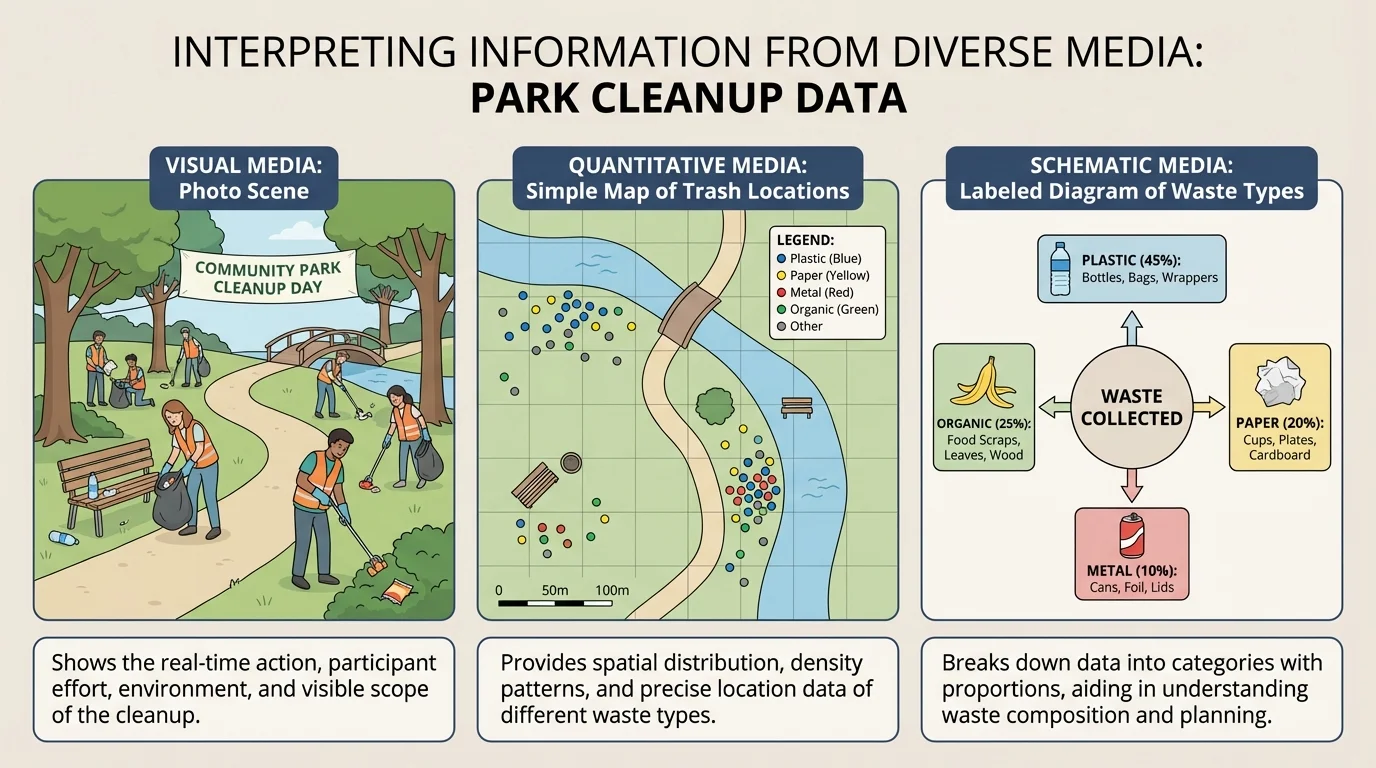
To interpret a visual well, pay attention to labels, titles, captions, colors, symbols, and scale. On a map, color may show areas of higher risk or heavier use. On a timeline, spacing may help show the order of events. On a diagram, arrows may reveal direction or process.
A common mistake is to look quickly and assume you understand. Good interpretation slows down. Ask: What does this image show clearly? What does it leave out? Is it giving facts, creating emotion, or both? Later, when comparing sources, you may return to the same idea we saw in [Figure 1]: different visuals about one topic often reveal different kinds of details rather than repeating one message exactly.
Graphs, maps, and diagrams are not just decorations. In many textbooks, they carry important information that never appears in the paragraph text, so skipping them can mean missing part of the lesson.
Captions matter too. A photo without a caption may leave you guessing. A strong caption explains who, what, when, or why the image matters. When a visual and its caption work together, interpretation becomes much easier.
[Figure 2] Quantitative information uses numbers to describe amounts, change, and comparison. This kind of information often appears in tables, bar graphs, line graphs, pie charts, and measurement data.
Imagine that a school tracks the amount of paper recycled each week. A written sentence might say recycling increased over the month. A bar graph, however, can show exactly how much the amount changed from week to week. If the bars rise from week 1 to week 4, you can quickly see the pattern of growth.
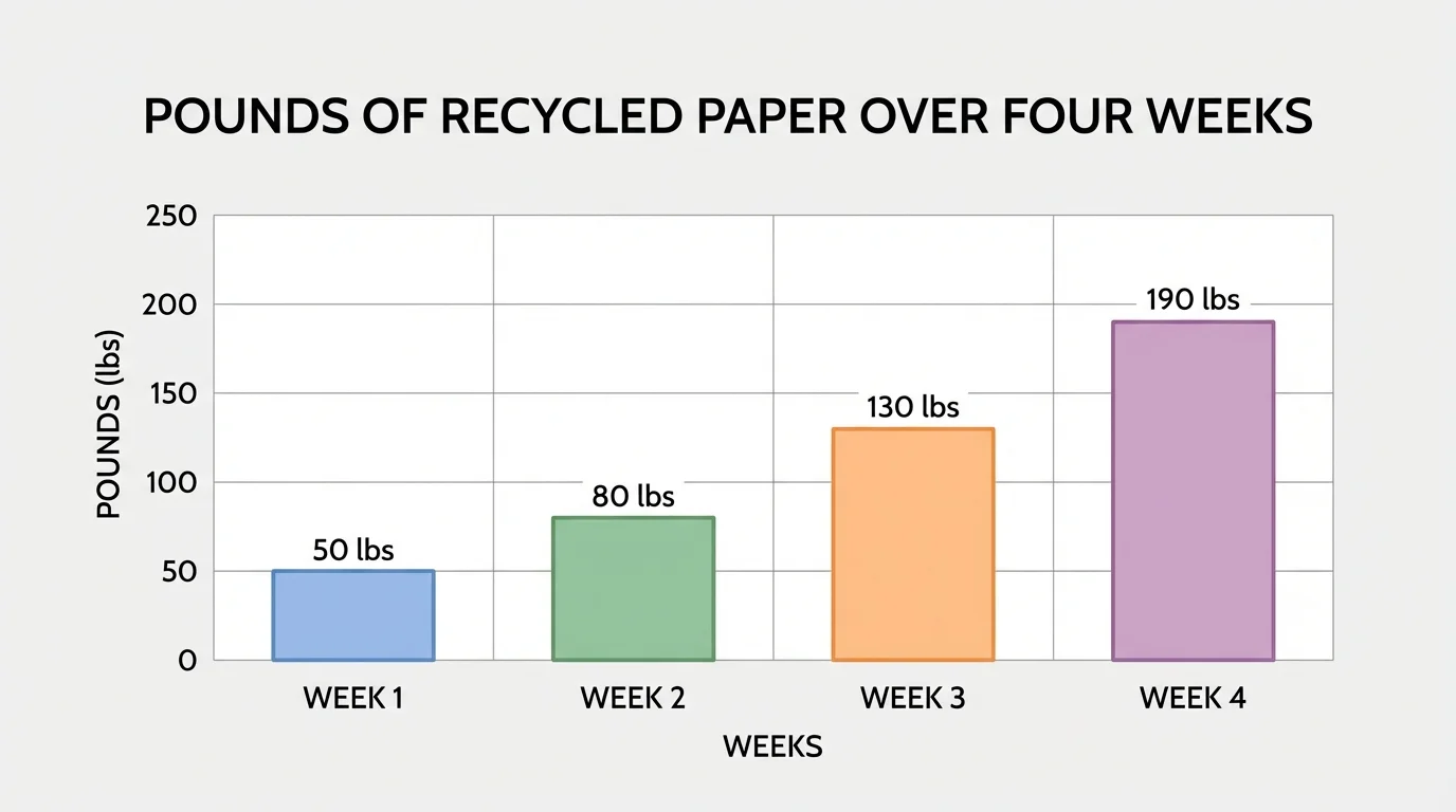
To interpret quantitative information, read the title first. Then look at the labels on both axes or headings in a table. Make sure you notice the unit, such as pounds, hours, students, or gallons. Without the unit, numbers can be misleading.
Suppose a table shows that one classroom recycled \(18\) pounds of paper, another recycled \(24\), and another recycled \(30\). From this, you can compare quantities directly. You can also describe change. The increase from \(18\) to \(30\) is \(30 - 18 = 12\). That tells you that the class with the highest amount recycled \(12\) more pounds than the class with the lowest amount.
Numbers are powerful because they can support or challenge a claim. If someone says, "Everyone at school is recycling a lot more now," data can help test that statement. If the graph stays nearly flat, the claim may be exaggerated. If the graph rises sharply, the data may support the claim. This is why the pattern shown earlier in [Figure 2] matters: it helps the viewer move from opinion to evidence.
Example: Interpreting a simple table
A table shows the number of library visitors on three days: Monday \(45\), Tuesday \(52\), and Wednesday \(40\).
Step 1: Identify the highest and lowest values.
The highest number is \(52\) on Tuesday, and the lowest is \(40\) on Wednesday.
Step 2: Compare them.
The difference is \(52 - 40 = 12\).
Step 3: Explain the contribution.
The table contributes exact numerical evidence. It does not just say Tuesday was busier; it proves by how much.
Be careful with scales. If a graph's vertical axis starts at \(50\) instead of \(0\), small changes may look huge. That does not always mean the graph is wrong, but it does mean the reader needs to pay close attention.
Oral information comes through speaking and listening, and [Figure 3] highlights that listeners learn not only from the words themselves but also from tone, pace, and emphasis. Oral sources include class presentations, speeches, interviews, news reports, debates, and conversations.
When a person speaks, the meaning is shaped by how the words are delivered. A speaker may slow down to stress an important point. A serious tone may signal concern. A lively voice may communicate excitement or urgency. In an interview, the way a person answers may reveal feelings that are not visible in a written transcript.
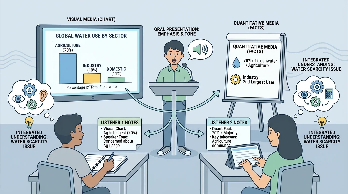
Interpreting oral information requires active listening. That means focusing on the speaker, noticing key points, and deciding which details are evidence and which are opinions. Good listeners also think about the speaker's purpose. Is the speaker informing, persuading, warning, or entertaining?
Listening also includes noticing point of view. Two people may talk about the same issue but emphasize different parts of it. One student speaking about school lunch waste may focus on cost. Another may focus on the environment. Neither source should automatically be accepted without thought. The listener should ask what evidence supports each view.
As the listening scene in [Figure 3] suggests, taking notes helps you separate major ideas from extra details. Writing down a few phrases, numbers, or examples can make later discussion much clearer.
When you listen to a presentation, you are not expected to remember every word. Focus on the main idea, the strongest supporting details, and any evidence the speaker uses.
Oral information is especially important in collaboration. In group work, students share ideas aloud, respond to each other, and build understanding together. Interpreting spoken information carefully helps everyone stay on topic and use evidence well.
Often, the best understanding comes from combining sources. A text may explain the background of an issue. A graph may show the data. A speech may explain why people care. When these sources agree, they strengthen one another. When they differ, they raise important questions.
Suppose you are studying whether students get enough sleep. A health article may explain why sleep matters. A survey chart may show how many hours students report sleeping. A student interview may reveal that homework and sports make bedtime difficult. Together, these sources give a fuller picture than any one of them alone.
This process is called synthesizing information. When you synthesize, you bring ideas together from different sources and formats to form a clearer understanding. You do not just list facts from each source. You connect them.
Comparing across formats means asking how sources are similar, different, and connected. A graph may support a speaker's claim, a photograph may add emotional impact to a news report, or an interview may explain reasons behind a trend shown in data. Strong interpretation depends on seeing these connections clearly.
Sometimes one source fills a gap left by another. A chart may show that absenteeism rose in winter, but it may not explain why. An interview with the school nurse may suggest that flu season played a role. A weather report may add further evidence. Good learners notice these relationships.
Understanding information from different formats also helps you speak and work with others more effectively. If you present on a topic, you should choose the format that best fits your purpose. A graph may be better than a long explanation when you want to show a trend. A diagram may be better when you want to explain parts of a machine or stages in a process.
When collaborating, students should listen respectfully, ask useful questions, and refer to evidence. Instead of saying, "I just think this," you can say, "The graph shows this pattern," or "The speaker explained that problem in the interview." That makes discussion stronger and more focused.
| Strategy | How it helps |
|---|---|
| Listen for main ideas | Helps you identify the most important message in a speech or discussion |
| Study titles and labels | Helps you interpret graphs, charts, and diagrams correctly |
| Ask clarifying questions | Helps fill in missing information and avoid misunderstanding |
| Take brief notes | Helps you remember evidence from oral and visual sources |
| Compare sources | Helps you see whether different formats support or challenge one another |
Table 1. Presentation and collaboration strategies for interpreting and discussing information from diverse formats.
Presenters also need to explain how their evidence connects to the topic. Showing a graph is not enough by itself. A strong presenter tells the audience what the graph means. Playing a short audio clip is not enough by itself. A strong presenter explains why the clip matters.
One common mistake is assuming that every source is equally complete. A photo may be powerful, but it may show only one moment. A speaker may sound confident, but confidence is not the same as proof. A graph may seem impressive, but if the labels are unclear, its meaning may be uncertain.
Another mistake is confusing fact with opinion. "The cafeteria is too noisy" may be an opinion. "The sound level measured \(85\) decibels during lunch" is quantitative evidence. Both may matter, but they do not work in the same way.
A third mistake is focusing on only one format. If you ignore visuals, you may miss patterns. If you ignore oral details, you may miss tone and emphasis. If you ignore numbers, you may miss the evidence that supports a claim.
"The medium is part of the message."
— A key idea in media literacy
Careful interpreters ask questions, check details, and explain why a source matters. They do not stop at "I saw it" or "I heard it." They keep going until they can explain what the information contributes.
[Figure 4] Consider a school trying to decide whether to improve its recycling program. The issue can be understood through several formats. An overflowing-bin poster image might show the problem clearly. A data table might list how much paper and plastic is thrown away each week. A student speech might explain why recycling matters to the school community.
The visual source contributes immediate evidence of what the problem looks like. Students can see that some bins are full while others are barely used. This can reveal placement problems or confusion about which materials belong where.
The quantitative source contributes exact measurements. If the table shows that the school throws away \(120\) pounds of paper in one week and recycles only \(45\) pounds, that comparison gives the issue numerical weight. The difference is \(120 - 45 = 75\) pounds, which helps listeners understand the size of the problem.
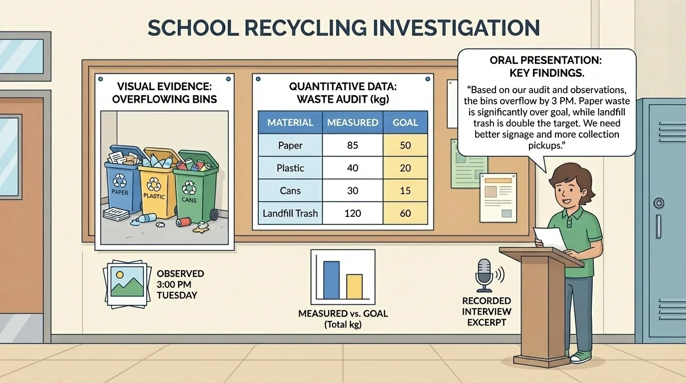
The oral source contributes explanation and perspective. A student speaker may describe how confusing bin labels cause mistakes or how a new campaign could improve results. Spoken words can make the issue feel immediate and important to the audience.
Looking back at the combined-source investigation, it becomes clear that no single format is enough. The image shows the problem, the data measures it, and the speech explains why action matters. Together, they support better decisions.
Case study: Explaining source contribution
A student says, "Our school should add more recycling bins."
Step 1: Use a visual source.
A photo shows students placing recyclable items into regular trash because the nearest recycling bin is far away.
Step 2: Use a quantitative source.
A chart shows that only \(3\) recycling bins serve an area used by \(200\) students during lunch.
Step 3: Use an oral source.
Student interviews reveal that many students want to recycle but are unsure where bins are located.
Step 4: Explain the contribution of each.
The photo makes the problem visible, the chart provides measurable evidence, and the interviews add student perspectives. Together they create a stronger argument.
Whether you are reading, watching, listening, or discussing, your goal is the same: understand the message and explain how each source helps build meaning. That skill matters in every subject, from science and history to language arts and daily life.