One of the fastest ways to lose an audience is to make them listen to a long explanation with nothing to look at. One of the fastest ways to confuse them is to show too much at once. Strong presenters know a powerful secret: the best presentations do not just tell information. They show it in smart ways. A well-chosen picture, graph, sound clip, or chart can help an audience understand a big idea much faster than words alone.
When you give a presentation, you are doing more than reading facts. You are helping listeners build meaning in their minds. That is why multimedia matters. Multimedia means using more than one type of communication, such as spoken words, pictures, graphics, music, sound, charts, or video. In a presentation, these tools should make information clearer, not just make the slides look exciting.
A strong presentation is like a team. Your voice gives explanation and energy. Your visuals give support. Your audio, if you use it, can provide evidence or mood. When all of these parts work together, the audience can focus, understand, and remember more.
People learn in different ways. Some understand best by listening. Others understand best by seeing a picture, a map, or a diagram. Most people learn best when they can hear an explanation and see a clear visual at the same time. Multimedia helps connect these different ways of learning.
It also helps with complex information. If you are explaining how a tornado forms, a labeled diagram may make the process easier to understand. If you are presenting data from a class survey, a bar graph can make the results easier to compare. If you are sharing a speech about protecting oceans, a short sound clip of waves or a photo of plastic pollution may help the audience connect emotionally to the topic.
But helpful does not mean flashy. A presentation filled with spinning text, loud music, and random pictures may feel exciting for a moment, yet it often makes the main idea harder to follow. The goal is always clarity. Every media choice should answer one question: How does this help the audience understand?
Visual display is anything the audience looks at to understand information in a presentation, such as a slide, chart, graph, map, diagram, or labeled image.
Graphic is a visual design element, such as an icon, symbol, chart, or diagram, used to explain or organize ideas.
Audience means the group of people listening to and watching a presentation.
Good presenters think about their audience before choosing visuals. Students in your class may need larger text, simpler charts, and direct explanations. A group of younger children would need even simpler visuals. A group of adults might understand more detailed graphs. Effective presenters adjust their choices so the information matches the people in the room.
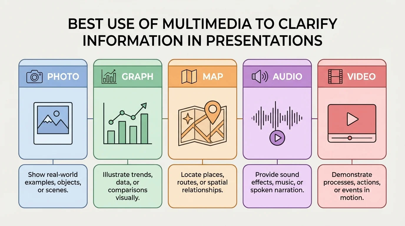
Different kinds of media serve different purposes, as [Figure 1] shows through common presentation tools and their best uses. A photo can help the audience see a real object or place. A diagram can show parts of something. A graph can compare amounts. A map can show location. Audio can let the audience hear a voice, a sound in nature, or a piece of music. A short video clip can show movement or change over time.
For example, suppose your topic is volcanoes. A photograph shows what a volcano looks like. A diagram shows the inside parts, such as the magma chamber and vent. A map shows where volcanoes are located around the world. A short video shows an eruption in motion. Each type of media adds a different kind of understanding.
Presenters also use text as part of a visual display. Titles, labels, and short bullet points help guide the audience. However, slides should not become full pages of writing. If the audience is busy reading a paragraph on the screen, they are no longer listening closely to the speaker.
Another useful type of media is a chart or table. These are especially helpful when the audience needs to compare information. For example, if you are presenting different types of renewable energy, a table can quickly compare solar, wind, and hydroelectric power.
| Media Type | Best Use | Example |
|---|---|---|
| Photo | Show what something looks like | A picture of a desert ecosystem |
| Diagram | Show parts or structure | Layers of the Earth |
| Graph | Show data and comparisons | Class survey results |
| Map | Show location | Route of westward expansion |
| Audio | Let audience hear evidence | A speech excerpt or nature sounds |
| Video | Show motion or process | How a machine works |
Table 1. Common types of multimedia and the kind of information each one helps explain.
As you continue planning a presentation, it helps to remember the comparison in [Figure 1]. If your information is mostly about place, use a map. If it is mostly about numbers, use a graph. If it is mostly about appearance or emotion, a strong image may work best.
The most important rule is match the media to the message. Do not add a picture just because the slide looks empty. Do not add music just because silence feels awkward. Every choice should support the point you are making.
If you are giving an informative presentation, use media that explains facts clearly. That might include labeled diagrams, maps, charts, or timelines. If you are giving an opinion presentation, you can still use facts, but you may also choose images that help the audience understand why the issue matters. For instance, a presentation about saving local parks might include before-and-after photos of clean and littered spaces.
A helpful way to think about media choices is to ask these questions:
Sometimes the best choice is to use no extra media at all on a particular point. Not every sentence needs a visual. Strong presentations have balance. Too many visuals can feel crowded, and too few can feel flat.
Purpose over decoration
Multimedia is most effective when it has a job to do. A chart might reveal a pattern. A photo might provide evidence. A sound clip might let the audience hear something they could not imagine from words alone. When media is used only as decoration, it often competes with the speaker instead of helping the message.
This is why good presenters often plan their speech and their visuals together. They decide where the audience will most need support. Then they choose one useful visual for that moment instead of filling every slide with effects.
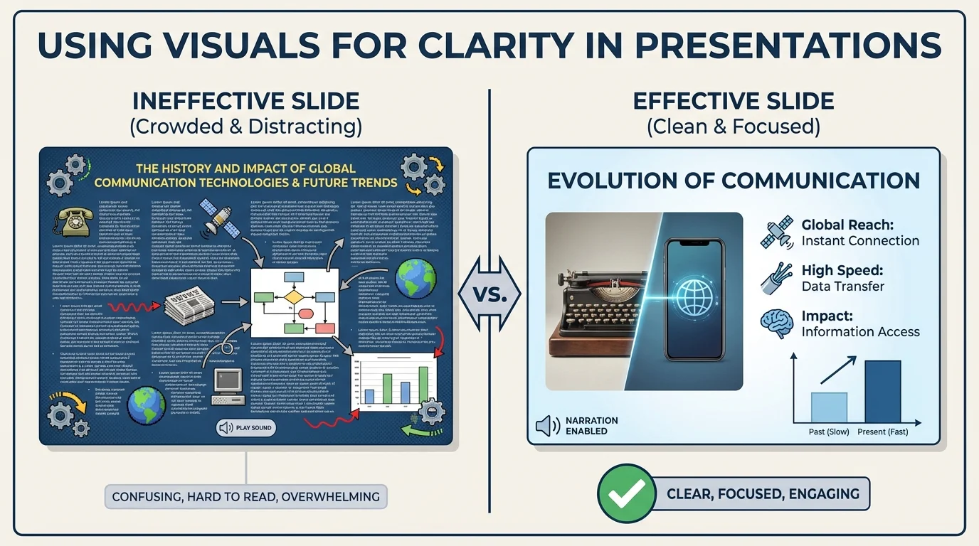
The way a slide is arranged changes what the audience notices first, as [Figure 2] illustrates with the difference between clutter and clarity. A clear visual display is easy to read quickly. It has a simple title, enough empty space, and only the most important information. A cluttered display makes the audience work too hard.
Readable text is essential. Font should be large enough for people in the back of the room to see. Colors should contrast clearly. Dark text on a light background or light text on a dark background often works well. Pale yellow words on a white background may look fancy, but they are hard to read.
Images and graphics should also be clear. Blurry pictures, stretched photos, or tiny graphs can confuse the audience. Labels on charts need to be large enough to read. If a graph has too many bars or too many colors, the main pattern can disappear.
Bullet points should be short. They are reminders, not full speeches. Instead of writing every sentence you plan to say, write a few key words or phrases. Then explain them aloud. This keeps the audience connected to you instead of staring silently at the screen.
Charts and graphs deserve special care because they are designed to clarify information. A bar graph is useful for comparing categories. A line graph is useful for showing change over time. A pie chart can show parts of a whole, but only when there are not too many slices. If your data is messy or detailed, a simple table may be clearer than a crowded graph.
Color can also organize information. For example, in a presentation about habitats, green can label forests and blue can label oceans. However, too many bright colors at once can make a slide feel chaotic. Use color to guide attention, not to overwhelm the eye.
The human brain often notices images faster than blocks of text. That is one reason a well-chosen visual can help an audience understand a topic more quickly than a long written explanation.
Later, when you revise your presentation, use the comparison in [Figure 2] as a guide. Ask yourself whether your slide looks clean, focused, and easy to understand in just a few seconds.
Sound can be powerful in a presentation, but it must be used with care. Sometimes hearing something is the best evidence. For example, in a presentation about bird communication, a short bird call recording can help the audience understand how animals send signals. In a presentation about famous speeches, a brief audio clip of the speaker's voice can make history feel more real.
Music can also set a tone, but it should never cover up the speaker's voice or distract from the main information. Background music during every slide is usually not helpful. It can make it harder for the audience to listen and think. A very short musical excerpt may work when the topic is music itself or when the audio is direct evidence.
Volume matters. If a clip is too quiet, people miss it. If it is too loud, it can startle the audience. Timing matters too. The presenter should introduce the clip first, play it at the right moment, and then explain why it matters.
Before using sound, test the equipment. A presentation can quickly become confusing if the audio does not play, takes too long to load, or begins unexpectedly. Effective presenters prepare for these problems by checking their tools ahead of time.
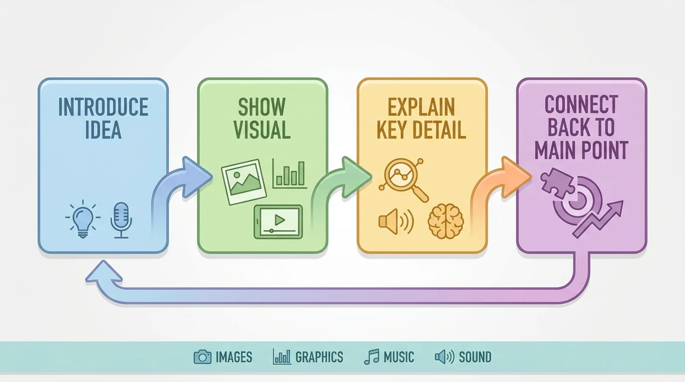
A presentation works best when the speaker and the visuals move together in a clear sequence, as [Figure 3] shows. First, the speaker introduces the idea. Next, the visual appears. Then the speaker explains what the audience should notice. Finally, the speaker connects that visual back to the main point. This order helps listeners stay oriented.
For example, if you are showing a graph of school recycling results, do not simply display the graph and say, "Here it is." Instead, guide the audience. You might say, "Our class wanted to know whether recycling improved over three months. This graph shows the amount collected each month. Notice how the bars rise from September to November. That pattern suggests our school campaign made a difference."
Transitions are important too. A transition is a word or phrase that smoothly moves the audience from one idea to the next. In presentations, transitions can also connect your speaking to your visuals. Phrases such as "This map helps us see where the event happened" or "The next chart compares the results" prepare the audience to look for the right information.
Timing matters just as much as design. If you move past a slide too quickly, the audience may not have time to understand it. If you leave a slide up too long after you stop talking about it, people may keep staring at it instead of listening to your next point.
Eye contact and body position also affect how the audience uses the visual. If you keep looking at the screen instead of the audience, your speech feels less direct. It is better to glance at the visual when needed, point out a key feature, and then turn back to your listeners.
Case example: Explaining a class survey
A student gives a presentation about favorite after-school activities.
Step 1: State the purpose.
The student says that the class survey asked which activity students chose most often.
Step 2: Show the right visual.
The student uses a bar graph because the goal is to compare categories such as sports, reading, gaming, and art.
Step 3: Direct attention.
The student points out that the tallest bar is sports and the shortest bar is art.
Step 4: Connect back to the message.
The student explains that these results may help the school decide which clubs to offer after class.
The visual supports the speaking instead of replacing it.
When you plan your own speaking order, the sequence in [Figure 3] helps you avoid a common mistake: putting up a visual and hoping the audience figures it out alone. A presenter's job is to guide what the audience sees and hears.
Consider how different school subjects call for different media choices. In science, a labeled diagram of the water cycle may clarify movement of water through evaporation, condensation, and precipitation. In history, a map can show where an event happened, and a timeline can show when it happened. In language arts, a short quotation displayed on a slide can focus attention on important words from a text.
Suppose a student is presenting about endangered sea turtles. A strong presentation might include a map of nesting areas, a photo of hatchlings, and a chart comparing turtle populations over time. Each visual has a different purpose: location, emotional connection, and evidence. Together, they make the information clearer and more meaningful.
Now consider a presentation arguing that schools should reduce plastic waste. A student might use a photo of overflowing trash bins, a chart showing how many plastic bottles are thrown away in a week, and a short list of proposed solutions. This combination works because it uses evidence and organization, not just decoration.
Strong choices are specific. They are selected because they make one idea easier to understand, remember, or believe.
One common mistake is clutter. Clutter means too much information packed into one space. A cluttered slide may have long paragraphs, several images, many colors, and different font styles all at once. The fix is to simplify. Keep only what truly supports the point.
Another mistake is using unrelated media. For example, a funny picture that has nothing to do with the topic may get a quick laugh, but it can weaken the presentation. The audience may remember the joke and forget the message.
Too many animations and effects can also create problems. If text spins, flashes, or bounces on every slide, the audience pays attention to the movement instead of the meaning. Effects should be limited and purposeful.
A further mistake is reading the slide word for word. This makes the speaker sound disconnected and gives the audience no reason to listen. Your slide should support your speech, not become your entire speech.
Finally, some presenters forget to give credit for images, audio, or information they did not create. Responsible presenters keep track of their sources and follow teacher directions for citing them. This shows honesty and respect for other people's work.
From earlier speaking lessons, remember that a presentation needs a clear main idea, organized points, and evidence. Multimedia does not replace those parts. It strengthens them when used carefully.
When revising, ask yourself whether each slide or sound clip earns its place. If removing an item makes the presentation clearer, that item probably was not needed.
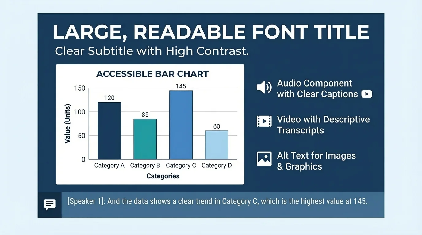
Good presentations are designed so all audience members can understand them, as [Figure 4] shows through features like large text, strong contrast, captions, and clear labels. This idea is called accessibility. Accessibility means making information usable for as many people as possible, including people who may have difficulty seeing, hearing, or processing information quickly.
For example, if a video includes spoken words, captions can help audience members who cannot hear clearly. If a chart uses color, labels should still make sense even for people who do not notice color differences easily. If text is too small or crowded, many people will struggle to read it, not just a few.
Presenting responsibly also means being accurate. Do not edit a graph in a misleading way. Do not crop an image so much that it changes the truth. Do not use dramatic music to force a feeling that the evidence does not support. Multimedia should help the audience understand reality, not trick them.
Accessibility and honesty often work together. A clearly labeled graph, for example, is easier to understand and more trustworthy. The design features in [Figure 4] are not extra decorations. They are part of respectful communication.
"The purpose of a presentation is not to impress the screen. It is to help the audience understand."
When presenters use multimedia well, they speak with purpose, show information clearly, and guide the audience carefully from one idea to the next. That is what makes a presentation effective.