A strong presentation is rarely just about what you say. Think about the last time a speaker actually held your attention: chances are, they did more than stand and talk. They may have shown a chart that made a trend obvious in seconds, played a short audio clip that made an issue feel real, or used a photo that turned an abstract claim into something concrete. Digital media can do that work effectively, but only when it is used strategically.
In a presentation, digital media includes tools such as words on slides, graphs, photographs, audio clips, videos, animations, and interactive features. The goal is not to make a presentation flashy. The goal is to help an audience understand your ideas more clearly, follow your reasoning more easily, and trust your evidence more fully.
That means every media choice should answer a simple question: How does this help the audience understand? If a visual, sound, or effect does not improve understanding or add meaningful interest, it probably does not belong.
Presentations often ask an audience to process several things at once: a topic, a claim, supporting evidence, and the speaker's reasoning. That is a lot to hold in memory. Digital media can reduce that mental load by making ideas visible, organized, and memorable.
For example, if a student is presenting findings about teen sleep habits, saying "many students do not get enough sleep" is a start. Showing a bar graph of average sleep hours by grade level makes the finding easier to understand at a glance. Adding a short quote from a sleep researcher can strengthen credibility. A single well-chosen image of a student working late, lit by a laptop screen, can also give the audience an immediate emotional connection to the issue.
Strategic use of digital media means choosing and using media on purpose to support a presentation's message, audience, and goal. It is different from simply adding media for decoration.
Evidence is the information that supports a claim, such as facts, statistics, examples, expert quotations, or observations. Reasoning is the explanation that connects that evidence to the claim.
When media is used well, it can do at least three important jobs. First, it can clarify information. Second, it can highlight important evidence. Third, it can increase interest so that the audience stays focused. But interest should support learning, not distract from it. A funny sound effect or dramatic transition may get attention for a moment, yet weaken the seriousness of the message if it feels unrelated.
Different kinds of media are useful for different communication tasks, as [Figure 1] shows. A smart presenter does not ask one type of media to do everything. Instead, the presenter matches the medium to the kind of understanding the audience needs.
Textual elements include titles, key terms, short bullet points, labels, and quotations. Text works best when the audience needs exact wording, a definition, a claim, or a brief list of points. It does not work well when large chunks of writing are placed on slides and then read aloud. If the audience is reading a paragraph, they are probably not listening carefully to the speaker.
Graphical elements include charts, graphs, diagrams, maps, icons, and infographics. These are especially effective for showing patterns, comparisons, steps, or relationships. A graph can reveal a trend much faster than a spoken list of numbers. A diagram can show parts of a machine, a cell, or a process in a way that words alone struggle to do.
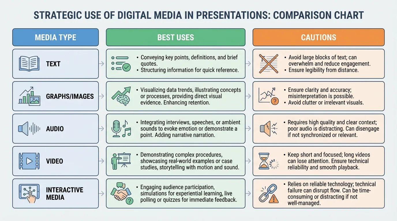
Audio elements include music, narration, interviews, ambient sound, or recorded evidence. Audio is useful when sound itself is part of the meaning. In a presentation about campaign speeches, for example, a short clip can reveal tone, pacing, and emotion better than a written transcript alone. In a presentation on environmental noise, recordings of traffic or birdsong can serve as direct evidence.
Visual elements include photographs, video clips, animations, and demonstrations. These are strong choices when the audience needs to see a process, event, setting, or behavior. A video of a robotics prototype in motion tells more than a still image. A time-lapse clip of melting ice can support a presentation about climate patterns more vividly than description alone.
Interactive elements include live polls, clickable maps, embedded questions, simulations, or audience response tools. These are especially valuable when you want the audience to test an idea, make a prediction, or compare their assumptions with actual data. However, interactive features should be controlled carefully. If they take too long or feel confusing, they interrupt the flow of the presentation.
Each medium has limits. Text can become crowded. Graphs can mislead if designed poorly. Audio can be hard to hear. Video can consume too much time. Interactive tools can fail technically. Strategic presenters understand both the strengths and the risks.
A presentation is never created in a vacuum. The right media choice depends on audience, purpose, setting, and time. A presentation for classmates may allow a little more informal tone than one for a school board, a science fair panel, or a community group. A persuasive presentation might use emotional images more often than an informational one, while a research presentation may depend more heavily on charts and source-based visuals.
Suppose you are giving a presentation on whether your school should start classes later. If your purpose is to persuade administrators, you might use a clean graph of sleep research, a brief expert quotation, and one student survey result. If your audience is younger students, you may need simpler labels, less text, and more explanation. If your audience already knows the issue, you can spend less time on background and more time on evidence and solutions.
Purpose and audience should control every media decision. Ask: What does my audience already know? What might confuse them? What kind of proof will they find convincing? What medium will help them follow my reasoning most easily?
It is also important to think about the presentation environment. Will you be speaking in a bright classroom where dark slides show up best? Will there be speakers for audio? Will the internet connection be reliable enough for interactive tools or embedded video? Strategic use includes planning for real conditions, not just ideal ones.
One of the fastest ways to weaken a presentation is to overload the screen. Slide design matters because audiences process visual information quickly, as [Figure 2] illustrates through the difference between cluttered and clear design. If a slide is crowded, confusing, or hard to read, even strong research can lose impact.
Effective slides usually follow a few key principles. Use a clear title that tells the point of the slide. Limit text to essential words and phrases. Choose readable fonts and large enough sizes. Use strong contrast, such as dark text on a light background or light text on a dark background. Leave enough blank space so that the screen does not feel packed.
This is where visual hierarchy matters. Visual hierarchy means arranging information so the audience notices the most important thing first, then the next, and then the supporting details. Larger titles, bold key numbers, and clear placement help guide the eye. When information is grouped into small chunks, the audience understands it faster.
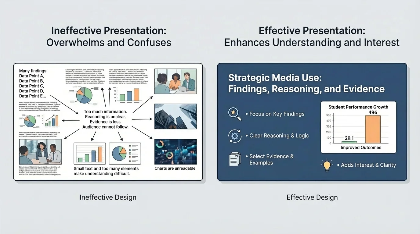
Consider the difference between two slides on water use. One slide has a full paragraph, five colors, three unrelated clip-art images, and tiny labels. The other has the title Households Use Most Water in Three Ways, a simple icon set for showers, toilets, and laundry, and three short percentages. The second slide does not just look better; it teaches better.
Color should also be used with purpose. Color can group related ideas, highlight a trend, or direct attention to a key piece of evidence. But too many colors make a slide harder to understand. Animation can help reveal steps one at a time, but excessive movement distracts. A transition should never become the most memorable part of a serious presentation.
People often remember visuals faster than spoken details. That is why one accurate, well-designed chart can do more work than several minutes of explanation.
Accessibility matters too. If text is too small, some audience members cannot read it. If colors are too similar, important differences may disappear. If a video has no captions, some viewers may miss crucial content. A strong presentation tries to make meaning available to as many people as possible.
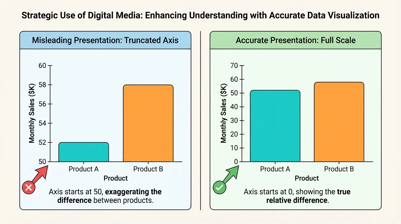
Digital media becomes most powerful when it helps the audience trust your claims. A well-made chart, photo, quotation slide, or map can strengthen your credibility. At the same time, media can also weaken trust if it exaggerates, oversimplifies, or hides important context. Visual evidence must be honest, as [Figure 3] demonstrates when comparing accurate and misleading graph design.
When using statistics, present them clearly and fairly. If you create a graph, label the axes, include units when needed, and use a scale that represents the data honestly. A bar chart with a truncated axis can make a small difference look huge. A pie chart with too many slices can confuse rather than clarify.
Images also need context. A dramatic photograph may attract attention, but the audience should know what it shows, when it was taken, and why it matters. One image does not automatically prove a broad claim. It is often stronger to pair a photograph with a statistic or expert source so that emotional impact and factual support work together.
Short quotations can be useful, especially from experts, witnesses, or primary sources. But choose them carefully. A quotation slide should highlight only the most important line, not an entire article passage in tiny print. Introduce the speaker and explain why the source is reliable.
Citing sources is part of strategic media use. If you use a graph from a study, an image from a news organization, or an audio clip from an interview, identify the source. This shows honesty and allows the audience to check where the information came from. It also separates strong academic communication from unsupported opinion.
| Media choice | Helpful when | Risk if used poorly |
|---|---|---|
| Graph | Showing trends, comparisons, or changes over time | Can mislead through scale, labels, or selective data |
| Photo | Making an issue concrete and emotionally real | Can oversimplify or bias the audience without context |
| Quote slide | Highlighting expert or primary-source language | Can become text-heavy or taken out of context |
| Video clip | Showing process, action, tone, or behavior | Can be too long and take over the presentation |
Table 1. Common media choices, their strengths, and risks during evidence-based presentations.
As your presentation grows more complex, keep asking whether the media is making the evidence clearer. If the audience remembers the design but cannot explain the finding, the media has failed its main job.
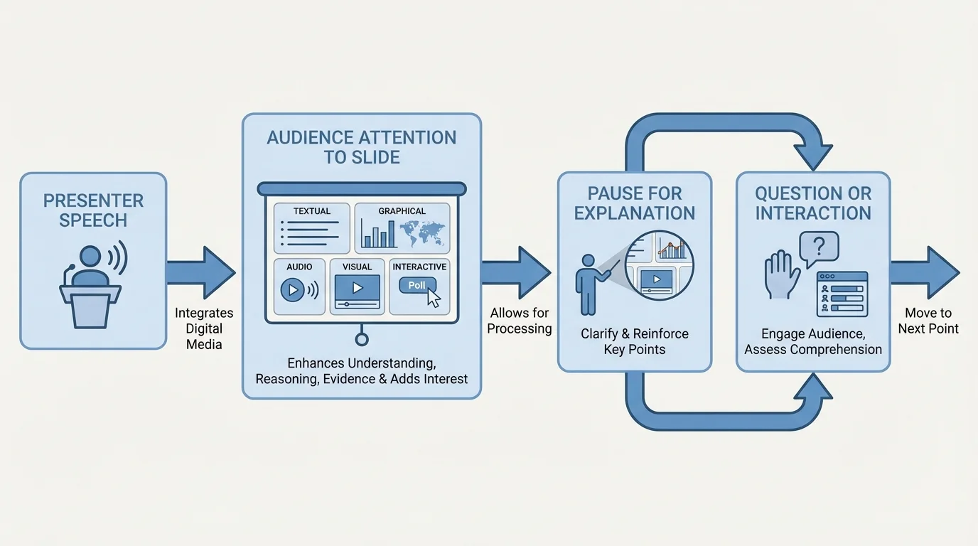
A presentation is not a slideshow with a person standing nearby. It is a coordinated performance of speech, evidence, and design. Strong presenters connect their voice to the screen in a deliberate way, as [Figure 4] shows through the flow between speaking, viewing, and responding. The media supports the speaker; it does not replace the speaker.
One common mistake is reading slides word for word. When that happens, the speaker adds very little value. Instead, use the slide to show the key idea while your speech explains it, interprets it, or gives it meaning. If a graph is on the screen, do not just say, "Here is a graph." Point the audience to what matters: "Notice that the sharpest increase happens after ninth grade."
Timing matters. Pause long enough for the audience to absorb a visual. If you switch slides too quickly, people cannot read or interpret what they are seeing. If you leave a slide up too long after you have finished discussing it, attention drifts. Transitions should guide the audience: "Now that we have looked at the survey results, let's compare them with national data."
Audio and video require extra control. Test volume in advance. Trim clips so they are brief and purposeful. Introduce the clip before it begins, so the audience knows what to listen or watch for. Afterward, explain what the clip proves. Without explanation, even an interesting clip may feel disconnected from the argument.
Case study: presenting survey findings about school lunch waste
A student team wants to explain why so much cafeteria food is thrown away and propose changes.
Step 1: Start with a clear claim
The opening slide states that lunch waste is high because many students dislike menu options and lunch periods are too short.
Step 2: Use the best medium for each type of proof
A bar graph shows the percentage of students who throw away parts of lunch. A short quote from a cafeteria worker adds perspective. One photo of unopened food in trash bins makes the issue concrete.
Step 3: Explain the evidence aloud
The presenters do not read the graph labels one by one. They point out the most important pattern and explain why it matters.
Step 4: End with a practical recommendation
The final slide lists two realistic changes: longer lunch time and more student input on menu choices.
This presentation works because each media choice has a job, and every job supports the argument.
When media and speaking work together, the audience can follow the line of thought more easily. They hear the claim, see the proof, and understand the logic that connects them.
Many weak presentations do not fail because the topic is poor. They fail because the media choices are careless. One mistake is cognitive overload, which happens when the audience is asked to process too much at once: crowded slides, rapid talking, long videos, multiple charts, and complex labels all competing for attention.
Another mistake is using media that is interesting but irrelevant. A dramatic background image, a popular song, or a flashy animation may seem engaging, but if it does not support the claim or evidence, it distracts from the message. Interest is valuable only when it helps meaning stick.
Technical dependence is another problem. If your whole presentation depends on the internet, a single connection problem can interrupt everything. Good presenters have backup plans: downloaded videos, screenshots of websites, printed notes, or alternative explanations if a tool fails.
You already know that effective speaking depends on organization, clear evidence, and audience awareness. Digital media does not replace those skills. It strengthens them when used thoughtfully.
Finally, avoid the temptation to use every available feature. More media does not automatically mean more quality. In many cases, one strong graph, one relevant image, and a well-explained argument are more effective than ten different effects competing for attention.
Strategic digital media is used far beyond school assignments. Scientists use graphs and diagrams to explain findings to other researchers and to the public. Journalists combine maps, interviews, photographs, and data visualizations to explain current events. Engineers use models and animations to show how a design works. Business leaders use dashboards and charts to justify decisions. Activists use short videos and infographics to raise awareness and motivate action.
The same principles apply in class. A history presentation on the Dust Bowl might use a map to show affected regions, a photograph to humanize the event, and a primary-source quotation to give voice to people who lived through it. A biology presentation on disease spread might use a process diagram, a graph of infection rates, and a short animation of transmission. As we saw earlier in [Figure 1], different media types serve different purposes, and effective presenters choose among them rather than treating them as interchangeable.
Even a simple presentation can become much stronger through careful selection. If you are explaining why public transportation matters in your city, a before-and-after traffic image may add impact, but the deciding evidence may come from a chart showing commute times. If you are arguing that social media affects sleep, a short student survey graph may be more convincing than several general statements.
Slide design still matters in these situations. The difference between clutter and clarity that appears in [Figure 2] is not just about appearance; it affects whether your audience can find the main point quickly enough to stay with your reasoning. Similarly, the graph choices in [Figure 3] remind us that presentation ethics matter. A polished but misleading chart is not good communication.
Before finishing any presentation, review each media element one by one. Ask what job it is doing. Is it clarifying a concept? Showing evidence? Demonstrating a process? Creating appropriate interest? If you cannot answer clearly, revise or remove it.
Also think about sequence. Audiences usually understand best when information moves from simple to more detailed. Introduce the claim, provide necessary context, show the evidence, explain the reasoning, and then conclude with significance or next steps. Media should follow that structure. A presentation becomes confusing when the audience sees detailed proof before they even know the question being answered.
The flow among speaking, screens, and audience attention in [Figure 4] remains useful here. Your presentation should feel guided, not chaotic. Every sound, image, word, and interaction should move the audience closer to understanding.
The best digital media choices are often the most intentional ones. They are clear instead of crowded, relevant instead of random, and persuasive because they make truth easier to see.