Look around a room and you can find letters almost everywhere. Letters are on books, cubbies, signs, labels, and names. When we learn to print letters, we learn how to put our ideas on paper. We can write our name, label a picture, and begin to write words and sentences.
A letter is a shape we write to help make words. The alphabet has 26 letters, and each one has a special form. Some letters are tall. Some are round. Some use straight lines, and some use curves.
When we print letters, we try to make them neat and clear. Clear letters are easy to read. If we make letters carefully, other people can understand our writing better.
Uppercase letters are big letters, such as A, B, and C. Lowercase letters are small letters, such as a, b, and c. Print means to write letters clearly, not in cursive.
The alphabet gives us two ways to write each letter: an uppercase form and a lowercase form. We use both kinds when we write.
An uppercase letter is also called a capital letter. A lowercase letter is the smaller form. Many letters come in matching pairs, as [Figure 1] shows. For example, A matches a, B matches b, and M matches m.
Some uppercase and lowercase letters look almost the same, like C and c, O and o, and S and s. Some look different, like R and r, G and g, and Q and q. It is important to learn both forms so we can read books and write our own words.
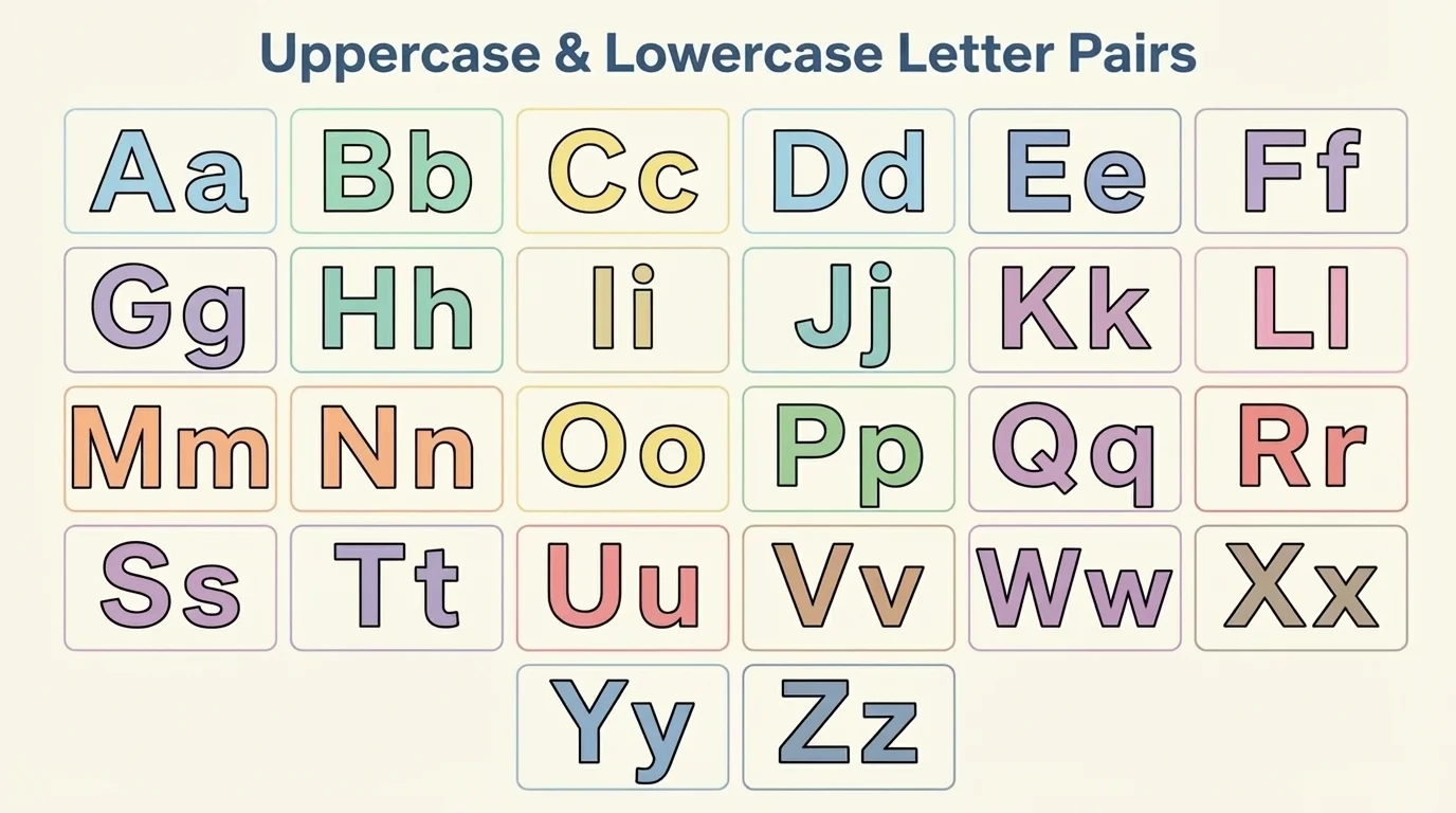
Here are some matching pairs: A and a, D and d, E and e, K and k, L and l, P and p, T and t, and Z and z. We also learn pairs like H and h, N and n, U and u, and V and v.
When you see a name like Mia, the first letter is uppercase: M. The other letters are lowercase: i and a. That is one way uppercase and lowercase letters work together.
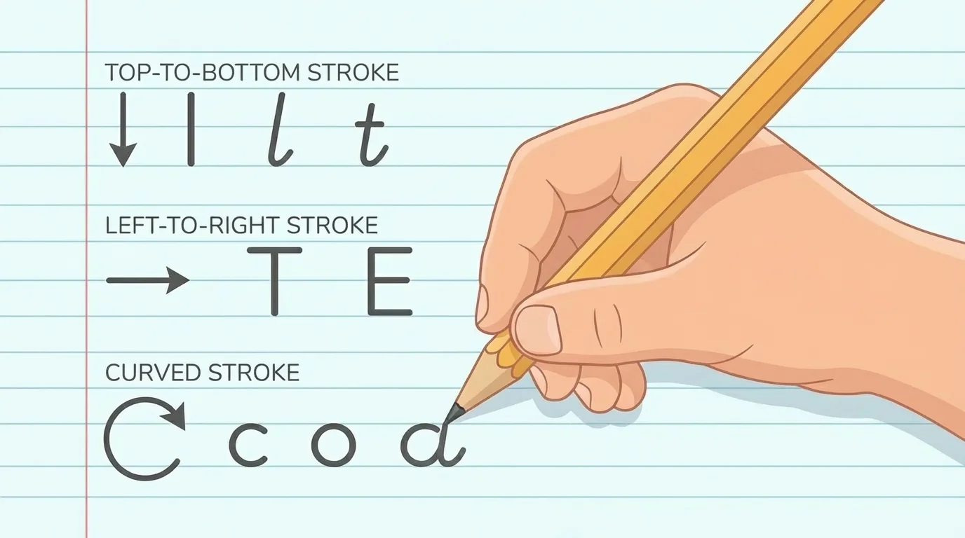
Careful hand movements help us make letters the right way, and [Figure 2] shows that printing uses a good pencil grip and simple strokes. We hold the pencil so we can control it. Then we move the pencil slowly and carefully.
Many letters begin at the top. Some letters use straight lines, like L, T, E, F, H, and I. Some letters use curves, like C, O, S, and U. Some letters use both, like P, R, B, D, and G.
We print letters one part at a time. A letter may have a long line, a short line, or a round part. For example, lowercase l is one tall line. Uppercase E has one long line down and three short lines across. Lowercase a has a round part and a short line.
Printing is not about going fast. It is about making each letter look like the letter it is supposed to be. Slow, careful writing helps letters look neat.
Good letter formation means making each letter with the right shape. When a letter has the right shape, it is easier to read. Good formation includes starting in a good place, making the parts in order, and keeping the letter a good size.
As we saw in [Figure 2], printing uses simple movements: down, across, around, and back up. These little movements help us build many different letters.
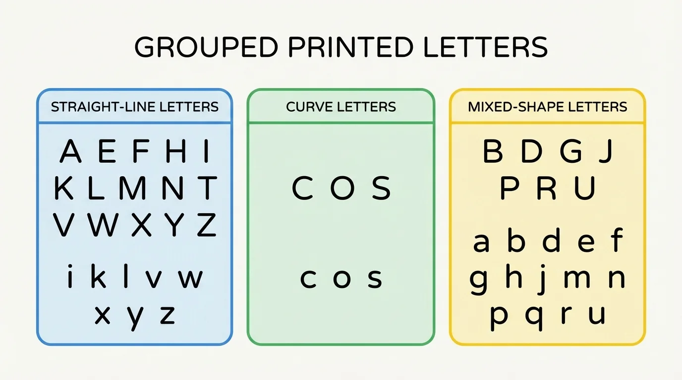
Letters can be grouped into families because some letters are made in similar ways. Looking at groups helps us remember how to print them, and [Figure 3] shows that some letters belong together because they share lines or curves.
One family has straight-line letters. These include E, F, H, I, L, T, and lowercase l. Another family has round letters, such as O, C, and lowercase o. Some letters mix lines and curves, such as B, P, R, D, and lowercase b and p.
It can also help to notice special features. Some lowercase letters go tall, like b, d, h, k, and l. Some stay small in the middle space, like a, c, e, m, n, o, and s. Some lowercase letters reach down below the line, like g, j, p, q, and y.
When we notice these patterns, letters are easier to remember. The grouped letters in [Figure 3] help us see that many letters are built from the same kinds of shapes.
We do not use uppercase letters all the time. We use them in special places. One important place is the first letter in a name. Names like Ava, Leo, Sam, and Nora begin with uppercase letters.
We also use an uppercase letter at the beginning of a sentence. If we write, "Cats nap," the C in Cats is uppercase. The rest of the letters are lowercase unless another word is a name.
Simple writing examples
Step 1: A name
Emma begins with uppercase E. The letters m, m, and a are lowercase.
Step 2: A sentence
"I run." begins with uppercase I.
Step 3: A label
If a child draws a dog and writes "Dog," the D can be uppercase at the start.
Using uppercase and lowercase letters in the right places helps writing follow the rules of standard English. These rules make writing look organized and easy to read.
Neat printing means letters are shaped well and spaced nicely. Letters should not crash into each other. They should sit in their own spaces so each one can be seen.
A good spacing pattern helps words look clear. Leave a little room between letters and a bigger room between words. If letters are too close, a word can be hard to read.
Size matters too. Very tiny letters can be hard to see. Very huge letters may not fit well. When letters are about the same size, writing looks tidy.
Your brain can recognize a letter very quickly, but only if the shape is clear enough. That is why neat printing helps both reading and writing.
Lines on paper can help. Some letters sit on the line. Some tall letters reach up. Some letters, like g and y, go below the line. Knowing where letters belong helps make writing look careful.
Here are many uppercase letters: A, B, C, D, E, F, G, H, I, J, K, L, M, N, O, P, R, S, T, U, V, W, X, Y, and Z.
Here are many lowercase letters: a, b, c, d, e, f, g, h, i, j, k, l, m, n, o, p, r, s, t, u, v, w, x, y, and z.
We can use these letters in words: cat, dog, sun, map, hat, pig, red, hop, jam, and box. We can also use them in names: Ana, Ben, Mia, Eli, Zoe, and Max. Notice that the names begin with uppercase letters, while many other letters are lowercase.
Some letters need extra care because they can be mixed up. For example, b and d are different. p and q are different too. Lowercase m and n both have humps, but m has more. Looking closely helps us print the correct letter.
When children learn to print many letters, they are building a foundation for writing. Letter by letter, they learn how to share names, labels, ideas, and stories on paper.