A forest can receive more rainfall and still lose species. A lake can look healthy from the shore while its oxygen level crashes below the surface. In ecology, appearances are often misleading, which is why scientists rely on evidence and mathematical representations to explain what is happening. Numbers, graphs, and models help reveal patterns that our eyes alone can miss. They also help us revise explanations when new evidence shows that our first idea was incomplete or wrong.
Ecologists study living systems at many scales, from a patch of moss on a rock to a prairie, a coral reef, or an entire biome. At every scale, organisms interact with food sources, competitors, predators, climate, water, light, and nutrients. Those interactions affect both population size and the variety of life in an area. To understand those changes clearly, scientists organize observations into forms that can be compared and tested.
Biodiversity refers to the variety of life in a place, including how many species are present and how evenly individuals are distributed among those species. A community with many species may be more resilient than one dominated by only one or two species, because different organisms can respond differently to change. When drought, disease, pollution, habitat loss, or invasive species affect an ecosystem, biodiversity may shift in ways that also change energy flow and matter cycling.
A population is all the individuals of one species living in the same area at the same time. Populations do not stay constant. They rise and fall as births, deaths, immigration, and emigration change. If the rabbit population in a grassland increases, predators may later increase too. If a cold winter kills many insects, bird populations may decline because less food is available. These changes are not random; they are responses to environmental factors that can be supported by evidence.
Biotic factors are living influences in an ecosystem, such as predators, prey, competitors, parasites, and disease organisms.
Abiotic factors are nonliving influences, such as temperature, sunlight, water availability, soil nutrients, salinity, and dissolved oxygen.
Ecosystem is the living community and its nonliving environment interacting as a system.
Because ecosystems vary in size, the same kind of factor can have different effects at different scales. A rise in temperature of only a few degrees may slightly change conditions in one stream but contribute to large-scale coral bleaching across an ocean region. Evidence must therefore be interpreted in context.
Organisms need matter and energy to survive. Plants and algae capture energy, usually from sunlight, and use materials such as \(CO_2\), water, and minerals to build biomass. Animals obtain energy by eating plants or other animals. Decomposers break down dead material and recycle nutrients. Any factor that changes access to energy or matter can influence survival, reproduction, and biodiversity.
Common biotic factors include competition for food, predation, invasive species, and disease. Common abiotic factors include drought, flood, wildfire, pH, nutrient concentration, and temperature. For example, if nutrient runoff adds excess nitrogen and phosphorus to a pond, algae may grow rapidly. Later, decomposition of that algae can reduce dissolved oxygen, causing fish deaths. A mathematical comparison of oxygen levels before and after runoff can support that explanation more strongly than observation alone.
When a quantity changes over time, scientists often compare the starting value and the ending value. Useful tools include difference, ratio, and percent change.
Percent change is calculated by \(\dfrac{\textrm{new} - \textrm{original}}{\textrm{original}} \times 100\%\).
Suppose a wetland bird population drops from \(120\) birds to \(90\) birds after a drought. The change is \(90 - 120 = -30\) birds. The percent change is \(\dfrac{-30}{120} \times 100\% = -25\%\). The negative sign shows a decrease. This calculation does not prove drought was the only cause, but it quantifies the change and helps support or test an explanation.
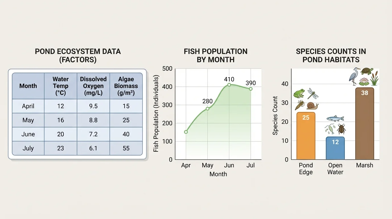
Ecologists use many kinds of evidence displays, and [Figure 1] illustrates why these representations are so powerful: a table preserves exact values, a line graph reveals trends over time, and a bar graph makes group comparisons easier. Choosing the right representation matters because each one highlights a different feature of the same evidence.
A table is useful when exact data points matter. A line graph is best for change over time, such as monthly deer population or annual rainfall. A bar graph is often better for comparing categories, such as the number of pollinator species in forest, meadow, and farmland habitats. Ratios and percentages can make comparisons fair when sample sizes differ.
For example, if one quadrat in a meadow contains \(12\) clover plants in an area of \(4\,m^2\), the population density is \(\dfrac{12}{4} = 3\) plants per \(1\,m^2\). If another quadrat contains \(18\) clover plants in \(9\,m^2\), the density is \(\dfrac{18}{9} = 2\) plants per \(1\,m^2\). Even though the second quadrat has more total plants, the first has the higher density. This is why raw counts alone can mislead.
Another useful measure is growth rate over a time interval. If a fish population increases from \(200\) to \(260\) fish in \(3\) months, the average change per month is \(\dfrac{260 - 200}{3} = 20\) fish per month. This average does not mean exactly \(20\) fish were added every month, but it summarizes the trend in the provided data.
The same ecosystem can look different depending on whether you view exact numbers, categories, or time trends. Scientists often use more than one representation before drawing a conclusion.
Worked example: population density and percent change
A marsh survey finds 45 frogs in a sampling area of \(15\,m^2\). The next month, the same area contains 36 frogs.
Step 1: Find the initial density.
\(\dfrac{45}{15} = 3\) frogs per \(1\,m^2\).
Step 2: Find the later density.
\(\dfrac{36}{15} = 2.4\) frogs per \(1\,m^2\).
Step 3: Calculate percent change in population.
\(\dfrac{36 - 45}{45} \times 100\% = \dfrac{-9}{45} \times 100\% = -20\%\).
The frog population density decreased, and the total count dropped by 20%.
Mathematics strengthens an explanation because it lets us compare observations precisely. If the frog decline happened during a month when water level also dropped, a scientist may propose that reduced water availability affected frog survival or breeding. That explanation still needs evidence, but the mathematical pattern helps identify what needs further investigation.
When conditions are favorable, populations can grow rapidly. When resources become limited, growth often slows. The graph patterns in [Figure 2] help distinguish these cases by showing whether the population keeps accelerating upward or begins to level off.
Carrying capacity is the largest population size that an environment can support over time with available resources. Food, nesting space, water, and shelter all matter. If a population is far below carrying capacity, it may grow quickly. As it approaches that limit, competition and other limiting factors usually increase.
Two common graph shapes appear in ecology. Exponential growth creates a J-shaped curve when resources are abundant and limits are low. Logistic growth creates an S-shaped curve when growth begins rapidly but slows as the population approaches carrying capacity. Real populations often fluctuate around this limit instead of staying perfectly stable.
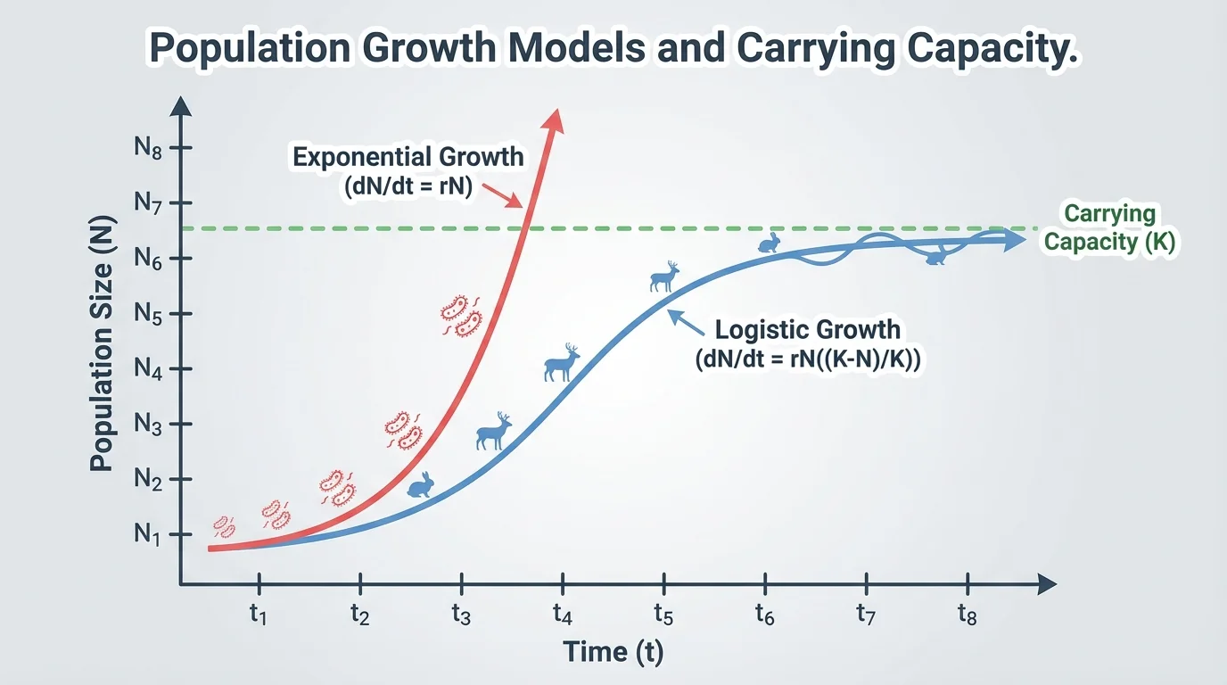
If a bacterial population in a lab rises from 100 to 200 to 400 to 800 cells at equal time intervals, the pattern suggests rapid growth. But if later counts are 900, 940, and 950, the slowing increase suggests limits are being reached. The revised explanation is not simply "the population is growing fast." A better explanation is that the population grows quickly at first and then slows as resources become limiting.
Scientists also examine decline. If a graph shows a sudden crash rather than a slow reduction, that may point to a different cause, such as disease outbreak, toxin exposure, or a major weather event. A gradual decline may fit a long-term habitat change. The shape of the data matters as much as the final number.
Limiting factors shape population size
No population can grow forever. Limiting factors include food supply, predation, disease, available space, temperature extremes, and access to water. Some limiting factors are density-dependent, meaning their effects become stronger as population density increases. Others, such as hurricanes or droughts, can affect populations regardless of density.
A useful mathematical tool for interpreting these patterns is average rate of change. If a seal colony decreases from 500 to 425 individuals over 5 years, the average yearly change is \(\dfrac{425 - 500}{5} = -15\) seals per year. This value does not explain why the decline happened, but it gives a measurable trend to compare with possible causes.
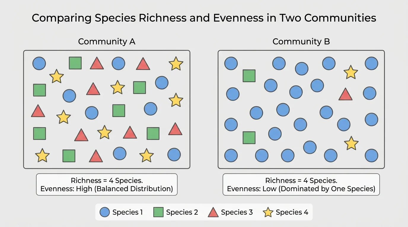
Biodiversity is not measured by species count alone, and [Figure 3] makes this clear by comparing communities with the same number of species but different distributions. A place with five species where one species makes up almost all individuals is less even than a place where those five species are present in similar numbers.
Species richness is the number of different species present. Species evenness describes how evenly individuals are distributed among those species. High biodiversity usually involves both richness and evenness, though scientists may measure them separately depending on the data provided.
Consider two tide pool communities. Community A has 4 species with counts of 25, 25, 25, and 25. Community B also has 4 species, but the counts are 88, 6, 4, and 2. Both communities have the same richness, but Community A has much greater evenness. That means Community A is generally considered more biodiverse.
Scale changes the interpretation. In a single pond, biodiversity might be estimated by counting species of insects, fish, amphibians, and plants. At a regional scale, scientists compare many ponds, streams, and wetlands. A local site may have low biodiversity while the larger region remains diverse because different sites contain different species. Explanations must match the scale of the evidence.
This comparison also warns us not to confuse "number of species" with the broader idea of biodiversity. A better explanation uses both richness and distribution when the provided data allow it.
| Ecosystem scale | Typical evidence | Useful mathematical representation | Question answered |
|---|---|---|---|
| Local plot | Counts in quadrats | Density, bar graph | How many organisms live per unit area? |
| Pond or stream | Monthly species counts | Table, line graph | How does biodiversity change over time? |
| Forest region | Species totals across sites | Comparative table, percentages | Which habitats support more species? |
| Biome | Large-scale monitoring data | Trend graphs, maps | How do climate patterns affect populations broadly? |
Table 1. Examples of how ecosystem scale changes the kind of evidence and mathematical representation used.
Science is not just about making explanations. It is about improving them. An initial explanation might fit part of the evidence, but when new data appear, scientists test whether that explanation still works. If not, they revise it.
Suppose students are given data showing that a lake's fish population declined by 40% over two summers. Their first explanation might be "water temperature increased, so fish died from heat stress." That might be reasonable if temperature also rose. But if provided data later show dissolved oxygen dropped sharply after an algal bloom, the explanation should be revised. A stronger explanation is that nutrient enrichment led to algal growth, decomposition reduced oxygen, and low oxygen stressed or killed fish.
Worked example: revising an explanation
Provided data for a lake show these oxygen values in \(\mathrm{mg/L}\): spring \(8.0\), early summer \(7.5\), late summer \(3.0\). Fish population counts over the same period drop from \(150\) to \(90\).
Step 1: Calculate the percent change in fish population.
\(\dfrac{90 - 150}{150} \times 100\% = \dfrac{-60}{150} \times 100\% = -40\%\).
Step 2: Identify the matching environmental trend.
Dissolved oxygen drops from \(8.0\) to \(3.0\), a change of \(-5.0\,\mathrm{mg/L}\).
Step 3: Revise the explanation.
The data support an explanation linking fish decline to decreasing oxygen more directly than to temperature alone.
The revised explanation is stronger because it matches the provided evidence more closely.
Revising explanations does not mean the first idea was useless. It means science becomes more accurate as evidence improves. This process is especially important in ecology, where many factors interact simultaneously.
Ecological relationships often involve chains of cause and effect. In food webs, predator populations, herbivore populations, and plant communities influence one another, and [Figure 4] shows this idea through a trophic cascade. Mathematical data from such systems help scientists move beyond simple claims like "more predators means fewer prey" and toward more complete explanations.
In one well-known pattern, when a predator population increases, a herbivore population may decrease, which can allow plants to recover. Suppose provided data show wolves in a region rise from 20 to 35, elk fall from 1,200 to 900, and young willow stems increase from 15 per plot to 28 per plot. The numbers support an explanation that predator recovery reduces browsing pressure, helping plants rebound.
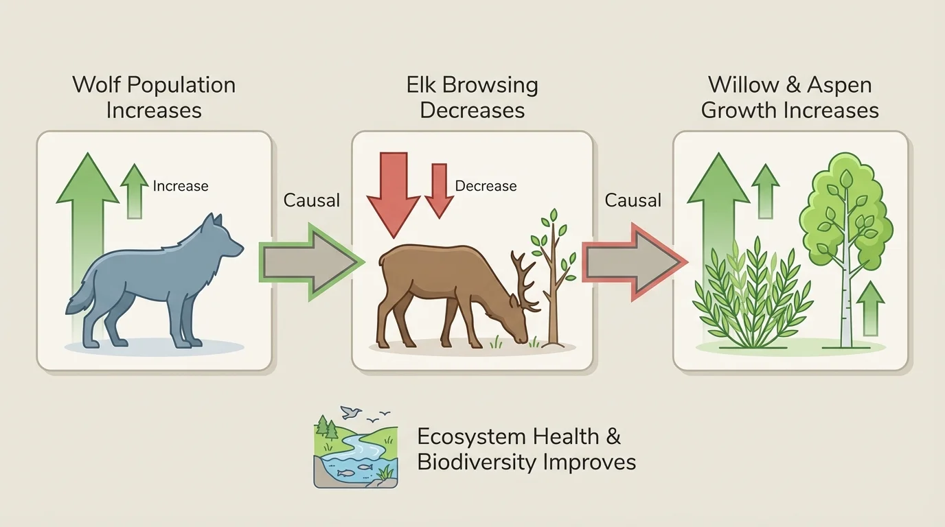
This kind of evidence does not mean wolves are the only relevant factor. Weather, disease, and human land use may matter too. But this pattern supports an interacting biotic explanation better than one focused on a single species in isolation.
Coral reef systems provide another example. If provided data show sea surface temperature rising while live coral cover declines from 60% to 35%, scientists may explain that heat stress contributes to bleaching and coral loss. If fish species counts then also decline, the explanation can expand: habitat loss in the reef affects populations that depend on coral structure for food or shelter.
Invasive species can also alter biodiversity. Imagine a shoreline plant survey where native plant species drop from 18 to 10 after an invasive grass spreads from 5% to 45% cover. The mathematical pattern supports the explanation that the invasive species competes with native plants for space, light, and nutrients.
Some ecosystems can appear stable right before a rapid shift. A lake may show only small changes in nutrient levels for years and then suddenly experience a major algal bloom once a threshold is crossed.
Nutrient runoff from farms or lawns adds another practical case. If nitrate concentration rises and algal biomass rises soon after, while dissolved oxygen falls, those linked changes support a chain-of-events explanation. The strongest version uses all the provided measurements rather than one number alone.
Data are powerful, but they must be interpreted carefully. A graph can show correlation, meaning two variables change together, without proving that one caused the other. For example, both insect abundance and temperature may rise in summer, but that does not mean temperature alone caused every increase. Other seasonal changes may also matter.
Scientists also look for variation and outliers. If most counts of a plant species are between 40 and 50 per plot, but one plot has only 10, that point may indicate a special local factor such as shade, grazing, or disturbance. An outlier should not be ignored automatically, but it should be interpreted carefully.
The assessment boundary for this topic matters: explanations are limited to provided data. That means students should not invent hidden variables or make unsupported predictions beyond the evidence. If the data show population decline and lower rainfall, it is reasonable to connect those observations. It is not reasonable to claim pesticide poisoning unless pesticide data were also provided.
This approach mirrors real scientific thinking. Good explanations are not the ones that sound dramatic. They are the ones most strongly supported by the available evidence. Mathematics helps because it makes those supports visible and comparable.
Worked example: comparing biodiversity across sites
Two forest plots are surveyed.
Plot A species counts: oak seedlings 10, ferns 10, mosses 10, wildflowers 10.
Plot B species counts: oak seedlings 28, ferns 8, mosses 2, wildflowers 2.
Step 1: Compare richness.
Both plots have 4 species, so their species richness is equal.
Step 2: Compare evenness.
Plot A has equal counts, while Plot B is dominated by one species.
Step 3: Form the explanation.
Based on the provided data, Plot A has higher biodiversity because the species are more evenly distributed.
This example shows why biodiversity explanations should not rely on species count alone.
Whether scientists study a schoolyard field, a wetland, a forest, or an ocean region, the same core reasoning applies: organize evidence, represent it mathematically, identify patterns, and revise explanations when better-supported interpretations emerge.