Have you ever noticed that a page full of numbers can look messy, but a graph can make the same information easy to understand in just a few seconds? Graphs are powerful because they help us see information. When we collect information about favorite foods, pets, books read, or types of weather, we are working with math that helps us organize and compare the world around us.
Math often begins with information we collect. That information is called a data set. A data set is a group of facts or numbers. If a class counts how many students chose apples, bananas, grapes, or oranges, those counts make a data set.
Many data sets are organized into categories. A category is a group or type. In a fruit survey, the categories might be apples, bananas, grapes, and oranges. In a classroom pet survey, the categories might be dogs, cats, fish, and birds.
You already know how to count, add, and subtract. Those skills are very important here because graphs help us organize numbers, and then we use addition and subtraction to answer questions about the graph.
[Figure 1] Graphs help us answer questions such as: Which category has the most? Which has the least? How many more students chose one category than another? How many students chose two categories together?
Sometimes the numbers in a data set are large, so drawing one picture or one square for each item would take too much space. That is why we use a scale. A scale tells how much one picture or one square stands for. For example, in a scaled graph, one picture might stand for \(2\) pets, or one square might stand for \(5\) books. A graph must also have a title and category labels so the reader knows what the information means.
There are two common kinds of scaled graphs used in this lesson. A picture graph uses pictures or symbols. A bar graph uses bars. In both kinds, the scale is very important. If one symbol stands for \(2\), then \(3\) symbols stand for \(6\). If one square stands for \(5\), then \(4\) squares stand for \(20\).
Every graph should include these parts:
Scale tells how much each picture, symbol, or square is worth on a graph. A graph is scaled when it uses a number greater than \(1\), such as \(2\), \(5\), or \(10\), for each picture or square.
When you read a graph, never guess by looking only at size. Always check the scale first. A short graph with a large scale can represent more than a tall graph with a small scale.
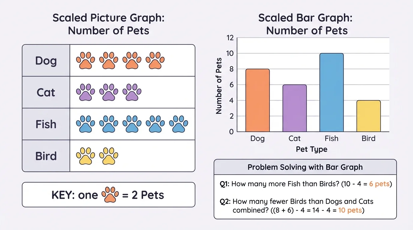
Suppose students in a class are asked what kind of pet they have. The data are: dogs \(10\), cats \(6\), fish \(4\), and birds \(8\). We want to make a picture graph.
First, choose a scale that matches the data well. Since all the numbers are even, a good key is: one picture stands for \(2\) pets. Then the graph will be easy to draw because each total can be shown with whole pictures.
Worked example 1: drawing a scaled picture graph
Use the pet data: dogs \(10\), cats \(6\), fish \(4\), birds \(8\).
Step 1: Choose a key.
Let one picture stand for \(2\) pets.
Step 2: Find how many pictures each category needs.
Dogs: \(10 \div 2 = 5\) pictures
Cats: \(6 \div 2 = 3\) pictures
Fish: \(4 \div 2 = 2\) pictures
Birds: \(8 \div 2 = 4\) pictures
Step 3: Draw and label the graph.
Write a title such as Class Pets. List the categories. Then draw the correct number of pictures for each category.
The picture graph shows the same data in a neat visual way.
A picture graph is useful because it is easy to read quickly. But remember: each picture may stand for more than one item. That means you must multiply or skip count to find the total.
[Figure 2] For example, if the bird row has \(4\) pictures and each picture means \(2\), then the number of birds is \(4 \times 2 = 8\). That is why the key is so important.
A bar graph uses bars instead of pictures. On a scaled bar graph, the numbers on one axis increase by equal steps, such as \(5, 10, 15, 20\). The bars must have the same width, and each bar must start at \(0\).
Let's use a different data set for a bar graph. Suppose students vote for favorite fruit: apples \(15\), bananas \(10\), grapes \(20\), oranges \(5\). A good scale is \(5\) because each number is a multiple of \(5\).
To draw the graph, write the categories along the bottom. Write the scale along the side: \(0, 5, 10, 15, 20\). Then draw each bar up to the correct number. Apples reach \(15\), bananas reach \(10\), grapes reach \(20\), and oranges reach \(5\).
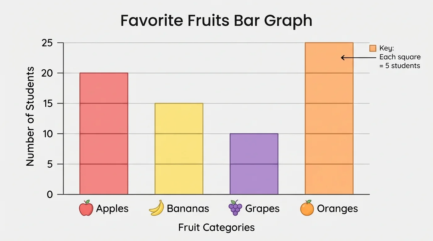
Since each square stands for \(5\), the apples bar uses \(3\) squares because \(3 \times 5 = 15\). The grapes bar uses \(4\) squares because \(4 \times 5 = 20\). This is exactly like the example where each square in a bar graph represents \(5\) pets.
Worked example 2: drawing a scaled bar graph
Use the fruit data: apples \(15\), bananas \(10\), grapes \(20\), oranges \(5\).
Step 1: Choose a scale.
Use increments of \(5\).
Step 2: Label the graph.
Write the categories on one axis and the numbers \(0, 5, 10, 15, 20\) on the other axis.
Step 3: Draw each bar to the correct height.
Apples to \(15\), bananas to \(10\), grapes to \(20\), oranges to \(5\).
The graph makes it easy to compare the categories.
Bar graphs are especially good for comparing amounts. It is easy to see which bar is tallest and which bar is shortest. Still, you should use the scale to find the exact amount.
[Figure 2] To read a graph carefully, use this order: read the title, check the categories, look at the scale, and then find the value for each category. If you skip the scale, you may read the graph incorrectly.
Think again about the fruit graph. The grapes bar reaches \(20\), and the oranges bar reaches \(5\). That means grapes were chosen more often. The exact difference is found by subtraction:
\(20 - 5 = 15\)
So \(15\) more students chose grapes than oranges.
You can also combine categories. If apples are \(15\) and bananas are \(10\), then together they are
\[15 + 10 = 25\]
So \(25\) students chose apples or bananas.
People use graphs in sports, science, business, and weather reports because our eyes can compare lengths and pictures very quickly.
When two categories are close in value, the graph helps you notice that quickly. But the exact answer still comes from math, not from just looking.
[Figure 3] shows bars of different heights for categories you can compare. Many graph questions ask you to compare two categories. The words how many more and how many less both tell us to find a difference, and we usually use subtraction.
Suppose a graph shows books read by students: Ava \(8\), Ben \(6\), Cara \(10\), and Diego \(4\). If the scale is \(2\), then each square stands for \(2\) books. We can read the total number of books for each student by using the scale carefully.
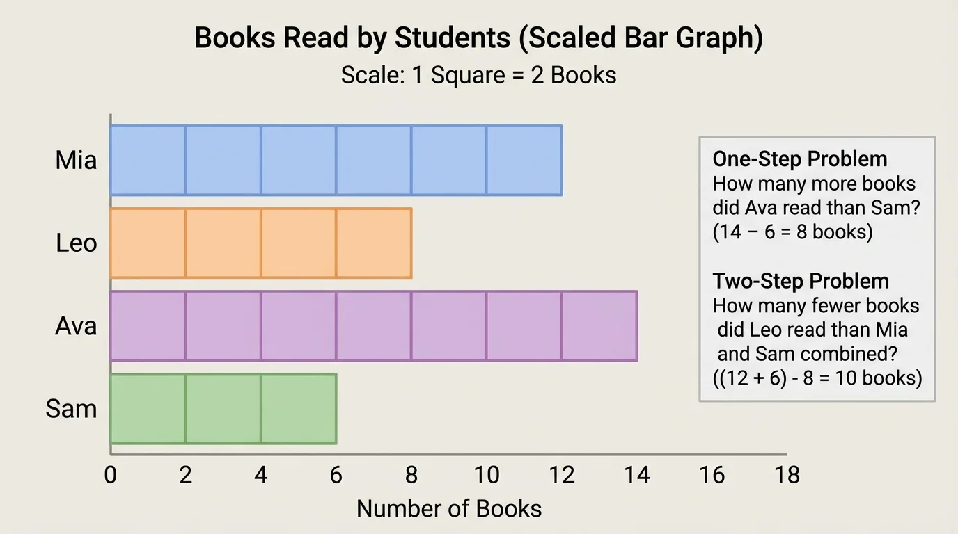
Worked example 3: one-step "how many more" problem
How many more books did Cara read than Ben?
Step 1: Read the graph values.
Cara read \(10\) books. Ben read \(6\) books.
Step 2: Subtract to find the difference.
\(10 - 6 = 4\)
Cara read \(4\) more books than Ben.
The same subtraction can answer a "how many less" question. If Diego read \(4\) books and Ava read \(8\) books, then Diego read
\(8 - 4 = 4\)
So Diego read \(4\) fewer books than Ava.
Worked example 4: one-step "how many less" problem
How many fewer books did Ben read than Cara?
Step 1: Find the larger and smaller amounts.
Cara read \(10\). Ben read \(6\).
Step 2: Subtract.
\(10 - 6 = 4\)
Ben read \(4\) fewer books than Cara.
Some questions are two-step problems. That means you must do two math actions to find the answer.
How two-step graph problems work
In a two-step problem, you might first add two categories together and then compare that total to another category. Or you might compare two categories first and then add or subtract again. Reading the graph correctly is the first step; choosing the operations is the next step.
Here is a two-step example using the same books graph. How many more books did Ava and Ben read together than Diego?
Worked example 5: two-step comparison problem
Find how many more books Ava and Ben read together than Diego.
Step 1: Add Ava and Ben.
\(8 + 6 = 14\)
Step 2: Compare that total with Diego.
\(14 - 4 = 10\)
Ava and Ben read \(10\) more books together than Diego.
Now try another kind of two-step thinking. How many fewer books did Ben and Diego read together than Ava and Cara read together?
First add Ben and Diego:
\(6 + 4 = 10\)
Then add Ava and Cara:
\(8 + 10 = 18\)
Now compare the totals:
\(18 - 10 = 8\)
So Ben and Diego read \(8\) fewer books together than Ava and Cara. This kind of question uses both addition and subtraction.
Later, when you compare categories again, the different bar lengths in [Figure 3] help you see which amount is larger before you calculate the exact answer.
Sometimes a data set does not match the scale perfectly. For example, if one picture stands for \(2\) and a category has \(3\), one whole picture is not enough and two whole pictures would be too many. In a picture graph, people may use a half-picture to show half the value.
If one picture stands for \(2\), then half a picture stands for \(1\). That way, \(3\) can be shown as one whole picture and one half-picture because
\(2 + 1 = 3\)
In a bar graph, a bar can stop between two labeled numbers if needed. But for many third-grade graphs, the teacher may choose a scale that matches the data well, so the graph is easier to read.
A smart choice of scale makes a graph neat and clear. If the numbers are \(5\), \(10\), \(15\), and \(20\), then a scale of \(5\) is very helpful. If the numbers are \(2\), \(4\), \(6\), and \(8\), then a scale of \(2\) works well.
Graphs are not only for math class. Schools use graphs to show lunch choices, library books checked out, or attendance by day. Stores might graph how many apples, bananas, or oranges were sold. Scientists graph rainfall, temperature, or animal counts. Coaches can graph points scored in games.
If a weather chart shows sunny days \(15\), rainy days \(10\), and snowy days \(5\), a person can quickly answer questions such as how many more sunny days than snowy days there were:
\(15 - 5 = 10\)
Or how many sunny and rainy days there were together:
\[15 + 10 = 25\]
These are the same skills you use with classroom graphs. The only thing that changes is the topic.
| Graph Type | What It Uses | Why It Helps |
|---|---|---|
| Picture graph | Symbols or pictures with a key | Easy to see groups quickly |
| Bar graph | Bars with a numbered scale | Easy to compare exact amounts |
Table 1. Comparison of picture graphs and bar graphs.
Whether you read a picture graph or a bar graph, the most important ideas stay the same: know the categories, check the scale, find the values, and use addition or subtraction to answer the question.