A publisher can estimate the reading level of a science book by looking at something surprisingly simple: the lengths of its words. If a sample of words from one chapter tends to be longer than a sample from another chapter, that gives us a clue about the two books. Statistics helps us turn that clue into a reasonable conclusion. Instead of checking every single word in every chapter, we study data from samples and use it to make comparisons.
When we compare two groups using data, we are often trying to answer questions like these: Are students in one school generally taller than students in another school? Does one brand of batteries usually last longer than another? Are words in a seventh-grade science book generally longer than words in a fourth-grade science book? To answer questions like these, we look at both the center of the data and the spread of the data.
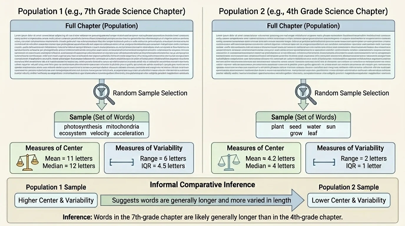
A population is the full group you want to learn about, and a sample is a smaller part of that group. A random sample gives each member of the population a fair chance to be selected, which helps the sample represent the larger group, as shown in [Figure 1]. If we want to compare all the word lengths in two science chapters, the two chapters are the populations, but the words we select from each chapter are samples.
If the sample is chosen fairly, we can use it to make an inference, which is a conclusion about the population based on sample data. An inference is not a guarantee. It is a reasonable statement supported by evidence.
For example, suppose we choose 20 words at random from a fourth-grade science chapter and 20 words at random from a seventh-grade science chapter. We measure each word by counting its letters. Then we compare the two sets of numbers. If the seventh-grade sample has a larger typical value and the data are not too mixed together, we may infer that words in the seventh-grade chapter are generally longer.
You already know that data can be collected, organized, and displayed. Here, the new idea is using sample data not just to describe one set, but to compare two populations in an informed way.
One important warning: a bad sample can lead to a bad conclusion. If someone only chooses special science words like photosynthesis and organism, the sample will be biased. Random sampling helps avoid that problem.
When we talk about the center of a data set, we mean a value that describes what is typical or central in the data. The two most common measures of center are the mean and the median.
Mean is the sum of all data values divided by the number of values.
Median is the middle value when the data are listed in order. If there are two middle values, the median is their average.
The mean uses every value in the set, so it can be affected a lot by very large or very small values. The median is often a better measure of a typical value when there are outliers or extreme values.
Suppose one sample of word lengths is: \(3, 4, 4, 5, 5, 6, 6, 7, 20\). The mean is \[\frac{3+4+4+5+5+6+6+7+20}{9} = \frac{60}{9} \approx 6.67\]
The median is the fifth value in order, which is \(5\). The mean is larger than the median because the value \(20\) pulls the mean upward.
When comparing two populations, we often start by comparing the means or medians of their samples. If one sample has a clearly larger center, that suggests the population may also have a larger typical value.
The center alone is not enough. Two data sets can have the same mean or median but still look very different. We also need a measure of how spread out the data are. This is called variability.
Range is the difference between the greatest value and the least value.
Interquartile range, or interquartile range, is the difference between the third quartile and the first quartile. It describes the spread of the middle half of the data.
The range is easy to find, but it depends only on the smallest and largest values. The interquartile range, often written as \(IQR\), gives a better idea of the spread of most of the data.
If one sample has a larger center but also a very large spread, the two groups may overlap a lot. That makes the comparison less clear. If one sample has a larger center and the spread is not too wide, the evidence is stronger.
For example, consider these two samples of quiz scores. Sample A: \(6, 6, 7, 7, 8, 8, 9\). Sample B: \(3, 5, 6, 8, 10, 11, 12\). Both have median \(8\), but Sample B is much more spread out. That spread matters because it changes how confidently we compare the groups.
A data display can make comparisons much easier. A dot plot shows individual values and helps you see the center, the spread, and whether the two samples overlap, as shown in [Figure 2]. When one plot is mostly to the right of another plot, the values in that group are generally larger.
Suppose the fourth-grade word lengths cluster around \(4\) and \(5\), while the seventh-grade word lengths cluster around \(6\), \(7\), and \(8\). A side-by-side dot plot makes that difference visible very quickly.
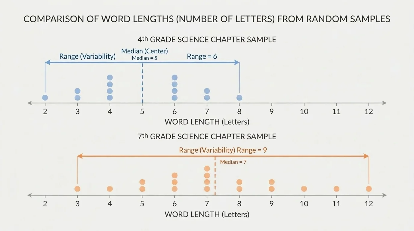
Overlap is important. If the two dot plots overlap only a little, the comparison is stronger. If they overlap a lot, we must be more cautious. The center may still differ, but the evidence is not as strong.
As we saw earlier in [Figure 1], a random sample stands in for the larger population. The dot plot in [Figure 2] then helps us see whether the sample gives evidence that one population tends to have larger values than the other.
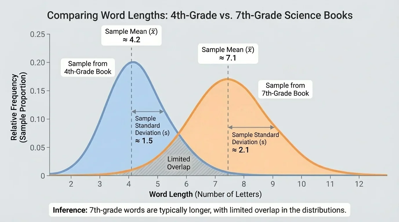
An informal comparative inference is a careful statement about two populations based on sample statistics. We do not use advanced probability rules here. Instead, we look for clear clues in the sample data: a difference in center, a reasonable amount of spread, and the amount of overlap between the samples. When one distribution is shifted to the right, as in [Figure 3], that suggests larger typical values.
Here is a useful pattern for writing a comparison: "The sample from Population A has a higher mean or median than the sample from Population B, and the data overlap only a little, so it is reasonable to infer that Population A generally has higher values than Population B."
Notice the words reasonable to infer and generally. Those words matter. A sample does not prove something about every single member of a population. It gives evidence about what is typical.
If the centers are almost the same, or if the spreads are very wide and the plots overlap a lot, then we should not make a strong claim. We might say, "The samples do not provide strong evidence that one population is generally larger than the other."
The best way to understand comparison is to see it done carefully with actual numbers.
Worked example 1: Comparing word lengths
A random sample of word lengths from a fourth-grade science chapter is \(3, 4, 4, 5, 5, 5, 6, 6, 7, 7\). A random sample from a seventh-grade science chapter is \(4, 5, 6, 6, 7, 7, 7, 8, 8, 9\).
Step 1: Find the median of each sample.
For the fourth-grade sample, the middle two values are \(5\) and \(5\), so the median is \[\frac{5+5}{2} = 5\]
For the seventh-grade sample, the middle two values are \(7\) and \(7\), so the median is \[\frac{7+7}{2} = 7\]
Step 2: Compare the spread.
The fourth-grade range is \(7 - 3 = 4\).
The seventh-grade range is \(9 - 4 = 5\).
The spreads are fairly similar.
Step 3: Make an inference.
The seventh-grade sample has a larger median, \(7\), compared with \(5\). Since the spreads are similar and the seventh-grade values are generally larger, it is reasonable to infer that words in the seventh-grade science chapter are generally longer.
This type of comparison matches the kind of decision real researchers make when they compare reading materials, test results, or manufacturing data.
Worked example 2: Comparing running distances
Two soccer teams track how many kilometers players run during a match. Team A sample: \(7, 8, 8, 9, 9, 10, 10, 11\). Team B sample: \(5, 6, 8, 9, 10, 12, 13, 14\).
Step 1: Find the mean of each sample.
For Team A, the sum is \(7+8+8+9+9+10+10+11 = 72\), so the mean is \[\frac{72}{8} = 9\]
For Team B, the sum is \(5+6+8+9+10+12+13+14 = 77\), so the mean is \[\frac{77}{8} = 9.625\]
Step 2: Compare the spread.
Team A range: \(11 - 7 = 4\).
Team B range: \(14 - 5 = 9\).
Team B has the larger mean, but also much greater variability.
Step 3: Make an inference.
It is reasonable to say Team B may generally run farther, because its mean is larger. However, the larger spread means the difference is less clear than in Example 1. The data overlap a lot, so the inference should be cautious.
This example shows why center alone is not enough. A larger mean does not automatically mean the comparison is strong.
Worked example 3: Comparing battery life
Brand X sample battery lives in hours: \(9, 10, 10, 10, 11, 11, 12\). Brand Y sample: \(7, 8, 10, 10, 12, 13, 14\).
Step 1: Find the medians.
Brand X has median \(10\) because the fourth value is \(10\).
Brand Y also has median \(10\) because the fourth value is \(10\).
Step 2: Compare variability.
Brand X range: \(12 - 9 = 3\).
Brand Y range: \(14 - 7 = 7\).
Step 3: Make an inference.
The medians are the same, so the typical values are not clearly different. Brand Y is more variable. Based on these samples, there is not strong evidence that one brand generally lasts longer than the other.
That conclusion is just as important as finding a difference. Sometimes the correct comparison is that the samples do not support a strong claim.
Organizing key numbers in a table can make a comparison easier to read.
| Sample | Center | Variability | Possible inference |
|---|---|---|---|
| Fourth-grade word lengths | Median \(5\) | Range \(4\) | Shorter typical words |
| Seventh-grade word lengths | Median \(7\) | Range \(5\) | Longer typical words |
| Team A running distances | Mean \(9\) | Range \(4\) | More consistent distances |
| Team B running distances | Mean \(9.625\) | Range \(9\) | Slightly larger average, but less consistent |
Table 1. A comparison of center, variability, and possible inferences for two pairs of samples.
Notice how the table separates two ideas: what is typical and how much the values vary. Both ideas are needed for a fair comparison.
Statistics like this are used in many real situations. Teachers and publishers compare text complexity. Coaches compare player performance. Engineers compare how long products last. Scientists compare measurements from experiments.
For example, a factory might take random samples from two machines that cut metal rods. If one machine has a mean rod length closer to the target and less variability, it may be performing better. In medicine, researchers may compare recovery times for patients using two treatments. They look at typical recovery time and how much the times vary from patient to patient.
The visual idea from [Figure 3] also applies here: when one sample distribution is shifted to the right with limited overlap, the evidence for a larger typical value is stronger. When the distributions overlap heavily, the comparison is weaker.
Publishers, testing companies, and app designers often study word length, sentence length, and vocabulary difficulty to estimate how hard a text will be for readers.
Even in sports broadcasts, announcers often compare averages and consistency without using the exact words measures of center and variability. When they say one player scores more points on average but another is more consistent, they are talking about the same ideas.
One common mistake is to compare only one number, like the mean, and ignore the spread. Another is to treat a sample result as absolute proof. A sample can suggest what is probably true about populations, but it does not tell us everything.
A strong comparison statement sounds like this: "The sample from Group A has a larger median and similar variability, so it is reasonable to infer that Group A generally has larger values." A weak or incorrect statement sounds like this: "Group A is always larger." The word always is usually too strong.
It also helps to choose the right center. If there are extreme values, the median may describe the typical value better than the mean. If the data are fairly balanced without outliers, the mean can be very useful.
As the dot plots in [Figure 2] suggest, comparison is not just about arithmetic. It is about seeing the whole picture: where the data cluster, how far they spread, and how much the groups overlap.