Have you ever looked at a page full of words and then noticed one chart or picture that made everything easier to understand? That is the power of a visual. When we do research, we often find facts, numbers, places, and ideas. A good visual helps us share that information in a way that is quick, clear, and engaging. Instead of reading many sentences about where animals live, a map can show it right away. Instead of reading a list of numbers, a chart can help us compare them fast.
A supporting visual is something you add to your writing or presentation to help explain information. It does not replace your words. It works with your words. A strong visual helps readers understand the most important parts of your research.
Visuals are useful because they help us gather, interpret, and communicate information. When we gather information, we might make a simple table or sketch to keep track of what we learn. When we interpret information, we look for patterns, such as which item has the most or least. When we communicate information, we choose a visual that helps another person understand what we discovered.
Supporting visual means a chart, map, illustration, diagram, or model that helps explain information. Interpret means to understand what information means. Communicate means to share ideas clearly with other people.
Think about a weather report. The speaker may tell you that rain is moving across part of a state, but the map makes the idea much easier to see. In the same way, your own research can become clearer when you use the right supporting visual.
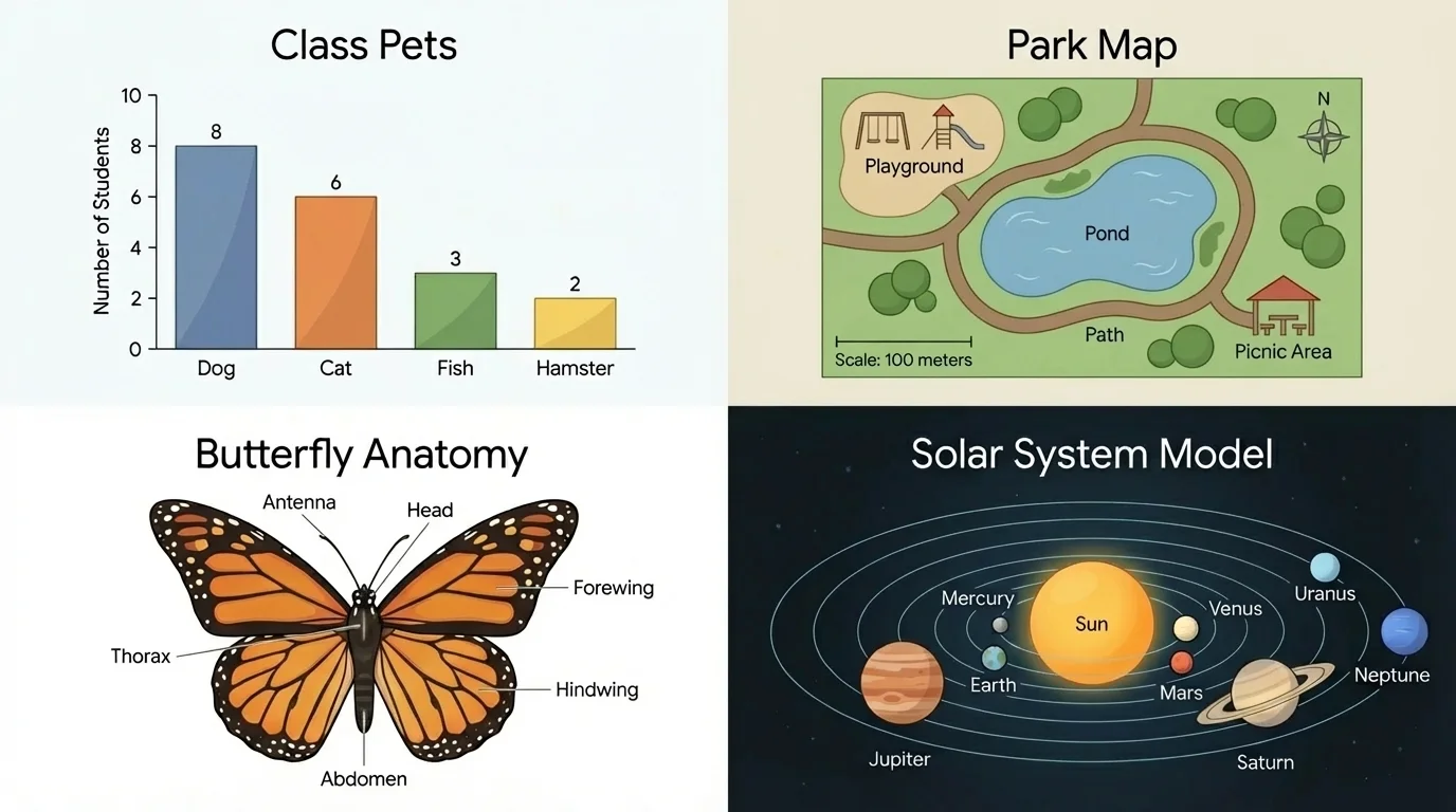
[Figure 1] Different visuals do different jobs. A chart is useful when you want to organize data or compare amounts. A map is useful when you want to show location. An illustration is useful when you want to show what something looks like. A model is useful when you want to show shape, size, or parts in a hands-on way.
A chart can be a bar chart, pictograph, or table. If a class surveys favorite pets and finds that dogs were chosen by more students than fish, a chart helps readers compare those answers quickly. A chart is especially good for information that includes numbers or groups.
A map shows where places are. In a short research project about your school, a map could show the playground, library, office, and cafeteria. In a project about animals, a map could show where penguins live and where camels live. Maps help readers understand place and distance.
An illustration is a drawing or picture made to explain something. A labeled illustration of a butterfly can show wings, antennae, and body parts. An illustration can make a topic easier to picture, especially when words alone are not enough.
A model is an object or representation that helps us study something. A globe is a model of Earth. A small model of the solar system helps show the order of planets. A clay model of a plant cell helps show its parts. Models are helpful when shape and structure matter.
Sometimes you may also use a diagram. A diagram is a special kind of drawing that explains parts or how something works. For example, a diagram of a seed might label the coat, embryo, and food supply. Diagrams and illustrations are similar, but diagrams are often more focused on teaching specific information.
People in many jobs use supporting visuals every day. Doctors read diagrams, meteorologists use maps, engineers study models, and reporters use charts to explain data.
When you look back at Figure 1, you can see that the same topic might be shown in more than one way. A butterfly could be shown with an illustration to show body parts, a chart to compare butterfly sizes, or a map to show where different butterflies live. The best choice depends on what you want your readers to learn.
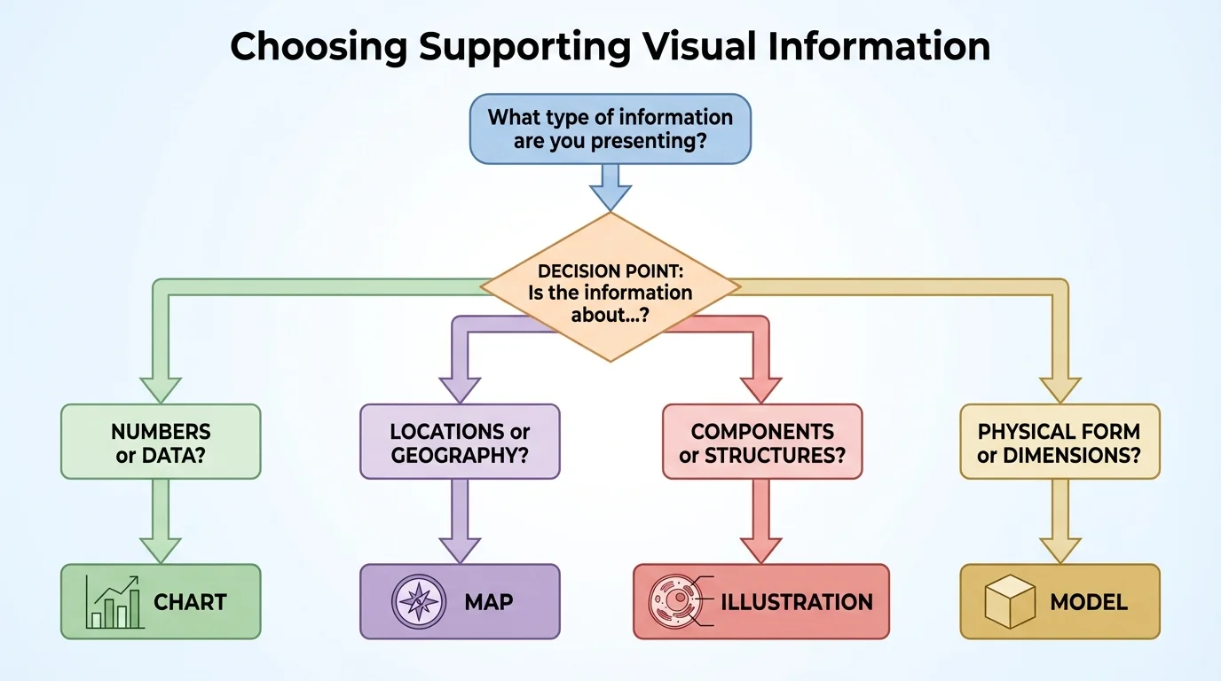
[Figure 2] One important research skill is choosing the best visual for the kind of information you have. A simple guide helps you ask: Is my information about numbers, places, parts, or size and shape?
If your information is about numbers, choose a chart. Suppose you studied birds at a feeder for four days and counted how many birds came each day. A bar chart would help readers compare the amounts from day to day.
If your information is about places, choose a map. If you researched where volcanoes are found, a map would help readers see that many volcanoes are near the edges of certain land areas and oceans.
If your information is about parts, choose an illustration or diagram. For example, if you researched how a flower grows, a labeled picture can show roots, stem, leaves, and petals.
If your information is about size, shape, or how something fits together, choose a model. A model of a bridge, for example, can help show how different pieces connect.
Sometimes more than one visual can help. In a report about your town park, you might use a map to show where the park is and a chart to show how many people visit in each season. Using more than one visual can be useful, but each one should have a clear job.
Choosing the best match means thinking about what your reader needs most. If the goal is to compare amounts, a chart is usually best. If the goal is to find a place, a map is usually best. If the goal is to study parts, an illustration or diagram is often best. If the goal is to understand shape or structure, a model is often best.
A poor match can confuse the reader. A map would not be the best choice for showing which fruit is most popular in class. A chart would not be the best choice for showing where the nurse's office is in school. Good researchers pick visuals carefully.
[Figure 3] Creating visuals is important, but reading them carefully is just as important. When readers study a visual, they look for clues. Good visuals usually include a title, labels, and sometimes a key or legend.
The title tells what the visual is about. A title such as Favorite Recess Games in Grade 3 prepares the reader to look at game choices. Without a title, the reader may not know what the visual means.
Labels name the parts. On a chart, labels may show what is being counted. On a map, labels may show room names or land areas. On an illustration, labels may point to parts of an insect, plant, or machine.
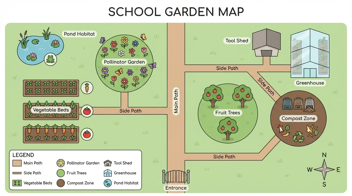
A legend, also called a key, explains symbols and colors. On a school garden map, green might mean grass, brown might mean paths, and small flower symbols might mark planting beds. The legend helps the reader understand what each symbol means.
A caption is a short piece of text that tells about the visual. A caption can explain what the reader is looking at and why it matters. Captions are especially helpful when a visual includes details that need a little explanation.
Accuracy matters too. If a map shows the library in the wrong place, the visual is not helpful. If a chart uses wrong numbers, readers may believe something that is not true. Research visuals must be neat, but they must also be correct.
| Part of a Visual | What It Does |
|---|---|
| Title | Tells the topic |
| Label | Names a part or category |
| Legend or Key | Explains colors or symbols |
| Caption | Gives extra information |
Table 1. Important parts of supporting visuals and their jobs.
When you study a visual, ask yourself questions. What is this mostly about? What do the labels tell me? What is the most important thing I notice? What facts does this visual help me understand faster? Those questions help you interpret information instead of only looking at it.
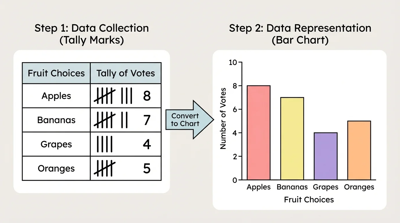
[Figure 4] Good visuals do not begin with drawing. They begin with thinking. Before making a visual, decide what information matters most. A planning process begins with collecting facts, sorting them, and then choosing a clear way to show them.
Suppose your class asks students which fruit they like best: apples, bananas, grapes, or oranges. First, you gather answers. Next, you organize them. You might count the answers and find apples got \(8\), bananas got \(5\), grapes got \(6\), and oranges got \(3\). Then you choose a bar chart because the information is about comparing amounts.
Now think about how the chart should look. It needs a title, such as Favorite Fruits in Our Class. It needs category labels for the fruits. It needs bars that match the counts. The bars should be neat and easy to compare.
If you were making an illustration instead, you would still plan first. In a project about frogs, you might choose the most important body parts to label. In a map, you would decide which places should be included. In a model, you would decide what materials help you show the shape clearly.
Example: Turning facts into a visual
A student researches where classroom noise comes from and records these results: talking \(7\), chairs moving \(4\), pencil sharpening \(2\), and door sounds \(3\).
Step 1: Look at the kind of information.
These are amounts, so a chart is a strong choice.
Step 2: Organize the data.
Put the categories in a clear order and keep the counts correct: talking \(7\), chairs moving \(4\), pencil sharpening \(2\), door sounds \(3\).
Step 3: Add helpful parts.
Give the chart a title, label the categories, and make sure the bars match the numbers.
The finished chart helps readers see quickly that talking is the biggest source of noise.
As you can see again in Figure 4, a strong visual grows from well-organized information. If the facts are mixed up, the visual will also be confusing. Careful planning saves time and makes your work stronger.
In a short research project, you usually begin with a question. You might ask, "Which birds visit our schoolyard?" or "What can we learn about our town park?" As you gather information from books, observations, interviews, or safe websites, you can keep track of what you find in notes and simple organizers.
After that, you decide what information needs support from a visual. If you researched birds, a chart could compare how many times each bird was seen. An illustration could label the parts of one bird. A map could show where in the schoolyard each kind was spotted. Each visual helps communicate a different part of your research.
You already know that strong writing has a main idea and details. Visuals work the same way. The main idea tells what the research is about, and the visual helps show important details in a clear way.
Visuals should connect directly to your topic. If your report is about recycling at school, a chart showing favorite ice cream flavors would not belong. Every visual should support the research question or answer it more clearly.
When students present information aloud, visuals can also help the audience stay focused. A speaker who points to a chart or map gives listeners another way to understand the information. That is why posters, slides, and reports often include visuals.
One common mistake is adding too much. A visual with too many colors, labels, and decorations can be hard to read. Clear is better than crowded. Choose only the information that matters most.
Another mistake is leaving out key parts. A chart without labels, a map without a title, or an illustration without names can confuse the reader. Always check for the basic parts your visual needs.
A third mistake is picking the wrong kind of visual. This is why choosing carefully matters so much. If you remember the ideas from [Figure 2], you can match numbers with charts, places with maps, parts with illustrations, and structures with models.
A final mistake is not checking facts. A visual may look nice but still be wrong. Good researchers compare their visual to their notes and make sure every label, number, and location is accurate.
"A picture is worth a thousand words" can be true, but only when the picture is clear, correct, and connected to the topic.
Neatness also matters. Straight lines, readable labels, and balanced spacing make a visual easier to understand. Readers should spend their energy learning from your visual, not trying to decode it.
You see supporting visuals all the time. A bus map helps riders find stops. A sports chart helps fans compare scores. A recipe illustration can show what the steps or the finished dish look like. A toy-building guide often uses diagrams or models to show how parts fit together.
In science, students may use a model of the Earth, Moon, and Sun to study movement. In social studies, a map may show where different regions are located. In reading and writing, a chart can help organize information from a book. Supporting visuals are useful in almost every subject.
Some people understand information faster when they can both read words and see a visual. That is one reason textbooks, museums, and news reports use so many charts, maps, and diagrams.
When you notice a weather map on television or a chart in a magazine, try asking yourself why that visual was chosen. Looking closely at examples from everyday life helps you become better at making your own.