Have you ever sat through a presentation where the speaker read tiny words from a crowded slide while a random sound effect played in the background? It is hard to pay attention, and it is even harder to learn. Now think about a different presentation: a clear photo, a simple chart, and a speaker who explains exactly why each visual matters. The second presentation feels stronger because the media and visuals help build the main idea instead of getting in the way.
When you give a presentation, you are not just sharing facts. You are guiding your audience. You may want to inform them, explain how something works, or persuade them to agree with an opinion. To do that well, you can use multimedia components and visual displays. These tools can make ideas easier to understand, easier to remember, and more interesting to hear.
But there is an important rule: use media when appropriate. That means you should not add graphics, sound, or video just because you can. Every part of your presentation should have a job. If a picture, chart, sound clip, or slide helps develop your main idea or theme, include it. If it distracts from your message, leave it out.
Multimedia means using more than one kind of media in a presentation, such as spoken words, pictures, charts, sound, or video. A visual display is something the audience looks at to better understand the speaker's message, such as a slide, poster, map, graph, or diagram.
A strong presentation works like teamwork. Your voice explains the ideas. Your visuals support the explanation. Your media choices help the audience notice what matters most. When these parts work together, your presentation becomes clearer and more powerful.
People learn in different ways. Some understand best when they hear an explanation. Others understand better when they see a picture, chart, or labeled diagram. Many people learn best when they can both hear and see the information. That is why visual displays and multimedia can be so effective during oral presentations.
Suppose you are explaining why recycling is important. You could simply say that a lot of trash ends up in landfills. But if you also show a photo of overflowing trash bins or a simple chart comparing recycled items and wasted items, your audience can quickly grasp the problem. The visual gives shape to the words.
Visuals also help audiences remember key points. A good image or chart can stay in someone's mind much longer than a list of spoken details. That does not mean visuals replace speaking. Instead, they support it. The best presentations use words and visuals together.
The human brain often processes images faster than long blocks of text. That is one reason a clear diagram can help an audience understand an idea quickly.
Visuals are especially helpful when you are explaining steps, comparing things, showing changes over time, or describing something the audience cannot see in front of them. For example, if you are describing the parts of a volcano, a labeled picture can make your explanation much easier to follow.
Presentations can include many types of media, as [Figure 1] shows, and each type helps in a different way. A graphic might be a drawing, icon, chart, or diagram. A photograph can show a real place, person, or object. A graph can display patterns in data. A sound clip can let the audience hear an example. A short video clip can show movement or an event that is hard to describe with words alone.
Visual displays can be digital, like slides on a screen, or physical, like a poster board, model, or chart paper. If a student is giving a report about the solar system, a slide with planet images is a visual display. If another student brings a labeled model of the water cycle, that is also a visual display.
Different kinds of multimedia fit different purposes. A map helps show where something is. A timeline helps show when events happened. A diagram helps explain parts or steps. A sound clip helps when hearing matters, such as bird calls in a science report about local animals.
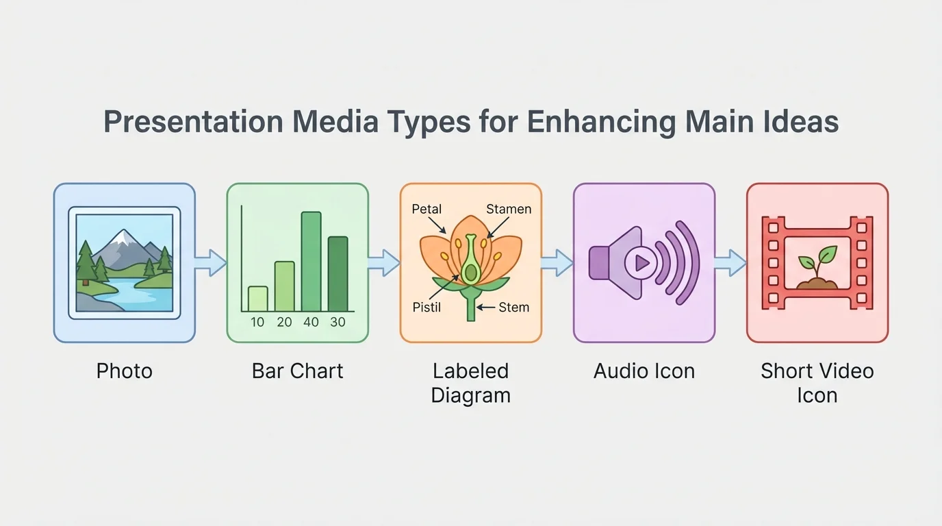
Not every presentation needs every kind of media. In fact, too many kinds at once can overwhelm the audience. A simple and thoughtful choice is usually better than a crowded, flashy one.
Later, when you decide what to include, remember the idea from [Figure 1]: different media do different jobs. Choosing the right one depends on what your audience most needs to understand.
Before adding any visual or sound, ask yourself: What is my main idea? Then ask: What does my audience need in order to understand that idea better? These questions keep your presentation focused.
If your presentation explains how something works, a step-by-step diagram may be best. If your presentation tries to persuade people, a photo or chart that provides strong evidence may be best. If your presentation tells about a place, a map or photograph may be most helpful.
Your media should connect directly to your central message. If your topic is "Why school gardens help communities," you might include a photo of a school garden, a simple chart showing vegetables grown, and a diagram of how plants grow from seed to harvest. All of these strengthen the theme because they help the audience see and understand the benefits of the garden.
Now imagine the same presentation with a spinning background, loud music, and unrelated clip art of cartoon vegetables on every slide. Those choices may seem fun, but they do not develop the main idea. They distract attention away from the important points.
Main idea first, media second
Skilled presenters do not begin by asking, "What cool media can I add?" They begin by asking, "What do I want my audience to understand, feel, or believe?" Then they choose visuals and sounds that support that purpose. This keeps the presentation organized and meaningful.
One good test is this: if you remove the visual, would the audience lose an important piece of understanding? If the answer is yes, the visual is probably useful. If the answer is no, it may not be needed.
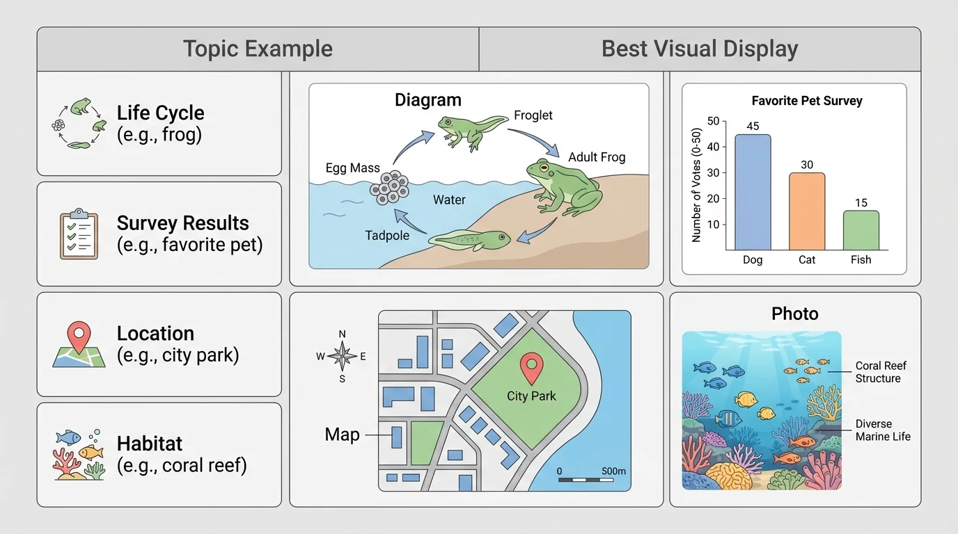
Different visuals do different jobs, and [Figure 2] helps show why matching the visual to the content matters. A photograph is strong when you want to show what something really looks like. A diagram is better when you need to label parts or explain a process. A chart or graph is useful when you want the audience to compare amounts or notice a pattern.
For example, if you are presenting about endangered sea turtles, a photo can help the audience connect emotionally to the animal. A map can show where sea turtles live. A diagram can explain the life cycle from egg to adult. A bar graph can compare the number of turtles seen over several years.
Labels matter too. A visual should be easy to understand quickly. If you show a chart with unclear labels, the audience may spend more time guessing than listening. Keep titles short and meaningful. Make sure axes, categories, and key parts are clearly marked.
Here is a comparison of common choices:
| Visual type | Best used for | Example |
|---|---|---|
| Photograph | Showing real appearance | A close-up of a bee covered in pollen |
| Diagram | Showing parts or steps | Parts of a flower |
| Bar graph | Comparing amounts | Favorite school lunch survey results |
| Line graph | Showing change over time | Temperature across a week |
| Map | Showing location | States in a region |
| Timeline | Showing order in time | Important events in an explorer's life |
Table 1. Common visual types, their best uses, and simple examples.
As you continue planning, think back to [Figure 2]. A visual is most helpful when its form matches the kind of information you want to share.
Sound can be powerful, but only if it clearly supports your message. If you are presenting about musical instruments, a short audio clip of a violin and a trumpet can help the audience hear the difference. If you are presenting about weather, a brief recording of thunder may make the topic more real.
However, sound should be used carefully. Background music during your whole presentation can make it hard for people to hear your voice. Loud effects can startle the audience or seem silly. If a sound clip does not teach something important, it probably does not belong.
The same is true for video. A short clip can be useful when motion matters. For example, if you are explaining how a hummingbird hovers or how a volcano erupts, a brief video can show action that a still image cannot. But long videos can take over the presentation. Remember: you are still the presenter.
When speaking to an audience, your voice should stay clear and easy to hear. Multimedia should support your speaking, not compete with it.
A helpful rule is to keep clips short and purposeful. Introduce the clip, play it, and then explain why it matters. That way, the audience knows what to notice.
A good slide or display is easy to read from across the room, as [Figure 3] illustrates. If your text is tiny, your audience may give up trying to read it. If your slide is packed with too many words, they may read instead of listening. If your colors clash, the information may become hard to see.
Clear design helps your audience focus on the main point. Use large text, short phrases, and enough empty space so the slide does not feel crowded. Keep colors simple and high-contrast, such as dark text on a light background. Choose one or two readable fonts instead of many different styles.
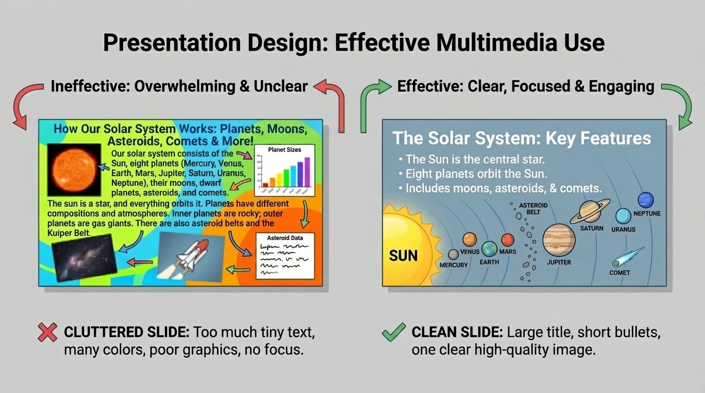
One strong image is often better than many small ones. If you place five unrelated pictures on a slide, the audience may not know where to look. If you place one meaningful image next to a short title or a few key words, the audience can focus on the connection between what they see and what you say.
Bullet points should be brief. They are not a script. Instead of writing full paragraphs, use short reminders. For example, a slide about saving water might say: "Fix leaks," "Turn off tap," and "Use less water outdoors." Then you explain each point out loud.
The lesson from [Figure 3] is simple: a clean design makes your message easier to understand. Fancy effects are less important than clarity.
Example: Improving a crowded slide
A student is making a presentation about bats. The first slide has a long paragraph, three different fonts, six colors, and four tiny pictures.
Step 1: Keep only the most important words.
The student changes the paragraph into three short bullet points: "Bats are mammals," "Most eat insects," and "They help ecosystems."
Step 2: Simplify the design.
The student uses one dark font on a light background and removes extra colors.
Step 3: Choose one strong visual.
The student keeps one clear photo of a bat in flight instead of four tiny pictures.
The revised slide is easier to read, easier to understand, and easier to present.
Poster boards and printed displays follow the same rules. Make labels large, organize information into sections, and leave space between parts. A messy poster can be just as confusing as a messy slide.
Your presentation should be led by you, not by the screen, and [Figure 4] shows what that looks like. Face the audience often. Speak clearly. Use the slide or display as a support tool. Point to important parts when needed, but do not turn your back to the audience for too long.
A common mistake is reading every word on a slide. When that happens, the audience can read ahead, stop listening, or lose interest. Instead, glance at your notes or bullets and explain the ideas in your own words. This makes you sound more confident and helps your speech feel natural.
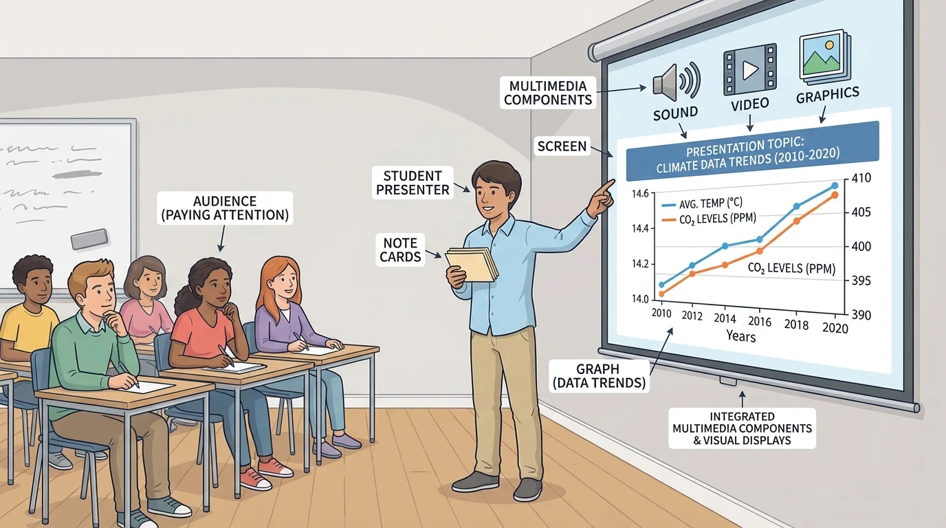
Transitions are important too. A transition is a word or phrase that helps move from one idea to the next. You might say, "Now that we have looked at the causes, let's look at the effects," or "This chart shows what happened next." Good transitions connect your speaking to your visuals.
Timing matters. Show a visual when you are ready to talk about it. Do not leave a complicated chart on the screen while discussing something unrelated. Your audience should always know why they are looking at a particular image or display.
As in [Figure 4], the speaker and the visual work together. The audience watches the presenter for explanation and the visual for support.
Let us look at some situations where multimedia and visuals are used well.
A student gives an opinion presentation on why recess should be longer. She includes a simple bar graph showing student survey results and a photo of children being active outside. The graph provides evidence, and the photo connects to the topic. These visuals strengthen her argument.
Another student explains the life cycle of frogs. He uses a labeled diagram showing egg, tadpole, froglet, and adult frog. He also includes one short audio clip of frog calls when discussing habitats. The diagram explains the stages, and the sound clip adds a meaningful detail.
Example: Matching media to purpose
Topic: "Why local bees matter"
Step 1: Choose the main idea.
The student wants the audience to understand that bees help plants grow by pollination.
Step 2: Choose visuals that teach.
The student picks a photo of a bee on a flower, a labeled diagram of pollination, and a small chart showing crops that depend on pollinators.
Step 3: Remove extras.
The student decides not to add unrelated buzzing sound effects on every slide because they would distract from the explanation.
The final presentation is focused, informative, and easy to follow.
In social studies, a student presenting about westward expansion might use a map to show movement and a timeline to show the order of key events. In science, a student explaining the water cycle might use a diagram with arrows showing evaporation, condensation, precipitation, and collection. In health, a student discussing exercise could use a chart comparing different activities and how they help the body.
The best examples all share the same pattern: each media choice has a reason. Nothing is included just for decoration.
One common mistake is using too much text. If a slide contains whole paragraphs, the audience may try to read instead of listen. The fix is to shorten the text to key words or short bullet points.
Another mistake is adding visuals that are not clearly connected to the topic. For example, a presentation about space exploration does not become better just because every slide has a cartoon alien in the corner. The fix is to keep only visuals that support the message.
A third mistake is choosing a confusing layout. When words, pictures, arrows, and colors are placed without order, the audience may not know where to look first. The fix is to organize information in a clean pattern with titles, sections, and space between items.
Some students also use too many animations or transitions on slides. Moving text, spinning images, and loud sounds can feel exciting at first, but they quickly become distracting. The fix is to use simple effects only when they help the audience notice an important point.
Professional presenters often remove as much as they add. A slide usually becomes stronger when unnecessary words, pictures, and effects are taken away.
Another mistake is forgetting to explain the visual. A student may show a chart but never tell the audience what it means. Always introduce the visual, explain the important part, and connect it back to your main idea.
Using media well also means using it responsibly. If you use a photo, graph, or video from a book or website, your teacher may ask you to give credit to the source. This shows honesty and respect for the work of others.
You should also make sure your visuals are accurate. A chart with wrong labels or a photo that does not match the topic can confuse the audience. Check your information carefully before presenting.
Think about your audience too. If your slide has pale yellow words on a white background, some people may not be able to read it well. If your audio is too quiet or too loud, some may miss the point. Responsible presenters want everyone in the audience to have a fair chance to understand.
Good media choices are audience choices
The best multimedia decisions are not based on what looks flashy. They are based on what helps the audience understand the presentation clearly, accurately, and respectfully.
When you use graphics, sound, and visual displays thoughtfully, you do more than decorate a presentation. You build understanding. You guide attention. You make your main ideas stronger. That is what effective presenting is all about.