A report with only words can feel like a long hallway with all the doors closed. A strong visual opens a door. Suddenly, the reader can see the pattern in the data, the place on a map, or the proof in a photograph. Researchers do not add visuals just to decorate a page. They use visuals to help other people understand information faster, better, and more accurately.
When you research a topic, you often gather facts from books, articles, websites, interviews, and your own observations. Then you summarize and combine that information into your own work. Sometimes the best way to explain what you found is not only with sentences. A photo, chart, graph, map, diagram, or model can show important ideas in a clear and powerful way.
A supporting visual is a chart, graph, map, photo, diagram, model, or other visual tool that helps explain information. It should connect directly to the topic. It should not be random or just "nice to look at." If a visual does not help the audience understand the research, then it does not belong.
Relevant means closely connected to the topic or question. Supporting visual information means visual material that adds evidence, explanation, or clarity to written or spoken ideas. A strong visual supports the main point instead of distracting from it.
Visuals matter because the human brain notices patterns, shapes, and differences quickly. A page of numbers might be hard to understand at first glance, but a graph can reveal which number is greatest, which is least, and how values change over time. A map can show location better than a long paragraph. A photo can provide evidence that something is real.
Visuals also help with memory. If you read that a town receives more rain in spring than in winter, you may remember it. But if you see a bar graph with spring bars much taller than winter bars, the pattern sticks in your mind. Good researchers think about what their audience needs to understand, then choose the clearest way to show it.
That does not mean visuals replace writing. Writing explains, describes, and connects ideas. Visuals work with writing. A strong report uses both. The words tell the meaning; the visual helps the reader see the evidence.
There are many kinds of supporting visuals, and each one has a job. As [Figure 1] shows, different visuals are useful for different kinds of information. A graph is best for numbers and patterns. A map is best for places. A photo is best for showing real objects or events. A diagram is helpful when you want to label parts. A model is useful when something is too large, too small, or too complex to study easily in real life.
A chart can organize information into categories. For example, if you are researching animal habitats, a chart can compare where different animals live, what they eat, and when they are active. A graph shows numerical information visually. If your class counts the number of birds seen each week, a graph can show whether the number goes up or down.
A map is useful when location matters. If you are studying where volcanoes are found, a map can show that many are near the edges of tectonic plates. A photo evidence shows something real that was observed. For example, if students study litter in a park, photos can document the amount and kinds of trash in different places.
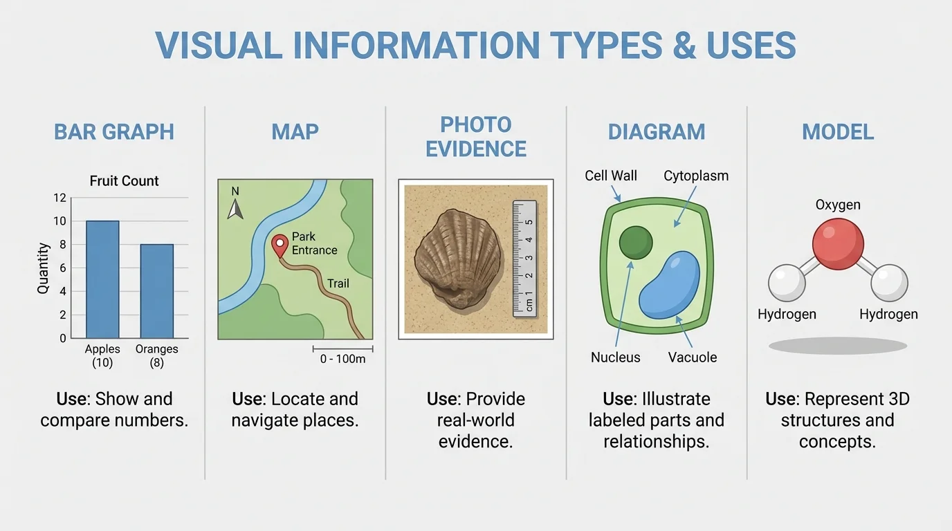
A diagram can simplify something complicated. A labeled plant diagram can show roots, stems, leaves, and flowers more clearly than a photo alone. A model is a physical or digital representation of something. A clay volcano, a solar system model, or a computer 3D building design can help show shape and structure.
Sometimes one project uses more than one visual. A report about weather might include a graph of temperatures, a map of storm paths, and a photo of cloud types. Each visual does a different job.
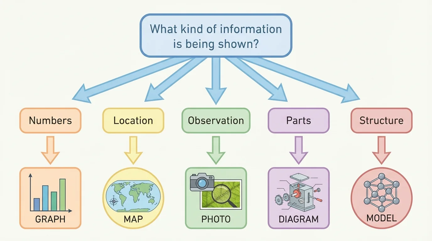
[Figure 2] Choosing the right visual is an important research skill. First ask what kind of information you need to show. Are you showing numbers? A place? A process? A real observation? A comparison of parts? The answer helps you select the best visual.
If you want to show change over time, a line graph often works well. If you want to compare amounts in categories, a bar graph is often better. If you want to show where something happens, use a map. If you want to show what something looked like during an observation, use a photograph. If you want to show how parts fit together, use a diagram or model.
Suppose you are researching school garden plants. If your question is "Which plant grew the tallest?" a bar graph fits well. If your question is "Where in the garden does each plant grow?" a map of the garden beds works better. If your question is "What signs of insect damage did we observe?" photo evidence is useful. If your question is "What are the parts of the bean plant?" a labeled diagram is the best choice.
A relevant visual matches the information exactly. If you choose a pie chart when your data shows change across many days, readers may get confused. If you use a photo when you really need to compare measurements, the photo may not help enough. The goal is always clarity.
One question, one job
A good supporting visual has a clear purpose. Before adding one, ask: "What should the reader understand after looking at this?" If the answer is not clear, the visual may be too broad, too crowded, or unrelated to the topic.
Researchers do not just grab the first image they find online. They check whether it is accurate, trustworthy, and connected to the topic. Reliable visual information can come from books, news articles, school databases, science organizations, museums, and government websites. It can also come from your own observations, such as photos you take or data you collect.
A source is where information comes from. When you use a visual from a source, ask some careful questions. Who made it? When was it made? Does it match information from other reliable sources? Is it clear and complete? A map from a trusted atlas is more dependable than a random image with no author. A graph from a science website is more credible if the data source is named.
If you create your own graph from data you collected, the data itself still has a source. Maybe it came from your class experiment, a weather station, or a survey. Good researchers keep notes about where information comes from so they can give credit later.
Many misleading images on the internet look convincing at first. A cropped photo, a map with missing labels, or a graph with a strange scale can give the wrong idea even when it looks professional.
Research is not about copying. It is about reading, observing, and then putting ideas into your own words and forms. To summarize means to tell the main ideas briefly. To synthesize means to combine information from different sources into a new understanding.
Visuals can help with both. For example, if three sources describe how recycling helps communities, you might create a chart that compares what each source says about saving materials, reducing trash, and protecting land. That chart is not copied from one source. It is built from your notes and shows your understanding of the information.
If you read about bird migration in one book, find a map online, and collect your own local bird observations, you can synthesize those ideas by creating a display that combines migration routes with your own notes. This kind of work shows real thinking. It turns separate facts into one meaningful picture.
| Information you have | Best visual choice | Why it helps |
|---|---|---|
| Rainfall by month | Bar graph | Shows amounts clearly for each month |
| Locations of rivers | Map | Shows where they are |
| Parts of a volcano | Diagram | Labels each part |
| Animal tracks found outdoors | Photo evidence | Records what was actually seen |
| How a water filter works | Model or diagram | Shows structure or steps |
Table 1. Examples of matching different kinds of information to useful visual formats.
[Figure 3] A good visual is not only relevant. It is also clear. A well-designed graph includes a title, labels, and a scale that makes sense. Without these parts, the reader may not know what the visual means.
Every visual should have a title that tells what it shows. Graphs should label both axes. Maps may need a key, compass rose, or scale. Diagrams should label important parts neatly. Photos often need captions to explain what the reader is seeing. Models may need tags or notes so viewers know what each part represents.
Keep visuals neat and easy to read. Use print that is large enough. Do not crowd too much information into one space. Use colors carefully. If colors are too bright or too similar, people may have trouble telling items apart. Lines on a graph should be clear, and bars should be evenly spaced.
Accuracy matters too. If a bar graph uses uneven steps on the vertical axis, the data can look bigger or smaller than it really is. For example, if one graph marks the axis as \(0, 2, 4, 6, 8\) and another jumps from \(0\) to \(10\) to \(100\), the reader may misunderstand the comparison unless the scale is clearly explained. Equal intervals help graphs stay fair and readable.
[Figure 3] Captions are especially helpful because they connect the visual to the research. A caption is a short explanation placed near the visual. It tells what the visual shows and why it matters. A good caption can turn a picture into evidence.
Example: Improving a weak graph
A student makes a graph about favorite fruits but forgets several important parts.
Step 1: Notice the problem
The graph has bars, but it has no title, no category names, and no number scale.
Step 2: Add the missing information
The student adds the title Favorite Fruits in Grade 5, labels the horizontal axis with apple, banana, orange, and grape, and labels the vertical axis with the number of students.
Step 3: Check the scale
The student uses equal intervals such as \(0, 2, 4, 6, 8, 10\), so the bars can be compared fairly.
The graph is now much clearer and more useful.
[Figure 4] Supporting visuals are strongest when they work like evidence in an argument. A photo and caption can connect directly to a written claim. If a student says, "Plants near the window grew better," a photo alone is not enough. The report should explain what the photo proves. Maybe the plants near the window have taller stems or greener leaves. The visual helps support the sentence.
The same is true for graphs and maps. A graph may show that more students walk to school than ride bikes. A map may show that most volcanoes are near plate boundaries. But the writer or speaker should point out the meaning: "The graph shows walking is the most common way students in our survey travel to school." That sentence helps the audience understand why the visual matters.
When you use a visual as evidence, do not assume the reader will figure everything out. Explain it. Name the pattern, result, or detail that supports your idea. This turns the visual from decoration into proof.
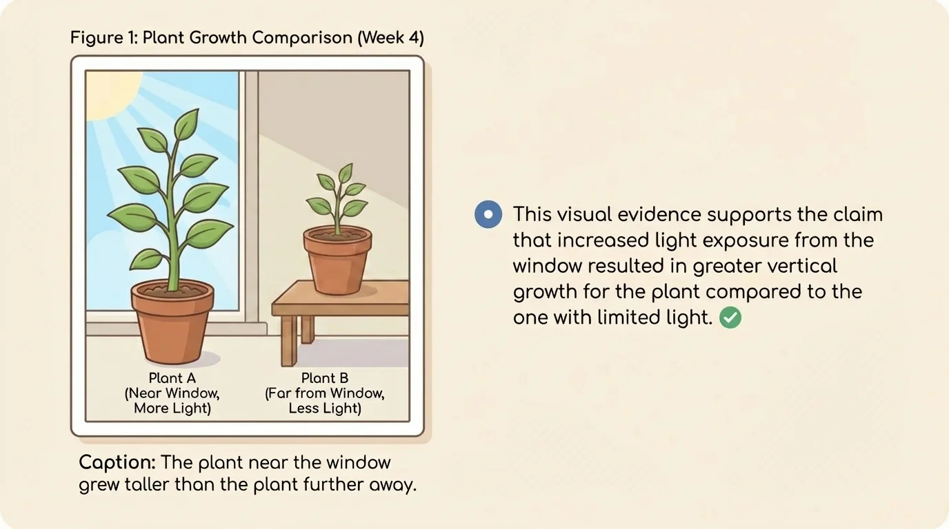
Later in a report, you might return to that same visual. For example, the plant image supports a claim about sunlight, but you could also compare it to measurement data in a graph. Using more than one kind of evidence makes your research stronger.
Whenever you use information from a book, article, website, or database, you should provide a list of sources. Visuals need this care too. If a map came from an atlas or a website, the source should be listed. If a photograph came from a museum collection, the source should be listed. If the graph is based on data from a weather service, the source of the data should be listed.
If you made the visual yourself, you may still need to tell where the information came from. For example, you might write that the graph was created by the student using rainfall data from a local weather station. This shows honesty and helps readers trust the work.
A simple source list often includes the author or organization, the title, and where the information was found. Your teacher may give a special format to follow. The most important idea is to give credit clearly and completely.
When you paraphrase facts in your own words, you still need to give credit to the source. The same rule applies to visuals. Changing the size, color, or layout of an image does not make it your original information.
One common mistake is choosing a visual that is interesting but not relevant. A student writing about weather may add a pretty rainbow photo even though the report is about temperature data. If the rainbow does not help explain the main idea, it distracts instead of supports.
Another mistake is including a visual without explanation. A graph dropped onto a page with no caption or sentence leaves readers guessing. A third mistake is using inaccurate visuals, such as a map with no labels, a graph with a misleading scale, or a photo that does not really show the point being discussed.
Copying visuals without listing the source is also a problem. Researchers must be honest. They should show where both words and visuals come from. Finally, avoid making visuals too crowded. If a chart has too many categories, the reader may not understand it. Sometimes two simple visuals are better than one confusing one.
Suppose a class studies playground use at recess. Students count how many children use the swings, slide, basketball court, and soccer field over five days. A bar graph would clearly compare the areas. If they also want to show where each play area is located, they could add a map of the playground. If they notice damaged equipment, photo evidence could document what they observed.
Now think about a report on local trees. Students might use a diagram to label parts of a leaf, a chart to compare tree types, and photos from their neighborhood to show bark, branches, or seeds. Because these visuals come from different kinds of information, each one helps in a different way. This is like the comparison we saw earlier in [Figure 1], where each visual type has its own best use.
A geography project about rivers might include a map of the river's path, a graph of rainfall amounts, and a photo of erosion on the riverbank. A science project about plant growth might include a line graph of height over time and a labeled diagram of plant parts. In every case, the strongest visual is the one that directly answers the research question.
When students plan visuals carefully, they become better communicators. They do more than collect facts. They choose evidence, organize it, and present it so others can learn from it. That is a real research skill, and it matters in school, at work, and in everyday life.