A strong presentation is not just a person talking while slides glow in the background. In real life, people make decisions based on presentations all the time: city leaders study charts before changing policies, scientists use diagrams to explain discoveries, and students convince others with evidence in class. The difference between a forgettable presentation and a powerful one often comes down to how well the speaker uses images, charts, video, audio, and layout to help the audience understand what matters.
When you present, your job is not only to say information out loud. Your job is to help an audience see the idea, follow the reasoning, and remember the evidence. That is where multimedia and visual displays become important. Used well, they make confusing information easier to understand, support your claims, and keep the audience interested. Used poorly, they can distract people, overload them with text, or even weaken your message.
Multimedia means using more than one form of communication in a presentation, such as spoken words, images, charts, video, audio, and text. A visual display is any visual tool that helps explain information, including slides, graphs, diagrams, maps, models, or posters.
Good presenters make careful choices. They think about their purpose, their audience, and the kind of information they need to communicate. A presentation for classmates about renewable energy, for example, needs visuals that explain how solar panels work and data that supports the argument that renewable energy matters. A speech honoring a community leader might use photos and short quotations instead. The tools change because the purpose changes.
People understand information better when it is organized in more than one useful way. Hearing a statistic may help, but seeing it in a graph can make the pattern clearer. Listening to a description of a machine may be interesting, but a labeled diagram may make the parts easier to understand. Multimedia works best when each part adds something important.
This matters especially when a topic includes details, comparisons, or evidence. If a student says, "Our school wastes a lot of paper," that is a claim. If the student then shows a chart comparing paper use in different months, the audience can judge the claim more clearly. The visual display turns a general statement into something more precise.
Multimedia also helps with attention and memory. A presentation that uses a meaningful image, a simple chart, or a short audio clip can create stronger focus than a long stream of spoken facts. But interest alone is not enough. The media should deepen understanding, not just entertain.
Researchers who study communication often find that people remember ideas better when spoken explanation and useful visuals work together. The key word is useful: extra decoration does not improve learning nearly as much as a clear, relevant visual.
That is why strong presentations are designed, not improvised. Every visual should answer a question such as: What does this help my audience understand? What claim does it support? What evidence does it reveal?
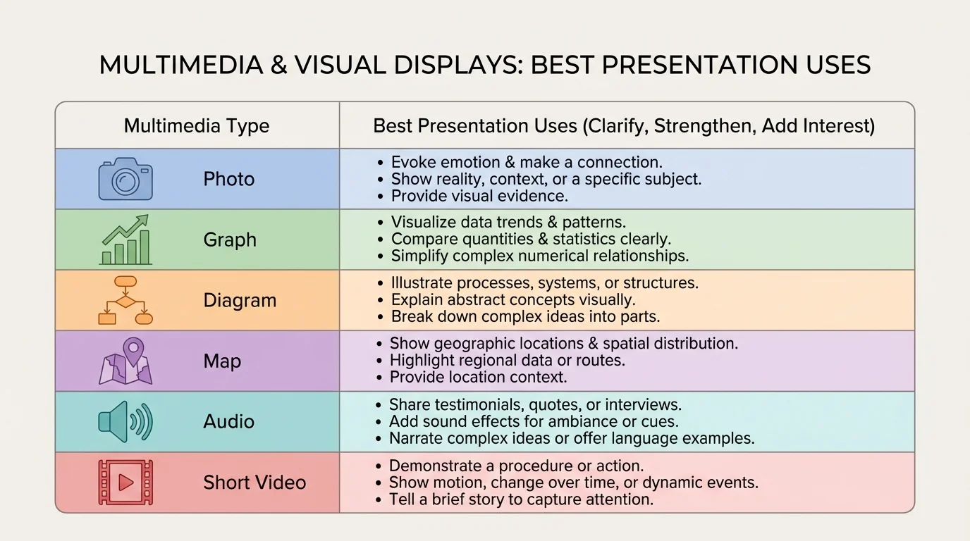
Different kinds of media do different jobs, as [Figure 1] makes clear when it compares which formats work best for different kinds of information. A photo can create context or show a real example. A chart or graph can display patterns in data. A diagram can explain parts of a system. A map can show location and movement. Audio can let the audience hear a voice, sound, or piece of music. Video can show action or change over time.
The best choice depends on what your audience needs most. If you are explaining how a volcano erupts, a diagram is often better than a paragraph of text because it shows structure. If you are arguing that a school lunch program improved student participation, a bar graph may be better because it lets the audience compare before-and-after numbers quickly. If you are presenting about regional music traditions, a short audio clip might communicate more than description alone.
| Media type | Best use | Example in a presentation |
|---|---|---|
| Photo | Show a real object, person, or event | Photo of coastal flooding during a climate presentation |
| Graph or chart | Show patterns, comparisons, or changes | Bar graph of recycling amounts by month |
| Diagram | Explain parts or processes | Labeled diagram of the water cycle |
| Map | Show place or movement | Map of migration routes |
| Audio | Let the audience hear sound directly | Short clip of a historical speech |
| Video | Show motion, sequence, or behavior | Short clip of a robot completing a task |
Table 1. Common media types and the kinds of information they communicate most effectively.
Another important idea is relevance. Relevant media directly supports the topic and the point you are making. An exciting video that has little to do with your claim may grab attention for a moment, but it weakens the presentation because it steals focus from your main message. Good presenters ask whether a piece of media belongs there for a reason.
You should also think about the audience's age, background knowledge, and needs. A chart full of tiny labels may confuse middle school students. A complicated scientific animation may overwhelm an audience that needs a simpler explanation first. Effective multimedia matches the audience's level of understanding.
Media choice is a reasoning choice. Selecting a visual is not mainly about decoration or technology. It is about deciding what form of information best helps an audience understand the point you are making. Skilled presenters choose media the way writers choose evidence: carefully, purposefully, and with the audience in mind.
Sometimes the strongest choice is to use no extra media at all for a moment. If a speaker is sharing a personal story or asking the audience to reflect on an important question, a blank screen or simple title slide can keep attention on the speaker's words. Multimedia should support the presentation, not control it.
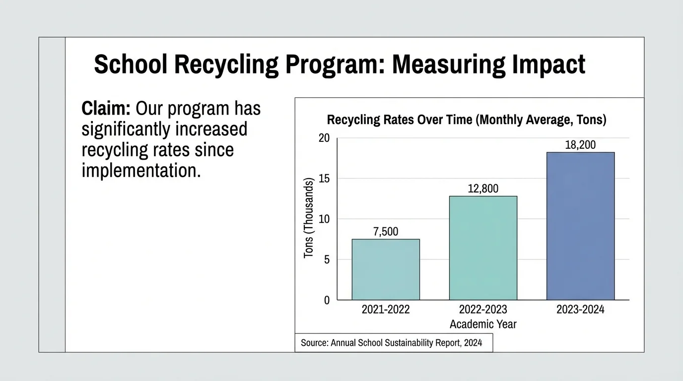
Visuals are especially powerful when they support a claim with clear evidence, as [Figure 2] illustrates through a sample slide that links an argument to a graph and source. A claim is the point you want your audience to accept. Evidence is the information that supports that point. Multimedia helps when it makes the evidence easier to understand, compare, or trust.
Suppose you are giving a presentation arguing that the school should expand its recycling program. You might begin with the claim: "Our school can reduce waste by improving recycling stations." To support that claim, you could show a bar graph of the number of bags of mixed trash and recyclable materials collected over several weeks. If the graph shows that many recyclable items ended up in trash bins, your audience sees a reason for change.
A visual display becomes stronger when it includes source citation. If your graph is based on data collected by the environmental club, say so on the slide. If a photo comes from a local newspaper, credit it. If a chart uses information from a government website, name the source. Citing sources builds trust and shows that your evidence is not invented or copied carelessly.
Presenters should also explain what the audience is looking at. Never assume a chart speaks for itself. A speaker might say, "This graph shows that the cafeteria produced the most plastic waste on Fridays, which supports the need for better sorting bins before weekend cleanup." That sentence connects the visual to the claim.
Notice that the visual does not replace speaking. It works together with speaking. If the audience only sees a graph but does not hear why it matters, the evidence may feel disconnected. If they only hear numbers without seeing the pattern, the idea may be harder to remember. The strongest presentations combine spoken explanation and visible proof.
Case study: weak support versus strong support
A student is presenting on the topic of later school start times.
Step 1: Weak version
The student says, "Later start times are better for students," and shows a slide with a large photo of a sleeping teenager. The image fits the topic, but it does not provide proof.
Step 2: Stronger version
The student keeps one relevant image, but adds a simple chart comparing average sleep hours before and after a schedule change in another district.
Step 3: Best version
The student explains the chart aloud, names the source, and connects the results to the claim: students got more sleep and attendance improved.
The strongest version uses media not just to match the topic, but to support the argument.
As with the comparison in [Figure 1], different evidence calls for different visual forms. Numbers often belong in graphs or tables, while processes fit diagrams better. Choosing the right form helps the claim feel logical and convincing.
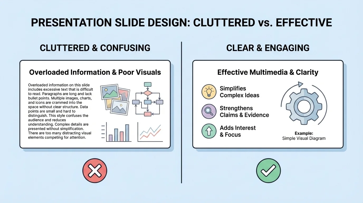
Even strong information can fail if the design is confusing. Slide design matters because the audience has only a few seconds to understand what appears on the screen, and [Figure 3] highlights how much easier a clean slide is to read than a cluttered one. Good design makes the important parts stand out.
One basic rule is to keep text brief. Slides are not essays. If a slide is packed with long paragraphs, the audience faces a problem: should they read the screen or listen to the speaker? Usually they cannot do both well at the same time. Short bullet points, key phrases, labels, and titles work better than full blocks of text.
Font size also matters. If words are too small, people in the back cannot read them. Colors matter too. Dark text on a light background or light text on a dark background usually creates strong contrast. Low-contrast combinations, such as yellow text on white or dark blue on black, make reading harder.
Images should be large enough to see and clear enough to understand. Cropped, blurry, or stretched images can confuse the audience or look unprofessional. Charts and graphs should highlight the main pattern, not bury it in too many labels, gridlines, or unnecessary colors.
Consistency helps as well. If every slide uses a different font, color scheme, and layout, the presentation may feel chaotic. A consistent design creates a sense of order. It also lets the audience focus on content instead of constantly adjusting to new visual styles.
Whitespace is another useful design tool. Whitespace is the empty space around words and images. It is not wasted space. It gives the eye room to rest and makes the main ideas easier to notice. A crowded slide often feels harder than it really is because there is no visual breathing room.
When writing paragraphs, you already organize ideas so readers can follow them. Slide design works in a similar way. Titles, spacing, bullet points, and placement guide the audience's attention just as topic sentences and transitions guide a reader through writing.
When you look back at [Figure 3], the difference is not just appearance. The cleaner version supports listening because it gives the audience fewer things to process at once. Good visual design is really good communication design.
One of the most common presentation problems is reading directly from the screen. Audiences usually disengage when a speaker simply repeats written text word for word. If the slide already says everything, the speaker adds very little. Effective presenters treat visuals as support, not as a script.
Instead of reading, explain. Point out patterns, describe why a detail matters, or guide the audience through the image. For example, if a line graph shows rising temperatures over time, say, "Notice the steady increase after the year 2000," rather than reading every number aloud. Your voice should help the audience interpret the visual.
Timing matters too. Show a visual when the audience needs it, not too early and not long after the point has passed. If a video clip is used, keep it short and introduce it first so the audience knows what to watch for. If an audio clip is used, make sure the sound is loud enough and meaningful enough to justify the time it takes.
Eye contact and body position also affect how visuals work. Do not turn your back on the audience for long periods while staring at the screen. Face the audience as much as possible. If you gesture toward a chart or image, do so briefly and clearly, then return attention to your explanation.
Transitions help the audience stay oriented. A presenter might say, "Now that we have looked at the causes, this diagram shows the effects," or "This next chart compares our school data with city data." These signal words connect one piece of media to the next and help the presentation feel organized.
Some mistakes happen so often that learning to avoid them can improve a presentation immediately. One mistake is adding media just because it looks impressive. Fancy transitions, spinning text, or loud background music may draw attention, but often for the wrong reason. If the audience remembers the effect and forgets the idea, the effect was not helpful.
Another mistake is using too much information on one slide. This can happen with crowded timelines, tiny tables, or graphs packed with several unrelated data sets. If the audience needs a long time just to decode the visual, they may stop following the speaker's argument.
A third mistake is using weak or unreliable sources. A chart without a named source may make the audience question whether the numbers are trustworthy. A random image from the internet may be inaccurate, outdated, or used without permission. Careful presenters evaluate sources for credibility and relevance.
It is also a mistake to use media that does not match the claim. A beautiful landscape photo may fit a presentation on environmental issues, but if the argument depends on data about water quality, the photo cannot do the same work as a graph, map, or table. The goal is not simply to have visuals. The goal is to have the right visuals.
"The best visual aid is the one that makes the idea easier to understand."
— Presentation principle
Finally, technical problems can weaken a presentation if you are not prepared. Test videos, audio, links, and slide formatting ahead of time. Make sure files open correctly. Have a backup plan, such as screenshots or notes, in case technology fails.
Strong multimedia use begins before slides are created. First, identify your purpose. Are you informing, explaining, persuading, or honoring someone? Next, consider your audience. What do they already know? What might confuse them? What will interest them?
Then choose your main points and decide what kind of support each one needs. Some ideas need only clear speaking. Some need a photo or diagram. Some need data shown visually. This planning stage prevents random slide-building and helps every part of the presentation work toward the same goal.
After that, gather materials carefully. Look for accurate images, reliable statistics, and trustworthy sources. Keep track of where your information comes from. Then design your slides or visual displays so that each one has a clear purpose. Ask yourself whether each visual clarifies information, strengthens a claim, or adds meaningful interest.
Finally, rehearse with the media included. Many presentations sound different once visuals are added. You may discover that one slide appears too long, one chart needs simplification, or one image works better if moved earlier. Rehearsal lets you improve the connection between speaking and visuals.
Consider a student giving a presentation on why the school should plant more trees on campus. A weak version might include several slides of tree photos and a lot of text about shade, air quality, and beauty. The topic is good, but the presentation may remain general and unconvincing.
A stronger version would make better use of multimedia. One slide could include a campus map marking areas with little shade. Another could show temperature readings from shaded and unshaded spots taken during lunch. A third could use before-and-after photos from another school that added trees. These visuals do different jobs: the map shows location, the data shows evidence, and the photos make the change easier to imagine.
The speaker would then guide the audience through the visuals: "This map identifies the hottest areas students cross each day," "These temperature readings show a difference of several degrees," and "These photos show how tree placement improved seating areas at another campus." Now the presentation does more than state an opinion. It builds an argument.
This example shows an important truth: multimedia is most effective when every piece has a role. One visual explains, one proves, one adds context, and the speaker connects them into a clear message.