Have you ever noticed that one day can feel cold and rainy, but a whole season still has a pattern? A summer day might bring a storm, and a winter day might feel warmer than usual. Even so, when we look at many days together, we begin to see what weather is usually like during that season. Scientists and students use data to help tell that story.
When we collect weather information and put it into tables and graphs, we can see patterns more clearly. Instead of saying, "I think spring is rainy," we can look at the data and explain what we notice. That makes our ideas stronger, clearer, and based on evidence.
Weather is what the air and sky are like at a certain time and place. Weather can change from day to day. One day may be sunny, the next day cloudy, and the next day rainy.
Climate describes the usual pattern of weather in a place over time. For grade-level weather studies, this means we can look at many days in a season and ask what kind of weather is typical. If winter usually has colder temperatures and more snow than summer, that is part of the climate pattern for that place.
Weather is the condition of the air outside at a certain time, such as sunny, rainy, windy, hot, or cold.
Climate is the pattern of typical weather conditions in a place over a longer time.
Season is one part of the year, such as winter, spring, summer, or fall, that has its own usual weather patterns.
It is important to remember that one strange day does not tell us the whole story. If it snows one spring day, that does not mean spring is usually snowy. We need many observations to describe a season well.
Weather data is information we gather about the weather. We can observe it with our senses and with tools. Students might record whether a day is sunny, cloudy, rainy, snowy, or windy. They might also record temperature with a thermometer.
Some weather data is counted. For example, we can count the number of rainy days in a month. If there are rainy days on Monday, Thursday, and Saturday, then the number of rainy days is \(3\). We can also compare numbers, such as saying \(8 > 3\) when there are more sunny days than rainy days.
Some data describes what happened on each day. For example, a class may observe that the first week of fall had two windy days, three sunny days, and two cloudy days. When we collect these observations in an organized way, we can find patterns.
Tables and graphs both help organize information. A table arranges information into rows and columns. A graph shows information visually so it is easier to compare.
We can collect data for one week, one month, or a whole season. More data often gives a clearer picture. If we only look at \(2\) days, we may miss the bigger pattern. If we look at \(30\) or more days, the seasonal pattern is easier to see.
A table arranges weather observations in rows and columns, as [Figure 1] shows with a simple weekly weather record. Tables help us keep information neat so we can find answers quickly.
For example, a class studying spring weather might make a table with the days of the week in one column and the type of weather in another column. They might also include temperature. Then they can look across the table and count how many days were rainy, sunny, or cloudy.
| Day | Weather | Temperature |
|---|---|---|
| Monday | Rainy | \(18\) |
| Tuesday | Cloudy | \(17\) |
| Wednesday | Sunny | \(22\) |
| Thursday | Rainy | \(19\) |
| Friday | Sunny | \(23\) |
Table 1. A sample spring weather table showing daily weather and temperature.
From this table, we can count \(2\) rainy days, \(1\) cloudy day, and \(2\) sunny days. We can also notice that the sunny days are warmer than the cloudy day in this small set of data.
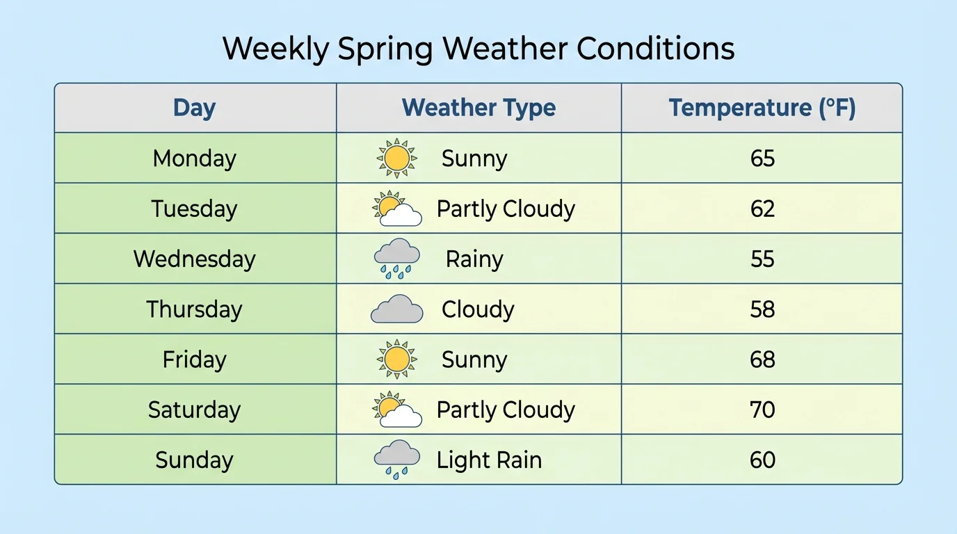
Tables are useful because they help us organize facts before we make a graph. If our data is messy or scattered, it is hard to describe typical seasonal weather. A clear table is often the first step toward understanding a pattern.
Later, when we compare graph types, we can return to the same organized idea from [Figure 1]. A good table makes it easier to build a pictograph or a bar graph correctly.
A pictograph uses pictures or symbols to show data, and [Figure 2] illustrates how one picture can stand for more than one day. Pictographs are useful because the pictures make the data easy to read.
Every pictograph needs a key. The key tells what each picture means. For example, if one sun picture stands for \(2\) sunny days, then \(3\) sun pictures stand for \(6\) sunny days because \(3 \times 2 = 6\).
Suppose a class records summer weather for part of a month. Their pictograph key says that each picture equals \(2\) days. The pictograph might show \(4\) sun pictures, \(1\) cloud picture, and \(2\) rain pictures. That means there were \(8\) sunny days, \(2\) cloudy days, and \(4\) rainy days.
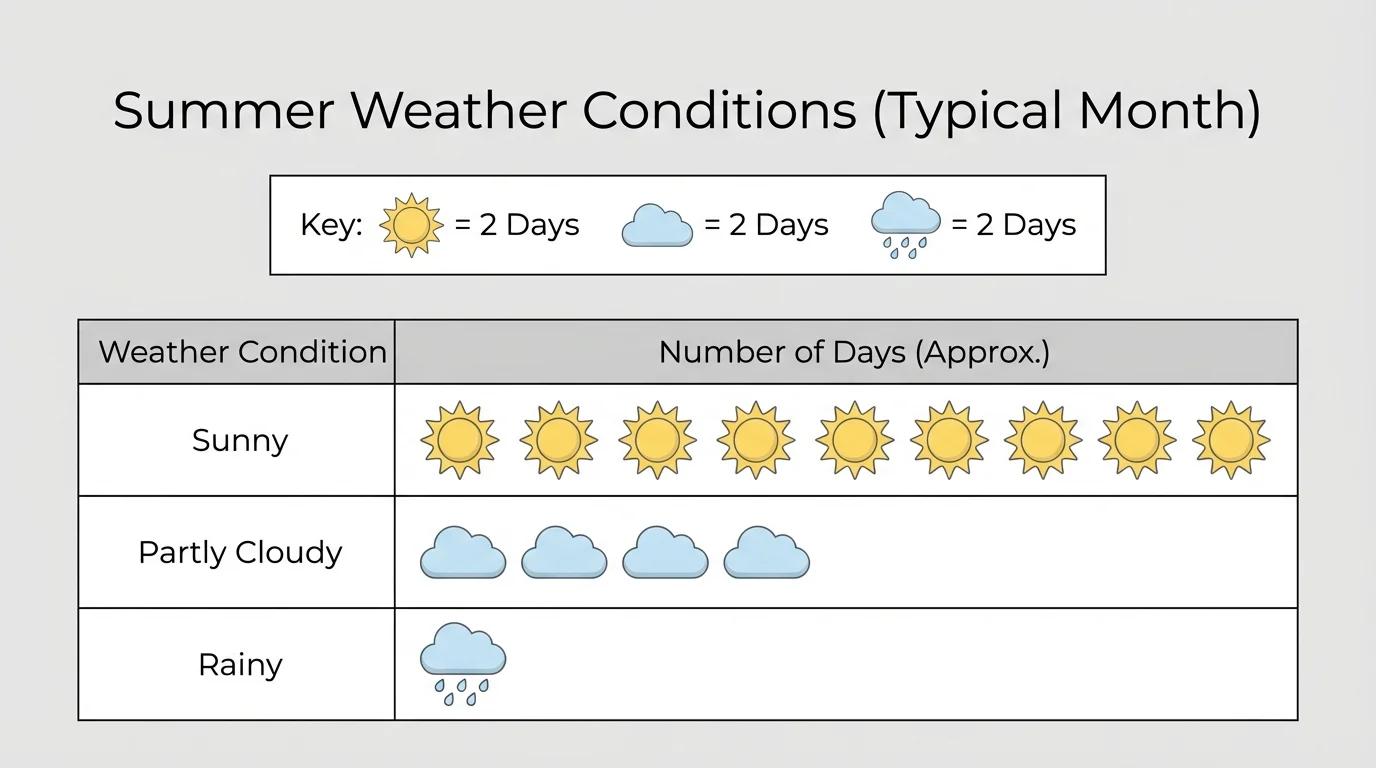
When reading a pictograph, always look at the key first. If you forget the key, you may think \(4\) sun pictures means only \(4\) sunny days, but with the key it actually means \(8\) sunny days.
Reading a pictograph
A winter pictograph uses the key: one snowflake picture equals \(2\) snowy days. The graph shows \(3\) snowflake pictures.
Step 1: Read the key.
Each picture stands for \(2\) days.
Step 2: Count the pictures.
There are \(3\) pictures.
Step 3: Multiply.
\(3 \times 2 = 6\)
The pictograph shows \(6\) snowy days.
Pictographs are great for showing small groups of data in a clear and friendly way. They help students notice which kind of weather happened most often and which happened least often. Looking back at [Figure 2], we can quickly see the weather type with the most symbols.
A bar graph uses bars to show data, and bar height helps us compare weather types quickly, as [Figure 3] demonstrates. Each bar stands for a category, such as sunny, rainy, cloudy, or windy.
Bar graphs need labels. The categories usually go along the bottom. The numbers are shown along the vertical axis. If a bar reaches \(5\), that means there were \(5\) days of that weather type.
Suppose a class studies fall weather and counts the number of days for each weather type. They make a bar graph with these values: sunny \(= 7\), rainy \(= 4\), cloudy \(= 5\), windy \(= 6\). The tallest bar is sunny, so sunny days happened most often. The shortest bar is rainy, so rainy days happened least often.
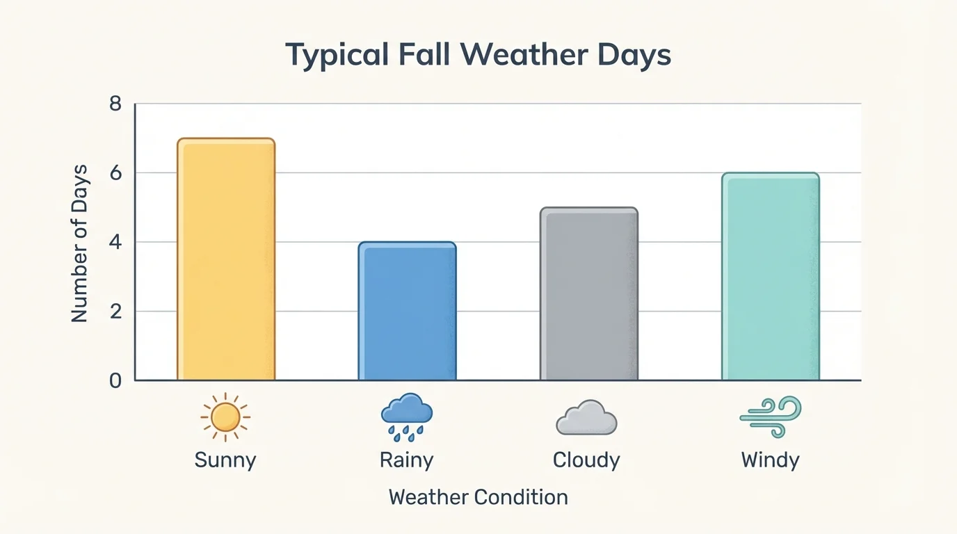
Bar graphs are especially helpful when you want to compare numbers fast. You do not need to count individual pictures, as in a pictograph. You can look at the bar heights and compare them right away.
If one bar reaches \(6\) and another reaches \(4\), then the difference is \(6 - 4 = 2\). That tells us one weather type happened on \(2\) more days than the other. This makes bar graphs useful for answering comparison questions.
Reading a bar graph
A spring bar graph shows rainy days \(= 5\), sunny days \(= 8\), and cloudy days \(= 3\).
Step 1: Find the largest number.
The largest value is \(8\).
Step 2: Match it to the weather type.
The bar for sunny days reaches \(8\).
Step 3: Compare another category.
Rainy days are \(5\), so sunny days happened \(8 - 5 = 3\) more times.
The graph shows that sunny weather was most common in this set of spring data.
When students use weather data, they often start with a table and then turn the same numbers into a bar graph. That way, the data stays organized and becomes easier to compare. The bars in [Figure 3] make the pattern easy to see in just a quick glance.
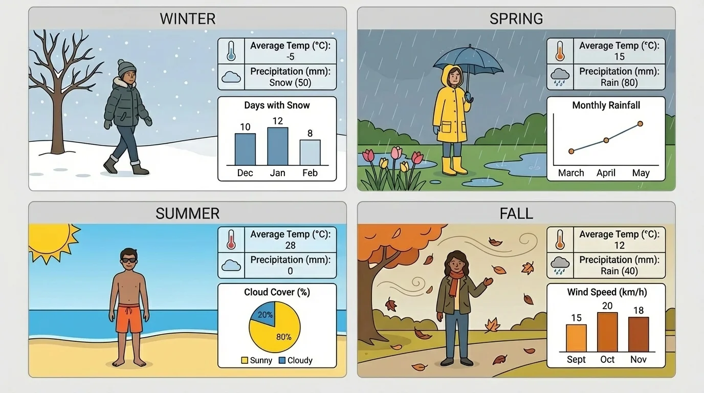
Each season has a pattern of weather that we can describe from data, and [Figure 4] shows simple examples of these seasonal patterns. We are not trying to guess every single day. We are looking for what is usual or expected most of the time.
If winter data shows many cold days and several snowy days, we can say winter is typically colder and snowier than summer in that place. If summer data shows many sunny days and warmer temperatures, we can say summer is typically warmer and sunnier.
Spring may often have more rain, and fall may often have cooler, windier days. These patterns are not exactly the same in every place on Earth, but data helps us describe what is typical in one location.
To describe a season well, use evidence from the table or graph. A strong sentence might say, "The bar graph shows that summer had \(9\) sunny days and only \(2\) rainy days, so summer is usually sunny in this set of data." A weak sentence would just say, "Summer is nice," because it does not use evidence.
We should also remember that seasons can have surprises. A cool summer day or a warm winter day can happen. But when we study many days together, the pattern becomes clearer. That is the power of data.
From observations to patterns
Single observations tell what happened on one day. Tables gather many observations together. Pictographs and bar graphs help us compare those observations. When we study the whole set, we can describe the typical weather expected during a season.
Looking again at [Figure 4], we can connect the pictures of the seasons to the evidence we would see in real tables and graphs. The picture is only a quick model; the data is what lets us make a careful scientific description.
People use seasonal weather data all the time. Families check typical winter weather to decide if they need coats, boots, or gloves. Coaches may plan outdoor sports by looking at which season is usually wetter or hotter.
Farmers also pay attention to seasonal patterns. They need to know when rainy weather is more common and when warmer temperatures usually arrive. This helps them decide when to plant crops.
Schools use weather patterns too. If winter is often snowy in a place, schools may prepare for delayed starts or indoor recess. People who travel can also pack the right clothes by checking typical seasonal weather.
Some places have very different seasonal patterns from others. A winter that is snowy in one state may be rainy in another. That is why collecting local weather data is so important.
Weather data helps us make better choices because it is based on patterns, not just guesses. When we use tables and graphs, we can explain those patterns clearly to other people.
Good scientists read data carefully. They check the labels, count correctly, and pay attention to the key in a pictograph. They also make sure the bars in a bar graph match the numbers in the table.
If a pictograph key says each picture equals \(2\) days, and you count \(5\) pictures, then the total is \(10\) days because \(5 \times 2 = 10\). If a bar graph has one bar at \(7\) and another at \(3\), then the first category happened \(4\) more times because \(7 - 3 = 4\).
It is also important not to make a claim that is too big. A table showing one week of spring weather tells us about that week. A table showing many weeks gives us stronger evidence for what spring is usually like.
When we organize observations, read graphs carefully, and use evidence, we can describe seasonal weather in a scientific way. Tables, pictographs, and bar graphs help turn many small weather observations into a clear pattern we can understand.