Have you ever noticed that your shadow seems to stretch far across the ground in the morning, shrink near the middle of the day, and then stretch out again later? That is not random. It is a pattern, and scientists love patterns because patterns help us explain how the natural world works.
When we collect observations and organize them into charts and graphs, hidden ideas become much easier to see. A table of numbers may look ordinary at first, but a graph can quickly show whether something rises, falls, repeats, or changes direction. In Earth and space science, graphs help us study regular changes in shadows, the repeating cycle of day and night, and the different stars we see during the year.
These patterns are connected to Earth's motion. Earth turns, and that turning creates a daily cycle we can observe from the ground. Earth also moves through space in a way that changes which parts of the night sky are visible at different times of year. We can observe these changes, record data, and represent the data in clear visual displays.
Scientists do not just look once. They observe again and again. When a pattern repeats, it tells us that something dependable is happening. If a fifth-grade class measures a shadow at the same place every hour, they will usually find that the shadow is longest early and late in the day and shortest around midday. If they record sunrise and sunset over many days, they can compare the amount of daylight. If they observe the night sky over months, they can notice that some star patterns appear in one part of the year and not another.
A graphical display is any visual way to show data, such as a table, line graph, bar graph, or diagram. Different displays are useful for different kinds of observations. A line graph is very good for showing change over time. A bar graph is useful for comparing separate categories, such as the number of daylight hours in different months. A data table is useful for keeping exact measurements organized.
When scientists collect data, they look for patterns, not just single facts. A pattern is something that repeats or changes in a predictable way.
In this topic, the most important skill is learning to connect what you observe with how you represent the data. If your graph is clear, you can answer questions such as: When was the shadow shortest? Which month had more daylight? Which season showed a certain star pattern?
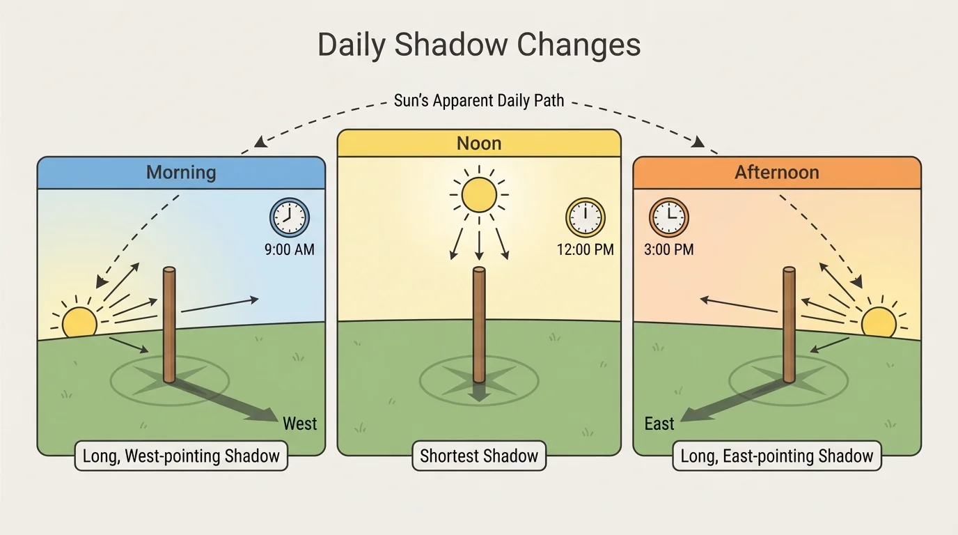
A shadow forms when an object blocks light. Outside on a sunny day, your body, a flagpole, or a stick in the ground can cast a shadow. Over one day, both the shadow length and the direction of that shadow change, and [Figure 1] illustrates this pattern with a simple object standing in sunlight.
In the morning, the Sun appears lower in the eastern sky, so shadows are usually long and point toward the west. Near the middle of the day, the Sun appears higher in the sky, so shadows become shorter. Later in the afternoon, the Sun appears lower in the western sky, and shadows grow longer again, now pointing generally toward the east.
This means that two things are changing at once. The shadow's length changes, and the direction it points changes. If students only measure the length, they get part of the pattern. If they also note the direction, they get a fuller picture of what is happening in the sky above them.
A simple investigation uses a stick or meter stick placed upright in the same location. At times such as 8:00 a.m., 10:00 a.m., 12:00 p.m., and 2:00 p.m., students can mark the tip of the shadow and measure the distance from the stick to that tip. They can also write the direction, such as west, northwest, north, northeast, or east, depending on location and time.
Apparent motion is the way an object seems to move in the sky from our point of view on Earth. The Sun appears to move across the sky during the day, even though it is Earth's rotation that causes this daily pattern.
The important idea is that the shadow is not changing randomly. It follows a daily pattern caused by the changing position of the Sun in the sky. Later, when we read graphs, we can use this idea to explain why the graph rises and falls the way it does.
If one student measures a shadow of 20 cm at 8:00 a.m., 5 cm at noon, and 20 cm at 4:00 p.m., the numbers alone already suggest change. But when those same values are graphed, the pattern becomes easier to recognize and explain, just as the changing positions in [Figure 1] make the daily trend easier to picture.
Once observations are collected, the next step is to organize them. A data table can list time, shadow length, and direction. Then a graph can help reveal the pattern more clearly. A line graph is often the best choice when measurements are taken in time order, and [Figure 2] displays how shadow length changes during one day.
Suppose a class records the following measurements for one stick on a sunny day.
| Time of Day | Shadow Length | Direction |
|---|---|---|
| 8:00 a.m. | 20 cm | West |
| 10:00 a.m. | 12 cm | Northwest |
| 12:00 p.m. | 5 cm | North |
| 2:00 p.m. | 11 cm | Northeast |
| 4:00 p.m. | 20 cm | East |
If we plot time on the horizontal axis and shadow length on the vertical axis, the graph goes down from morning to noon and then back up in the afternoon. This creates a line that slopes downward and then upward, showing a clear daily pattern: long, shorter, shortest, longer, longest again.
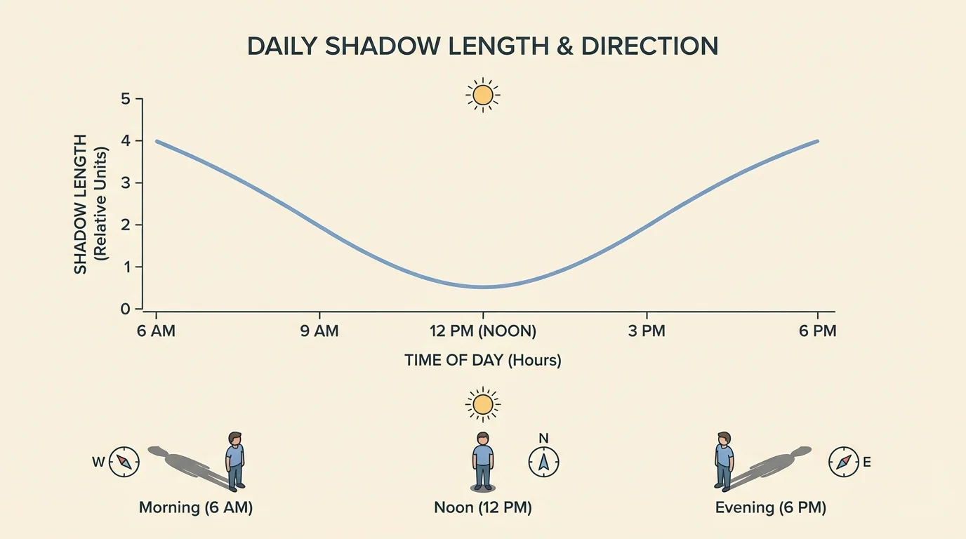
A graph lets us answer questions quickly. The lowest point on the graph shows when the shadow was shortest. The highest points show when it was longest. The shape of the graph tells us that the change is gradual, not sudden.
Reading a shadow graph
A student measures a shadow at three times: 9:00 a.m. = 14 cm, 12:00 p.m. = 6 cm, and 3:00 p.m. = 13 cm.
Step 1: Put the times in order on the horizontal axis.
The order is 9:00 a.m., 12:00 p.m., 3:00 p.m.
Step 2: Plot the lengths on the vertical axis.
The values are 14 cm, 6 cm, and 13 cm.
Step 3: Interpret the trend.
The shadow gets shorter and then longer again. The shortest shadow is at 12:00 p.m.
The shadow gets shorter and then longer again. The shortest shadow is at 12:00 p.m.
Direction can also be displayed. Students might use a compass rose drawing, arrows, or a table of directions. Since direction is not a number like length, it is often better shown with arrows in a diagram than on the same line graph. This is a good reminder that the best graphical display depends on the kind of data being shown.
When reading a graph, always check the labels, the units, and the scale. If one graph measures length in centimeters and another in meters, they cannot be compared carelessly. Clear labels make scientific data much easier to understand.
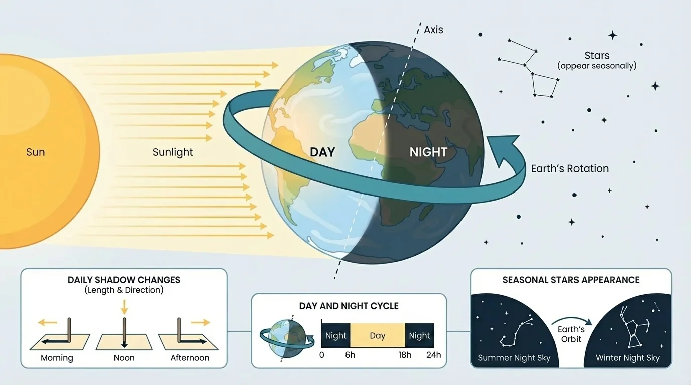
The repeating cycle of day and night is one of the most familiar patterns on Earth, and [Figure 3] shows why one side of Earth has daylight while the other side has darkness at the same time. This pattern happens because Earth is constantly turning, or rotating.
Rotation means spinning around an axis. Earth rotates once in about one day. As Earth turns, a place on Earth moves from the sunlit side into darkness and then back into sunlight again. That is why day and night repeat over and over.
People on different parts of Earth do not have noon at the same moment. When it is daytime in one place, it may be nighttime somewhere else. This shows that day and night are not caused by the Sun turning on and off. They are caused by Earth's rotation.
We can represent day and night data in several ways. A bar graph can compare the number of daylight hours on different dates. A line graph can show how sunrise time changes over many days. A simple model drawing can show Earth with a lighted half and a dark half.
How rotation creates a repeating pattern
Earth's rotation is steady and continuous. Because of that, the pattern of daylight and darkness is predictable. If a place faces the Sun, it has daytime. When Earth's turning carries that place away from the Sun, it has nighttime. Scientists can use this predictable pattern to keep time and compare observations from different places on Earth.
Suppose students collect daylight data for several dates and record the hours of daylight. They might see values such as 9 hours, 12 hours, or 15 hours on different dates. A bar graph makes those comparisons easy because each bar stands for one date and its daylight amount.
When interpreting such a graph, students should ask: Which date has the tallest bar? Which has the shortest? Is there a repeating yearly pattern? Even without explaining the causes of seasons, we can still observe and represent the pattern of changing daylight.
| Date | Hours of Daylight |
|---|---|
| March 21 | 12 hours |
| June 21 | 15 hours |
| September 21 | 12 hours |
| December 21 | 9 hours |
Notice that this table focuses on observed daylight amounts. It helps students recognize a pattern in the data without needing to study the causes of seasons, which is outside the boundary for this topic.
If you look at the night sky in one month and then again several months later, you may notice that some constellations are no longer easy to see while others have appeared. The pattern in [Figure 4] illustrates that the night sky does not look exactly the same all year from the same place on Earth.
A constellation is a pattern of stars that people have named. Some constellations are easier to observe during certain parts of the year. This does not mean the stars are disappearing. It means that Earth's changing position in space changes which part of the night sky we face at night during the year.
Students can represent star observations with a monthly chart. Across the top are months such as January, February, March, and so on. Down the side are constellation names. A check mark or colored box can show when a constellation is visible in the evening sky.
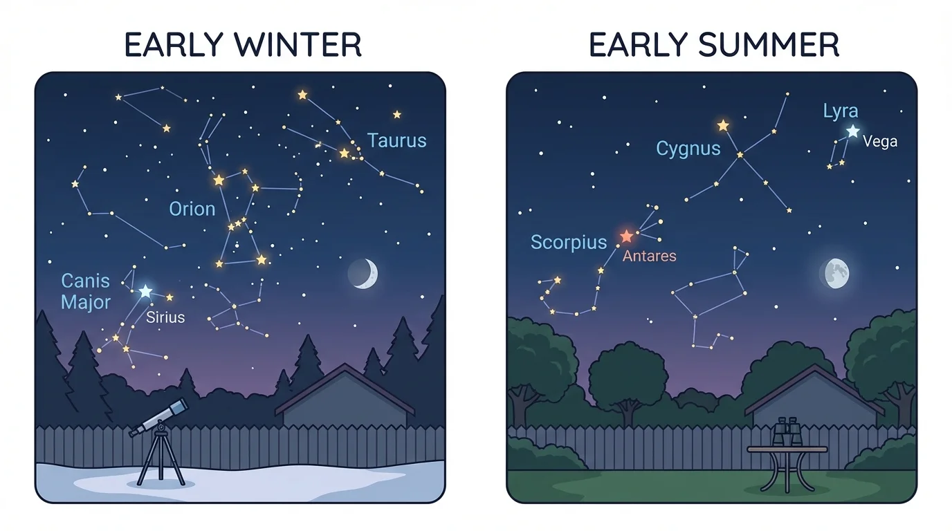
For example, one chart might show that Orion is visible on many winter evenings, while Scorpius is more visible on summer evenings. The exact stars depend on location, date, and time, but the big idea stays the same: the visible star patterns change in an organized way over the year.
Ancient people used repeating star patterns to plan travel, farming, and celebrations. Long before modern clocks and calendars, the sky helped people keep track of time.
A chart is often better than a line graph for star visibility because the data are categories, not measurements like length. Students are not asking, "How much star?" They are asking, "Which stars are visible during which months?" That makes a chart or table the clearer choice.
Later, when students compare observations across months, they can return to [Figure 4] to remember that the sky view from one place changes over time in a pattern, not in a random way.
Scientists choose displays carefully. If the wrong display is used, the pattern can be hard to see. Here is a useful comparison.
| Display Type | Best For | Example in This Topic |
|---|---|---|
| Data table | Exact values | Shadow lengths measured at each hour |
| Line graph | Change over time | Shadow length from morning to afternoon |
| Bar graph | Comparing separate categories | Hours of daylight on different dates |
| Chart with symbols | Showing presence or absence | Which constellations are visible in each month |
| Diagram | Showing spatial relationships | Earth lit on one side and dark on the other |
Table 3. Comparison of common graphical displays used to represent sky and shadow observations.
A line graph works well when values move in order through time. That is why it is so useful for shadow length, as seen earlier in [Figure 2]. A diagram works better when students need to picture where light and darkness are on Earth, as in [Figure 3].
Good graphs also need titles, axis labels, and equal spacing. If the times 8:00, 10:00, and 12:00 are squeezed unevenly onto a graph, the picture can become misleading. Honest graphs help us see real patterns clearly.
These ideas are not only for science class. People use sky patterns in daily life. Builders and architects think about sunlight and shadows when designing playgrounds, windows, and shaded areas. Farmers and gardeners observe daylight patterns. Hikers and campers pay attention to sunrise, sunset, and the night sky.
Long ago, people told time by watching shadows from sundials. A sundial works because the Sun's apparent motion causes a shadow to move in a predictable way. Even today, astronomers and weather observers use regular sky patterns to plan observations.
Real-world example: planning recess shade
A school wants to know when the playground has the shortest equipment shadows so students have the least shade.
Step 1: Measure shadow lengths at different times.
Suppose the class records 18 cm at 9:00 a.m., 7 cm at 12:00 p.m., and 16 cm at 3:00 p.m.
Step 2: Graph the data.
The graph falls to 7 cm at noon and then rises again.
Step 3: Use the pattern.
The shortest shadows, and therefore the least shade, occur near noon.
Graphical displays help people make decisions from real observations.
This shows an important scientific habit: collect evidence, organize it, and use the evidence to answer a question. The same method works whether you are studying a playground shadow or the stars visible in the evening sky.
One common mistake is thinking that a longer shadow always means a taller object. That is not necessarily true. The same object can cast both long and short shadows at different times of day. You must compare shadows made at the same time if you want to compare object heights fairly.
Another mistake is confusing a graph of daylight hours with a graph of temperature. More daylight and warmer weather may sometimes happen around similar times of year, but they are not the same measurement. Always read what the axis labels actually say.
Students may also think that stars move in and out of existence because different constellations are visible at different times of year. The better explanation is that our view changes. Observation charts help show that the visible sky pattern changes regularly.
Finally, remember that data can have small differences because of weather, measuring errors, or observation times. Clouds may block sunlight or stars. That is why scientists take careful notes about when and how observations were made.
"The job of science is to find order in what we observe."
When you use graphs and charts well, you are doing exactly that. You are taking observations from the real world and turning them into patterns that can be explained.