A streaming app can predict what music you might like, sports analysts compare practice time with performance, and scientists study how temperature changes with altitude. In all of these cases, two variables may be connected, but how strong is that connection really? A graph can give you a visual clue, but mathematics gives you a number: the correlation coefficient. That number helps answer an important question: How well does a line describe the relationship in the data?
When we collect data on two quantitative variables, we often want to know whether they move together. For example, if the number of hours students study increases, do quiz scores usually increase too? If the age of a car increases, does its value usually decrease? These questions are about the direction and strength of an association.
A linear fit is a line used to model the relationship between two variables in a scatter plot. If the points in the scatter plot lie close to a line, the linear fit may be useful for describing the data or making predictions. If the points are widely scattered or follow a curve instead, a linear fit may not be appropriate.
You already know that a scatter plot places ordered pairs \(x, y\) on a coordinate plane. The variable \(x\) is usually the explanatory variable, and \(y\) is usually the response variable.
The correlation coefficient, written as \(r\), measures the direction and strength of a linear relationship between two quantitative variables. Technology computes \(r\) for us, but understanding what it means is the real goal.
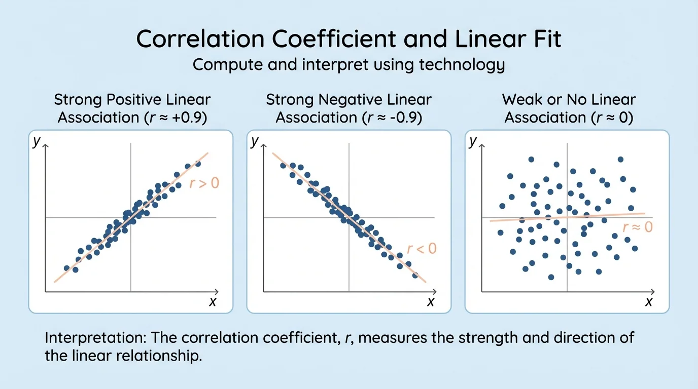
Before looking at any numerical output, it is smart to examine the scatter plot. Your eyes often notice whether the points rise from left to right, fall from left to right, or show no clear pattern at all. This comparison becomes clear in [Figure 1], where different scatter plots display very different kinds of association.
If the points tend to rise as \(x\) increases, the association is positive. If the points tend to fall as \(x\) increases, the association is negative. If the points do not cluster around any line, the linear association is weak or absent.
A linear fit is often found by technology using the least-squares regression line. This is the line that makes the overall squared vertical distances between the data points and the line as small as possible. You do not usually compute that line by hand in this course; instead, you use a calculator, spreadsheet, or graphing software.
Correlation coefficient \(r\) is a number between \(-1\) and \(1\) that describes the direction and strength of a linear relationship.
Positive correlation means \(r > 0\).
Negative correlation means \(r < 0\).
Little or no linear association means \(r\) is close to \(0\).
The value of \(r\) does not tell you everything. It does not tell you whether one variable causes the other, and it does not tell you whether a line is appropriate if the pattern is curved. That is why a scatter plot and the value of \(r\) should always be used together.
The sign of \(r\) gives the direction of the linear association. A positive value means the variables tend to increase together. A negative value means one variable tends to decrease as the other increases.
The absolute value \(|r|\) tells the strength of the linear relationship. Values of \(r\) near \(1\) or \(-1\) mean the points lie close to a line. Values near \(0\) mean the points do not follow a strong linear pattern.
Although different textbooks may use slightly different cutoffs, a common interpretation guide is shown below.
| Value of \(|r|\) | Typical interpretation |
|---|---|
| \(0\) to \(0.3\) | Weak linear association |
| About \(0.3\) to \(0.7\) | Moderate linear association |
| About \(0.7\) to \(1\) | Strong linear association |
Table 1. A common guide for interpreting the strength of a linear correlation using \(|r|\).
These labels are only guidelines. Context matters. In some fields, an \(r\) value of \(0.5\) may be considered useful. In others, researchers may want a much stronger relationship before trusting a linear prediction.
Even a very strong correlation such as \(r = 0.95\) does not guarantee perfect prediction. It only tells you that the data closely follow a line.
The extreme cases are important. If \(r = 1\), the points lie exactly on a line with positive slope. If \(r = -1\), the points lie exactly on a line with negative slope. Real-world data almost never reach these perfect values.
Most graphing calculators, spreadsheets, and statistics tools can compute a linear regression and report \(r\). The exact buttons differ by device, but the process is similar.
First, enter the paired data values into two lists or columns. Next, choose a linear regression option. The technology then reports an equation of the form \(y = mx + b\) or \(\hat{y} = mx + b\), along with the correlation coefficient \(r\) and sometimes \(r^2\).
How to read technology output
If technology gives a regression equation such as \(\hat{y} = 4.2x + 61\), the slope \(4.2\) means the predicted value of \(y\) increases by about \(4.2\) for each increase of \(1\) in \(x\). If it also reports \(r = 0.89\), that tells you the linear relationship is strong and positive.
Some tools report only \(r^2\), called the coefficient of determination. If you know the slope is positive, then \(r\) is the positive square root of \(r^2\). If the slope is negative, then \(r\) is the negative square root of \(r^2\). For example, if \(r^2 = 0.81\) and the regression line slopes downward, then \(r = -0.9\).
When interpreting output, always include context. Saying "\(r = 0.84\)" is incomplete. A better statement is: "The correlation coefficient is \(0.84\), so there is a strong positive linear relationship between hours studied and quiz score."
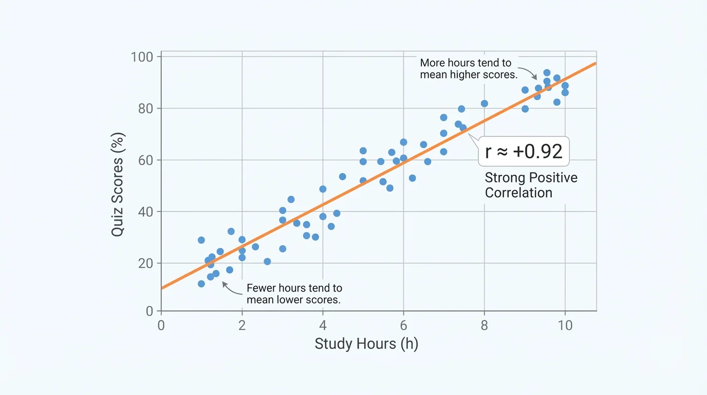
A teacher records the number of hours \(x\) that students studied for a quiz and their scores \(y\). A scatter plot suggests an upward trend, as shown in [Figure 2]. Technology gives the regression line \(\hat{y} = 6.1x + 58.4\) and the correlation coefficient \(r = 0.92\).
Interpreting a strong positive correlation
Step 1: Identify the value of \(r\).
The technology output gives \(r = 0.92\).
Step 2: Determine the direction.
Because \(r\) is positive, the association is positive. As study time increases, quiz scores tend to increase.
Step 3: Determine the strength.
Since \(|0.92|\) is close to \(1\), the relationship is strong.
Step 4: Write the interpretation in context.
There is a strong positive linear relationship between hours studied and quiz score.
This means a linear model is a good fit for these data.
The scatter plot pattern matches the value of \(r\): the points cluster closely around a line that rises from left to right. This is exactly what we expect from a strong positive correlation.
You can also use the regression equation to make predictions, but only if the data pattern is reasonably linear and you stay within a sensible range of \(x\)-values. Correlation helps justify whether the linear model is appropriate in the first place.
A used-car website tracks the age of a car in years and its resale value. Technology gives the regression line \(\hat{y} = -1800x + 24{,}500\) and the correlation coefficient \(r = -0.87\).
Interpreting a strong negative correlation
Step 1: Read the sign of \(r\).
Since \(r = -0.87\), the association is negative.
Step 2: Judge the strength.
The value \(|-0.87| = 0.87\) is close to \(1\), so the linear relationship is strong.
Step 3: State the interpretation in context.
There is a strong negative linear relationship between the age of a car and its resale value.
Step 4: Explain what that means.
As car age increases, resale value tends to decrease, and a linear model describes the data fairly well.
This example shows that a negative correlation is not "bad." It simply means the variables move in opposite directions. In many real situations, such as temperature versus heating cost or distance remaining versus distance traveled, a negative relationship makes perfect sense.
A group of students compares the number of songs on their playlists with the number of hours they sleep each night. Technology reports \(r = 0.11\).
Interpreting a weak linear relationship
Step 1: Read the sign.
Because \(r\) is positive, the trend is technically positive.
Step 2: Check the magnitude.
The value \(|0.11|\) is very close to \(0\), so the linear relationship is very weak.
Step 3: Write the conclusion in context.
There is a very weak positive linear relationship between playlist size and hours of sleep.
In practical terms, this means a linear fit is not very useful here. Even though \(r\) is slightly above \(0\), the data do not strongly follow a line.
One of the most important ideas in statistics is that correlation does not prove causation. If two variables are strongly correlated, that does not mean one directly causes the other.
For example, ice cream sales and swimming accidents may both rise in summer. A strong positive correlation might exist, but buying ice cream does not cause accidents. The lurking variable is temperature or season: warmer weather increases both.
"Correlation describes a relationship; it does not explain why the relationship exists."
This matters whenever you interpret data from the real world. A correlation coefficient is a tool for description, not automatic proof of cause and effect.
The value of \(r\) can be strongly affected by unusual data points called outliers. It can also be misleading if the data follow a curve instead of a line. These situations appear in [Figure 3], where one graph shows a single extreme point and another shows a nonlinear pattern.
An outlier can make \(r\) much larger or smaller than expected. A curved pattern may have a low \(r\) even if the variables are clearly related. That is why statisticians do not rely on \(r\) alone.
Always inspect the scatter plot before trusting the correlation coefficient. Ask: Do the points roughly follow a line? Are there any unusual points far away from the rest? Is the pattern curved?
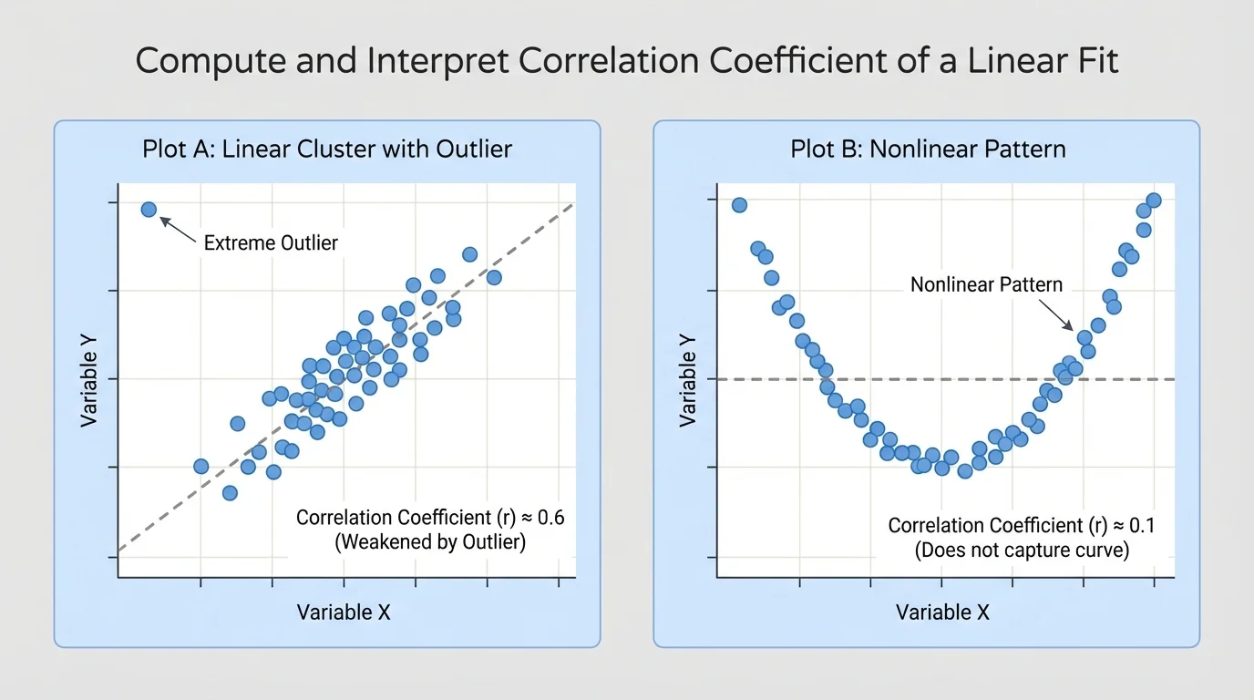
Later, when you compare models, [Figure 3] remains a useful reminder that a single number cannot replace visual reasoning. A strong-looking curved pattern is still not a strong linear relationship.
Why scatter plots come first
The correlation coefficient only measures how well the data match a line. It does not detect whether another model, such as a quadratic model, might describe the data better. Looking at the graph first protects you from misinterpreting \(r\).
Suppose technology reports \(r = 0.02\). That suggests almost no linear association. But if the points form a U-shaped curve, then the variables may still have a strong non-linear relationship. The issue is not "no relationship"; the issue is "no useful linear relationship."
Correlation coefficients are used in many fields because they help summarize large amounts of data quickly. In sports science, coaches might study the relationship between training time and sprint speed. In economics, researchers might compare years of education with income. In environmental science, they may examine rainfall and crop yield.
Doctors and public health researchers also use correlation to look for patterns, such as the relationship between exercise time and resting heart rate. Engineers compare material thickness with strength. Social scientists compare screen time with sleep duration. In each case, \(r\) helps answer whether a linear model is reasonable.
Large data sets can produce statistically interesting correlations that are still not useful for prediction. A relationship can be real but too weak to support strong decisions.
For students, this idea appears in everyday life too. A school might compare attendance with course grades. A strong positive \(r\) would suggest that students who attend more often tend to earn higher grades, though it would still not prove that attendance alone causes better performance.
Many technology tools report both \(r\) and coefficient of determination, written as \(r^2\). These values are connected, but they are not interpreted in exactly the same way.
The value \(r\) tells the direction and strength of the linear relationship. The value \(r^2\) tells the proportion of the variation in \(y\) that is explained by the linear model using \(x\).
For example, if \(r = 0.8\), then \(r^2 = 0.64\). This means about \(64\%\) of the variation in the response variable is explained by the linear model. The remaining \(36\%\) is due to other factors or random variation.
Connecting \(r\) and \(r^2\)
Step 1: Start with the correlation coefficient.
Suppose \(r = -0.6\).
Step 2: Square the value.
\(r^2 = (-0.6)^2 = 0.36\).
Step 3: Interpret both numbers.
The value \(r = -0.6\) means a moderate negative linear relationship. The value \(r^2 = 0.36\) means about \(36\%\) of the variation in \(y\) is explained by the linear model.
Notice that \(r^2\) is never negative, but \(r\) can be. That is why \(r\) is needed to tell direction, while \(r^2\) is useful for discussing how well the model explains variation.
When you are asked to compute and interpret the correlation coefficient of a linear fit, a strong answer usually includes four ideas: use technology to obtain \(r\), identify whether the relationship is positive or negative, describe whether it is weak, moderate, or strong, and explain your conclusion in the context of the variables.
It is also good practice to mention whether a linear model seems appropriate from the scatter plot. If the graph is curved or has influential outliers, then the correlation coefficient may not tell the full story.
A precise interpretation might sound like this: "Using technology, the correlation coefficient is \(r = -0.78\). This indicates a moderately strong negative linear relationship between outside temperature and daily heating cost, so a linear model is fairly reasonable for these data."