Two basketball players can both average \(12\) points per game, but one might score almost exactly \(12\) every game while the other scores \(2\), \(4\), \(10\), \(18\), and \(26\). Those players do not perform in the same way, even though the average looks the same. That is why statistics is not only about finding one number. It is about choosing the numbers that best describe the data.
When we study data, we often want to answer questions like these: What is a typical value? How spread out are the values? Are the data balanced, or do they stretch farther in one direction? Are there unusual values that change the picture? To answer these questions well, we need to match the right measure to the shape of the data and to the situation in which the data were collected.
A data set is a collection of values, such as test scores, heights, number of books read, or daily temperatures. A distribution tells us how those values are spread out. Sometimes the values are packed closely together. Sometimes they are spread far apart. Sometimes most values are in the middle, and sometimes a few unusual values sit far away from the rest.
If we only report one number, we may hide important details. For example, suppose five students read \(4\), \(4\), \(5\), \(5\), and \(22\) books in a year. The mean is \(\dfrac{4+4+5+5+22}{5} = \dfrac{40}{5} = 8\). But saying that the average is \(8\) books makes it sound like many students read around \(8\) books, which is not true. Most students read much fewer. This is why the shape of the data matters.
Measures of center are numbers that describe a typical or middle value in a data set. Common measures of center are the mean, median, and mode.
Measures of variability are numbers that describe how spread out the data are. Common measures of variability include the range and the interquartile range.
To describe data well, we usually need one measure of center and one measure of variability. Together, they tell us what is typical and how much the values differ.
The mean is what many people call the average. To find it, add all the data values and divide by the number of values. If the data set is \(6\), \(8\), \(9\), \(9\), \(13\), then the mean is \(\dfrac{6+8+9+9+13}{5} = \dfrac{45}{5} = 9\).
The median is the middle value when the data are arranged from least to greatest. In the same data set, \(6\), \(8\), \(9\), \(9\), \(13\), the median is \(9\) because it is the middle number. If there are two middle numbers, the median is halfway between them.
The mode is the value that appears most often. In \(6\), \(8\), \(9\), \(9\), \(13\), the mode is \(9\). Some data sets have no mode, one mode, or more than one mode.
These three measures do not always give the same answer. That difference can be useful. When the mean and median are close, the data may be fairly balanced. When they are far apart, the data may be skewed or may include an outlier.
The range is the difference between the greatest value and the least value. For the data \(6\), \(8\), \(9\), \(9\), \(13\), the range is \(13 - 6 = 7\).
Range is easy to find, but it depends only on two numbers: the smallest and the largest. If one of those numbers is unusual, the range can change a lot. So range is helpful, but it does not always tell the whole story.
The interquartile range, or IQR, looks at the middle half of the data. It is found by subtracting the first quartile from the third quartile. In simpler words, it tells how spread out the middle \(50\%\) of the data are. Because it ignores the highest and lowest extremes, it is often more useful when there are outliers.
To find quartiles, first list the data in order. The median splits the data into a lower half and an upper half. The median of the lower half is the first quartile, and the median of the upper half is the third quartile.
Suppose the data are \(2\), \(4\), \(5\), \(6\), \(7\), \(9\), \(12\). The median is \(6\). The lower half is \(2\), \(4\), \(5\), so the first quartile is \(4\). The upper half is \(7\), \(9\), \(12\), so the third quartile is \(9\). The IQR is \(9 - 4 = 5\).
The shape of a distribution affects which statistics describe it best, as [Figure 1] shows. A distribution can be symmetric, which means the data are balanced around the center. It can also be skewed, which means one side stretches farther than the other. A distribution may also have clusters, gaps, or unusual values.
When a distribution is symmetric and has no extreme outliers, the mean usually does a good job of describing the center. That is because the values balance around the mean. The range can also be useful if there are no strange extreme values.
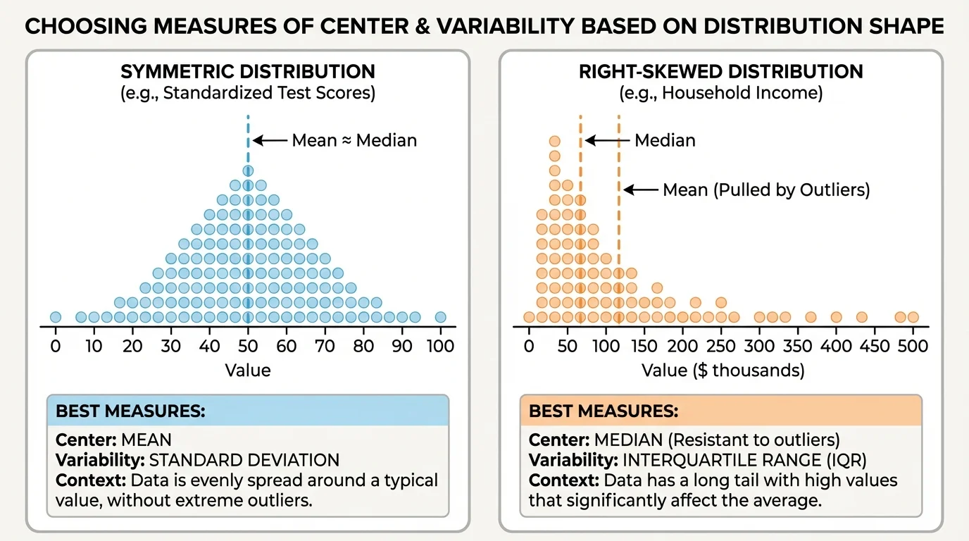
A distribution is often called right-skewed when the tail stretches to the right toward larger values, and left-skewed when the tail stretches to the left toward smaller values. In skewed data, the mean gets pulled toward the long tail. The median usually stays closer to the middle of the bulk of the data.
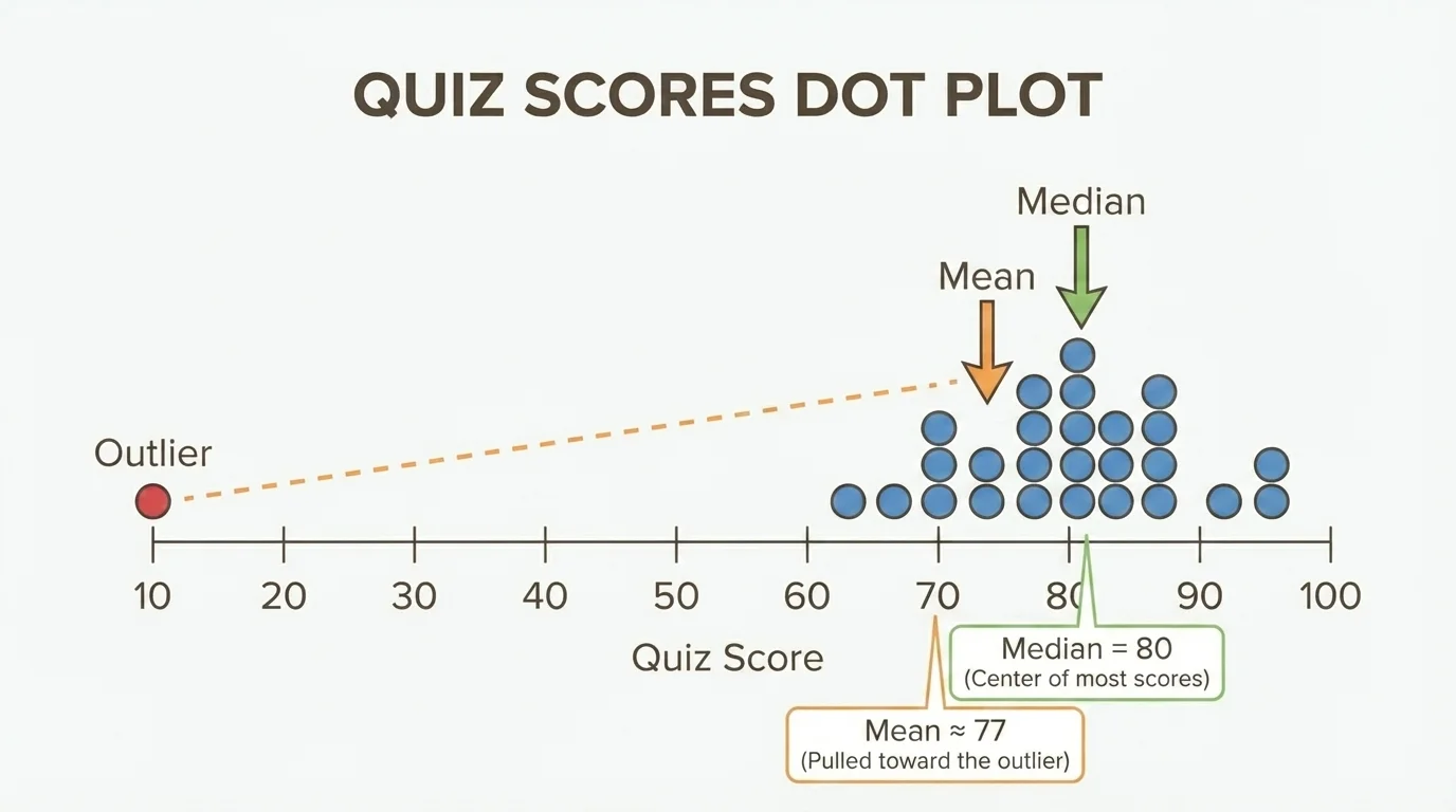
An outlier is a value much greater or much less than most of the others. Outliers matter because they can strongly affect the mean and the range. They usually affect the median and IQR much less.
One unusually large or small data value can change the mean a lot even when every other value stays the same. That is why professional statisticians pay close attention to outliers before deciding how to summarize data.
Looking at the shape first helps us make better choices. A graph, dot plot, or box plot can reveal whether the data are fairly even or pulled in one direction. The side-by-side distributions in [Figure 1] make this easier to notice than a list of numbers alone.
When data are fairly symmetric and there are no strong outliers, the mean is often the best measure of center, and the range can be a useful measure of spread. But when outliers are present, the mean may be misleading because unusual values pull it away from where most of the data are, as [Figure 2] illustrates.
For skewed distributions or data sets with outliers, the median is often a better measure of center, and the IQR is often a better measure of variability. These measures focus more on the middle of the data and less on the extremes.
This idea is very important in real life. For example, incomes in a city are often right-skewed because a small number of people earn much more than most others. In that case, the median income usually gives a better picture of a typical person's income than the mean income.
On the other hand, if a machine fills bottles with juice and almost all bottle amounts are close to the center with no unusual values, the mean can be a very useful summary. The context tells us whether extremes are important or whether we want the overall balance point.
Choosing the best summary depends on both the numbers and the story behind them. If the data are balanced, the mean uses every value and often works well. If the data are uneven or include unusual values, the median and IQR often describe what is typical better.
A good rule is this: first inspect the data, then choose the measure. Do not decide on the mean just because it is familiar. The best summary is the one that matches the distribution.
Worked examples show how two data sets can lead to different choices even when they seem similar at first. Notice how each decision depends on shape and context, not just on calculation.
Worked example 1: Symmetric test scores
A small group has test scores of \(70\), \(75\), \(80\), \(85\), and \(90\). Choose a good measure of center and variability.
Step 1: Look at the shape.
The values are spread evenly around \(80\). The data are fairly symmetric, and there are no outliers.
Step 2: Find the mean.
\(70+75+80+85+90 = 400\), and \(\dfrac{400}{5} = 80\).
Step 3: Find the median.
The middle value is \(80\).
Step 4: Find the range.
\(90 - 70 = 20\).
A good summary is mean \(80\) and range \(20\) because the distribution is symmetric and has no unusual values.
In this example, the mean and median are the same. That often happens in balanced data. The range also gives a reasonable picture because the smallest and largest values are not unusually far away.
Worked example 2: Skewed reading data
Five students read \(1\), \(2\), \(2\), \(3\), and \(15\) books. Choose a good measure of center and variability.
Step 1: Look for unusual values.
The value \(15\) is much larger than the others, so the data are right-skewed.
Step 2: Find the mean.
\(1+2+2+3+15 = 23\), and \(\dfrac{23}{5} = 4.6\).
Step 3: Find the median.
The ordered data are already listed, so the middle value is \(2\).
Step 4: Compare the mean and median.
The mean is \(4.6\), but most students read only about \(2\) books. The mean is pulled upward by \(15\).
Step 5: Find a measure of variability.
The range is \(15 - 1 = 14\). The lower half is \(1\), \(2\), so the first quartile is \(1.5\). The upper half is \(3\), \(15\), so the third quartile is \(9\). The IQR is \(9 - 1.5 = 7.5\).
A better summary is median \(2\) and IQR \(7.5\) because the data are skewed and include an extreme value.
This example shows why context matters too. If a teacher wants to know what a typical student read, the median is better. If the teacher wants to know the total reading done by the whole group, the mean still has some value because it uses every data point.
Worked example 3: Comparing two soccer players
Player A scores \(4\), \(5\), \(5\), \(6\), \(5\) goals in five games. Player B scores \(1\), \(2\), \(5\), \(8\), \(9\) goals in five games. Compare center and variability.
Step 1: Find each mean.
Player A: \(4+5+5+6+5 = 25\), so the mean is \(\dfrac{25}{5} = 5\).
Player B: \(1+2+5+8+9 = 25\), so the mean is \(\dfrac{25}{5} = 5\).
Step 2: Find each median.
Player A ordered: \(4\), \(5\), \(5\), \(5\), \(6\), so the median is \(5\).
Player B ordered: \(1\), \(2\), \(5\), \(8\), \(9\), so the median is also \(5\).
Step 3: Find each range.
Player A: \(6 - 4 = 2\).
Player B: \(9 - 1 = 8\).
Step 4: Interpret the results.
Both players have the same center, but Player A is much more consistent because the scores vary less.
The centers are equal, but the variability is different. Player A has a tighter distribution.
These examples show that center answers one question and variability answers another. A typical value alone does not tell the whole story.
The same data can be described in different ways depending on the question being asked. Suppose a class records the time students spend on homework each night. If one student had an unusual night and worked for \(180\) minutes while most others worked for \(20\) to \(40\) minutes, the median may better describe a typical night. But if the class wants to know the total amount of homework time for the whole group, the mean is useful because it includes every minute.
Context also helps us judge whether a value is really unusual. In weather data, a hot day might not be an outlier in summer, but it might be an outlier in winter. In sports, a high score could be normal for one game and surprising for another. Numbers do not explain themselves. We need the situation around them.
"Statistics are numbers with a story."
Think about shopping data. A store might study the number of items customers buy. If most people buy \(1\), \(2\), or \(3\) items but one family buys \(25\), the mean number of items may rise a lot. If the store wants to know what a typical shopper does, the median may be more helpful. If the store wants to predict how many total items must be stocked, the mean may still matter.
When comparing two groups, we should compare both their centers and their variability. Two groups can have the same center but very different spreads, as [Figure 3] demonstrates. That means one group may be more consistent, even though the "average" looks the same.
Suppose two classes both have a median test score of \(78\). If Class A has scores packed closely around \(78\), while Class B has scores spread from very low to very high, then the classes are different in an important way. Class A is more consistent.
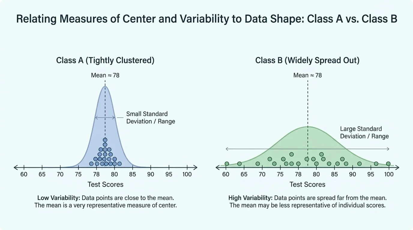
This is why a full comparison might sound like this: "Both classes have about the same center, but Class B has greater variability." That statement is much more informative than saying only that both classes scored around \(78\).
Later, when you examine more graphs and summaries, [Figure 3] remains a useful model: equal centers do not guarantee equal distributions. Spread is part of the story.
| Data shape | Better measure of center | Better measure of variability | Reason |
|---|---|---|---|
| Fairly symmetric, no outliers | Mean | Range | The data are balanced, and extreme values are not misleading. |
| Skewed | Median | IQR | The median and IQR resist being pulled by a long tail. |
| Contains outliers | Median | IQR | These measures focus on the middle and are less affected by unusual values. |
Table 1. A guide for choosing measures of center and variability based on distribution shape.
One common mistake is to use the mean every time without checking the data. Another is to mention only the center and ignore the spread. A third mistake is to call a value "typical" when it is actually far from most of the data.
A smart approach is to ask three questions: What does the graph or list look like? Are there outliers? What am I trying to learn from the data? If the data are balanced, the mean may be best. If they are skewed or have unusual values, the median may be better. If you want to describe the middle spread, the IQR can help more than the range.
Good statistical descriptions use more than one number. A center without variability can hide important differences, and variability without center leaves out what is typical. The best descriptions combine both and match the shape of the data.
That is what makes statistics powerful. It is not just about computing numbers. It is about making sensible choices so that the numbers truly describe the real situation.
Schools use these ideas when looking at test scores, reading growth, or attendance. Coaches use them when comparing players or teams. Scientists use them when measuring rainfall, temperature, or animal sizes. Businesses use them to study customer habits and product sales.
In all of these cases, choosing the right measure helps people make better decisions. If the wrong measure is chosen, the conclusion may be unfair or misleading. A principal may misunderstand student performance, a coach may misjudge consistency, or a store may misunderstand typical customer behavior.
So whenever you see data, remember that the best summary depends on both the shape of the distribution and the context in which the data were gathered. That is how statisticians turn a list of numbers into meaningful information.