A streaming service, a hospital, and a basketball team might seem to have nothing in common, but all three rely on the same basic idea: comparing categories. A hospital might compare treatment type and recovery outcome. A team might compare shot location and whether the shot was made. A school might compare grade level and club membership. When data involve two categories at once, a well-built table can reveal patterns that are easy to miss in a long list of responses.
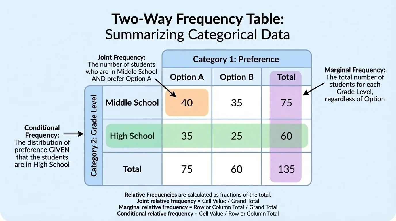
When each piece of data belongs to two groups at the same time, statisticians often organize the information with a two-way frequency table. One variable is placed in the rows, and the other variable is placed in the columns. Each interior cell shows how many observations fit both categories.
For example, a survey might record whether students play a sport and whether they have a part-time job. Both variables are categorical variables because they place students into categories rather than measuring a numerical value like height or time.
Counts are useful, but percentages are often even more useful. A school with 2,000 students and a school with 200 students cannot be compared fairly using raw counts alone. That is why statisticians often convert counts into relative frequencies, which are proportions or percentages of a total.
A frequency is a count. A relative frequency compares that count to a total. For example, if \(18\) students out of \(60\) prefer online notes, the relative frequency is \(\dfrac{18}{60} = 0.30\), or \(30\%\).
Two-way tables help answer questions such as: "What proportion of all students are seniors in band?" "What percent of athletes have jobs?" and "Is there a relationship between sleep category and screen time category?" These questions involve different kinds of percentages, so choosing the correct total matters.
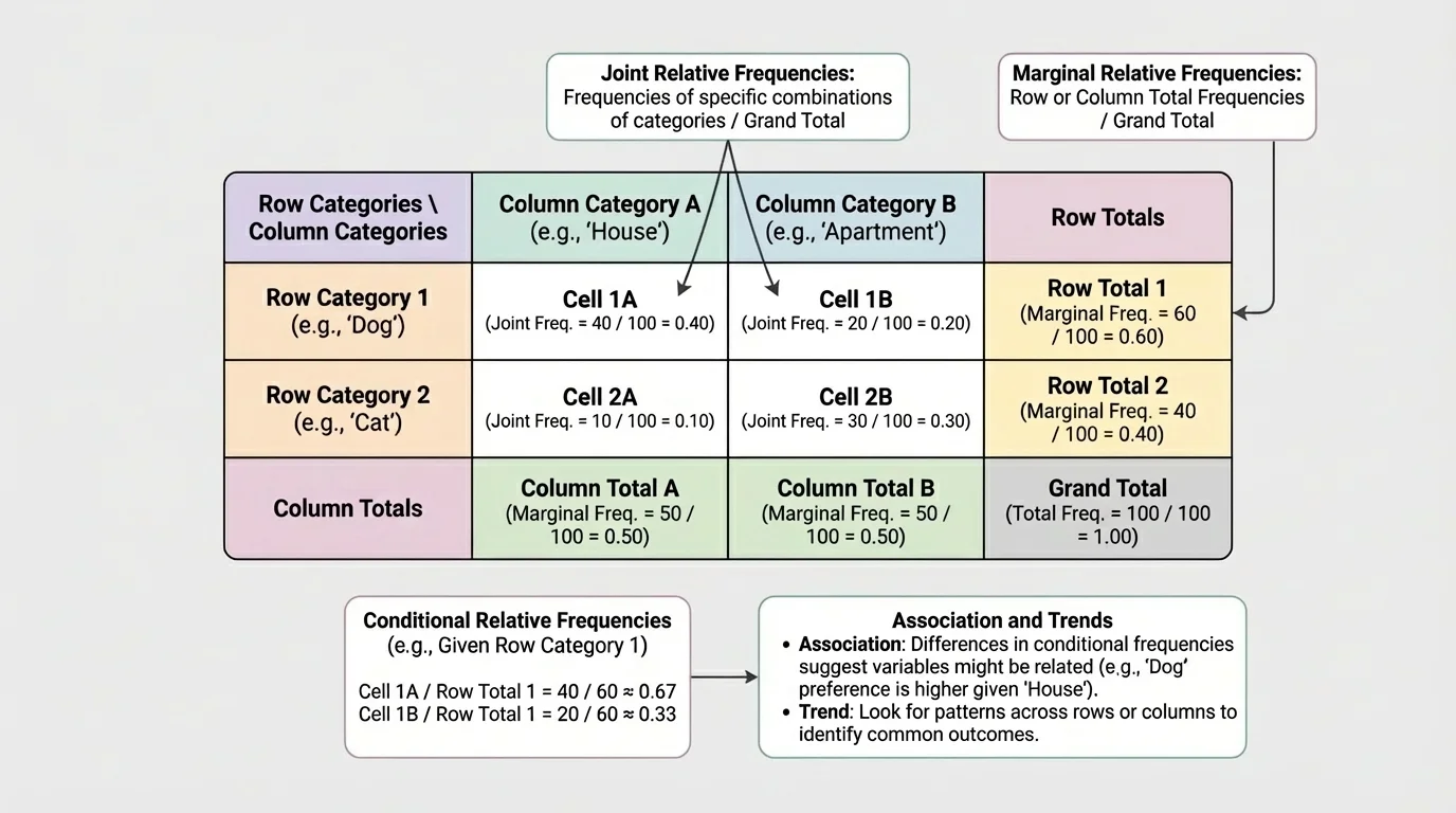
A two-way table organizes two categorical variables at once. The rows list the categories for one variable, and the columns list the categories for the other. Each interior cell contains a frequency, or count, for the intersection of one row and one column.
The totals at the ends of rows are called row totals. The totals at the bottoms of columns are called column totals. The total of all observations in the table is the grand total. These totals are the key to computing the right percentages later.
Suppose a survey asks students whether they prefer digital notes or paper notes, and whether they are in grades \(9\)–\(10\) or grades \(11\)–\(12\). Every student belongs to one category from the first variable and one category from the second variable, so every student fits into exactly one interior cell.
If the categories are complete and non-overlapping, the counts in all interior cells add up to the grand total. This is a good accuracy check. If they do not add correctly, there is probably a counting error or a category problem.
| Preference | Grades \(9\)–\(10\) | Grades \(11\)–\(12\) | Total |
|---|---|---|---|
| Digital notes | \(42\) | \(58\) | \(100\) |
| Paper notes | \(38\) | \(22\) | \(60\) |
| Total | \(80\) | \(80\) | \(160\) |
Table 1. A two-way frequency table showing note preference by grade group.
In this table, \(42\) students are both in grades \(9\)–\(10\) and prefer digital notes. The grand total is \(160\), which means \(160\) students were surveyed in all.
The three most important kinds of relative frequency focus on different parts of a table. A percentage may compare an interior cell to the grand total, a row total, or a column total. That denominator determines the meaning.
Joint relative frequency compares one interior cell to the grand total. It answers the question, "What proportion of all observations are in both categories?"
Marginal relative frequency compares a row total or column total to the grand total. It tells how common a single category is overall, regardless of the other variable.
Conditional relative frequency compares one interior cell to a row total or a column total. It answers the question, "Out of a particular group, what proportion falls into one category of the other variable?"
Joint relative frequency: \(\dfrac{\textrm{cell frequency}}{\textrm{grand total}}\)
Marginal relative frequency: \(\dfrac{\textrm{row total or column total}}{\textrm{grand total}}\)
Conditional relative frequency: \(\dfrac{\textrm{cell frequency}}{\textrm{relevant row total or column total}}\)
Using Table 1, the joint relative frequency for students who are in grades \(11\)–\(12\) and prefer digital notes is \(\dfrac{58}{160} = 0.3625\), or \(36.25\%\).
The marginal relative frequency for students who prefer paper notes is \(\dfrac{60}{160} = 0.375\), or \(37.5\%\).
A conditional relative frequency depends on the group you condition on. Among grades \(9\)–\(10\), the proportion who prefer digital notes is \(\dfrac{42}{80} = 0.525\), or \(52.5\%\). Among students who prefer digital notes, the proportion in grades \(11\)–\(12\) is \(\dfrac{58}{100} = 0.58\), or \(58\%\). These are different because the denominators are different.
A survey of \(120\) students records whether each student is in band and whether the student is an underclassman or upperclassman.
Worked example
The data are shown below.
| Underclassman | Upperclassman | Total | |
|---|---|---|---|
| Band | \(36\) | \(24\) | \(60\) |
| Not in band | \(18\) | \(42\) | \(60\) |
| Total | \(54\) | \(66\) | \(120\) |
Table 2. Band membership by grade grouping.
Step 1: Find a joint relative frequency.
The proportion of all students who are upperclassmen and in band is \(\dfrac{24}{120} = 0.20\).
So the joint relative frequency is \(20\%\).
Step 2: Find a marginal relative frequency.
The proportion of all students who are underclassmen is \(\dfrac{54}{120} = 0.45\).
So the marginal relative frequency is \(45\%\).
Step 3: Find a conditional relative frequency.
Among students in band, the proportion who are underclassmen is \(\dfrac{36}{60} = 0.60\).
So the conditional relative frequency is \(60\%\).
The key idea is that the denominator changes with the question. "Of all students" means use the grand total. "Among students in band" means use the band row total.
Notice how the wording controls the math. Phrases like of all, overall, or in the survey usually point to the grand total. Phrases like among band students or for upperclassmen usually point to a row total or column total.
Statistics is not just about computing percentages. It is about saying what those percentages mean in context. A correct number with a vague explanation is not enough.
Suppose a student says, "\(60\%\) are underclassmen." That statement is incomplete unless we know whether the student means among band members, among non-band members, or among all students. Context turns arithmetic into interpretation.
As we saw earlier in [Figure 1], the same interior cell can produce different relative frequencies depending on which total is used. That is why careful readers pay attention to whether a question asks about all observations, a row category, or a column category.
In journalism and social media, misleading graphics often come from changing the comparison group without clearly saying so. The percentages may be calculated correctly, but the interpretation can still be deceptive if the denominator is hidden.
When interpreting a relative frequency, always state the group and the category. For example: "Among upperclassmen, \(\dfrac{24}{66} \approx 36.4\%\) are in band." That sentence is much clearer than simply saying "\(36.4\%\) are in band."
A health class survey groups students by daily recreational screen time and by average sleep category.
Worked example
| Less than \(7\) hours sleep | At least \(7\) hours sleep | Total | |
|---|---|---|---|
| More than \(3\) hours screen time | \(45\) | \(30\) | \(75\) |
| At most \(3\) hours screen time | \(20\) | \(55\) | \(75\) |
| Total | \(65\) | \(85\) | \(150\) |
Table 3. Sleep category by screen time category.
Step 1: Find the joint relative frequency for students with more than \(3\) hours of screen time and less than \(7\) hours of sleep.
Use the grand total: \(\dfrac{45}{150} = 0.30\).
So \(30\%\) of all surveyed students are in both categories.
Step 2: Find the marginal relative frequency for students with at least \(7\) hours of sleep.
Use the column total over the grand total: \(\dfrac{85}{150} \approx 0.567\).
So about \(56.7\%\) of all students sleep at least \(7\) hours.
Step 3: Find the conditional relative frequency of getting less than \(7\) hours of sleep among students with more than \(3\) hours of screen time.
Use the row total for students with more than \(3\) hours of screen time: \(\dfrac{45}{75} = 0.60\).
So \(60\%\) of that group gets less than \(7\) hours of sleep.
Step 4: Compare with the other screen-time group.
Among students with at most \(3\) hours of screen time, the proportion with less than \(7\) hours of sleep is \(\dfrac{20}{75} \approx 0.267\).
So about \(26.7\%\) of that group gets less than \(7\) hours of sleep.
Because \(60\%\) and \(26.7\%\) are very different, the data suggest an association between screen time category and sleep category.
That last comparison is especially important. To look for a relationship between two categorical variables, statisticians often compare conditional relative frequencies across groups. Large differences suggest a possible association.
Two variables show an association when knowing one variable gives useful information about the other. In a two-way table, this often appears when the conditional relative frequencies are noticeably different from one group to another.
If the conditional distributions are similar across groups, then there may be little or no association. For example, if about \(50\%\) of each grade group prefers digital notes, note preference and grade group may not be strongly associated.
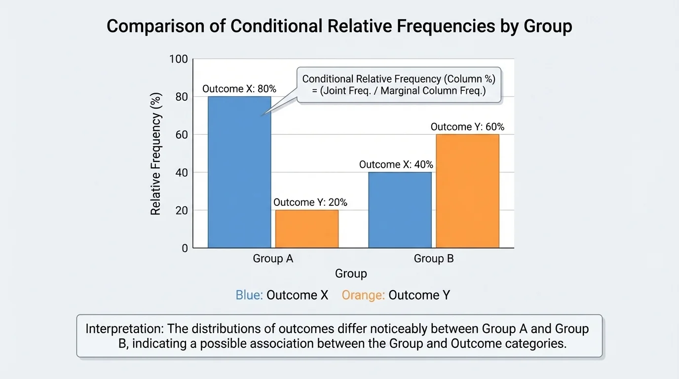
One useful strategy is to compare rows or compare columns, but not both at once unless you are very careful. If you want to know whether sleep depends on screen time category, compare the sleep percentages within each screen-time group. Keep the conditioning direction consistent.
Later, when you revisit visual comparisons, grouped bar charts can be helpful because they make differences in conditional percentages easier to spot than raw counts alone. A big gap in percentages often matters more than a big gap in counts, especially when the groups are different sizes.
Association is not causation
If two variables are associated, that does not prove one causes the other. A survey may show that students who sleep less also report higher stress, but that does not prove lack of sleep is the only cause of stress. Other factors may also matter.
Association is about pattern, not proof of cause. Experiments are designed differently from surveys and are better suited for studying causation.
A school wellness survey records exercise habit and stress category for \(200\) students.
Worked example
| High stress | Not high stress | Total | |
|---|---|---|---|
| Exercises regularly | \(28\) | \(92\) | \(120\) |
| Does not exercise regularly | \(40\) | \(40\) | \(80\) |
| Total | \(68\) | \(132\) | \(200\) |
Table 4. Reported stress by exercise habit.
Step 1: Compute the conditional relative frequency of high stress among students who exercise regularly.
\(\dfrac{28}{120} \approx 0.233\)
So about \(23.3\%\) of regular exercisers report high stress.
Step 2: Compute the conditional relative frequency of high stress among students who do not exercise regularly.
\(\dfrac{40}{80} = 0.50\)
So \(50\%\) of students who do not exercise regularly report high stress.
Step 3: Interpret the difference.
The percentages \(23.3\%\) and \(50\%\) are far apart.
This suggests an association between exercise habit and reported stress category.
The table suggests that high stress is less common among students who exercise regularly, but it does not prove that exercise alone causes lower stress.
Notice that we did not compare \(28\) and \(40\) directly. That would ignore the group sizes of \(120\) and \(80\). Relative frequency gives a fairer comparison.
Two-way tables are everywhere. Public health researchers compare vaccination status and illness outcome. Businesses compare age group and product preference. Colleges compare application decision and intended major. Sports analysts compare play type and success rate.
Suppose a basketball coach wants to know whether shot result is associated with shot location. Counts alone might suggest that more shots are made in the paint than from the corner, but if far more shots were taken in the paint, that comparison is incomplete. Conditional relative frequencies such as "made shots among corner attempts" and "made shots among paint attempts" are more informative.
Election analysts also use this idea. They compare voting preference with region, age bracket, or education category. Marginal relative frequencies show the overall size of each group, while conditional relative frequencies show how one category behaves within another.
"Numbers become meaningful when you know what whole they are part of."
That principle is the heart of relative frequency. Every percentage tells a story about part of a whole. The question is: which whole?
A very common mistake is using the wrong denominator. If the question says "among students with more than \(3\) hours of screen time," then the denominator should be the total number of students in that group, not the grand total.
Another mistake is confusing marginal and joint relative frequencies. A marginal relative frequency uses a row or column total. A joint relative frequency uses an interior cell. If the question mentions two categories at once, it is probably asking for a joint or conditional value rather than a marginal one.
As shown earlier in [Figure 2], shading different parts of a table helps clarify this difference: one cell for joint, one margin for marginal, and one conditioned row or column for conditional.
You should also check whether percentages add logically. The joint relative frequencies for all interior cells should add to \(1\), or \(100\%\), because together they represent the entire table. The conditional relative frequencies across a single row should also add to \(1\), and the same is true across a single column if the conditioning is by column.
Finally, be precise in writing. A strong interpretation includes the group, the category, and the percentage. For example: "Among students who do not exercise regularly, \(50\%\) report high stress." That is much stronger than writing only "\(50\%\)."