A school counselor notices that many large sets of test scores seem to cluster around an average, with fewer very high and very low scores. The same pattern appears in adult height, some manufacturing measurements, and many biological traits. That is not a coincidence. Many real data sets form a shape that is close to a bell curve, and when that happens, the mean and standard deviation become powerful tools for making estimates about the whole population.
In statistics, this idea matters because a single count or measurement variable can often be summarized in a meaningful way. Instead of listing every data value, we can describe the center, the spread, and the shape. If the shape is close to normal, then we can estimate what percent of values fall in certain intervals, even without seeing every piece of data.
For a quantitative data set, the mean gives a measure of center. It is the average value:
\[\bar{x} = \frac{\textrm{sum of all data values}}{\textrm{number of data values}}\]
The standard deviation tells how spread out the data are around the mean. A small standard deviation means the values tend to stay close to the mean. A large standard deviation means the values are more spread out.
You already know that the mean describes a typical value and that graphs such as dot plots, histograms, and box plots help reveal the shape of a distribution. That shape is essential here, because using a normal model only makes sense when the data's overall pattern supports it.
If two classes both have a mean test score of \(75\), they may still be very different. One class might have scores packed tightly between \(72\) and \(78\), while another might have scores ranging from \(50\) to \(100\). The standard deviation captures that difference in spread.
Suppose a set of quiz scores has mean \(\mu = 80\) and standard deviation \(\sigma = 5\). A score of \(85\) is \(5\) points above the mean, which is \(1\) standard deviation above the mean. A score of \(70\) is \(10\) points below the mean, which is \(2\) standard deviations below the mean.
As [Figure 1] shows, a normal distribution is a symmetric, bell-shaped distribution in which most values cluster near the mean and the frequencies taper off as you move farther away. In a perfectly normal distribution, the mean, median, and mode are all equal and lie at the center.
This shape is important because once we know the mean and standard deviation, we can say a lot about the data. The center of the bell is the mean, and the width of the bell is controlled by the standard deviation.
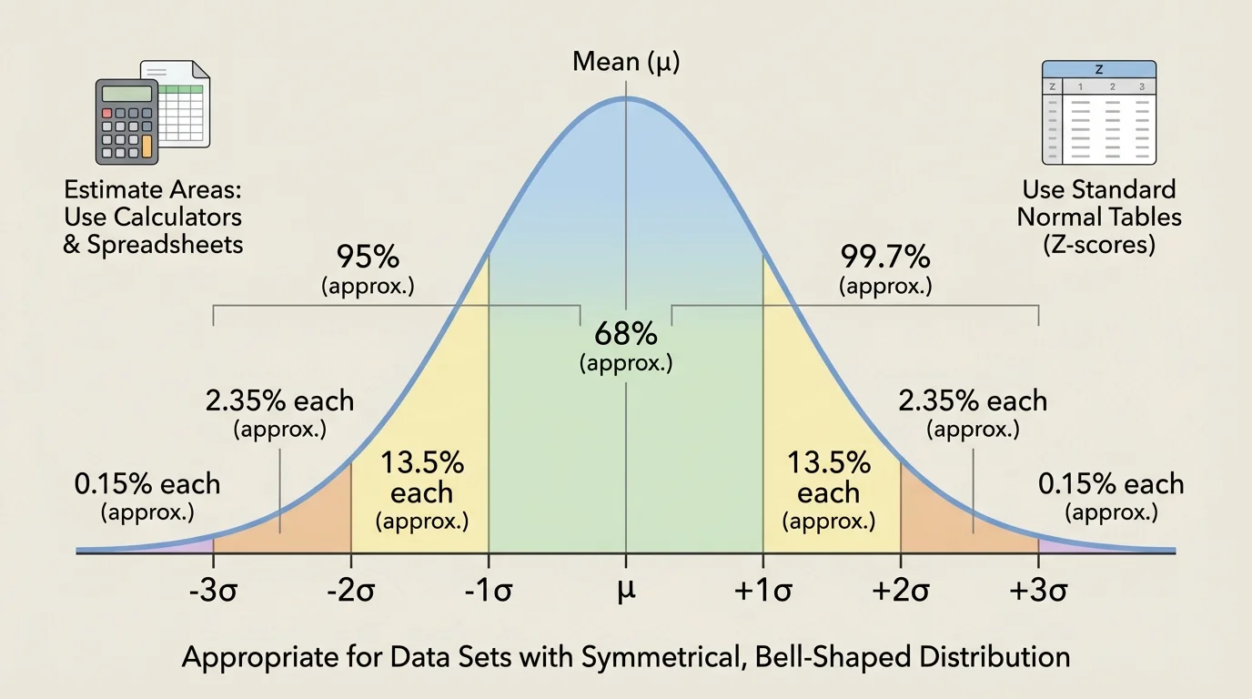
One of the most useful facts about normal distributions is the empirical rule, also called the \(68\)–\(95\)–\(99.7\) rule:
About \(68\%\) of values lie within \(1\) standard deviation of the mean.
About \(95\%\) of values lie within \(2\) standard deviations of the mean.
About \(99.7\%\) of values lie within \(3\) standard deviations of the mean.
If the mean is \(80\) and the standard deviation is \(5\), then about \(68\%\) of values lie between \(75\) and \(85\), about \(95\%\) lie between \(70\) and \(90\), and about \(99.7\%\) lie between \(65\) and \(95\). As [Figure 1] illustrates, these intervals spread outward evenly from the center because the curve is symmetric.
Mean is the average value of a data set.
Standard deviation measures the typical distance of data values from the mean.
Normal distribution is a symmetric, bell-shaped distribution that can be modeled using the mean and standard deviation.
Not every bell-shaped graph is perfectly normal, but many are close enough that the normal model gives useful estimates. In statistics, "fit the data to a normal distribution" means using the mean and standard deviation to create a normal model that approximates the actual data.
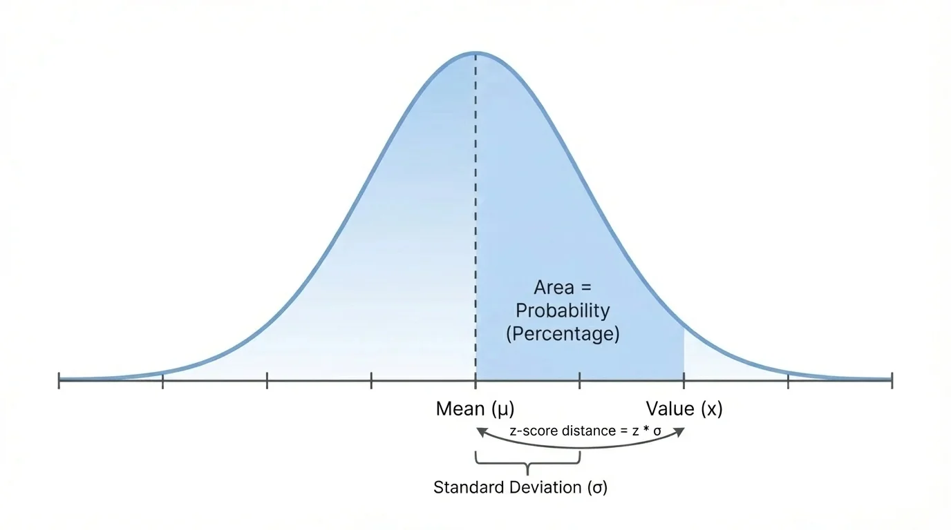
As [Figure 2] shows, to compare values from a distribution, statisticians often use a z-score. A z-score represents distance from the mean measured in standard deviations. A z-score tells how unusual or typical a value is relative to the rest of the distribution.
The formula is
\[z = \frac{x - \mu}{\sigma}\]
Here, \(x\) is the data value, \(\mu\) is the mean, and \(\sigma\) is the standard deviation.
If \(z = 0\), the value is exactly at the mean. If \(z = 1\), the value is \(1\) standard deviation above the mean. If \(z = -2\), the value is \(2\) standard deviations below the mean.
Z-scores are especially useful when comparing scores from different scales. For example, a student who scores \(88\) on one exam and \(540\) on another exam may have done better relative to the group on the second exam if that score has the larger z-score.
Why standardizing helps
Raw scores are measured in original units such as points, centimeters, or seconds. Z-scores convert those values into a common scale based on standard deviations from the mean. That makes comparisons possible across different data sets.
A positive z-score means the value is above average, and a negative z-score means the value is below average. A z-score with a large absolute value, such as \(2.5\) or \(3\), suggests a relatively unusual value.
The empirical rule gives fast estimates when the data are approximately normal. Because the normal curve is symmetric, we can split the percentages evenly on each side of the mean.
For example, if about \(68\%\) of the data lie within \(1\) standard deviation of the mean, then about \(34\%\) lie between the mean and \(1\) standard deviation above the mean, and another \(34\%\) lie between the mean and \(1\) standard deviation below the mean.
Likewise, because about \(95\%\) lie within \(2\) standard deviations, the percentage between \(1\) and \(2\) standard deviations on one side is about
\[\frac{95\% - 68\%}{2} = 13.5\%\]
And because about \(99.7\%\) lie within \(3\) standard deviations, the percentage between \(2\) and \(3\) standard deviations on one side is about
\[\frac{99.7\% - 95\%}{2} = 2.35\%\]
That leaves about \(0.15\%\) in each tail beyond \(3\) standard deviations.
Worked example 1
Adult male heights in a region are approximately normal with mean \(175 \textrm{ cm}\) and standard deviation \(7 \textrm{ cm}\). Estimate the percentage of adults with heights between \(168 \textrm{ cm}\) and \(182 \textrm{ cm}\).
Step 1: Relate the interval to the mean and standard deviation.
\(168 = 175 - 7\) and \(182 = 175 + 7\), so the interval is within \(1\) standard deviation of the mean.
Step 2: Apply the empirical rule.
About \(68\%\) of values in a normal distribution lie within \(1\) standard deviation of the mean.
The estimated percentage is about \(68\%\).
This kind of estimate is useful when exact probabilities are not necessary. It gives a quick sense of how common values in a certain interval are.
Sometimes we want a more precise percentage than the empirical rule can provide. For that, we use the idea of area under the curve. In a normal distribution, the total area under the curve is \(1\), or \(100\%\). The area above, below, or between values represents the proportion of the population in that region.
If a calculator or spreadsheet gives an area of \(0.8413\) to the left of a value, that means about \(84.13\%\) of the population is below that value.
Many graphing calculators have commands for normal probabilities. A common calculator command finds the area between two values for a normal distribution with known mean and standard deviation. Spreadsheets also have functions that compute normal cumulative probabilities.
For a normal table, the usual process is to convert the value to a z-score and then look up the cumulative area to the left. For example, if \(z = 1.25\), the table might show an area of about \(0.8944\). That means about \(89.44\%\) of values lie below \(1.25\) standard deviations above the mean.
Worked example 2
A standardized exam score is approximately normal with mean \(500\) and standard deviation \(100\). Find the z-score of a student who scored \(650\).
Step 1: Write the z-score formula.
\[z = \frac{x - \mu}{\sigma}\]
Step 2: Substitute the values.
\(z = \dfrac{650 - 500}{100} = \dfrac{150}{100} = 1.5\)
Step 3: Interpret the result.
A score of \(650\) is \(1.5\) standard deviations above the mean.
The z-score is \(1.5\).
Once we know the z-score, we can use a calculator, spreadsheet, or z-table to estimate the percentage of students below or above that score.
Worked example 3
Suppose package weights are approximately normal with mean \(2.0 \textrm{ kg}\) and standard deviation \(0.1 \textrm{ kg}\). Estimate the percentage of packages weighing less than \(2.15 \textrm{ kg}\).
Step 1: Find the z-score.
\(z = \dfrac{2.15 - 2.0}{0.1} = \dfrac{0.15}{0.1} = 1.5\)
Step 2: Use technology or a z-table.
The cumulative area to the left of \(z = 1.5\) is about \(0.9332\).
Step 3: Convert to a percentage.
\(0.9332 = 93.32\%\)
About \(93.32\%\) of the packages weigh less than \(2.15 \textrm{ kg}\).
If we wanted the percentage heavier than \(2.15 \textrm{ kg}\), we would subtract from \(1\): \(1 - 0.9332 = 0.0668\), so about \(6.68\%\) are heavier.
All three tools are based on the same idea: they estimate area under the normal curve. The difference is mainly how much work you do by hand.
| Tool | What you usually enter or look up | Typical result |
|---|---|---|
| Normal table | Z-score such as \(1.20\) | Area to the left, such as \(0.8849\) |
| Graphing calculator | Lower bound, upper bound, mean, standard deviation | Area between values |
| Spreadsheet | Value, mean, standard deviation, and function choice | Cumulative probability or interval probability |
Table 1. Common ways to estimate probabilities for a normal distribution.
For instance, as [Figure 3] helps illustrate, not every distribution is suitable for a normal model. A graphing calculator can directly estimate the proportion between \(70\) and \(90\) when the mean is \(80\) and the standard deviation is \(5\). A spreadsheet can do the same by finding the cumulative probability below \(90\) and subtracting the cumulative probability below \(70\).
The exact area under a normal curve cannot be found with ordinary algebra formulas in a simple way. That is why statisticians rely on tables, calculators, and computer functions to compute normal probabilities accurately.
Not all distributions fit a normal model. This is one reason technology is so important in statistics. It allows us to move beyond rough estimates and make decisions using more precise percentages.
Not every data set should be treated as normal. Some distributions are skewed, some have two peaks, and some contain strong outliers. In those cases, using the mean and standard deviation to fit a normal distribution can give misleading results.
A right-skewed distribution has a long tail on the right. Income data are a classic example: many people earn moderate incomes, but a small number earn extremely high incomes. That pulls the mean to the right, and a normal model may badly misrepresent the population.
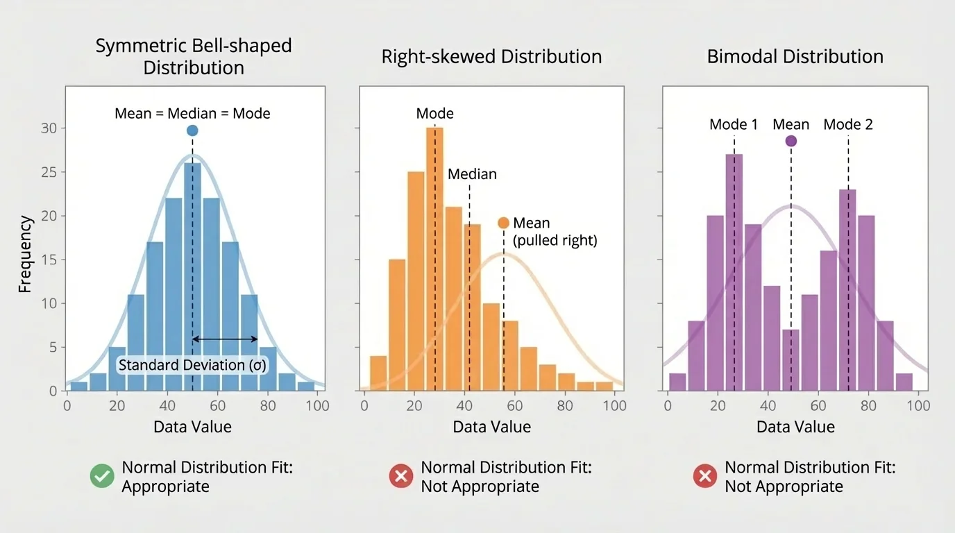
A left-skewed distribution has a long tail on the left. A bimodal distribution has two clear peaks, often suggesting that two different groups are mixed together. For example, if a data set combines heights of younger children and adults, the result may have two centers rather than one bell-shaped center.
Also, categorical data do not belong in a normal distribution model at all. Categories such as eye color, favorite music genre, or type of transportation are not measured on a numerical scale where mean and standard deviation make sense.
How to judge whether a normal model is reasonable
Look at a histogram or dot plot. If the distribution is roughly symmetric, unimodal, and free of extreme outliers, a normal model may be appropriate. If it is strongly skewed, clearly bimodal, or dominated by unusual values, use other methods to describe the data instead.
Even when data are not perfectly normal, the model can still be useful if the shape is reasonably close. But statistics is not about forcing every data set into one shape. It is about choosing a model that matches the evidence.
In medicine, some measurements such as blood pressure readings in a large healthy population may be treated as approximately normal. Doctors can then estimate what percentage of patients fall within a healthy range or identify unusually high or low measurements by z-score.
In manufacturing, machine-made parts are often designed so their lengths or weights vary only slightly around a target mean. If the distribution is close to normal, engineers can estimate the percentage of parts that meet quality standards. This helps factories reduce waste and improve consistency.
In education, large-scale assessment scores are often analyzed with normal models. A z-score can tell whether a student performed above or below average and by how much relative to the group. That is far more informative than just saying a score is "high" or "low."
Worked example 4
A company produces metal rods with lengths that are approximately normal. The mean length is \(50 \textrm{ cm}\), and the standard deviation is \(0.4 \textrm{ cm}\). Quality standards accept rods between \(49.2 \textrm{ cm}\) and \(50.8 \textrm{ cm}\). Estimate the percentage of rods that meet the standard.
Step 1: Convert each bound to a z-score.
\(z_{\textrm{low}} = \dfrac{49.2 - 50}{0.4} = \dfrac{-0.8}{0.4} = -2\)
\(z_{\textrm{high}} = \dfrac{50.8 - 50}{0.4} = \dfrac{0.8}{0.4} = 2\)
Step 2: Find the area between \(z = -2\) and \(z = 2\).
Using the empirical rule, about \(95\%\) of values lie within \(2\) standard deviations of the mean.
Step 3: Interpret the result.
About \(95\%\) of rods are expected to meet the quality standard.
The estimated percentage is about \(95\%\).
Notice how this connects center, spread, and shape. The mean sets the target, the standard deviation shows variation, and the normal model turns those into useful percentage estimates.
When you analyze a single measurement variable, always ask three questions: What is the center? How spread out are the values? What shape does the distribution have? If the shape is approximately bell-shaped, then the mean and standard deviation let you estimate percentages quickly and powerfully. If not, a different summary or model is more honest and more accurate.