Airlines estimate fuel use, businesses predict sales, and scientists track changes in temperature using patterns in data. Very often, the first clue appears in a scatter plot: a cloud of points that seems to rise or fall in a nearly straight path. When that happens, mathematics gives us a powerful tool: we can fit a linear function to describe the trend and make useful predictions.
A scatter plot compares two quantitative variables. Each point represents one pair of values, such as hours studied and test score, temperature and electricity use, or age of a car and its resale value. When the points suggest a straight-line trend, we say the data show a linear association. Then a linear function can model the relationship.
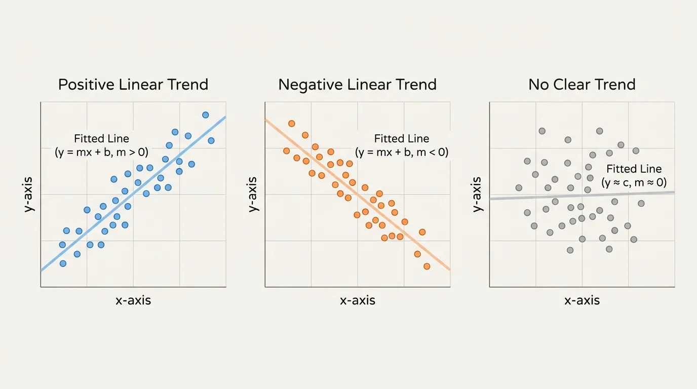
[Figure 1] A scatter plot does more than display data. It helps us ask important questions: As one variable increases, does the other usually increase? Does it decrease? Do the points cluster closely around an imagined line, or are they widely scattered? These visual clues tell us whether a linear model makes sense.
For example, if students who spend more time practicing a skill tend to score higher on assessments, the scatter plot may show an upward trend. If older phones tend to have lower resale values, the scatter plot may show a downward trend. In both cases, a line can summarize the overall pattern without matching every point exactly.
Recall that a linear function has the form \(y = mx + b\), where \(m\) is the slope and \(b\) is the \(y\)-intercept. Its graph is a straight line.
[Figure 2] In data modeling, the line is usually not exact. Real-world data contain variation, measurement error, and natural unpredictability. So the goal is not to force all points onto one line. The goal is to find a line that captures the overall direction of the data.
A linear association appears when the points in a scatter plot tend to lie around a straight line. The association can be positive, meaning both variables tend to increase together, or negative, meaning one tends to decrease as the other increases.
The points may also show how strong the pattern is. A strong linear association has points clustered closely around a line. A weak linear association has more spread. Some scatter plots show no useful linear pattern at all, even if a relationship exists.
You should look for these features before fitting a line:
A scatter plot is a graph that displays pairs of numerical data as points.
A line of best fit is a line that models the overall trend in a scatter plot.
A positive association means that larger values of one variable tend to go with larger values of the other.
A negative association means that larger values of one variable tend to go with smaller values of the other.
Not every set of paired data should be modeled with a linear function. If the points curve noticeably, flatten out, or change direction, another kind of model may work better. A good mathematician does not just fit a line because a line is familiar; a good mathematician checks whether the graph supports that choice.
To fit a linear function means to choose a line that represents the trend in the data. The line should reflect the general pattern, not chase every individual point.
A good fitted line usually has points scattered on both sides of it. If almost all points lie above the line or almost all lie below it, the line is probably not centered well. You can think of a good fit as a line that balances the data.
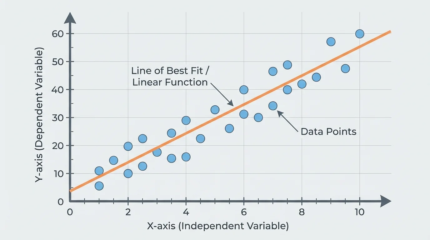
This fitted line is often called a trend line or line of best fit. In more advanced statistics, technology may calculate the least-squares regression line, but at this level it is essential to understand the idea first: draw or estimate a line that captures the overall linear pattern.
[Figure 3] Once the line is chosen, it can be written as an equation in the form \(y = mx + b\). Then the equation becomes a model. With that model, you can estimate values, describe rates of change, and compare trends.
Every fitted line has two major parts: the slope and the y-intercept. These are not just numbers. They have meanings tied to the real situation represented by the data.
The slope tells how much the predicted value of \(y\) changes for each \(1\)-unit increase in \(x\). If the slope is positive, the model rises. If the slope is negative, the model falls. In a study-hours model, a slope of \(5\) would mean each extra hour of study is associated with about \(5\) more points on the predicted score.
The \(y\)-intercept is the predicted value of \(y\) when \(x = 0\). Sometimes this is meaningful. Sometimes it is not. For example, if \(x\) represents hours studied, then \(x = 0\) is reasonable. But if \(x\) represents the age of a tree measured only from \(10\) to \(80\) years, the intercept may not be a sensible real-world prediction.
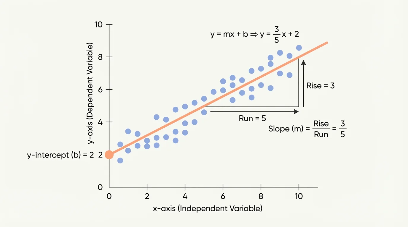
To find the slope from two points \((x_1, y_1)\) and \((x_2, y_2)\) on the fitted line, use
\[m = \frac{y_2 - y_1}{x_2 - x_1}\]
After finding \(m\), substitute one point into \(y = mx + b\) to solve for \(b\).
Choose points on the line, not usually data points
When you estimate a model from a scatter plot by eye, you often select two convenient points that lie on the fitted line itself. Those points may not be original data points. This matters because the fitted line represents the trend, and your equation should match that trend line rather than one particular pair of measurements.
That idea surprises many students at first. A line of best fit is not required to pass through actual data points. It is meant to summarize the data cloud. That is why using two clear points on your drawn line usually gives a better model than using two random data points from the scatter plot.
When technology is not being used, a practical method is to sketch a line that seems to run through the center of the data. Then choose two easy-to-read points on that line. Use those points to calculate the slope and write the equation.
Here is the process:
Professional analysts often use software to find a best-fit line, but they still begin by looking at the scatter plot first. A perfect-looking equation is not useful if the graph shows that a linear model is the wrong choice.
This visual approach is especially useful when a problem asks for a reasonable fit rather than an exact regression equation. It builds the habit of connecting graphs, equations, and real meaning.
Suppose a scatter plot of study time \(x\) in hours and quiz score \(y\) suggests a positive linear trend. A reasonable drawn line passes through the points \((2, 68)\) and \((6, 84)\). Find a linear model.
Worked example: fitting a positive linear model
Step 1: Find the slope.
Using \((2, 68)\) and \((6, 84)\),
\(m = \dfrac{84 - 68}{6 - 2} = \dfrac{16}{4} = 4\)
Step 2: Use the slope and one point to find \(b\).
Substitute \((2, 68)\) into \(y = 4x + b\):
\(68 = 4(2) + b = 8 + b\)
\(b = 60\)
Step 3: Write the equation.
\(y = 4x + 60\)
Step 4: Interpret the model.
The slope \(4\) means each additional hour of study is associated with about \(4\) more quiz points. The intercept \(60\) means the model predicts a score of about \(60\) when \(x = 0\) hours.
A reasonable linear model is \(y = 4x + 60\).
If a student studies for \(5\) hours, the model predicts \(y = 4(5) + 60 = 80\). That does not guarantee a score of \(80\), but it gives a useful estimate based on the trend.
Now consider a scatter plot where \(x\) is outside temperature in degrees and \(y\) is daily heating cost in dollars. A fitted line passes through \((30, 42)\) and \((50, 30)\). Find the model and interpret it.
Worked example: fitting a negative linear model
Step 1: Find the slope.
\(m = \dfrac{30 - 42}{50 - 30} = \dfrac{-12}{20} = -0.6\)
Step 2: Find the intercept.
Use \((30, 42)\):
\(42 = -0.6(30) + b\)
\(42 = -18 + b\)
\(b = 60\)
Step 3: Write the equation.
\[y = -0.6x + 60\]
Step 4: Interpret the model.
The slope \(-0.6\) means that for each \(1\)-degree increase in temperature, the predicted heating cost decreases by about \(\$0.60\). The intercept \(60\) is the predicted cost at \(0\) degrees.
The fitted model is \(y = -0.6x + 60\).
This example shows why direction matters. In [Figure 1], a negative linear association slopes downward, and the slope in the equation must also be negative.
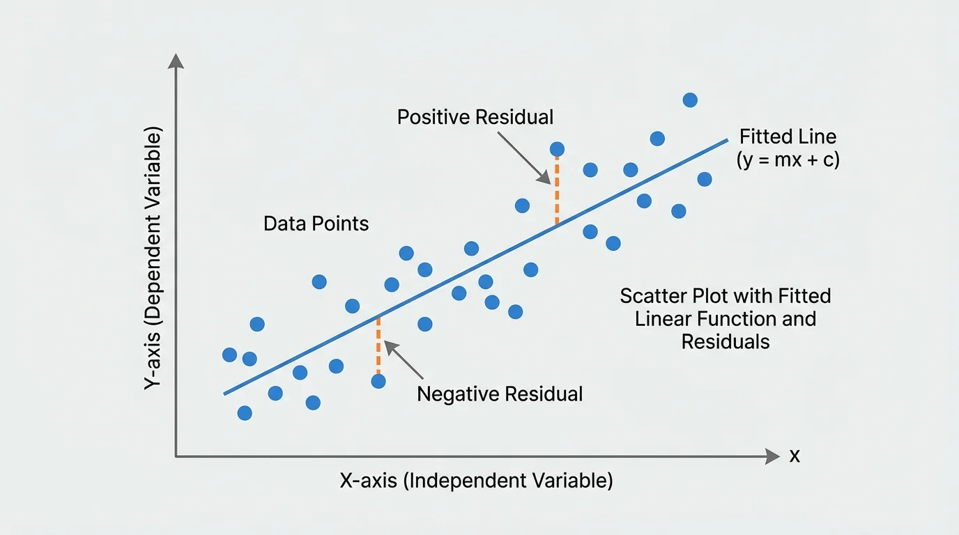
Even a good model will not usually hit every point exactly. The difference between an actual value and a predicted value is called a residual. Residuals help us judge whether the line is a good fit.
If a point lies above the line, the actual value is greater than the predicted value, so the residual is positive. If a point lies below the line, the residual is negative. Smaller residuals mean the model predicts more accurately for those data points.
Suppose a model predicts \(78\) for a student, but the actual score is \(82\). The residual is \(82 - 78 = 4\). Suppose another student's predicted score is \(85\), but the actual score is \(80\). The residual is \(80 - 85 = -5\).
When residuals are small and appear scattered above and below the line without a pattern, the linear model is usually reasonable. If residuals are consistently positive in one region and negative in another, the data may actually follow a curved pattern instead of a line.
A scatter plot suggests an increasing trend. Two students propose different fitted lines:
Model A: \(y = 3x + 20\)
Model B: \(y = 4x + 12\)
Three actual data points from the plot are \((2, 19)\), \((4, 29)\), and \((6, 35)\). Compare the models using residuals.
Worked example: comparing models with residuals
Step 1: Find Model A predictions and residuals.
For \(x = 2\), predicted \(y = 3(2) + 20 = 26\), so residual \(= 19 - 26 = -7\).
For \(x = 4\), predicted \(y = 3(4) + 20 = 32\), so residual \(= 29 - 32 = -3\).
For \(x = 6\), predicted \(y = 3(6) + 20 = 38\), so residual \(= 35 - 38 = -3\).
Step 2: Find Model B predictions and residuals.
For \(x = 2\), predicted \(y = 4(2) + 12 = 20\), so residual \(= 19 - 20 = -1\).
For \(x = 4\), predicted \(y = 4(4) + 12 = 28\), so residual \(= 29 - 28 = 1\).
For \(x = 6\), predicted \(y = 4(6) + 12 = 36\), so residual \(= 35 - 36 = -1\).
Step 3: Compare the residuals.
Model A residuals are \(-7\), \(-3\), and \(-3\). Model B residuals are \(-1\), \(1\), and \(-1\).
Model B has residuals closer to \(0\), so it fits the data better.
Model B, \(y = 4x + 12\), is the better linear model for these data.
Notice that the better model has residuals that are smaller and more balanced around zero, much like the visual balance around the line shown earlier in [Figure 2] and the vertical distances highlighted in [Figure 4].
A fitted line describes association, not proof of cause. If two variables have a strong linear association, it does not automatically mean one causes the other. For example, ice cream sales and beach attendance may rise together, but warmer weather may be causing both.
This matters when interpreting models. A line can be useful for prediction even when the reason behind the relationship is uncertain. However, conclusions about cause require more evidence than a scatter plot alone can provide.
"A model is useful because it simplifies reality, not because it becomes reality."
That principle protects you from overclaiming. Mathematics can reveal patterns, but responsible interpretation requires context.
Sometimes a scatter plot has a general trend but includes an unusual point far from the rest. Such a point is called an outlier. Outliers can affect the fitted line a great deal, especially if they are far to the left or right.
Other times, the pattern is not linear at all. A curved growth pattern, a rapid rise followed by leveling off, or a U-shaped pattern should not be forced into a line. Looking back at the basic pattern types in [Figure 1], only the roughly straight trends are appropriate for linear modeling.
| Pattern in Scatter Plot | Linear Model Appropriate? | Reason |
|---|---|---|
| Points cluster around an upward line | Yes | Suggests positive linear association |
| Points cluster around a downward line | Yes | Suggests negative linear association |
| Points follow a curved path | No | Relationship is nonlinear |
| Points are randomly scattered | No | No meaningful linear trend |
| Mostly linear with one extreme point | Maybe | Check whether the outlier changes the model too much |
Table 1. Situations in which a linear model is or is not appropriate for a scatter plot.
When judging a model, always ask two questions: Does a line match the main pattern? Are any unusual points distorting the picture?
Fitting linear functions to scatter plots appears across many fields. In environmental science, researchers may model how energy use changes with temperature. In economics, analysts may compare years of education and average income. In sports, coaches may study training time and performance measures. In medicine, scientists may model dosage and response over a limited range when the relationship is approximately linear.
In each case, the graph comes first. Then the line provides a compact way to describe the trend. The slope gives the rate of change, and the intercept provides a starting estimate when it makes sense in context.
Interpolation and extrapolation
Using a fitted line to predict values within the range of the observed data is called interpolation. Using it beyond the observed range is called extrapolation. Interpolation is usually more reliable because it stays within the data pattern you have actually seen.
If a model is based on temperatures from \(30\) to \(60\) degrees, using it to predict heating cost at \(45\) degrees is more trustworthy than using it at \(100\) degrees. Extrapolation can be risky because the pattern may change outside the original data range.
One common mistake is using two random data points instead of two points on the fitted line. Another is forgetting to check whether the pattern is actually linear. A third is interpreting the intercept in situations where \(x = 0\) has no real meaning.
Students also sometimes confuse a model with exact truth. A fitted line gives estimates, not guarantees. Predictions may be close, but they are still predictions. The scatter in the graph tells you that real data vary.
Finally, be careful with units and context. A slope of \(2\) is incomplete unless you know it means something like \(2\) quiz points per hour, \(2\) dollars per degree, or \(2\) centimeters per year. Units give the slope its meaning.