A single topic can seem completely different depending on how it is presented. A speaker might describe a problem in a serious voice, a chart might show the numbers behind it, and an infographic might make the same idea feel urgent through color and design. Strong readers and listeners do more than notice information. They figure out the most important idea, identify the details that support it, and explain how each format helps them understand the topic more clearly.
When you study an issue such as recycling, school safety, nutrition, climate, or social media use, you often do not learn from just one kind of source. You may listen to a speech, read a paragraph, study a graph, or watch a short video. Each format presents information in its own way, and each one may reveal something that the others do not. Learning to analyze these forms together helps you become a more careful thinker and a stronger speaker.
A media format is the way information is delivered. It may be oral, such as a speech or podcast; visual, such as a photograph, poster, map, or infographic; or quantitative, such as a chart, graph, or table. Some sources combine several formats at once, like a video with narration and statistics on screen.
Format matters because it shapes what stands out. In a speech, a speaker can emphasize certain words, pause for effect, and use tone to sound worried, excited, or confident. In a visual text, size, color, and layout can guide your eye toward the most important message. In quantitative media, numbers can make a claim more precise by showing amount, change, or comparison.
For example, suppose a class is studying sleep habits in teenagers. A student speaker might say that many middle school students are not getting enough sleep. A bar graph could show that the average sleep time is less than the recommended amount. A poster might include an image of a tired student and a bold caption. All three share one topic, but each clarifies it in a different way.
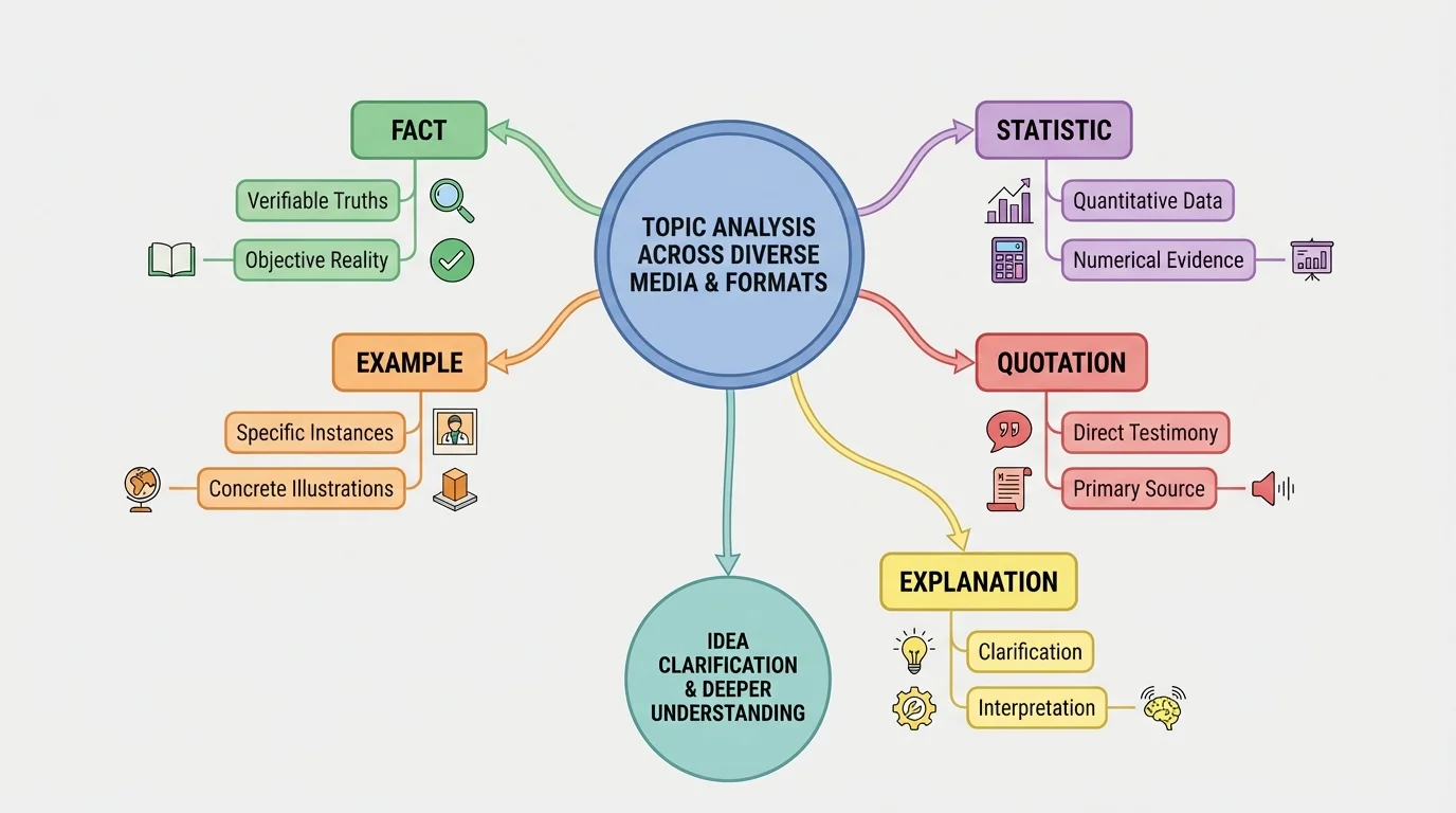
Main idea is the most important point a source wants the audience to understand.
Supporting details are the facts, examples, explanations, quotations, descriptions, or statistics that develop and prove the main idea.
Clarify means to make an idea easier to understand by adding explanation, evidence, or examples.
When you analyze information, your job is not just to collect details. Your job is to ask, "What is the source mostly saying?" and "Which details help prove that point?" That skill becomes even more important when the source is not only written text but also speech, visuals, or data.
[Figure 1] A main idea is the central message that holds a source together. It is not just the topic. The topic might be "school lunches," but the main idea might be "school lunches should include more fresh food because healthier meals improve student focus." In strong communication, one main idea connects to several kinds of support.
Supporting details answer questions such as: What proof is given? What examples or explanations help develop the point? A statistic, a quote from an expert, a story about a real situation, or a comparison can all function as support. Good support is relevant, which means it directly connects to the main idea instead of wandering away from it.
Not every detail in a source is equally important. Some details are central because they directly prove the claim. Others are minor because they provide background but do not strongly support the argument. Skilled readers and listeners separate the major support from the extra information.
Consider this short claim: "The school should plant more trees because trees cool the playground." If the source includes the facts that shaded areas are several degrees cooler and that students spend more time outside when temperatures are comfortable, those details strongly support the claim. A detail about the color of the shovels used during planting would not support the main idea. It may be interesting, but it is not important evidence.
Topic, main idea, and support are not the same. A topic is the general subject. The main idea is the source's specific message about that subject. Supporting details are the pieces of evidence or explanation that help the audience accept or understand that message. When students confuse these three levels, they often choose details that are true but not central.
This distinction matters in presentations too. If you are explaining a text or issue to an audience, you need to move beyond repeating random facts. You should state the main idea clearly and then choose the strongest details that make your explanation convincing and easy to follow.
An oral source includes anything you hear, such as a speech, debate, interview, announcement, or presentation. When listening, students sometimes focus only on what is said and forget to notice how it is said. But oral communication includes tone, pace, stress, volume, and pauses. These choices can reveal what the speaker considers important.
To find the main idea in oral information, listen for repeated words, strong claims, and sentences near the beginning or end. Speakers often introduce the key point early and return to it later. If a student says, "Our school needs a later start time," and then gives reasons about sleep, attention, and health, the repeated claim points to the main idea.
Supporting details in oral sources may include examples, stories, expert opinions, and statistics spoken aloud. Because spoken information can move quickly, it helps to listen for signal phrases such as "for example," "according to," "this shows," or "the data suggests." These phrases often introduce support.
You should also pay attention to tone, which is the speaker's attitude or feeling. A serious tone may suggest urgency. A calm tone may help the audience trust the speaker. If a speaker pauses before a key phrase, that pause acts like a spotlight. Oral delivery can clarify ideas by showing which parts deserve emphasis.
Audience matters too. In a formal presentation, a speaker should choose language, volume, and examples that fit the listeners. A presentation to classmates may sound different from a presentation to school board members. The main idea may stay the same, but the way it is explained may change to match the audience's background knowledge and interests.
Case study: Listening to a short speech
A student says: "Our cafeteria should reduce plastic waste. Each day, hundreds of plastic forks and wrappers are thrown away. Other schools have switched to reusable trays and cut their waste. If we make similar changes, we can save money and help the environment."
Step 1: Identify the main idea.
The main idea is that the cafeteria should reduce plastic waste.
Step 2: Find the supporting details.
The speech mentions many items being thrown away, examples from other schools, and possible benefits such as saving money and helping the environment.
Step 3: Explain how the details clarify the issue.
The details show the size of the problem, provide a model from other schools, and explain why the audience should care.
When you explain oral information, be accurate. Do not change the speaker's message or leave out a detail that changes its meaning. If the speaker sounds uncertain or gives weak evidence, that also matters. Analysis includes judging how strong the support really is.
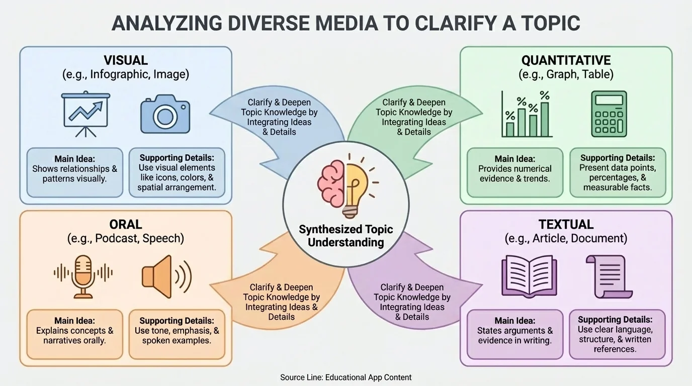
[Figure 2] A visual source communicates mainly through images, layout, symbols, labels, color, or design. Visual texts guide attention very quickly and can direct a viewer toward the most important message before a single paragraph is read.
To identify the main idea of a visual source, start by looking at the title, headline, or largest image. Then examine what is emphasized. Is one part bigger, brighter, or centered? Is a symbol repeated? Are certain words bold? Visual emphasis often points toward the main message.
Supporting details in visual sources may appear as labels, captions, symbols, diagrams, side notes, arrows, or smaller images. In an infographic about healthy eating, the main idea might be that balanced meals improve health. Supporting details could include portions of food groups, short facts about nutrients, and images of example meals.
Be careful not to confuse decoration with evidence. A dramatic photo can create emotion, but it may not actually prove a claim. A visual source becomes stronger when it combines attractive design with meaningful support. Ask yourself whether the image simply catches attention or truly helps explain the topic.
Captions and labels are especially important. A photograph of a dry riverbed may suggest drought, but a caption can tell you where the photo was taken, when it was taken, and what it is meant to show. Without that information, viewers may guess incorrectly.
Design choices can also influence how viewers feel. Red may suggest danger or urgency. Green may suggest health or nature. Large bold print can make a point seem more important. These choices do not automatically make a source wrong, but they can shape interpretation. That is why analysis includes both what is shown and how it is shown.
People often process visual patterns faster than full paragraphs of text. That speed is useful, but it also means viewers can be influenced by design choices before they stop to question the evidence.
Later, when you present your analysis, you should describe the visual source precisely. Instead of saying, "The poster is good," say, "The poster clarifies the issue by using a large heading, a simple diagram, and short captions that connect the image to the claim," much like the structure highlighted in [Figure 2].
[Figure 3] Quantitative information is information expressed with numbers. It often appears in tables, charts, graphs, percentages, surveys, or measurements. To understand numerical evidence, readers need to examine the title, categories, labels, and scale.
The main idea in quantitative media often appears as a trend or comparison. For example, if a graph shows that paper recycling increased each month after new bins were added, the main idea may be that the new bins were effective. The graph does not usually state this as a sentence, so the viewer must interpret the pattern.
Supporting details in quantitative sources come from the actual numbers. If a table shows that water use dropped from 500 liters to 350 liters after a conservation campaign, the numerical change supports the claim that the campaign made a difference. Numbers can make a point more specific and more testable.
However, numbers can also be misunderstood. A graph with a very narrow scale can make a small change look huge. A survey may represent only a small group, not everyone. A percentage without the total number can be confusing. For instance, saying that absenteeism dropped by 50 percent sounds dramatic, but if the number fell from 2 students to 1 student, the change may not show a large pattern.
When you analyze quantitative information, ask these questions: What do the numbers measure? What units are used? Over what time period? What comparison is being made? Does the data support the claim strongly, weakly, or only partly?
| Question to Ask | Why It Matters |
|---|---|
| What does the title say? | It tells the topic of the data. |
| What do the axes or columns measure? | They show what is being compared. |
| What is the scale? | It affects how large or small changes appear. |
| What pattern appears? | It helps identify the main idea or trend. |
| What numbers are most important? | They serve as supporting details. |
Table 1. Key questions for analyzing charts, graphs, and tables.
For example, suppose a graph shows that students read an average of 12 minutes per night in September and 20 minutes per night in December. The increase of 8 minutes is a supporting detail. If a presenter argues that a reading challenge improved reading habits, the graph helps clarify the claim by showing measurable change.
Numbers do not explain themselves. You still need words to interpret them. A graph can show a pattern, but a strong analyst explains what the pattern means and how it connects to the topic or issue.
This is why good presentations often combine data with explanation. A speaker should not simply display a chart and move on. The audience needs guidance about what trend matters and why.
Many important topics are best understood when you compare several sources. A speech may provide reasons, a photograph may create context, and a chart may provide measurable proof. When these sources agree, they can strengthen each other. When they differ, they can reveal missing information or different viewpoints.
This process is called synthesis: combining ideas from multiple sources to build a fuller understanding. If a principal says school attendance improved, a chart can confirm whether the numbers support that statement. If a poster says a river is polluted, a table of water quality measurements can reveal how serious the problem is.
Sometimes one format explains something that another format leaves unclear. A map may show where flooding occurred, while an oral interview explains how residents were affected. A table may show test scores, while a student speech explains why study spaces at home are limited. Together, these sources turn a topic into a more complete picture.
Different formats can do different jobs. Oral sources often reveal purpose, emotion, and reasoning. Visual sources highlight patterns, symbols, and immediate impressions. Quantitative sources provide precision, comparison, and measurable evidence. Strong analysis explains not only what each source says but also what each source contributes.
When multiple sources disagree, do not assume one must be useless. Instead, ask what each one measures, emphasizes, or leaves out. A source may be accurate but incomplete. Analysis becomes stronger when you can explain these limits clearly.
Not all supporting details are equally convincing. Some are strong because they are specific, accurate, and closely connected to the main idea. Others are weak because they are vague, emotional without evidence, or unrelated. To evaluate support, ask whether the detail truly helps the audience understand the issue.
Anecdotes, or short personal stories, can make a topic feel real, but one story does not prove that something is always true. Statistics can be powerful, but they need context. Images can be memorable, but they need labels or explanation. Good analysis looks at both the usefulness and the limits of each type of detail.
You should also watch for bias, which is a tendency to present information in a one-sided way. Bias does not always mean a source is false, but it can affect what details are included or ignored. A speaker trying to persuade an audience may emphasize helpful evidence and leave out facts that weaken the claim.
Another important question is whether enough support is provided. A main idea may sound reasonable, but if it relies on only one weak example, the audience may not be convinced. Clear communication usually uses several forms of support, especially when the issue is complex.
"Evidence is strongest when it is clear, relevant, and explained."
As you become a stronger analyst, you will notice that explaining support is just as important as finding it. A statistic alone does not clarify a topic unless someone explains what the number means. A visual alone does not clarify a problem unless someone connects the image to the claim.
Analyzing sources and presenting analysis belong together. In a formal presentation, you should state the topic clearly, identify the main idea of each source, and explain how supporting details deepen understanding. Good presenters do not overwhelm the audience with every detail they found. They select the most important evidence and organize it logically.
When speaking, use precise language such as "The speaker's main idea is...," "The graph supports this by showing...," or "The infographic clarifies the issue because...." These sentence patterns help your audience follow your reasoning. They also show that you are not merely describing the source but analyzing it.
Visual aids in a presentation should support your explanation, not replace it. If you show a chart, explain the key pattern. If you display a photograph, explain why it matters. If you quote a speaker, connect that quotation to the larger issue under study. Clear speaking means guiding the audience through the evidence step by step.
Audience awareness matters here too. Presenting to classmates may allow more shared background knowledge. Presenting to adults or a community group may require more context. A good presenter chooses vocabulary, pace, and examples that match the audience while still staying accurate.
Presentation language example
Suppose you are explaining sources about reducing food waste.
Step 1: State the issue.
"The issue under study is how schools can reduce food waste."
Step 2: Name the main idea of a source.
"The speaker's main idea is that students throw away more food when lunch periods are rushed."
Step 3: Explain the support.
"This idea is supported by examples from students and by a chart showing more waste during the shortest lunch periods."
Step 4: Clarify the contribution.
"The spoken examples make the issue personal, while the chart makes the pattern measurable."
Notice that strong presentation language connects ideas, evidence, and purpose. It helps the audience understand not just what the source contains but why the source matters.
[Figure 4] Suppose a class is studying whether the school should start a water conservation campaign. This issue becomes much clearer when students analyze several formats together.
First, students listen to a short presentation from the environmental club. The speaker says that the school wastes water through dripping faucets and overwatering grass. The main idea is that the school should reduce unnecessary water use. Supporting details include examples of leaks, a mention of environmental impact, and a call for action.
Next, students examine an infographic posted in the hallway. It shows pictures of a faucet, a water bottle, and the school garden. Short captions explain that turning off taps fully and adjusting sprinklers could reduce waste. The visual source clarifies the issue by making the problem concrete and easy to remember.
Then students study a table showing daily water use before and after simple repairs. If the table shows use dropping from 900 liters per day to 700 liters per day, that change supports the claim that repairs and better habits make a difference. The numbers do not only suggest a problem; they show evidence of improvement.
When students combine these sources, they gain a fuller understanding. The oral source provides reasons and urgency. The infographic simplifies actions people can take. The numerical source supplies proof. Together, the sources form a stronger explanation than any one source could provide alone.
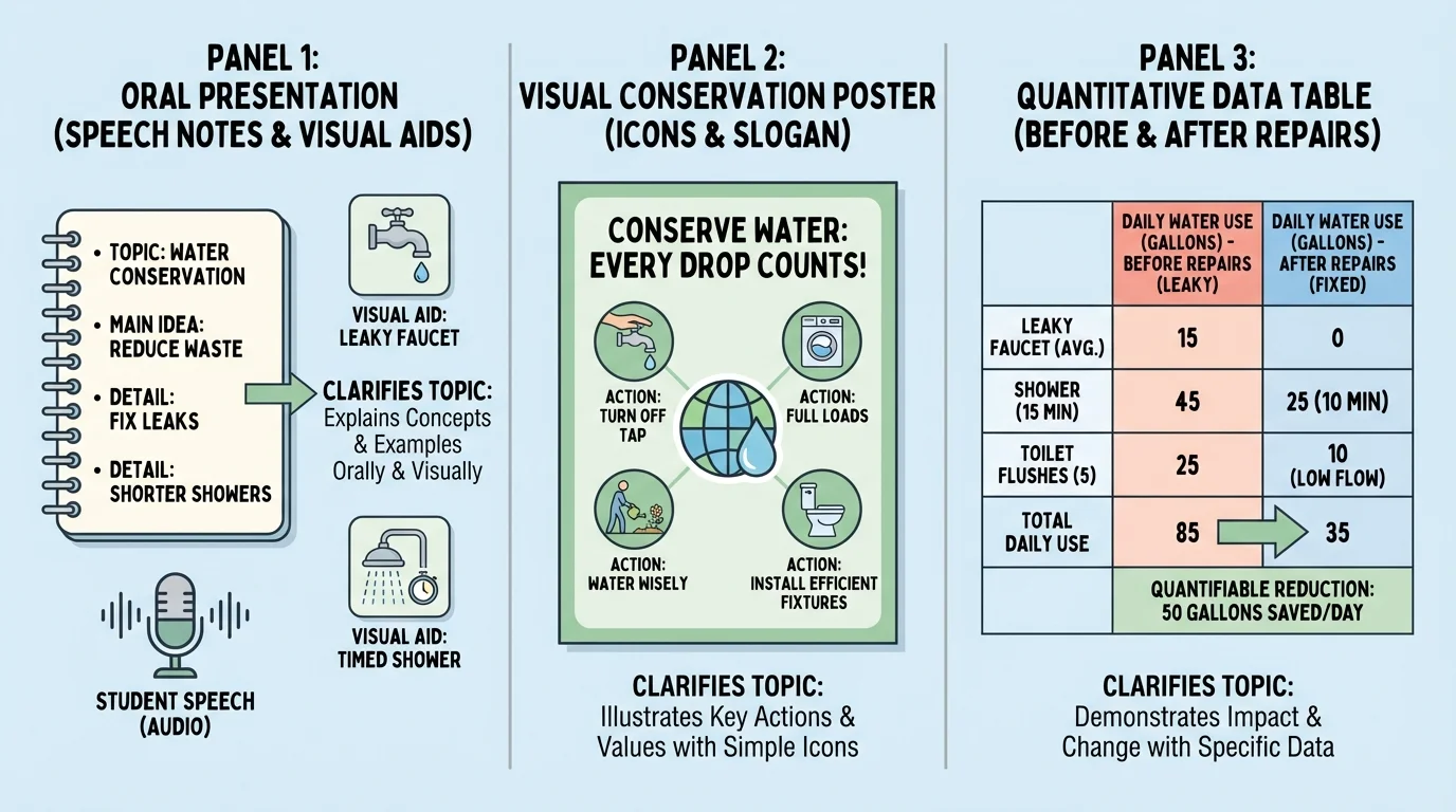
If you were presenting this issue, you could explain it like this: "The main idea across the sources is that our school can reduce water waste through small changes. The speaker explains why the problem matters, the infographic shows practical actions, and the data confirms that those actions reduce water use." That kind of statement makes the relationship among sources clear.
This example also shows why making connections across sources matters. The visual structure of support we saw earlier in [Figure 1] appears again here: one main idea is strengthened by examples, explanations, and numbers. The design choices we discussed in [Figure 2] help the infographic emphasize action, while the pattern reading practiced with [Figure 3] helps students interpret the water-use data correctly.
Whether the issue is health, the environment, school policy, or technology, the same skill applies. Find the central message, choose the strongest support, study how each format shapes understanding, and explain clearly how the evidence helps clarify the topic.