Suppose two basketball players both score the same average number of points per game. Are they equally consistent? Not necessarily. One player might score almost the same number of points every game, while the other might swing from very low games to very high games. That is why people who study data do not stop with just one number. To really understand a set of numbers, we need to describe both its center and its spread.
When we look at a data set, we want to answer questions like these: What is a typical value? How much do the values vary? Are most values packed together, or are they spread out? Is there a value that looks very different from the others? In statistics, these questions help us summarize numerical data in a way that matches the situation in which the data were collected.
A data set is a collection of values. For example, a class might record the number of books each student read in a month, or a weather station might record daily temperatures for a week. If we list all the numbers, we can see the raw information, but it may still be hard to understand the big picture.
To summarize a data set, we often use measures of center and measures of variability. Measures of center tell us what a typical value is like. Measures of variability tell us how much the values differ from one another. Both ideas matter. If two classes both have the same mean quiz score, one class may still have much more spread in scores.
Center describes a typical or middle value in a data set. Variability describes how much the data values differ from one another. Common measures of center are the mean and median. Common measures of variability are the interquartile range and the mean absolute deviation.
Good data descriptions also include the overall pattern of the data. This means noticing where most values are, whether the values seem balanced or uneven, and whether there are unusual values. A strong description uses numbers and words together.
Two important ways to describe the center of a data set are the mean and the median. The median is the middle value when the data are put in order, as [Figure 1] shows. The mean is found by adding all the values and dividing by the number of values.
The mean is sometimes called the average in everyday language. If the data values are the numbers of questions a class got correct on a short quiz, we compute the mean with this rule:
\[\textrm{mean} = \frac{\textrm{sum of all data values}}{\textrm{number of data values}}\]
For example, if the scores are \(8, 9, 7, 10, 6\), then the sum is \(8 + 9 + 7 + 10 + 6 = 40\). There are \(5\) scores, so the mean is \(\dfrac{40}{5} = 8\).
To find the median, first put the values in order. For the same data set, the ordered list is \(6, 7, 8, 9, 10\). The middle value is \(8\), so the median is \(8\).
When there is an even number of values, there is no single middle number. Then we find the two middle values and take their mean. For example, if the ordered data are \(3, 5, 6, 8\), the two middle values are \(5\) and \(6\). The median is \(\dfrac{5+6}{2} = 5.5\).
The median is often a better choice when the data include a very large or very small value. The mean uses every value directly, so unusual values can pull it up or down more strongly.
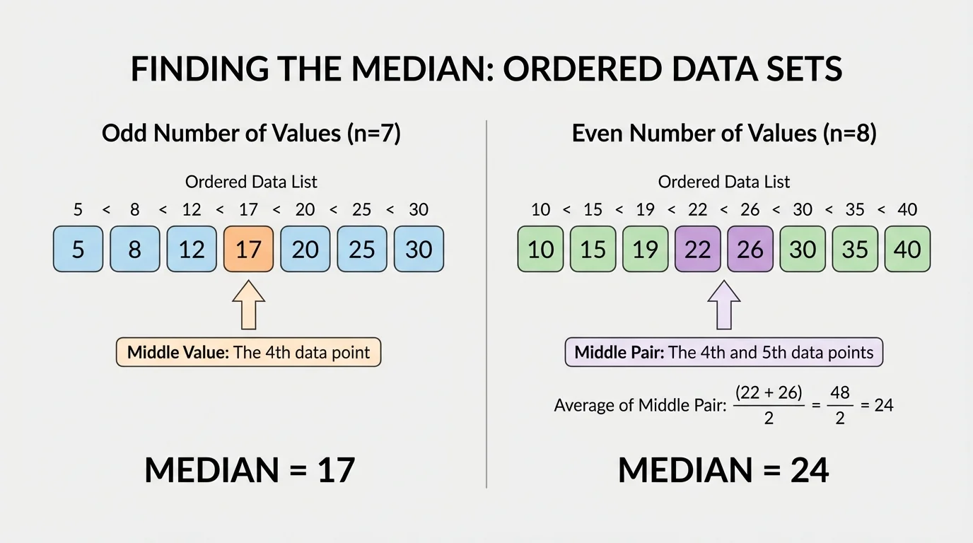
Notice that the mean and median may be close together, or they may be quite different. That difference can tell us something about the shape of the data. Later, when we discuss unusual values, we will return to the idea from [Figure 1] that the median depends on position in the ordered list, not on how far away an extreme value is.
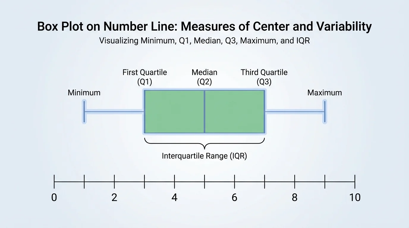
[Figure 2] Knowing the center is helpful, but it does not tell the whole story. The interquartile range, often shortened to IQR, tells us how spread out the middle half of the data is. Another measure, the mean absolute deviation, often shortened to MAD, tells us on average how far the data values are from the mean.
To understand the IQR, divide the ordered data into four parts called quartiles. The first quartile, written as \(Q_1\), is the middle of the lower half of the data. The third quartile, written as \(Q_3\), is the middle of the upper half. Then we calculate
\[\textrm{IQR} = Q_3 - Q_1\]
The IQR measures the spread of the middle \(50\%\) of the data. A small IQR means that the middle half of the values are close together. A large IQR means they are more spread out.
The mean absolute deviation starts with the mean. Then for each data value, find the absolute deviation, which is the distance between that value and the mean. Distances are always nonnegative, so we use absolute value. Finally, find the mean of those distances.
\[\textrm{MAD} = \frac{\textrm{sum of absolute deviations from the mean}}{\textrm{number of data values}}\]
If the MAD is small, most values are close to the mean. If the MAD is large, the values tend to be farther from the mean.
Both IQR and MAD describe variability, but they do it in different ways. The IQR focuses on the middle half of the data, while the MAD uses every value and measures average distance from the mean. That makes the IQR especially useful when extreme values are present.
To work with median and quartiles, always put the data in order first. To work with mean and MAD, add carefully and keep track of how many data values there are.
Students sometimes mix up the ideas of center and spread. The center tells what is typical. The spread tells how much the values differ. A good description usually includes one measure of center and one measure of variability.
When describing a data set, do more than list the mean or median. Explain the overall pattern in context. Ask: Where are most values located? Are they clustered together? Do they stretch farther in one direction? Is the distribution fairly balanced, or do a few values create a longer tail on one side?
For example, suppose students record how many minutes they read each night. If most values are between \(20\) and \(30\) minutes, with only a few higher values, we might say the data are clustered around the mid-\(20\)s and spread a little higher on the upper end. That description gives more meaning than just saying the mean is \(25\).
We also describe the pattern using the situation. If the data are test scores, a high spread may mean students had very different levels of understanding. If the data are running times, a low spread may mean the runners performed consistently.
Numbers need context
A mean of \(12\) does not mean much by itself. Is it \(12\) books read, \(12\) degrees, or \(12\) minutes? Is that large or small for the situation? Statistics becomes meaningful when we connect the numbers to what they actually measure.
Sometimes we compare two data sets. Then we can compare both center and variability. One team might have a higher median score, but another team might be more consistent because its variability is smaller.
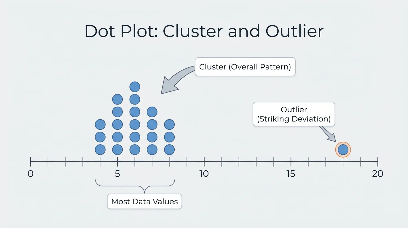
[Figure 3] An outlier is a value that stands out from the rest of the data. It is a striking deviation from the overall pattern. In a dot plot, an outlier may appear far from the main cluster of values. Outliers matter because they can change how we describe the data.
Suppose the daily number of minutes a student practices piano is \(20, 22, 21, 19, 85\). Most values are near \(20\), but \(85\) is much larger than the others. The mean is \(\dfrac{20+22+21+19+85}{5} = \dfrac{167}{5} = 33.4\). That mean is much larger than the typical practice time on most days. The median, however, is still \(21\), which better matches the cluster of values.
This is why outliers can pull the mean away from the center of most values. The median often resists that pull because it depends on order, not on the actual size of the extreme value. The same idea connects back to [Figure 1], where the median is found by position in the ordered list.
When you describe a data set, mention any striking deviations clearly. For example, you might say, "Most of the temperatures were between \(18\) and \(22\) degrees, with one unusually high temperature of \(30\) degrees." That statement is much more informative than simply giving the mean.
Weather scientists, sports analysts, and doctors all look for unusual data values. A surprising number can signal an error, a rare event, or something important that needs attention.
Not every extreme-looking value is a mistake. Sometimes it is a real result that tells us something important. The key is to notice it and explain its effect on the data summary.
Now let us put these ideas together with step-by-step examples.
Worked example 1: Finding the median and IQR
A class recorded the numbers of pets owned by \(9\) students: \(2, 1, 3, 0, 2, 4, 1, 2, 5\).
Step 1: Put the data in order.
The ordered data are \(0, 1, 1, 2, 2, 2, 3, 4, 5\).
Step 2: Find the median.
There are \(9\) values, so the middle is the \(5\)th value. The median is \(2\).
Step 3: Find the lower and upper halves.
The lower half is \(0, 1, 1, 2\). The upper half is \(2, 3, 4, 5\).
Step 4: Find \(Q_1\) and \(Q_3\).
For the lower half, the middle two values are \(1\) and \(1\), so \(Q_1 = 1\).
For the upper half, the middle two values are \(3\) and \(4\), so \(Q_3 = \dfrac{3+4}{2} = 3.5\).
Step 5: Find the IQR.
\(\textrm{IQR} = Q_3 - Q_1 = 3.5 - 1 = 2.5\).
The median number of pets is \(2\), and the middle half of the data has a spread of \(2.5\) pets.
This example shows that the center and spread together give a fuller picture. A typical student has about \(2\) pets, but the middle half of the class ranges across several values.
Worked example 2: Finding the mean and MAD
The numbers of goals scored by a soccer player in \(5\) games are \(2, 3, 3, 4, 8\).
Step 1: Find the mean.
The sum is \(2+3+3+4+8 = 20\). There are \(5\) values, so the mean is \(\dfrac{20}{5} = 4\).
Step 2: Find each absolute deviation from the mean.
From \(2\): \(|2-4| = 2\)
From \(3\): \(|3-4| = 1\)
From \(3\): \(|3-4| = 1\)
From \(4\): \(|4-4| = 0\)
From \(8\): \(|8-4| = 4\)
Step 3: Find the mean of those deviations.
The sum of the deviations is \(2+1+1+0+4 = 8\).
The MAD is \(\dfrac{8}{5} = 1.6\).
The mean is \(4\) goals, and on average the game scores differ from the mean by \(1.6\) goals.
Notice that the score of \(8\) is much higher than the others. It increases the mean and also increases the MAD because it is far from the center.
Worked example 3: Comparing two data sets in context
Two students tracked how many minutes they spent practicing violin each day for a week.
Student A: \(25, 25, 26, 24, 25, 25, 26\)
Student B: \(15, 20, 25, 30, 35, 20, 41\)
Step 1: Find a measure of center.
Student A mean: \(\dfrac{25+25+26+24+25+25+26}{7} = \dfrac{176}{7} \approx 25.14\)
Student B mean: \(\dfrac{15+20+25+30+35+20+41}{7} = \dfrac{186}{7} \approx 26.57\)
Step 2: Describe the spread.
Student A values stay very close to \(25\).
Student B values range from \(15\) to \(41\), so they are much more spread out.
Step 3: Interpret in context.
Student B practiced slightly more on average, but Student A was far more consistent from day to day.
This comparison shows why one summary number is not enough. Student B has a higher mean, but Student A has much less variability.
When comparing data sets, always write in context. Say "minutes of practice," "books read," or "degrees," not just "numbers." Statistics is about understanding real situations.
Coaches use center and variability to understand player performance. A batter with a steady number of hits per week may be more reliable than a batter whose performance jumps wildly, even if both have similar means.
Teachers may look at quiz scores to see whether students are improving together or whether some students need extra help. A median score shows what is typical, while the variability shows whether the class is performing similarly or very differently.
Scientists also summarize data. If a plant scientist measures the heights of seedlings, the center gives a typical height, and the spread shows whether the plants are growing evenly. If one seedling is much shorter than the rest, that striking deviation might suggest a problem with soil, light, or water.
Which measure should you use? If the data are fairly balanced and have no strong outliers, the mean and MAD can work well because they use every value. If the data include an outlier or are strongly uneven, the median and IQR are often better choices because they are less affected by unusual values.
For example, if you want to describe the usual amount of time students spend on homework and one student reports an extremely high number, the median may give a more reasonable picture of a typical day. If the values are all close together without unusual extremes, the mean gives a useful average.
| Situation | Better measure of center | Better measure of variability | Reason |
|---|---|---|---|
| Data are fairly even, no unusual values | Mean | MAD | These use every data value. |
| Data include an outlier | Median | IQR | These are less affected by extreme values. |
| You want the middle value in order | Median | IQR | These focus on position and middle half. |
Table 1. A comparison of when different measures of center and variability are often most useful.
As you become more skilled with data, remember that a strong description answers four ideas: center, variability, overall pattern, and striking deviations. A complete statement might sound like this: "The median reading time was \(24\) minutes, the IQR was \(6\) minutes, most students were between \(20\) and \(28\) minutes, and one student had an unusually high reading time of \(45\) minutes."
That kind of description tells a story about the data. It explains what is typical, how spread out the values are, what pattern most values follow, and whether anything unusual stands out.