A hospital, a basketball team, and a streaming app can all ask the same mathematical question: what does the data look like? A list of numbers by itself is hard to interpret, but once those values are placed on a number line, patterns suddenly appear. You can see whether most values cluster together, whether the data stretches far in one direction, and whether a few unusual values stand out. That is why plots on the real number line are so powerful in statistics.
When statisticians study a single numerical variable, they often want to summarize how the values are distributed. A graph does more than display the numbers. It helps reveal the center of the data, its spread, and the overall shape of the distribution. Three important displays for this purpose are the dot plot, the histogram, and the box plot.
These graphs are used when data consists of measurements or counts, such as heights, test scores, wait times, numbers of text messages sent, or daily temperatures. Because the values are numerical, each one has a position on the real number line. A well-made plot preserves that numerical meaning.
Suppose a class records the number of hours students slept last night: \(5, 6, 6, 6.5, 7, 7, 7, 7.5, 8, 9\). A graph of these values immediately shows that most students slept around \(7\) hours, while \(5\) and \(9\) are farther from the center. That kind of visual pattern is often more informative than the list alone.
Earlier work with numerical data included finding measures such as the mean, median, and range. Graphs do not replace these statistics; instead, they help you see why those statistics matter and whether they tell the whole story.
As you learn these displays, focus on four big questions: Where is the data centered? How much does it vary? Is the shape roughly balanced or pulled to one side? Are there any values that seem unusual compared with the rest?
Quantitative data consists of numerical values. If the values come from one characteristic, such as shoe size or commute time, then the result is a data set with one variable. The collection of how often values occur across the number line is called the distribution.
When describing a distribution, several features matter:
A distribution is symmetric if the left and right sides look roughly balanced around the center. It is skewed right if it stretches farther toward larger values, and skewed left if it stretches farther toward smaller values. A gap is an interval with no data values, while a cluster is a region where many values are concentrated.
A dot plot places each data value as a dot above its exact position on a number line.
A histogram groups data values into intervals and shows how many values fall in each interval using adjacent bars.
A box plot displays the five-number summary: minimum, first quartile, median, third quartile, and maximum.
Each graph shows the same data in a different way. A dot plot shows exact values clearly. A histogram emphasizes the overall shape for larger data sets. A box plot gives a compact summary of center and spread.
A dot plot is one of the most direct ways to represent numerical data, as [Figure 1] shows. Every data value is placed above its exact location on a number line, and repeated values are stacked vertically. Because no values are grouped, dot plots preserve the raw data very well.
Dot plots work especially well for small to medium-sized data sets. You can quickly count frequencies, see the most common values, and identify gaps or outliers. If five students scored \(8\) on a quiz, then five dots appear stacked above \(8\).
To make a dot plot, first draw a horizontal number line that includes the full range of the data. Then place one dot for each value. If a value occurs more than once, stack the dots above that number rather than spreading them sideways.
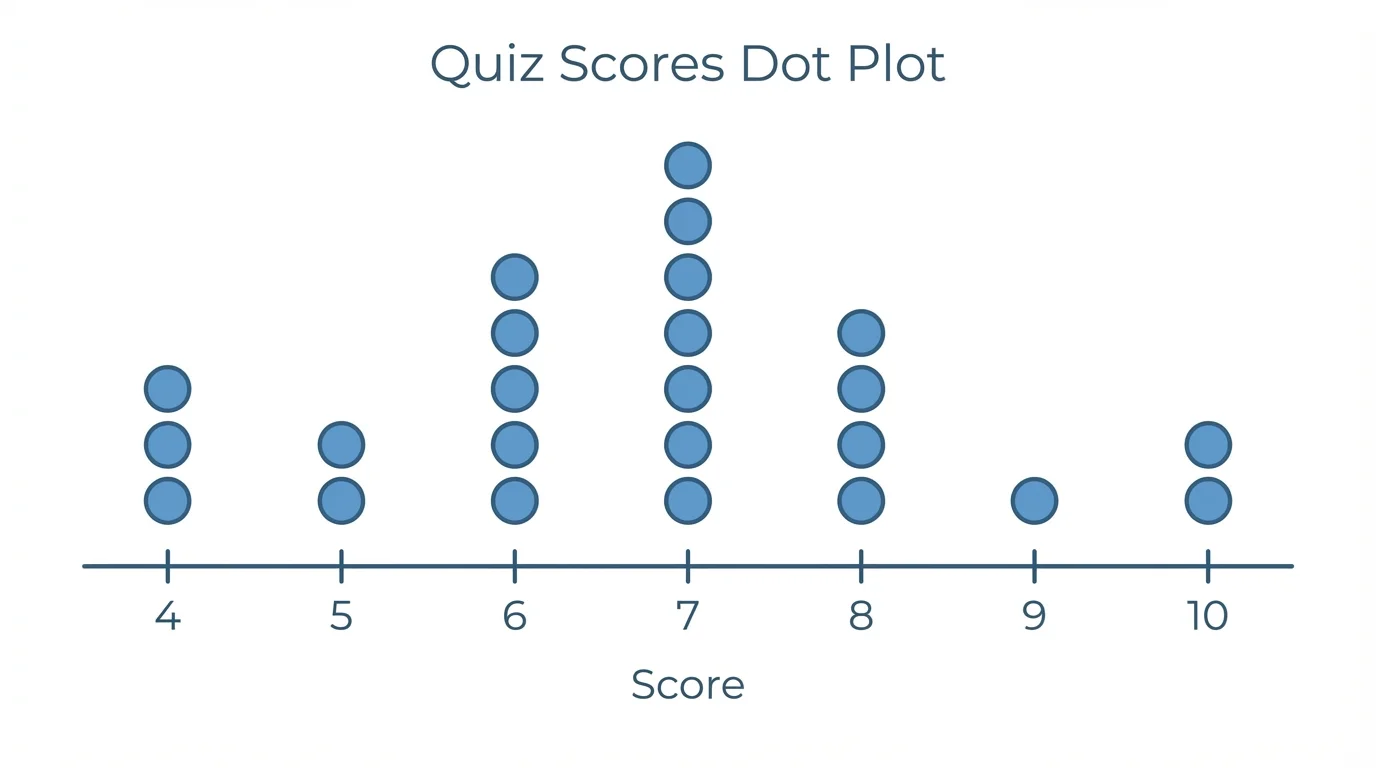
Suppose the data set is \(4, 5, 5, 6, 6, 6, 7, 8, 8, 10\). The dot plot shows one dot above \(4\), two above \(5\), three above \(6\), one above \(7\), two above \(8\), and one above \(10\). The shape suggests that the data clusters around \(6\) and \(7\), with a possible gap near \(9\).
Later, when you compare displays, remember what we see in [Figure 1]: dot plots are excellent when the exact values matter. If two classes both have median score \(7\), a dot plot can still reveal whether one class has more repeated scores or more isolated values.
Professional analysts still use simple plots like dot plots when checking small data sets because unusual values can be spotted immediately. Even with powerful software, the simplest graph is often the most revealing first step.
One limitation is that dot plots become crowded when the data set is large or when values include many decimals. In those cases, grouping values into intervals may make the overall pattern easier to see.
A histogram groups nearby values into equal-width intervals, often called bins, as [Figure 2] illustrates. Instead of showing each exact value, it shows how many values fall in each interval. This makes histograms especially useful for larger data sets.
For example, test scores might be grouped into intervals such as \(60\textrm{–}69\), \(70\textrm{–}79\), \(80\textrm{–}89\), and \(90\textrm{–}99\). A bar is drawn for each interval, and the height of the bar shows the frequency. Because the variable is numerical and intervals touch each other on the number line, histogram bars touch.
The choice of interval width matters. If intervals are too wide, important details may disappear. If they are too narrow, the graph may look jagged and confusing. Good histograms use intervals of equal width so comparisons are fair.
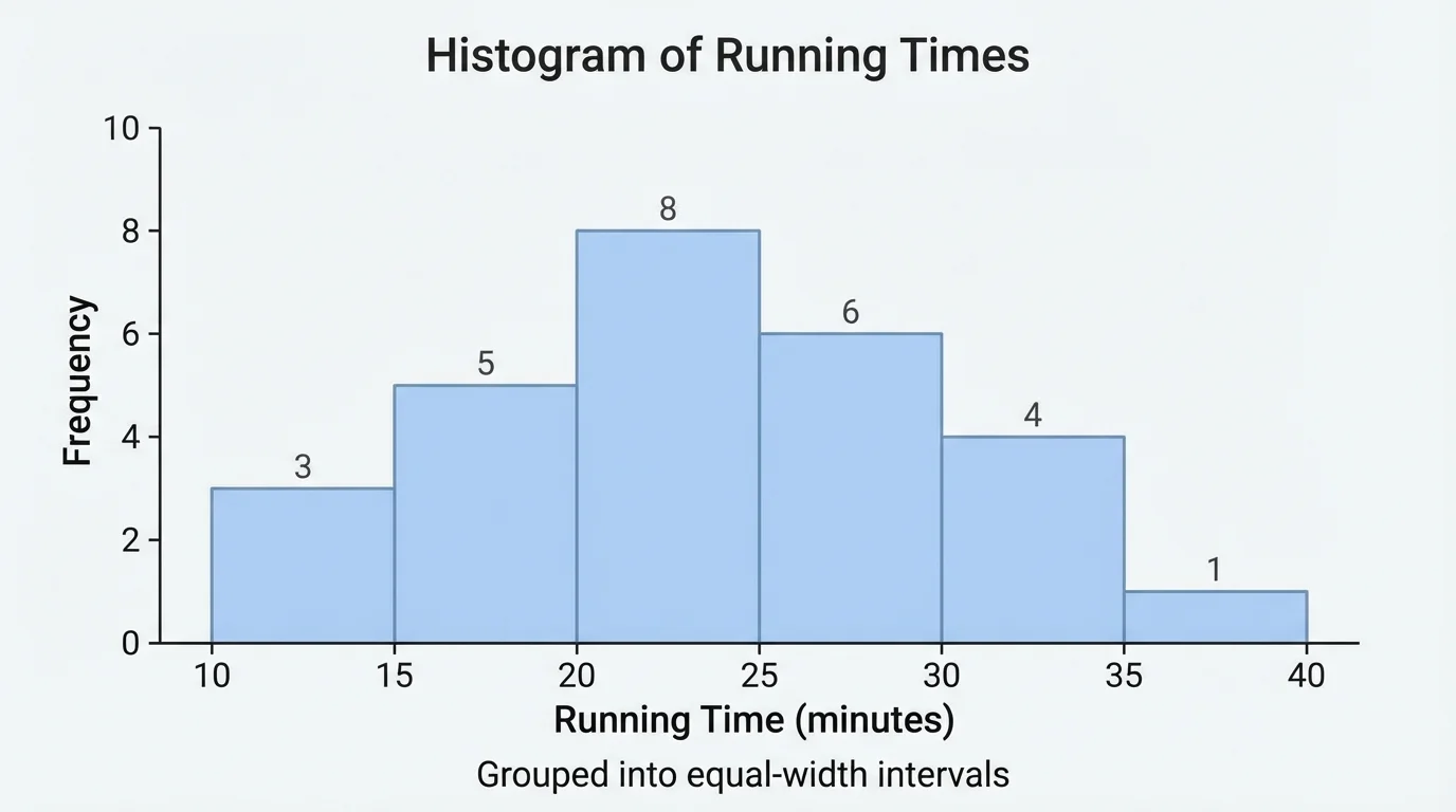
Histograms help you see the overall shape of a distribution. A histogram may show one clear peak, two peaks, strong skew, or a nearly uniform pattern. It is often easier to judge shape from a histogram than from a long list of numbers.
As with the grouped intervals in [Figure 2], histograms sacrifice exact values in order to highlight structure. You may not know the exact score of every student, but you can tell whether most students scored in the \(80\textrm{–}89\) range or whether scores are spread evenly across intervals.
Why histogram bars touch
In a histogram, the variable is quantitative and the intervals represent continuous stretches of the number line. Since one interval ends where the next begins, the bars are adjacent. This is different from a bar graph for categories, where separated bars represent distinct groups such as favorite sports or car colors.
A histogram is often better than a dot plot when there are dozens or hundreds of values. It provides a fast visual summary of how the distribution behaves over intervals rather than at exact points.
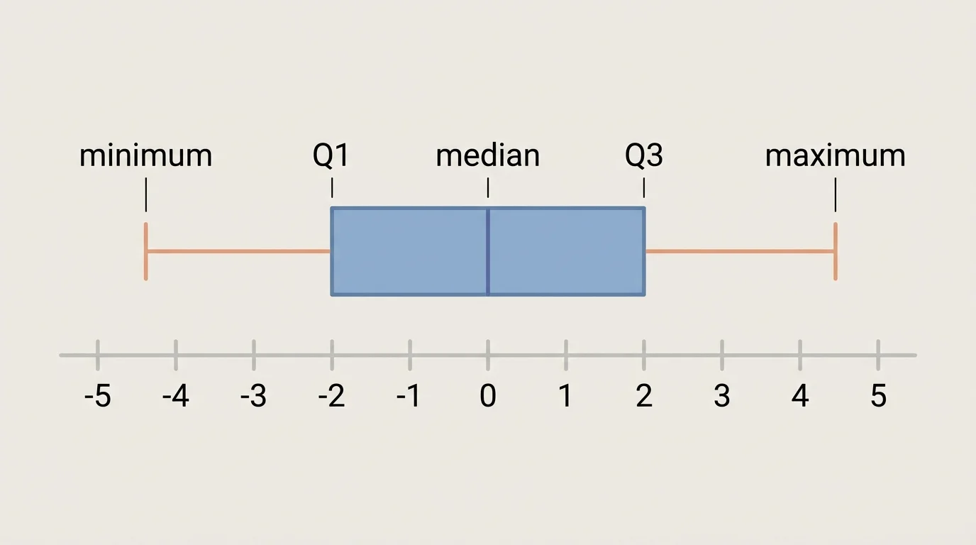
A box plot gives a compact summary of a data set using the five-number summary, as [Figure 3] shows. The five numbers are the minimum, first quartile \((Q_1)\), median, third quartile \((Q_3)\), and maximum. The box extends from \(Q_1\) to \(Q_3\), and a line inside the box marks the median.
The quartiles divide the ordered data into four parts. About \(25\%\) of the data lies below \(Q_1\), about \(50\%\) lies below the median, and about \(75\%\) lies below \(Q_3\). The distance \(Q_3 - Q_1\) is called the interquartile range, or \(IQR\).
Whiskers extend from the box toward the lower and upper ends of the data. In a basic box plot, they connect the box to the minimum and maximum. In some statistical software, unusually distant values are plotted separately as outliers, and the whiskers stop before them.
Box plots are excellent for comparing distributions, especially side by side. They make it easy to compare medians and spreads even when the original data sets are large. However, they do not show every individual value or detailed clustering.
The structure shown in [Figure 3] is especially useful when two data sets have similar ranges but very different middle halves. One group might have a small \(IQR\), meaning its central data is tightly packed, while another group might have a much larger \(IQR\), meaning more variation in the middle \(50\%\).
Solved example 1: Create and interpret a dot plot
A teacher records the number of books read by \(12\) students over a month:
\(1, 2, 2, 3, 3, 3, 4, 4, 5, 5, 5, 7\)
Step 1: Draw the number line.
The values run from \(1\) to \(7\), so the number line should include all integers from \(1\) through \(7\).
Step 2: Count each value.
Frequency counts are: \(1 \rightarrow 1\), \(2 \rightarrow 2\), \(3 \rightarrow 3\), \(4 \rightarrow 2\), \(5 \rightarrow 3\), \(6 \rightarrow 0\), \(7 \rightarrow 1\).
Step 3: Stack the dots above each value.
This creates a graph with the tallest stacks at \(3\) and \(5\), no dot above \(6\), and a single dot above \(7\).
Step 4: Interpret the graph.
The data has two local peaks at \(3\) and \(5\). There is a gap at \(6\). Most students read between \(2\) and \(5\) books.
The dot plot shows exact counts clearly and reveals a small cluster in the middle with a gap before the value \(7\).
Notice how the dot plot in this example shows more detail than a summary statistic alone. Two classes could have the same mean number of books read, yet one class might have a much more clustered pattern.
All three displays represent one-variable quantitative data on the real number line, but they emphasize different features. Choosing the best one depends on the size of the data set and what you want to learn from it.
| Display | Best use | Main strength | Main limitation |
|---|---|---|---|
| Dot plot | Small to medium data sets | Shows every exact value | Can become crowded |
| Histogram | Medium to large data sets | Shows overall shape well | Exact values are grouped |
| Box plot | Comparing distributions quickly | Summarizes center and spread compactly | Hides detailed clusters and exact frequencies |
Table 1. Comparison of dot plots, histograms, and box plots for one-variable quantitative data.
A dot plot is often the best starting point for a small class survey. A histogram is often best for a large set of measurements, such as hundreds of battery lifetimes. A box plot is especially useful when comparing two or more groups side by side, such as test scores from different classes.
Solved example 2: Build a histogram from grouped intervals
The commute times, in minutes, for \(20\) workers are:
\(8, 10, 12, 13, 15, 16, 18, 19, 20, 22, 24, 25, 27, 29, 30, 32, 35, 38, 40, 44\)
Use intervals of width \(10\): \(0\textrm{–}9\), \(10\textrm{–}19\), \(20\textrm{–}29\), \(30\textrm{–}39\), \(40\textrm{–}49\).
Step 1: Sort values into intervals.
\(0\textrm{–}9: 1\) value, \(10\textrm{–}19: 7\) values, \(20\textrm{–}29: 6\) values, \(30\textrm{–}39: 4\) values, \(40\textrm{–}49: 2\) values.
Step 2: Draw adjacent bars.
Each bar covers one interval on the number line, and its height equals the frequency for that interval.
Step 3: Interpret the histogram.
The tallest bars are in \(10\textrm{–}19\) and \(20\textrm{–}29\), so many workers commute between \(10\) and \(29\) minutes. The distribution extends farther to the right, suggesting slight right skew.
The histogram gives a quick picture of the overall commute-time pattern, even though it does not show every exact time separately.
Interval choice can affect the appearance of a histogram. If the same commute times were grouped in widths of \(5\) instead of \(10\), the graph would show more detail and possibly more local peaks.
Solved example 3: Create and interpret a box plot
The ordered data set is:
\(2, 4, 5, 7, 8, 10, 12, 13, 15, 18\)
Step 1: Find the median.
There are \(10\) values, so the median is the average of the \(5^{th}\) and \(6^{th}\) values: \(\dfrac{8 + 10}{2} = 9\).
Step 2: Find the quartiles.
The lower half is \(2, 4, 5, 7, 8\), so \(Q_1 = 5\). The upper half is \(10, 12, 13, 15, 18\), so \(Q_3 = 13\).
Step 3: Identify the five-number summary.
Minimum \(= 2\), \(Q_1 = 5\), median \(= 9\), \(Q_3 = 13\), maximum \(= 18\).
Step 4: Compute the interquartile range.
\(IQR = Q_3 - Q_1 = 13 - 5 = 8\).
Step 5: Draw the box plot.
Draw a box from \(5\) to \(13\), place a median line at \(9\), and add whiskers from \(2\) to \(5\) and from \(13\) to \(18\).
This box plot shows that the middle \(50\%\) of the data lies between \(5\) and \(13\), with center at \(9\).
When you compare this worked example to the structure in [Figure 3], you can see why box plots are efficient summaries: five numbers can capture a great deal of information about center and spread.
In sports analytics, a dot plot might display the number of rebounds a player gets in each game over two weeks. Coaches can see consistency, repeated values, and unusual games immediately. A histogram might show the distribution of sprint times for an entire team, revealing whether most athletes are clustered in a narrow range or spread widely.
In medicine, box plots are often used to compare groups, such as recovery times for patients using different treatments. If one treatment has a lower median and a smaller \(IQR\), that suggests faster and more consistent recovery among the middle half of patients.
Manufacturing companies use histograms to monitor product measurements. If bolt lengths are supposed to stay near a target value, a histogram can show whether production is centered properly or whether values are drifting too high or too low. Outliers may signal a machine problem or measurement error.
Why graph choice affects conclusions
The same data can lead to different insights depending on the display. A dot plot reveals individual repeats, a histogram highlights shape, and a box plot emphasizes median and quartiles. Strong statistical thinking includes choosing the display that matches the question being asked.
Schools use these tools as well. Attendance data, assignment completion times, and assessment scores are often graphed to find patterns. A graph can help teachers decide whether most students need support in one area or whether only a few students are far from the class norm.
One common mistake is confusing a histogram with a bar graph. In a histogram, bars touch because the intervals represent connected numerical ranges. In a bar graph for categories, bars are separated because the categories are distinct.
Another mistake is choosing unequal interval widths in a histogram without adjusting interpretation. If intervals are not comparable, the bar heights can mislead. For most introductory work, use equal-width intervals.
Students also sometimes compute quartiles incorrectly for box plots. Always order the data first. Then find the median, split the data into lower and upper halves, and find the medians of those halves. Careful organization prevents errors.
Do not assume a graph tells more than it actually does. A box plot cannot show exact frequencies within the box. A histogram cannot reveal every exact value. A dot plot may show individual values well but may be less practical for very large data sets.
"The purpose of a graph is not just to display data, but to make structure visible."
Good interpretation depends on matching the graph to the question. If you want exact values, use a dot plot. If you want the overall shape of many data points, use a histogram. If you want a compact comparison of center and spread, use a box plot.