A company can report that its employees earn an average salary of $82,000, and that can sound impressive. But if a few executives make extremely high salaries while most workers earn much less, the average may hide the real story. Statistics are powerful, but only when they match the shape of the data. Choosing the wrong measure can make a data set look more typical, more equal, or more predictable than it really is.
When we compare data sets, we usually want to answer two questions: What is a typical value, and how much do the values vary? The first question is about center. The second is about spread. In this lesson, you will learn how to use statistics appropriate to the shape of the distribution to compare center using the mean or median and to compare spread using the standard deviation or interquartile range.
A distribution is the way data values are spread out. Some distributions are balanced around the middle, while others stretch farther in one direction. Some have values that sit far away from the rest, called outliers. These features matter because not all statistics respond the same way to unusual values.
If a distribution is roughly symmetric and has no strong outliers, the mean gives a useful picture of the center, and the standard deviation gives a useful picture of the spread. If a distribution is skewed or has outliers, the median and interquartile range usually give a better description because they are less affected by extreme values.
Mean is the sum of all data values divided by the number of values.
Median is the middle value when the data are ordered, or the average of the two middle values if there is an even number of data points.
Interquartile range is the difference between the third quartile and first quartile, written as \(IQR = Q_3 - Q_1\).
Standard deviation measures how far data values typically lie from the mean.
One of the most important ideas in statistics is that a number is meaningful only when it fits the data it describes. A center without a spread is incomplete, and a spread measure disconnected from the right center can be misleading.
The mean uses every value in the data set. For a set of numbers \(x_1, x_2, x_3, ..., x_n\), the mean is
\[\bar{x} = \frac{x_1 + x_2 + x_3 + \cdots + x_n}{n}\]
Because the mean uses every value, it is sensitive to extreme numbers. If one value changes a lot, the mean changes too. That makes the mean useful when the data are fairly balanced, but risky when a few values are unusually large or small.
The median depends only on position in an ordered list. It is much less affected by outliers. For example, in the ordered set \(2, 3, 4, 5, 50\), the median is \(4\), even though the value \(50\) pulls the mean upward.
This leads to a key guideline: for roughly symmetric distributions, use the mean to describe center. For skewed distributions or distributions with outliers, use the median.
To find the median, first order the data from least to greatest. To find quartiles, split the ordered data into a lower half and an upper half, then find the medians of those halves.
Suppose two classes take the same quiz. If both classes have score distributions that are balanced and clustered around the middle, comparing means makes sense. But if one class has a few extremely low or high scores, medians may give a fairer comparison of typical performance.
Center tells you what is typical, but it does not tell you how consistent the data are. Two data sets can have the same center and still look very different. One may be tightly clustered, while the other is widely scattered.
The interquartile range measures the spread of the middle \(50\%\) of the data. Since it ignores the smallest \(25\%\) and largest \(25\%\), it is resistant to outliers. That makes it a strong partner for the median.
If \(Q_1 = 12\) and \(Q_3 = 18\), then
\[IQR = Q_3 - Q_1 = 18 - 12 = 6\]
The standard deviation measures typical distance from the mean. A small standard deviation means the values stay close to the mean. A large standard deviation means the values are more spread out. At this level, you should focus on interpreting standard deviation and using it with data that are roughly symmetric, even if a calculator often handles the calculation.
For a population, the standard deviation is written as
\[\sigma = \sqrt{\frac{\sum (x - \mu)^2}{n}}\]
For a sample, it is commonly written as
\[s = \sqrt{\frac{\sum (x - \bar{x})^2}{n-1}}\]
You do not always need to compute standard deviation by hand, but you do need to know what it means. It works best with the mean because both are influenced by the same features of the data, especially extreme values.
Looking at the graph of a data set often gives the fastest clue about which statistics to use. A histogram reveals whether a distribution is balanced, stretched to one side, or affected by unusual values. That visual evidence helps determine whether the mean and standard deviation or the median and interquartile range give the fairest comparison.
[Figure 1] A distribution is approximately symmetric if the left and right sides look roughly like mirror images. In a symmetric distribution, the mean and median are usually close together. This is why the mean often works well there.
A distribution is skewed right if it has a long tail toward larger values. Income data often look like this because a small number of people earn much more than most others. A distribution is skewed left if it has a long tail toward smaller values.
An outlier is a value far from the rest of the data. Outliers can strongly affect the mean and standard deviation, but they affect the median and IQR much less.
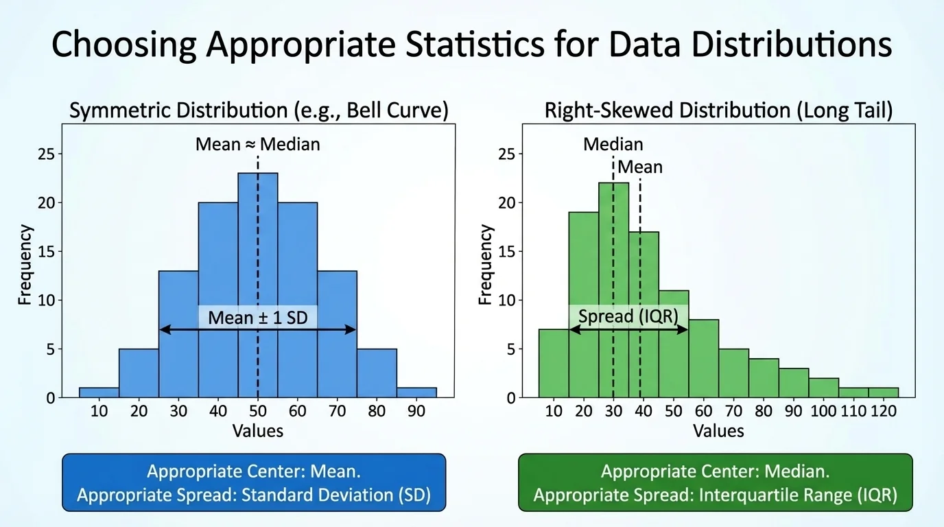
Because of that, the statistic pair you choose should match the data shape. For symmetric data with no strong outliers, compare mean and standard deviation. For skewed data or data with outliers, compare median and interquartile range.
This pairing is not random. Mean and standard deviation are both sensitive. Median and IQR are both resistant. Mixing a sensitive center with a resistant spread, or the reverse, can lead to confusing comparisons.
Choosing a matched pair of statistics
The best comparisons use one measure of center and one measure of spread that respond to the data in similar ways. The mean and standard deviation both react to all values, including extremes, so they work well together for symmetric distributions. The median and IQR both resist the effect of extremes, so they work well together for skewed distributions or data with outliers.
Later, when you compare box plots or histograms, remember what [Figure 1] makes clear: the picture of the distribution often tells you which summary statistics deserve the most trust.
A complete comparison should mention both center and spread. Saying one set has a higher average is not enough. You should also ask whether it is more consistent or more variable.
For example, if School A has a mean test score of \(78\) and School B has a mean test score of \(81\), School B appears stronger in center. But if School B also has a much larger standard deviation, its scores may be less consistent. Depending on the question, that wider spread may matter a lot.
Similarly, if two neighborhoods have the same median home price, they may still differ in spread. One neighborhood may have homes mostly clustered around the median, while another may have a much wider range in the middle \(50\%\) of prices, producing a larger IQR.
Good statistical comparisons use language like this: "Data Set A has a larger median than Data Set B, so its typical value is higher, but Data Set A also has a larger IQR, so its values are more spread out." That statement is stronger than simply saying one set is "better."
Suppose two small study groups have quiz scores that appear roughly symmetric.
Group A: \(72, 74, 76, 78, 80\)
Group B: \(68, 74, 76, 78, 84\)
Compare the groups using appropriate statistics.
Step 1: Choose the statistics.
The distributions are roughly symmetric and have no obvious outliers, so use the mean and standard deviation.
Step 2: Find the mean of each group.
For Group A, \(\bar{x} = \dfrac{72+74+76+78+80}{5} = \dfrac{380}{5} = 76\).
For Group B, \(\bar{x} = \dfrac{68+74+76+78+84}{5} = \dfrac{380}{5} = 76\).
Step 3: Compare spread by looking at distances from the mean.
For Group A, the distances from \(76\) are \(4, 2, 0, 2, 4\). The values are fairly close to the mean.
For Group B, the distances from \(76\) are \(8, 2, 0, 2, 8\). These are generally larger, so the standard deviation is larger.
Both groups have the same mean, \(76\), but Group B has the larger standard deviation. That means the groups have the same center, but Group B is less consistent.
This example shows why center alone does not tell the whole story. If a teacher wants a group with more predictable performance, Group A stands out even though the average is the same.
Consider monthly side-job earnings for two groups of students.
Group C: \(\$120, \$125, \$130, \$135, \$800\)
Group D: \(\$110, \$115, \$120, \$125, \$130\)
Compare the groups using appropriate statistics.
Step 1: Identify the shape.
Group C has one extremely large value, so the data are skewed right. That means the median and IQR are more appropriate than the mean and standard deviation.
Step 2: Find the medians.
For Group C, the ordered data are already listed, so the median is \(130\).
For Group D, the median is \(120\).
Step 3: Find the quartiles and IQRs.
For Group C, the lower half is \(120, 125\), so \(Q_1 = 122.5\). The upper half is \(135, 800\), so \(Q_3 = 467.5\).
Thus \(IQR = 467.5 - 122.5 = 345\).
For Group D, the lower half is \(110, 115\), so \(Q_1 = 112.5\). The upper half is \(125, 130\), so \(Q_3 = 127.5\).
Thus \(IQR = 127.5 - 112.5 = 15\).
Group C has the higher median, \(130\) versus \(120\), but it also has a much larger IQR. So Group C typically earns more, yet its earnings are far more variable.
If you used the mean here, the single value of $800 would pull Group C's mean far upward and might exaggerate what a typical student earns. The median gives a more realistic comparison.
Now compare these two data sets, both of which are roughly symmetric in the middle.
Set E: \(10, 12, 14, 16, 18\)
Set F: \(6, 12, 14, 16, 22\)
Determine what is the same and what is different.
Step 1: Find the center.
Both sets have median \(14\), since the middle value in each ordered set is \(14\).
Both also have mean \(14\), because \(\dfrac{10+12+14+16+18}{5} = 14\) and \(\dfrac{6+12+14+16+22}{5} = 14\).
Step 2: Compare spread.
Set E stays closer to the center. Its distances from \(14\) are \(4, 2, 0, 2, 4\).
Set F spreads farther from the center. Its distances from \(14\) are \(8, 2, 0, 2, 8\).
Step 3: Interpret.
Since Set F has values farther from the center, it has the larger standard deviation. It is more variable even though the centers match.
Equal centers do not guarantee similar data sets. Spread can reveal important differences hidden by center alone.
In science experiments, manufacturing, and sports performance, this distinction is crucial. Two athletes may have the same average race time, but the one with less variation is often more reliable.
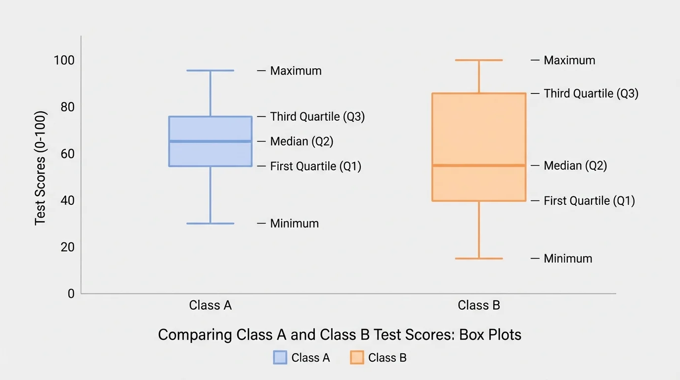
Box plots make it easy to compare medians and IQRs because the line inside each box marks the median and the box width represents the middle \(50\%\) of the data. They are especially useful for skewed distributions or when comparing several groups at once.
[Figure 2] A box plot is built from the five-number summary: minimum, \(Q_1\), median, \(Q_3\), and maximum. Longer boxes mean larger IQRs. If one median line is farther to the right, that data set has the larger median.
Histograms are better for seeing shape. They can show whether the distribution is symmetric, skewed, or clustered. That shape helps you decide which statistics to trust most.
If a histogram is roughly balanced with no extreme gaps or isolated values, the mean and standard deviation are often appropriate. If the histogram shows a long tail or isolated extreme values, the median and IQR are usually better.
| Distribution shape | Best measure of center | Best measure of spread | Reason |
|---|---|---|---|
| Roughly symmetric, no strong outliers | Mean | Standard deviation | Both use all values effectively |
| Skewed distribution | Median | Interquartile range | Both resist the effect of extreme values |
| Contains outliers | Median | Interquartile range | Outliers can distort mean and standard deviation |
Table 1. Recommended statistics for comparing center and spread based on the shape of the distribution.
When comparing multiple groups, students often begin with box plots for a quick comparison and then use histograms for a closer look at shape. This is why [Figure 2] remains useful even after the five-number summary is calculated: the picture supports interpretation.
Weather scientists, economists, and medical researchers often check the shape of data before choosing summary statistics. The wrong statistic can hide patterns that matter in decisions affecting millions of people.
Visual displays and summary statistics should work together. A graph tells you what kind of data story you have. The statistics then give precise numbers to describe that story.
In sports, a basketball player's average points per game may be high, but if the standard deviation is also high, the player may be inconsistent. A coach deciding on strategy may care about consistency as much as average output.
In medicine, a treatment's average effect may look strong, but researchers also need to know whether patient responses are tightly clustered or widely spread. A low spread can suggest predictable results, while a high spread may indicate that the treatment works very differently for different patients.
In economics, median household income is often reported instead of mean household income because income distributions are commonly skewed right. A few very high incomes can pull the mean upward, making it less representative of a typical household.
In manufacturing, a machine that produces parts with a target mean size but a large standard deviation may still be a problem because the parts are too inconsistent. Center and spread both matter for quality control.
One common mistake is using the mean just because it is familiar. The mean is not automatically the "best" average. Its usefulness depends on the distribution.
Another mistake is ignoring spread. If one group has a slightly higher center but a much larger spread, the comparison may be less impressive than it first appears.
A third mistake is mixing unmatched measures, such as comparing means and IQRs without justification. In most cases, use mean with standard deviation and median with IQR.
Finally, avoid vague conclusions. Instead of saying, "Set A is better," say, "Set A has a larger median but also a larger IQR, so it has a higher typical value but more variability." That is a statistical comparison, not just an opinion.