Suppose a class survey shows that many students who have a curfew also have chores at home. Is that just a coincidence, or is there a real pattern? Statistics helps answer questions like this by organizing information and looking for relationships. When two characteristics are recorded for the same people, we can compare the results in a careful way instead of just guessing.
Sometimes data is numerical, such as height or test scores. Other times data is about groups or labels, such as favorite sport, eye color, or whether a student has a curfew. When we study bivariate categorical data, we are looking at two categorical variables measured on the same subjects.
For example, a class might collect data about whether each student has a curfew on school nights and whether each student has assigned chores at home. Each variable has categories such as yes and no. The goal is not just to count students. The goal is to see whether the categories of one variable seem connected to the categories of the other.
Categorical variable means a variable whose values are placed into groups or categories instead of measured with numbers.
Frequency is the number of times a category appears.
Relative frequency is a frequency compared to a total, usually written as a fraction, decimal, or percent.
Two-way table is a table that shows frequencies for two categorical variables at the same time.
A two-way table is especially useful because it lets us compare groups clearly. Instead of reading through a list of survey responses one by one, we can see all the counts at once and then calculate percentages that reveal patterns.
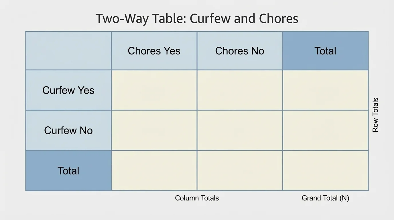
A two-way table organizes data into rows and columns. One variable is listed across the top, and the other is listed along the side. The numbers inside the table show how many subjects belong to each combination of categories. As [Figure 1] shows, the table also includes totals for each row, totals for each column, and one grand total for the whole data set.
If the rows are Curfew: Yes and Curfew: No, and the columns are Chores: Yes and Chores: No, then each inside cell answers a question such as, "How many students have a curfew and also have chores?"
The totals are important. A row total tells how many students are in one row category altogether. A column total tells how many students are in one column category altogether. The grand total tells how many students were surveyed in all.
Two-way tables can also have more than two categories in a variable. For instance, one variable might be transportation to school with categories bus, car, walk, and bike. The other variable might be grade level. The same ideas still work: organize, count, total, and compare.
To construct a table, begin with data collected from the same subjects. That part matters. If one survey asks one group about curfews and another survey asks a different group about chores, you cannot use those results to make a valid two-way table for association between the two variables.
Step 1: Choose the two categorical variables. For example, use Curfew and Chores.
Step 2: List one variable as row labels and the other as column labels.
Step 3: Count how many responses belong in each cell.
Step 4: Add row totals, column totals, and the grand total.
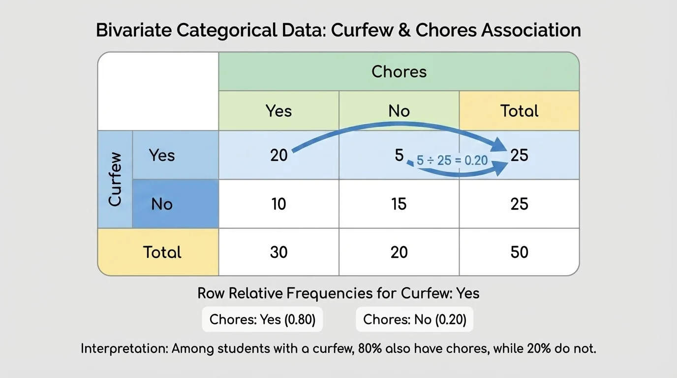
Here is an example of completed frequency data from a class of \(30\) students.
| Curfew | Chores: Yes | Chores: No | Total |
|---|---|---|---|
| Yes | 12 | 6 | 18 |
| No | 4 | 8 | 12 |
| Total | 16 | 14 | 30 |
Table 1. Frequency table for students with or without a curfew and with or without assigned chores.
From this table, we can answer questions directly. For example, \(12\) students have both a curfew and chores. Also, \(8\) students have neither a curfew nor chores. But frequency alone is not always enough to decide whether there is an association. For that, relative frequency is more powerful.
As [Figure 2] shows, a relative frequency compares part of a group to the whole group. In two-way tables, we usually calculate either row relative frequencies or column relative frequencies. Row relative frequencies are found by dividing each entry in a row by that row total.
For the first row in Table 1, the row total is \(18\). So the row relative frequencies are:
Students with a curfew who have chores: \(\dfrac{12}{18} = \dfrac{2}{3} \approx 0.667\), or about \(66.7\%\)
Students with a curfew who do not have chores: \(\dfrac{6}{18} = \dfrac{1}{3} \approx 0.333\), or about \(33.3\%\)
For the second row, the row total is \(12\). So the row relative frequencies are:
Students without a curfew who have chores: \(\dfrac{4}{12} = \dfrac{1}{3} \approx 0.333\), or about \(33.3\%\)
Students without a curfew who do not have chores: \(\dfrac{8}{12} = \dfrac{2}{3} \approx 0.667\), or about \(66.7\%\)
Column relative frequencies work similarly, but now each entry is divided by its column total. If you want to compare the makeup of each column, column relative frequencies are the better choice.
Percent means "out of \(100\)." To change a decimal to a percent, multiply by \(100\). For example, \(0.25 = 25\%\) and \(0.8 = 80\%\).
Whether you use row or column relative frequencies depends on the question you want to answer. If you want to compare students with curfew to students without curfew, row relative frequencies make sense when curfew is listed in rows. If you want to compare students with chores to students without chores, column relative frequencies may be more useful.
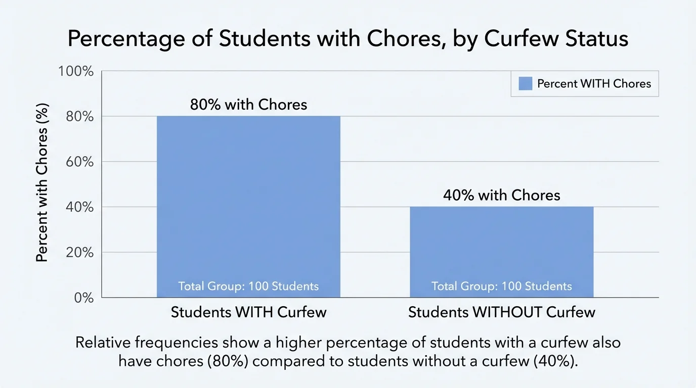
An association between two variables means that the distribution of one variable seems different depending on the category of the other variable. In a two-way table, we look for that by comparing relative frequencies, not just raw counts. When the percentages in different rows or columns are noticeably different, there may be an association, as shown in [Figure 3].
In Table 1, about \(66.7\%\) of students with a curfew have chores, but only about \(33.3\%\) of students without a curfew have chores. Those percentages are quite different. That is evidence of a possible association between having a curfew and having chores.
If the relative frequencies were about the same in each row, then there would be little or no evidence of association. For example, if about \(50\%\) of students with a curfew had chores and about \(49\%\) of students without a curfew had chores, the variables would not appear strongly associated.
It is important to be careful with language. Statistics can show that two variables are related in the data, but that does not prove one causes the other. Curfews do not necessarily cause chores, and chores do not necessarily cause curfews. There may be other factors, such as family rules, age, or household expectations.
Medical researchers often use two-way tables when comparing groups, such as whether patients took a medicine and whether they improved. The table helps organize the evidence before deeper statistical analysis is done.
That same thinking appears in many fields. Coaches compare training habits and injury categories. Schools compare attendance groups and assignment completion. Businesses compare customer age groups and buying choices. The basic idea remains the same: count carefully, then compare percentages.
Let us analyze the class survey from Table 1 in a complete step-by-step way. Notice that the same percentages discussed earlier can now be used to make a statistical statement about the relationship in the data.
Worked example 1
A class surveys \(30\) students about curfews and chores. The frequency table is:
| Curfew | Chores: Yes | Chores: No | Total |
|---|---|---|---|
| Yes | 12 | 6 | 18 |
| No | 4 | 8 | 12 |
| Total | 16 | 14 | 30 |
Table 2. Frequency data for worked example 1.
Step 1: Decide which relative frequencies to compare.
We want to know whether students with a curfew also tend to have chores, so compare rows based on curfew status.
Step 2: Calculate the row relative frequencies.
For students with a curfew: \(\dfrac{12}{18} \approx 0.667 = 66.7\%\)
For students without a curfew: \(\dfrac{4}{12} \approx 0.333 = 33.3\%\)
Step 3: Compare the percentages.
\(66.7\%\) is much larger than \(33.3\%\).
Step 4: Interpret the result.
Students with a curfew are more likely to have chores than students without a curfew, based on this class data.
There is evidence of a possible association between curfew and chores.
This example also shows why frequencies alone can be misleading. The counts \(12\) and \(4\) differ, but the percentages explain the difference more fairly because the groups are not the same size. One row has \(18\) students and the other has \(12\).
Now consider a different situation where column relative frequencies are more useful. Suppose a school wants to know whether students who take music lessons are more likely to be on a sports team.
Worked example 2
The data from \(40\) students is shown below.
| Sports Team: Yes | Sports Team: No | Total | |
|---|---|---|---|
| Music Lessons: Yes | 9 | 6 | 15 |
| Music Lessons: No | 11 | 14 | 25 |
| Total | 20 | 20 | 40 |
Table 3. Frequency data comparing music lessons and sports team membership.
Step 1: Choose a comparison.
We can compare the rows by asking what percent of each music group is on a sports team.
Step 2: Compute row relative frequencies.
For students who take music lessons: \(\dfrac{9}{15} = 0.6 = 60\%\)
For students who do not take music lessons: \(\dfrac{11}{25} = 0.44 = 44\%\)
Step 3: Interpret.
Because \(60\%\) and \(44\%\) are different, there is some evidence of an association between taking music lessons and being on a sports team.
The association is not as strong-looking as in the curfew example, but the percentages are still different enough to notice.
If we had instead compared only the counts \(9\) and \(11\), we might have thought students without music lessons are more involved in sports. But that ignores the fact that the second group is much larger. Relative frequency gives a fairer comparison.
Two-way tables are not limited to yes-or-no categories. They can also include several categories in one variable. That makes them useful for more realistic data sets.
Worked example 3
A group of \(50\) students is classified by daily recreational screen time and whether homework is usually completed.
| Screen Time | Homework Usually Completed | Homework Not Usually Completed | Total |
|---|---|---|---|
| Less than 1 hour | 12 | 3 | 15 |
| 1 to 3 hours | 18 | 7 | 25 |
| More than 3 hours | 4 | 6 | 10 |
| Total | 34 | 16 | 50 |
Table 4. Frequency data comparing screen time categories and homework completion.
Step 1: Find row relative frequencies for homework completion.
Less than \(1\) hour: \(\dfrac{12}{15} = 0.8 = 80\%\)
\(1\) to \(3\) hours: \(\dfrac{18}{25} = 0.72 = 72\%\)
More than \(3\) hours: \(\dfrac{4}{10} = 0.4 = 40\%\)
Step 2: Compare the percentages.
The completion percentages go from \(80\%\) to \(72\%\) to \(40\%\).
Step 3: Interpret the pattern.
Students in the highest screen time category are less likely to usually complete homework than students in the lower screen time categories. The variables appear to be associated.
Again, this does not prove screen time causes homework habits, but it does show a pattern in the data.
Larger tables can reveal trends, not just simple differences. In this example, the percentages suggest a downward pattern as screen time increases. That kind of pattern is exactly what statistics is meant to help us notice.
One common mistake is dividing by the wrong total. For row relative frequencies, divide by the row total. For column relative frequencies, divide by the column total. If you divide by the grand total when the question asks for row or column comparison, the interpretation will be weaker or incorrect.
Another mistake is forgetting that the data must come from the same subjects. A two-way table matches two variables for each person, object, or case.
A third mistake is claiming too much. If one group has a higher percentage than another, you can say there is evidence of a possible association. You should not say one variable definitely causes the other unless there is much stronger evidence from a well-designed study.
How to test your interpretation
Ask yourself one simple question: "Are the percentages in the rows or columns close together, or are they clearly different?" If they are close, there is little evidence of association. If they are clearly different, there is stronger evidence of association.
You can also check whether your percentages in each row add to \(1\) or \(100\%\) when using row relative frequencies. Column relative frequencies should add to \(1\) or \(100\%\) within each column. That is a quick way to catch calculation errors.
Two-way tables appear in many real situations. In health studies, researchers may compare whether patients exercise and whether they have high blood pressure. In environmental science, they may compare regions and whether a certain species is present. In schools, administrators might compare attendance groups and passing rates. In sports, teams compare training plans and injury categories.
These tables help people make decisions because they turn messy survey results into clear comparisons. A school counselor, for example, might use a table to see whether students who attend tutoring are more likely to pass a class. A company may compare whether customers in different age groups choose online shopping or in-store shopping.
As we saw earlier in [Figure 1], the table structure itself is simple, but the thinking behind it is powerful: organize counts, compute relative frequencies, and compare them carefully. And the visual contrast in [Figure 3] reminds us that percentages, not just counts, are what reveal possible association.
When you read charts, surveys, or news reports, noticing whether the comparison is based on counts or percentages can make a big difference. Strong statistical thinking often starts with a simple question: "Compared to what total?"