If you measured the water in several identical beakers, you might discover something surprising: even when the beakers look almost the same, the amounts can be different by just \(\dfrac{1}{8}\) of a unit. A line plot helps us see those tiny differences quickly. It is a simple graph, but it becomes very powerful when we want to organize data, compare measurements, find totals, and even figure out what would happen if everything were shared equally.
Measurements often come in fractions, especially in science, cooking, building, and sports. A plant might grow \(\dfrac{3}{4}\) inch in a week. A recipe might need \(\dfrac{1}{2}\) cup of milk. A jump rope might be trimmed by \(\dfrac{1}{8}\) foot. When many measurements are collected, it can be hard to understand the data by looking at a list alone. A line plot organizes the data on a number line so that patterns become easy to spot.
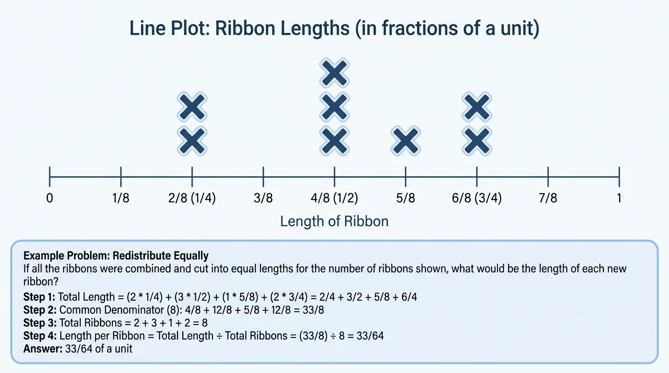
A line plot is a graph that shows data by placing marks above values on a number line. Each mark, often an \(X\), stands for one measurement. In a fraction measurement line plot, the number line is labeled with fractions that increase by equal amounts, as [Figure 1] shows. If three objects measure \(\dfrac{1}{2}\) unit, then there will be three \(X\) marks above \(\dfrac{1}{2}\).
A data set is the whole collection of measurements. For example, suppose the lengths of ribbons are \(\dfrac{1}{4}, \dfrac{1}{2}, \dfrac{1}{2}, \dfrac{3}{4}, \dfrac{1}{4}, \dfrac{5}{8}\). That list is the data set. A line plot helps us see right away which measurements happen most often and which measurements happen only once.
When the measurements are in halves, fourths, or eighths, the number line must be divided into equal parts. For example, from \(0\) to \(1\), the marks could be \(0, \dfrac{1}{8}, \dfrac{1}{4}, \dfrac{3}{8}, \dfrac{1}{2}, \dfrac{5}{8}, \dfrac{3}{4}, \dfrac{7}{8}, 1\). Using equal spacing matters because the line plot is based on a number line, and a number line must show values in order and at equal distances.
One strength of a line plot is that it shows both the values and the frequency of those values. Frequency means how many times a value appears. If \(\dfrac{1}{4}\) has two \(X\) marks above it, the frequency of \(\dfrac{1}{4}\) is \(2\). This is useful because it helps us answer questions like "Which measurement is most common?" and "How many objects were measured?"
Measurement is the size, amount, or length of something. A fraction can represent part of a unit, such as \(\dfrac{1}{2}\), \(\dfrac{1}{4}\), or \(\dfrac{1}{8}\). An equivalent fraction is a fraction that has the same value as another fraction, such as \(\dfrac{1}{2} = \dfrac{4}{8}\).
Equivalent fractions are especially important in line plots because data may need to be compared or added. For example, \(\dfrac{2}{4}\) and \(\dfrac{1}{2}\) belong at the same point on the number line because they are equal. If you do not recognize equivalent fractions, you might place data points in the wrong location.
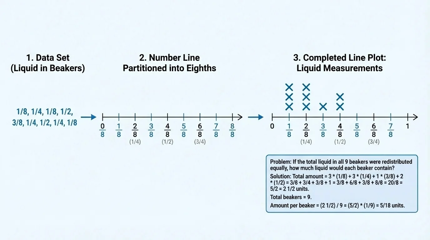
Turning a list of measurements into a graph is easier when you follow a clear process. As [Figure 2] illustrates, you begin with raw measurements, choose a matching number line, and then place one mark for each value. This keeps the graph organized and accurate.
Here is a simple method for making a line plot: first, read all the measurements in the data set. Second, decide what fractional intervals you need, such as halves, fourths, or eighths. Third, draw a number line and label it with equal spacing. Fourth, place one \(X\) above each measurement. If the same value appears again, stack another \(X\) above the first one.
Suppose the data set is \(\dfrac{1}{8}, \dfrac{1}{4}, \dfrac{1}{4}, \dfrac{3}{8}, \dfrac{1}{2}, \dfrac{1}{2}, \dfrac{1}{2}, \dfrac{5}{8}\). Since the measurements include eighths, the number line should be marked in eighths. Then place one \(X\) above \(\dfrac{1}{8}\), two above \(\dfrac{1}{4}\), one above \(\dfrac{3}{8}\), three above \(\dfrac{1}{2}\), and one above \(\dfrac{5}{8}\).
After making the line plot, always check that the total number of \(X\) marks matches the number of measurements in the data set. If there are \(8\) numbers in the list, there should be \(8\) marks on the line plot. This is a quick way to catch mistakes.
To add fractions, the fractions must refer to equal-size parts. Sometimes it helps to rename them with a common denominator. For example, \(\dfrac{1}{2} = \dfrac{4}{8}\) and \(\dfrac{1}{4} = \dfrac{2}{8}\).
Line plots work best when the labels are neat and the intervals are equal. If the marks on the number line are uneven, the graph becomes confusing. If the intervals skip needed values, some data points will not have a correct place.
Once the line plot is made, you can answer many questions from it. You can find the greatest measurement, the least measurement, the most common measurement, and the total number of measurements. You can also compare categories by counting and adding.
If there are \(4\) \(X\) marks above \(\dfrac{3}{4}\), that means four objects measured \(\dfrac{3}{4}\) unit. If there are no marks above \(\dfrac{5}{8}\), then no object measured \(\dfrac{5}{8}\) unit. A blank space can be just as informative as a stack of marks.
When a question asks, "How many measurements are greater than \(\dfrac{1}{2}\)?" look only at the values to the right of \(\dfrac{1}{2}\) on the number line. Then count the \(X\) marks above those values. Because the line plot is arranged from least to greatest, comparisons are often quick and visual.
The line plot in [Figure 1] also makes it easier to spot clusters. A cluster is a group of data points close together. If many measurements are near \(\dfrac{1}{2}\) and \(\dfrac{5}{8}\), the data cluster in that part of the number line. This can tell you where most of the measurements are concentrated.
A line plot is not only for reading values. It is also a tool for solving problems. Often, you must add fractions represented by the \(X\) marks. For instance, if two objects measure \(\dfrac{1}{4}\) unit and three objects measure \(\dfrac{1}{2}\) unit, the total is found by adding all those fractions.
You can write that total as \(\dfrac{1}{4} + \dfrac{1}{4} + \dfrac{1}{2} + \dfrac{1}{2} + \dfrac{1}{2}\). A faster way is to group equal measurements: \(2 \times \dfrac{1}{4} + 3 \times \dfrac{1}{2}\). Since \(2 \times \dfrac{1}{4} = \dfrac{2}{4} = \dfrac{1}{2}\), the total becomes \(\dfrac{1}{2} + \dfrac{3}{2} = 2\).
Sometimes the fractions have different denominators, such as \(\dfrac{1}{4}\) and \(\dfrac{1}{2}\). Then it helps to rename them using equivalent fractions. For example, \(\dfrac{1}{2} = \dfrac{2}{4}\), so \(\dfrac{1}{4} + \dfrac{1}{2} = \dfrac{1}{4} + \dfrac{2}{4} = \dfrac{3}{4}\). With eighths, you might rename \(\dfrac{1}{2}\) as \(\dfrac{4}{8}\) and \(\dfrac{1}{4}\) as \(\dfrac{2}{8}\).
Why equivalent fractions help on line plots
Fractions like \(\dfrac{1}{2}\), \(\dfrac{2}{4}\), and \(\dfrac{4}{8}\) all name the same point on a number line. When you add measurements from a line plot, using equivalent fractions lets you combine data correctly. It is like changing coins into the same type before counting their value.
You can also find differences. If one ribbon is \(\dfrac{7}{8}\) yard long and another is \(\dfrac{3}{8}\) yard long, the difference is \(\dfrac{7}{8} - \dfrac{3}{8} = \dfrac{4}{8} = \dfrac{1}{2}\) yard. The line plot helps you locate the values, and fraction subtraction tells how far apart they are.
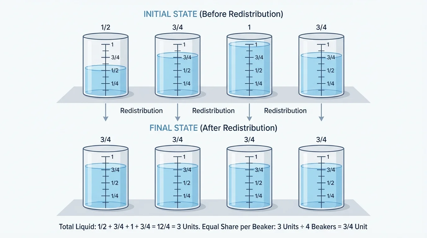
[Figure 3] shows one of the most interesting uses of a line plot: finding what happens when measured amounts are shared equally. In a set of identical beakers, some may contain more liquid than others. By reading the data from the line plot, adding the total amount, and dividing by the number of beakers, you can find how much liquid each beaker would have after redistribution.
This idea is closely related to finding an average, but at this grade level it is helpful to think of it as equal sharing. Add all the measurements together, then divide by how many items there are. If the total is \(3\) units for \(4\) beakers, each beaker gets \(\dfrac{3}{4}\) unit.
This process works whether the measurements are lengths, volumes, or other units. The important idea is that a line plot organizes the data, and fraction operations help solve the problem.
Solved example 1: Making a line plot
The measurements of eight pencils are \(\dfrac{1}{4}, \dfrac{1}{2}, \dfrac{1}{4}, \dfrac{3}{4}, \dfrac{1}{2}, \dfrac{1}{8}, \dfrac{1}{2}, \dfrac{3}{4}\) inch longer than a standard pencil. Make a line plot to represent the data.
Step 1: Find the needed intervals.
The data include \(\dfrac{1}{8}\), \(\dfrac{1}{4}\), \(\dfrac{1}{2}\), and \(\dfrac{3}{4}\), so a number line marked in eighths will work.
Step 2: Count each measurement.
\(\dfrac{1}{8}\) appears \(1\) time, \(\dfrac{1}{4}\) appears \(2\) times, \(\dfrac{1}{2}\) appears \(3\) times, and \(\dfrac{3}{4}\) appears \(2\) times.
Step 3: Place the marks.
Put \(1\) \(X\) above \(\dfrac{1}{8}\), \(2\) above \(\dfrac{1}{4}\), \(3\) above \(\dfrac{1}{2}\), and \(2\) above \(\dfrac{3}{4}\).
The line plot has \(8\) marks total, which matches the \(8\) measurements.
This example shows how counting frequencies turns a list into a picture of the data. It also shows why choosing the correct interval matters. If the line had only fourths, there would be no exact place for \(\dfrac{1}{8}\).
Solved example 2: Finding the total from a line plot
A line plot shows three leaves measuring \(\dfrac{1}{4}\) inch, two leaves measuring \(\dfrac{1}{2}\) inch, and one leaf measuring \(\dfrac{3}{4}\) inch. Find the total length.
Step 1: Write an addition expression.
\(\dfrac{1}{4} + \dfrac{1}{4} + \dfrac{1}{4} + \dfrac{1}{2} + \dfrac{1}{2} + \dfrac{3}{4}\)
Step 2: Group equal values.
\(3 \times \dfrac{1}{4} + 2 \times \dfrac{1}{2} + \dfrac{3}{4}\)
Step 3: Rewrite with a common denominator.
\(2 \times \dfrac{1}{2} = 1 = \dfrac{4}{4}\), and \(3 \times \dfrac{1}{4} = \dfrac{3}{4}\).
Step 4: Add.
\(\dfrac{3}{4} + \dfrac{4}{4} + \dfrac{3}{4} = \dfrac{10}{4} = 2\dfrac{1}{2}\)
The total length is \(2 \dfrac{1}{2}\) inches.
Notice how grouping equal measurements saves time. The line plot lets you count repeated values quickly, and then the fraction addition gives the total.
Solved example 3: Redistributing liquid equally
Four identical beakers contain \(\dfrac{1}{2}\) cup, \(\dfrac{3}{4}\) cup, \(1\) cup, and \(\dfrac{3}{4}\) cup of water. If all the water is redistributed equally, how much will each beaker contain?
Step 1: Add the total amount of water.
Rename to fourths: \(\dfrac{1}{2} = \dfrac{2}{4}\) and \(1 = \dfrac{4}{4}\).
Then add: \(\dfrac{2}{4} + \dfrac{3}{4} + \dfrac{4}{4} + \dfrac{3}{4} = \dfrac{12}{4} = 3\).
Step 2: Divide by the number of beakers.
There are \(4\) beakers, so compute \(3 \div 4 = \dfrac{3}{4}\).
Step 3: State the equal share.
Each beaker will contain the same amount after redistribution.
Each beaker would contain \[\frac{3}{4}\] cup of water.
The equal share found here matches the balanced beakers in the illustration. This is a powerful way to connect data displays with real problem solving.
Solved example 4: Comparing measurements greater than \(\dfrac{1}{2}\)
A line plot shows measurements \(\dfrac{1}{4}, \dfrac{1}{2}, \dfrac{5}{8}, \dfrac{5}{8}, \dfrac{3}{4}, \dfrac{7}{8}\). How many measurements are greater than \(\dfrac{1}{2}\)?
Step 1: Identify values to the right of \(\dfrac{1}{2}\).
Those values are \(\dfrac{5}{8}, \dfrac{5}{8}, \dfrac{3}{4}, \dfrac{7}{8}\).
Step 2: Count them.
There are \(4\) measurements greater than \(\dfrac{1}{2}\).
The answer is \(4\) measurements.
Questions like this are one reason line plots are useful. Instead of searching through a list, you can look at the graph and count the values in the part of the number line that matters.
Line plots appear in many situations. In science, students may measure the growth of seedlings to the nearest \(\dfrac{1}{8}\) inch. In cooking, a chef may compare amounts of ingredients used in test recipes. In sports, a coach may record jump distances or running times converted into equal fractional parts. In each case, the line plot helps organize repeated measurements and makes comparisons easier.
Suppose a class measures the amount of rain collected in small gauges over several days. The measurements might be \(\dfrac{1}{4}\) inch, \(\dfrac{1}{2}\) inch, or \(\dfrac{3}{4}\) inch. A line plot lets students see which amount happened most often and how much rain fell altogether.
Professional scientists and engineers often begin with simple data displays before using more advanced graphs. A clear, accurate plot can reveal patterns that are easy to miss in a long list of numbers.
Even when larger and more complicated graphs are used later, the basic ideas stay the same: organize the data, read the values carefully, and use math to answer questions about the data.
One common mistake is labeling the number line with unequal spacing. If \(\dfrac{1}{4}\) and \(\dfrac{1}{2}\) are not the same distance apart as \(\dfrac{1}{2}\) and \(\dfrac{3}{4}\), the graph is not correct. A number line must use equal intervals.
Another mistake is forgetting equivalent fractions. A measurement of \(\dfrac{2}{4}\) should not be plotted separately from \(\dfrac{1}{2}\), because they are the same value. Always check whether fractions name the same amount before plotting or adding.
Students also sometimes miscount the total number of \(X\) marks. A smart strategy is to compare the number of marks with the number of data values in the original list. If those numbers do not match, something needs to be fixed.
Finally, when solving equal-share problems, be careful to add the total first and divide second. If you divide too early or leave out a measurement, the answer will be incorrect.
| Question type | What to do |
|---|---|
| How many are at \(\dfrac{1}{2}\)? | Count the \(X\) marks above \(\dfrac{1}{2}\). |
| How many are greater than \(\dfrac{1}{2}\)? | Count all \(X\) marks to the right of \(\dfrac{1}{2}\). |
| What is the total of all measurements? | Add the fractions represented by all marks. |
| What is the equal share? | Add all measurements, then divide by the number of items. |
Table 1. Common question types for line plots and the matching strategy to solve each one.
By learning to build, read, and calculate from line plots, you gain a useful tool for working with real measurement data. Fraction measurements may look small, but they carry important information, and a line plot helps that information stand out clearly.