A border on a map can start a war, a shipping lane seen from space can explain global trade, and a street photograph can reveal migration, language, and identity in a single block. Geography is not just about where things are. It is about why location matters. The same place can look calm in a photograph, strategic on a political map, vulnerable in a satellite image, and economically vital in a transportation map. When geographers compare these representations, they can explain how places and regions are connected to power, culture, and wealth.
To understand human systems, geographers use more than one kind of evidence. A paper map may show boundaries. A satellite image may show land use, deforestation, flood damage, or urban growth. A photograph may capture architecture, signs, clothing, transportation, or religious buildings. A digital map can layer census data, roads, climate zones, and trade routes. Each tool shows a different part of the story.
Geographic representation is any visual or spatial way of showing information about Earth, including maps, satellite images, aerial photographs, ground photographs, charts, and digital spatial data.
Human systems are the ways people organize life on Earth, such as governments, economies, migration patterns, cities, and cultural regions.
Spatial relationship means how places are connected by location, distance, direction, accessibility, or pattern.
The most important idea is that location influences opportunity and constraint at the same time. A port city may become wealthy because it connects markets, but it may also become vulnerable to hurricanes or blockades. A mountain range may protect a country from invasion, but it may also isolate communities. A river can support agriculture, trade, and settlement, but it can also become a source of conflict if multiple regions depend on the same water.
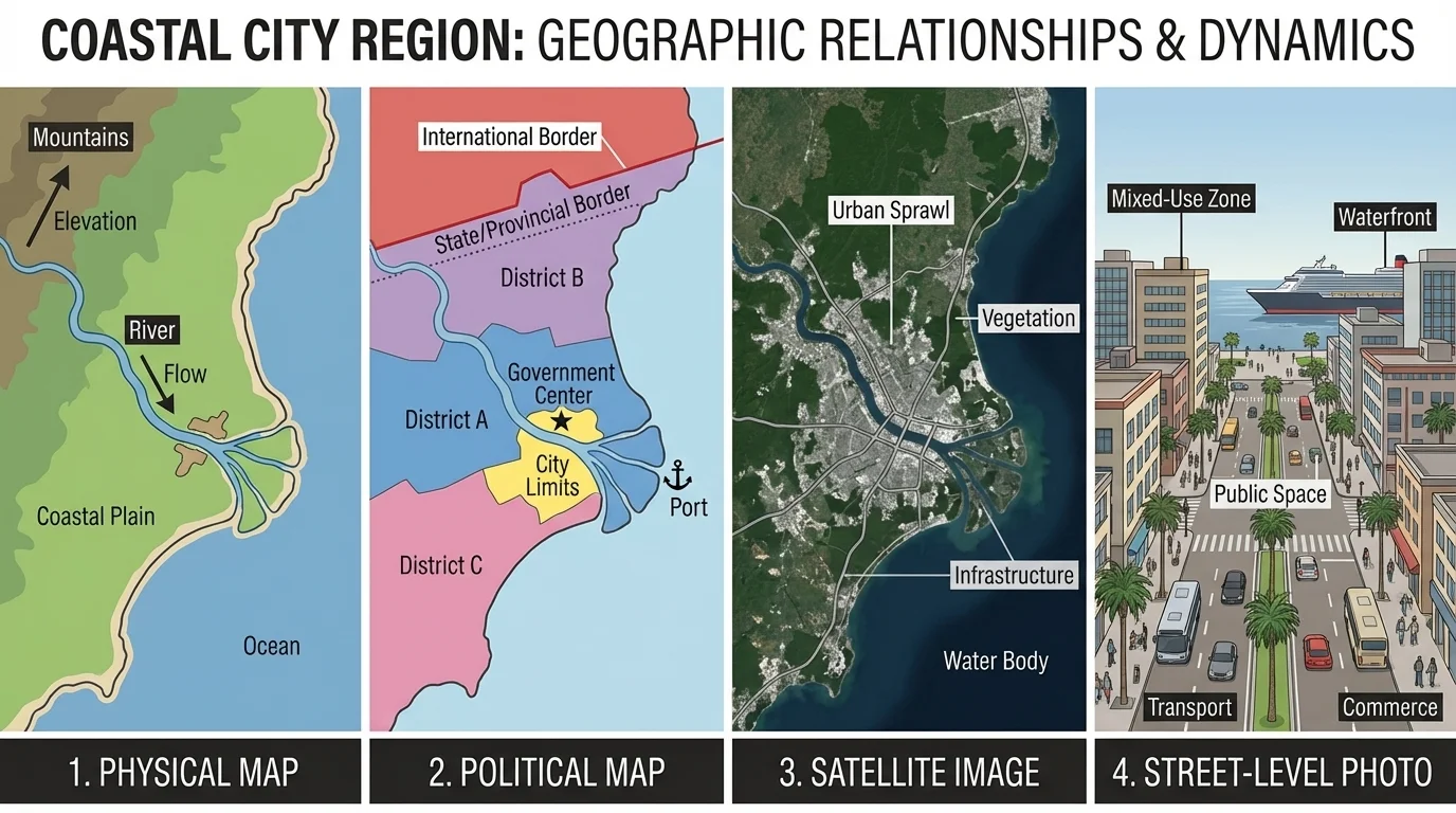
When geographers study a region, they rarely rely on a single image. As [Figure 1] illustrates, the same coastal city can appear as terrain on a physical map, as borders and capitals on a political map, as actual land cover on a satellite image, and as lived experience in a street photograph. Each representation answers a different question: What physical features shape movement? Who controls the territory? How is the land being used? What does everyday life look like there?
This matters because political, cultural, and economic dynamics do not occur in empty space. They happen in places with coasts, rivers, deserts, roads, neighborhoods, and borders. To explain a region well, a student must connect location to process. For example, it is not enough to say that a city is growing. A stronger geographic explanation asks whether the city lies near a port, on a river, beside a border crossing, in a dry climate, or along a transportation corridor.
Geographic tools also help reveal patterns that are difficult to see from the ground. A person standing on one street corner cannot easily detect suburban sprawl, the shrinking of a lake, or the spread of informal settlements across a metropolitan edge. Satellite imagery makes those changes visible over time. In contrast, a close-up photograph can reveal details that a satellite cannot, such as the language on signs, the condition of buildings, or the presence of street vendors.
A thematic map focuses on one topic, such as population density, election results, rainfall, language distribution, or income levels. Unlike a general reference map, it highlights a pattern. For instance, a thematic map of internet access may help explain why some regions attract technology industries while others face barriers to economic development.
Students also need to understand scale. Scale can mean the map ratio, such as how much land is represented by a certain distance on paper or screen, but it also means level of analysis. A local map of one city neighborhood may show schools, transit stops, and zoning. A continental map may instead show migration routes, trade corridors, and language families. Different scales reveal different relationships.
Satellite imagery shows Earth from above using sensors that record visible light and sometimes other wavelengths. This makes it possible to identify forests, urban heat islands, floodplains, irrigated agriculture, wildfire scars, or expanding suburbs. A cultural landscape, by contrast, is the visible imprint of human activity on the land: buildings, roads, fields, religious structures, monuments, or neighborhood layouts. Photographs are especially useful for interpreting cultural landscapes because they show how people shape and occupy space.
Another key tool is GIS, or Geographic Information Systems. GIS allows users to layer different kinds of spatial data in one place. A geographer might combine a flood-risk map with population data, transportation routes, and property values to see who is most vulnerable during storms. Layering data makes relationships clearer because political, cultural, and economic patterns often overlap rather than operate separately.
Maps must also be read critically. Projection affects the shape and size of places on flat maps. Legends explain symbols. Orientation tells direction. Dates matter because places change. A map of refugee flows from one year may look different the next year if conflict shifts. A satellite image from the dry season may make a landscape look completely different from an image taken after major rains.
Because each tool has strengths and weaknesses, the strongest geographic explanations compare them. A political map may show where a border lies, but it may not show whether the border cuts across a desert, a river valley, an ethnic homeland, or a heavily traveled trade route. A photograph may show a crowded market, but it cannot show the larger transport network that brings goods into the city. That is why geographers cross-check evidence rather than trusting one image alone.
Some satellites can detect changes in land cover over time so precisely that researchers can measure urban expansion, retreating glaciers, and even seasonal crop cycles across large regions.
The comparison in [Figure 1] also reminds us that no representation is neutral. Choices about color, classification, labels, and what data to include shape how viewers interpret a place. Good geographic analysis requires asking not only what a map shows, but also what it leaves out.
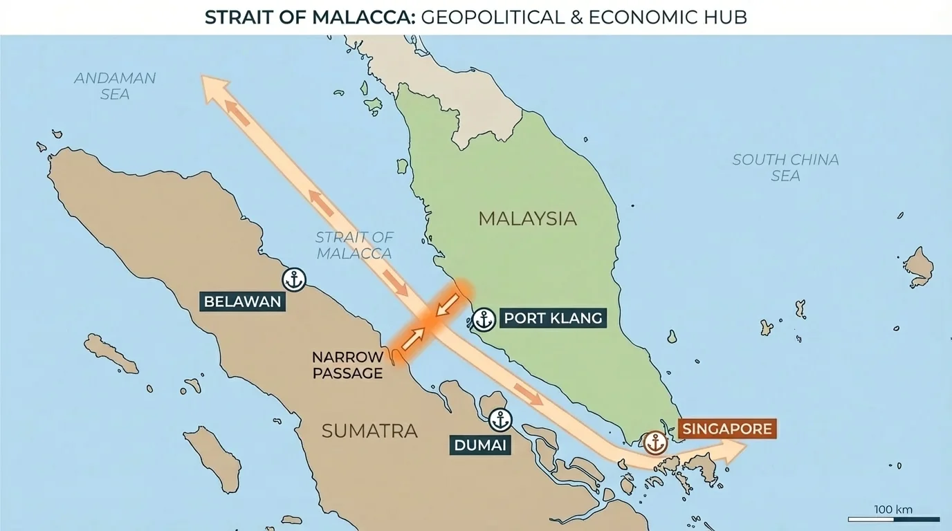
Political power is strongly affected by location. As [Figure 2] shows, places positioned at narrow waterways, border crossings, mountain passes, or major river junctions often become strategically important. States may compete to control these locations because they influence trade, defense, and communication.
A classic example is a maritime chokepoint, a narrow route that concentrates movement. The Strait of Malacca, between the Malay Peninsula and the Indonesian island of Sumatra, connects the Indian Ocean and the South China Sea. A map of the strait helps explain why it matters politically: much of the world's trade, especially energy shipments, passes through a limited space. Countries near it gain strategic importance, while disruptions there can affect economies far away.
Political maps are especially useful for seeing jurisdiction and control. They show borders, capitals, provinces, and disputed territories. But to explain political dynamics well, these boundaries must be connected to physical and human geography. A straight-line border in a desert may function differently from a border that follows a river through densely settled farmland. A boundary that divides ethnic communities may create long-term tension. A capital city located near the center of a country may help administrative control, while a capital near the coast may be more connected to global trade.
Satellite images can also reveal political realities. In divided cities, they may show barriers, checkpoints, settlement expansion, or unequal infrastructure. In conflict zones, they may show damaged neighborhoods, refugee camps, or changing front lines. Photographs add still another dimension by showing military presence, protest spaces, border walls, or symbols of state authority such as flags and government buildings.
The political importance of location is also clear in the South China Sea. A map of this region shows overlapping territorial claims, island groups, and major sea routes. Satellite imagery has been used to track dredging, airstrip construction, and artificial island building. These representations help explain why a seemingly remote area matters so much: it combines strategic military position, possible energy resources, and control over trade routes.
Inland political dynamics can be just as spatial. Consider the Sahel region of Africa, which stretches across the continent south of the Sahara. Maps showing rainfall zones, grazing land, ethnic settlement patterns, and state boundaries help explain conflict in some parts of the region. When environmental stress, migration, weak infrastructure, and political marginalization overlap geographically, instability can intensify.
Why borders are more than lines
Borders can separate governments, but they do not always separate people, languages, trade, or ecosystems. A border may cut across a mountain tribe's territory, divide a river basin, or separate a city from its labor force. Geographic representations help reveal whether a border functions as a barrier, a bridge, or both.
The strategic concentration shown in [Figure 2] applies beyond shipping. Airports, pipeline routes, rail hubs, and internet cable landing sites can also become politically important because location creates leverage. Political geography is therefore not just about territory; it is about the control of key nodes and connections.
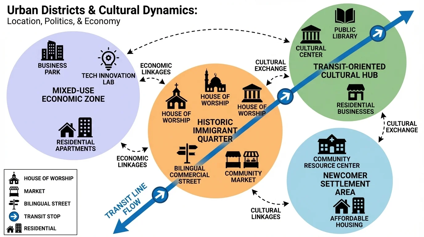
Culture leaves spatial patterns, and those patterns become visible through maps and photographs. As [Figure 3] illustrates, migration often creates clusters of language, religion, cuisine, and commerce within cities. These are not random. They form near affordable housing, transport lines, workplaces, family networks, and community institutions.
A diffusion pattern describes how ideas, beliefs, technologies, or cultural practices spread across space. Maps can show the spread of religions along trade routes, the movement of languages across colonial empires, or the distribution of musical styles through migration and media. Cultural diffusion may be contagious, spreading through nearby contact, or hierarchical, moving first through major cities and then into smaller places.
Photographs are especially valuable in cultural geography because they reveal details that maps often simplify. A single street image may show bilingual signs, architecture reflecting a migrant heritage, food markets selling imported goods, and religious clothing or symbols. These visible clues help identify a region's cultural landscape and explain how location influences daily life.
Urban maps can also show segregation, clustering, and access. In many metropolitan areas, neighborhoods are shaped by historical migration, discriminatory housing policies, transportation routes, and economic opportunity. A map of transit lines may explain why certain ethnic enclaves remain connected to jobs and services, while others become isolated. Cultural dynamics are therefore tied to both identity and infrastructure.
The U.S.-Mexico border provides a powerful example. Political maps show the boundary itself, but photographs and city maps reveal a far more complex reality. Twin cities such as El Paso and Ciudad Juárez are divided by national jurisdiction yet linked by labor flows, family ties, language use, trade, and shared environmental challenges. A photo of border infrastructure tells one story; a metropolitan economic map tells another. Together they show that culture and politics do not always align neatly.
Another example is the spread of Islam across North and West Africa. Historical maps of trans-Saharan trade routes help explain cultural diffusion because merchants, scholars, and political leaders carried ideas along caravan networks. Today, the locations of mosques, schools, and markets in photographs and urban plans still reflect centuries of exchange.
Case study: Reading a neighborhood through geographic representations
A student examines one district in Toronto, Canada.
Step 1: Use a city map to locate the neighborhood near major transit lines and a suburban highway.
Step 2: Compare census data showing a high percentage of residents born outside Canada and multiple commonly spoken languages.
Step 3: Study street photographs showing halal markets, South Asian restaurants, and multilingual storefronts.
Step 4: Explain the pattern: the neighborhood's location near transport and affordable housing helped migrant communities settle there, creating a distinct cultural landscape.
The clustering pattern in [Figure 3] also helps explain why cultural regions can persist even inside large global cities. Place matters because culture grows through proximity, repeated interaction, and access to shared institutions.
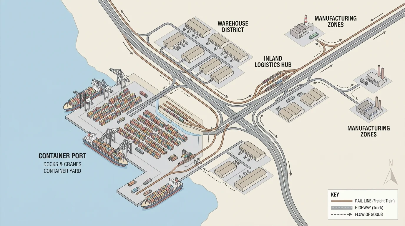
Economic systems are deeply geographic. As [Figure 4] shows, wealth-generating activity often concentrates at transportation corridors, ports, river valleys, border crossings, and resource regions. These are places where movement is efficient, goods can be exchanged, and labor can connect to markets.
Port cities are among the clearest examples. A map of rail lines, highways, warehouses, and container terminals helps explain why a single port can influence an entire inland region. Goods arriving by ship do not stay at the coast. They move through distribution hubs into factories, retail networks, and consumer markets. A port's location relative to deep water, hinterland connections, and nearby manufacturing helps determine its economic importance.
Satellite imagery can reveal industrial zones, agricultural irrigation, mining sites, and urban expansion around logistics hubs. These patterns help answer economic questions. Why does one region produce export crops while another depends on ranching? Why does one city attract technology firms while another remains focused on heavy manufacturing? Usually, the answer includes location, infrastructure, labor supply, and access to markets.
Economic maps also show inequality. A city map of property values, transit access, and public services can reveal uneven development. A rural region map showing roads, clinics, and internet connectivity can help explain why some communities have fewer opportunities. Economic geography is not only about where wealth is created, but also about who can reach it.
One major example is the Pearl River Delta in southern China. Maps of ports, special economic zones, factories, expressways, and nearby global shipping routes help explain why this region became one of the world's leading manufacturing centers. Its coastal location, access to global trade, and links to labor and capital all contributed to rapid growth.
Another example is the Nile Delta in Egypt. Physical maps show fertile alluvial land, while satellite images reveal intensive agriculture and dense settlement. Economic activity is concentrated there because water, transport access, and productive soils support farming and urban life. The region's importance is therefore both physical and economic.
Economic patterns do not happen independently of physical geography. Rivers, climate, soils, coasts, and mineral deposits often shape where people settle, what they produce, and how they trade.
The network in [Figure 4] demonstrates a broader rule: locations that connect flows of goods, people, energy, or information often gain economic influence. Geography helps explain why some places become hubs while others remain peripheral.
Case studies are useful because they show how political, cultural, and economic dynamics overlap. In the South China Sea, maps reveal maritime routes and overlapping claims; satellite images show island construction; photographs show military and civilian facilities. Together, these representations explain a region where geography shapes political competition and economic stakes at the same time.
In the Sahel, thematic maps of rainfall, grazing zones, crop land, and population movement help explain tensions between herders and farmers in some areas. Satellite imagery can track desertification or seasonal vegetation change. Photographs may show wells, fences, roads, and settlements. The geographic relationship is clear: environmental pressure interacts with mobility, livelihoods, and weak state control.
At the U.S.-Mexico border, maps of crossings, highways, maquiladora zones, and urban growth show economic integration. Photographs reveal cultural blending and political enforcement. Satellite imagery can show the built form of border infrastructure and changing settlement patterns. A strong explanation combines all three types of evidence.
In the Nile Basin, location creates linked interests across several countries, as [Figure 5] shows through the upstream-downstream arrangement of the river system. Water management in one place affects agriculture, energy, and security in another. This is a geographic relationship with political and economic consequences.
Ethiopia's construction of the Grand Ethiopian Renaissance Dam has drawn attention from downstream countries, especially Sudan and Egypt. A basin map helps explain why. The Blue Nile begins in the Ethiopian highlands, then flows downstream. Control of water storage upstream can affect timing and quantity of water downstream, influencing irrigation, hydropower planning, and food security.
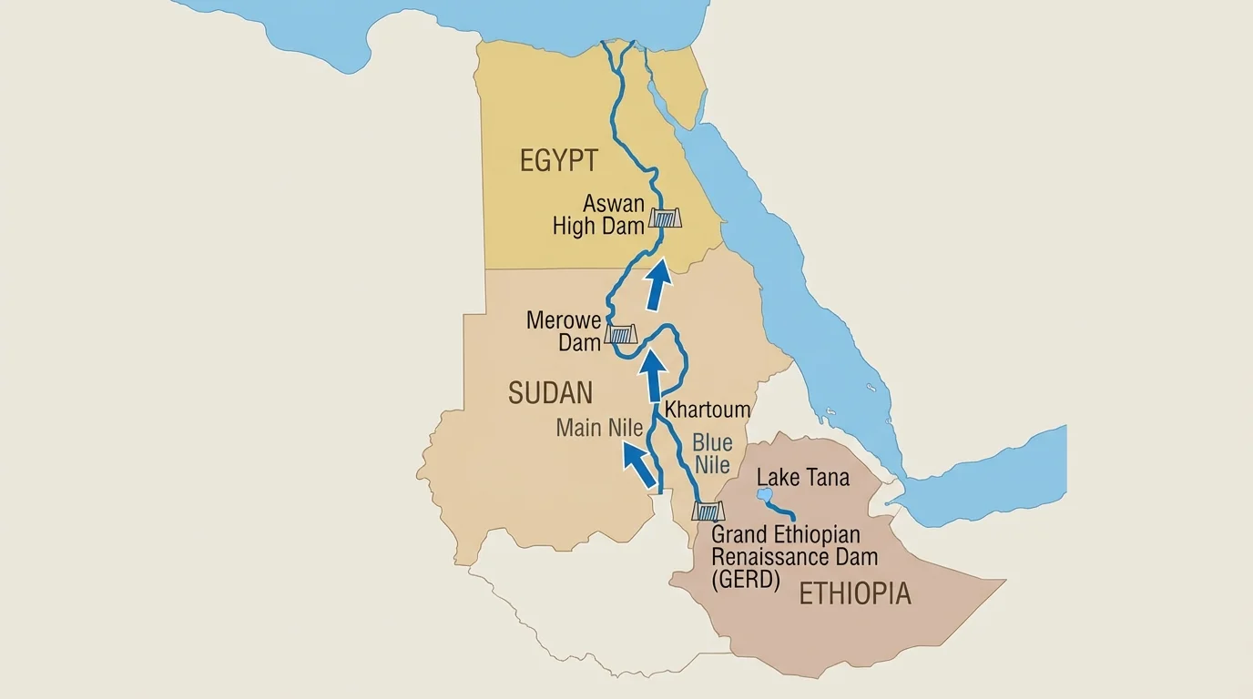
The downstream dependence seen in [Figure 5] is not unique to the Nile. Similar upstream-downstream relationships appear in the Mekong, the Tigris-Euphrates system, and the Colorado River. Maps and satellite images help reveal why water politics are rarely local issues; they are regional systems tied to location and flow.
Strong geographic reasoning usually follows a pattern. First, identify the place and its location. Second, choose the right representations. Third, compare what each one reveals. Finally, connect the evidence to political, cultural, or economic processes.
For example, suppose you want to explain why a coastal city is influential. A political map may show that it is a national capital. A physical map may show a sheltered harbor. A transportation map may show highways and rail links. A satellite image may show industrial expansion and port facilities. A street photograph may show migrant neighborhoods and international businesses. Taken together, these details support a much deeper explanation than any one source alone.
Building a geographic explanation
Question: Why has Dubai become globally important?
Step 1: Use a world map to locate Dubai between Europe, Asia, and East Africa along major air and sea routes.
Step 2: Use satellite imagery to identify port infrastructure, artificial coastal development, and urban expansion.
Step 3: Use photographs to identify architecture, tourism spaces, migrant labor environments, and commercial branding.
Step 4: Explain the relationship: Dubai's location at a crossroads of trade and travel helped it develop into a major logistics, finance, and tourism hub.
Notice that the best explanation is spatial. It does not simply list facts. It shows how location contributes to influence, and how representations provide evidence for that claim.
Maps and images are powerful, but they can also mislead if used carelessly. A map at one scale may hide local variation. A satellite image may be outdated. A photograph may present only one viewpoint. A thematic map may exaggerate a pattern through classification choices. Good analysis means checking sources, dates, scale, and purpose.
Students should also think about perspective. Who made the map? Why was the photograph taken? Which data layer is missing? A tourist image of a city may hide poverty nearby. A political map may imply that borders are fixed and uncontested when they are not. A satellite image may show physical structures but not reveal who controls them or how people experience them.
"Maps are arguments about the world, not just pictures of it."
— A guiding idea in critical geography
Responsible geographic interpretation combines precision with humility. The goal is not just to identify patterns, but to explain them carefully using multiple forms of evidence. When maps, satellite images, photographs, and other representations are read together, they reveal how location shapes politics, culture, and economics across regions and around the world.