A weather app can tell you whether the temperature is rising, but it is a graph that lets you see the pattern quickly. A science notebook may say that a plant grew taller, but measurements show exactly how much taller. Scientists do not rely only on words like "bigger," "faster," or "warmer." They use math to make their ideas clearer, stronger, and easier to test. When scientists use numbers, tables, graphs, and calculations, they can support conclusions with evidence instead of guesses.
Science is about asking questions and looking for evidence. Math helps organize that evidence. If students test which paper towel absorbs the most water, they need more than opinions. They need measurements, such as how many milliliters of water each towel holds. Then they can compare the numbers and decide which towel works best.
Mathematical thinking is useful because it helps us answer questions like these: How much did something change? Which object moved faster? Which material was stronger? Which design used less water or less space? In science, math turns observations into evidence.
Mathematical representation is a way of showing information with numbers, symbols, tables, graphs, measurements, or equations. A scientific conclusion is an explanation or answer based on evidence from observations and tests. A design solution is a plan or object made to solve a problem.
Suppose two groups grow bean plants in different amounts of sunlight. One group says, "Our plant looked healthier." Another group says, "Our plant grew from \(6 \textrm{ cm}\) to \(14 \textrm{ cm}\), so it increased by \(8 \textrm{ cm}\)." The second group gives stronger evidence because it uses measurement and subtraction: \(14 - 6 = 8\).
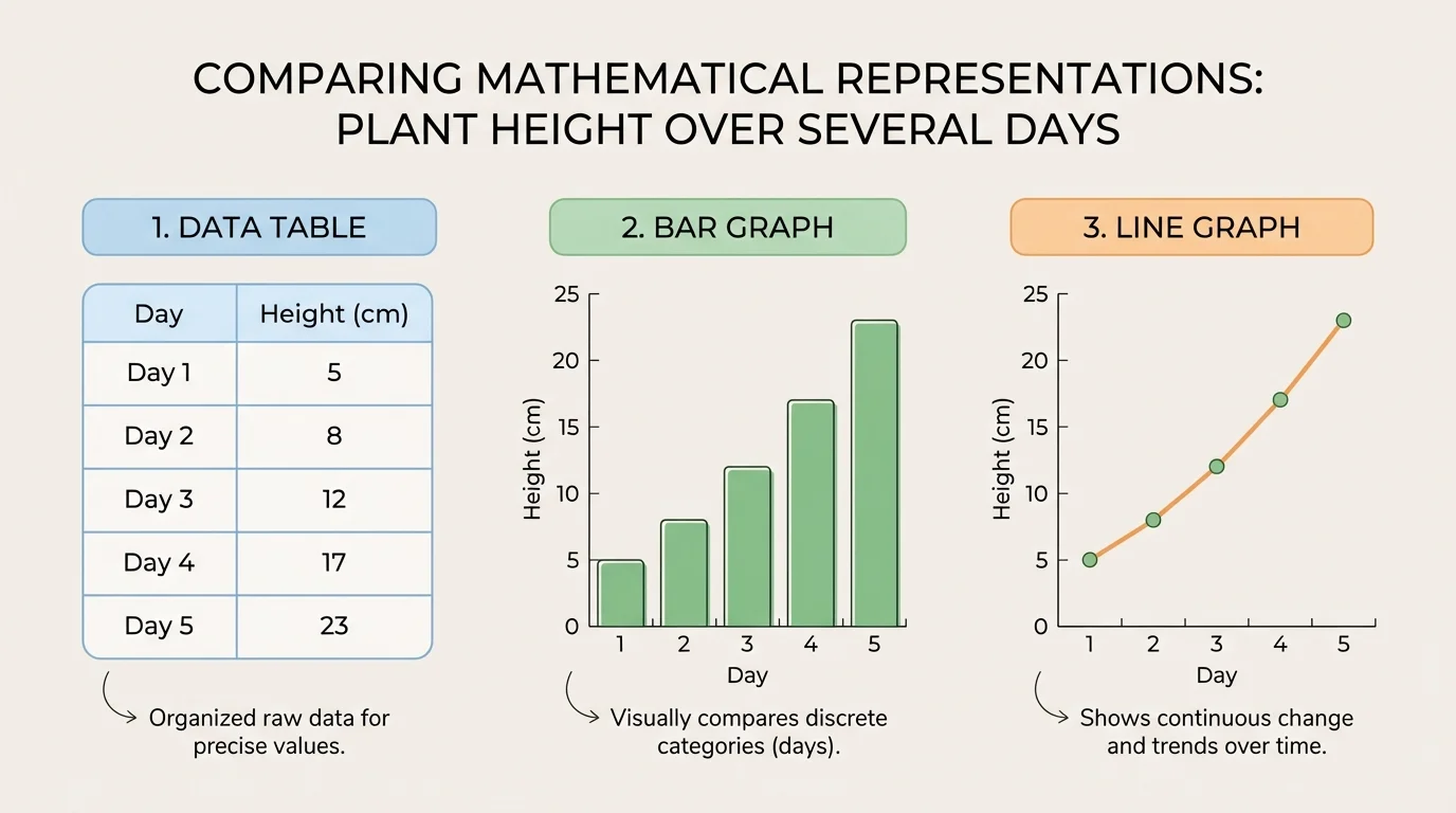
One set of science data can be shown in several ways, as [Figure 1] illustrates with the same plant measurements displayed as a table and graphs. A scientist may begin by measuring and recording data, then organize it into a table, and later make a graph to spot patterns more easily.
A data table is often the first step. It keeps information neat and easy to read. For example, if a plant's height is measured over five days, the data table might show day numbers and heights in centimeters.
Another mathematical representation is a graph. A bar graph is good for comparing categories, such as the amount of water absorbed by three brands of paper towels. A line graph is good for showing change over time, such as temperature during a day or plant growth across a week.
Scientists also use ratios and equations. A ratio compares two amounts. If a seedling in one pot gets \(100 \textrm{ mL}\) of water and another gets \(200 \textrm{ mL}\), the ratio is \(100:200\), which can be simplified to \(1:2\). This helps scientists compare conditions clearly.
Mathematical representations are powerful because each one shows something a little differently. A table gives exact values. A graph makes patterns easy to notice. A calculation shows how much something changed. Later, when students look at changes over time, the comparison first introduced in [Figure 1] still matters, because different representations can support the same conclusion in different ways.
Good mathematical representations begin with good measurements. If the measurements are careless, the conclusion may be weak. Scientists measure length, mass, volume, temperature, and time using tools such as rulers, balances, measuring cups, thermometers, and stopwatches. They always include units like \(\textrm{cm}\), \(\textrm{g}\), \(\textrm{mL}\), and \(\textrm{s}\).
Careful measuring also means paying attention to the variable. A variable is something that can change in an investigation. In a plant experiment, the amount of water might be one variable. The type of plant, soil, and pot size should stay the same if the test is meant to be fair. When only one main factor changes, the math makes the result easier to trust.
Earlier science work with fair tests is important here. In a fair test, one factor changes while other important conditions stay the same. Without a fair test, numbers may look precise, but the conclusion may still be unreliable.
Repeated measurements can make data better. If three students time the same toy car and get \(4 \textrm{ s}\), \(5 \textrm{ s}\), and \(4 \textrm{ s}\), they can use an average to describe the result more fairly than choosing just one number.
The average, or mean, is found by adding the values and dividing by the number of values:
\[\textrm{average} = \frac{4 + 5 + 4}{3} = \frac{13}{3} \approx 4.3\]
This tells us the car took about \(4.3 \textrm{ s}\). The average does not erase differences, but it helps describe the overall result.
After collecting data, scientists look for patterns. A pattern might show increase, decrease, repeating changes, or no clear change. If a class measures the temperature of water while it cools, they may see numbers like \(80\), \(70\), \(62\), \(56\), and \(51\). The pattern shows that temperature decreases over time.
Scientists often compare differences between values. If a plant grows from \(9 \textrm{ cm}\) to \(13 \textrm{ cm}\), the change is \(13 - 9 = 4 \textrm{ cm}\). If another plant grows from \(9 \textrm{ cm}\) to \(11 \textrm{ cm}\), the change is \(2 \textrm{ cm}\). The first plant grew \(2 \textrm{ cm}\) more than the second one.
Example: Using data to support a conclusion
Three groups test how far identical toy cars travel down ramps of different heights.
Step 1: Record the distances
Low ramp: \(60 \textrm{ cm}\)
Medium ramp: \(85 \textrm{ cm}\)
High ramp: \(110 \textrm{ cm}\)
Step 2: Compare the values
The medium ramp is \(85 - 60 = 25 \textrm{ cm}\) farther than the low ramp.
The high ramp is \(110 - 85 = 25 \textrm{ cm}\) farther than the medium ramp.
Step 3: Write the conclusion
As ramp height increases, the car travels farther. The numbers support the conclusion because each increase in ramp height matches an increase in distance.
Patterns do not always prove the reason by themselves, but they help scientists build explanations. If the same pattern appears again and again in fair tests, the conclusion becomes stronger.
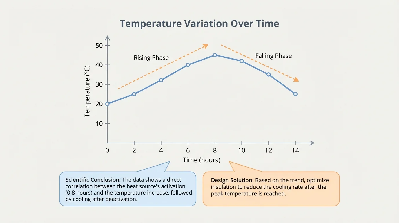
A graph can make a pattern visible in seconds, as [Figure 2] shows with temperatures changing through the day. Instead of reading many separate numbers, a student can look at the shape of the graph and notice whether the values rise, fall, or stay about the same.
Graphs need titles, labels, and scales. The horizontal axis often shows the independent variable, such as time. The vertical axis often shows the dependent variable, such as temperature or height. If the axes are not labeled, the graph can be confusing or even misleading.
For example, suppose a class measures outdoor temperature every two hours. The data might be \(12\), \(15\), \(18\), \(20\), \(17\), and \(14\) degrees. A line graph would rise and then fall. This supports the conclusion that the day warmed up until afternoon and then cooled later.
Bar graphs are different. They compare separate groups. If students compare the number of earthworms found in sandy soil, garden soil, and clay soil, bars can show which soil had the most worms. The tallest bar means the largest value, but students must still read the scale carefully.
Graphs can also reveal when a conclusion should be questioned. If data points jump up and down without a clear trend, scientists should be careful. A graph may show that the evidence is mixed. The smooth pattern in [Figure 2] is easier to explain than a graph with no clear direction.
Scientists often use simple formulas to describe relationships. A formula is a rule written with symbols and numbers. At this grade level, useful science formulas include average, speed, and density. These formulas connect measurements to scientific ideas.
How formulas help in science
A formula is not just a math trick. It shows how quantities are connected. When students use a formula, they are describing a scientific relationship in a short, precise way. That makes results easier to compare and explain.
One common formula is speed:
\[\textrm{speed} = \frac{\textrm{distance}}{\textrm{time}}\]
If a toy car travels \(12 \textrm{ m}\) in \(4 \textrm{ s}\), then its speed is \(\dfrac{12}{4} = 3 \textrm{ m/s}\). This helps students compare motion fairly. A car that goes \(15 \textrm{ m}\) in \(5 \textrm{ s}\) also has speed \(3 \textrm{ m/s}\), so both cars move at the same rate even though the distances are different.
Another useful formula is density:
\[\textrm{density} = \frac{\textrm{mass}}{\textrm{volume}}\]
If a block has mass \(20 \textrm{ g}\) and volume \(5 \textrm{ cm}^3\), its density is \(\dfrac{20}{5} = 4 \textrm{ g/cm}^3\). Density helps explain why some objects sink and others float.
Example: Comparing absorbency with averages
A paper towel brand is tested three times. It absorbs \(18 \textrm{ mL}\), \(20 \textrm{ mL}\), and \(19 \textrm{ mL}\) of water.
Step 1: Add the measurements
\(18 + 20 + 19 = 57\)
Step 2: Divide by the number of tests
\(\dfrac{57}{3} = 19\)
Step 3: Interpret the result
The average absorbency is \(19 \textrm{ mL}\). This average can be compared with other brands to help decide which towel works best.
When formulas are used correctly, they support scientific conclusions with clear evidence. Instead of saying "this object seems heavier for its size," density gives a precise comparison. Instead of saying "that runner looked faster," speed gives a measured answer.
[Figure 3] Math is not only for explaining what happens in science. It is also for solving problems. Engineers and inventors use measurements, calculations, and models to design things that work well. A design solution might be a stronger bridge, a water-saving garden, or a better lunch container. This example shows how measured dimensions help a designer choose materials that fit the problem.
Suppose students want to build a shade cover for a rectangular garden bed so plants do not get too much sunlight. They need to know the size of the garden before cutting any material. If the garden is \(4 \textrm{ m}\) long and \(3 \textrm{ m}\) wide, the area is:
\[A = l \times w = 4 \times 3 = 12 \textrm{ m}^2\]
This means the cover must protect about \(12 \textrm{ m}^2\) of space.
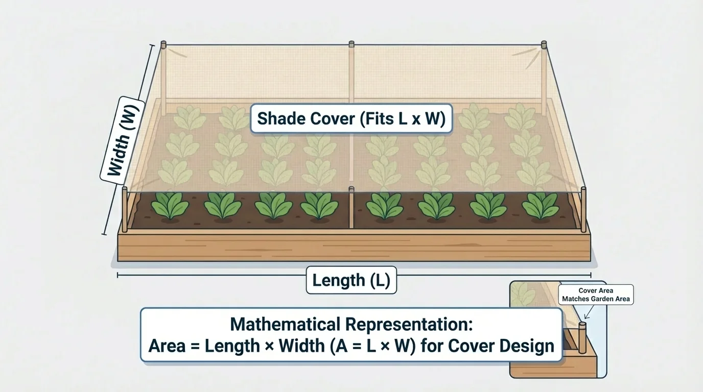
Now students can compare materials. If one fabric sheet covers only \(10 \textrm{ m}^2\), it is too small. A sheet that covers \(12 \textrm{ m}^2\) or a little more will fit better. Math helps avoid wasting materials and helps the design match the need.
Another example is building a simple water filter. Students may test different layers such as gravel, sand, and cloth. They can measure how much dirty water goes in and how much cleaner water comes out. If filter A lets \(250 \textrm{ mL}\) of water pass through in \(5 \textrm{ min}\), its rate is \(\dfrac{250}{5} = 50 \textrm{ mL/min}\). If filter B lets \(300 \textrm{ mL}\) pass in the same time, its rate is \(60 \textrm{ mL/min}\). Students can then decide which design is faster, but they should also think about which one cleans the water better.
Design solutions often involve more than one measurement. A good solution may need to be fast, strong, safe, and not too expensive. Math helps compare these features fairly. The garden example from [Figure 3] is simple, but the same idea is used in real engineering projects.
Math is powerful, but numbers alone do not guarantee a good conclusion. The conclusion depends on the quality of the test. If students compare two parachute designs but one is dropped from a higher place, the results are not fair. The measurements may be exact, but the test conditions are not equal.
Scientists also think about sample size. Testing only one seed, one paper airplane, or one ice cube may not be enough. More trials usually lead to more trustworthy conclusions. If five trials show the same result, confidence grows.
Even professional scientists repeat experiments many times. A surprising result is exciting, but it must be tested again before people can trust it.
Outliers matter too. An outlier is a value very different from the others. If four toy-car times are about \(4 \textrm{ s}\) and one is \(12 \textrm{ s}\), students should check whether something unusual happened. Maybe the car hit a bump. Scientists do not ignore data carelessly, but they do investigate strange results.
Mathematical representations appear in daily life far beyond the science classroom. Weather reports use graphs for temperature and rainfall. Doctors use measurements such as height, mass, and heart rate. Sports analysts compare speeds, scores, and averages. Gardeners measure sunlight and water. Builders calculate length, area, and volume before construction begins.
Environmental science uses math constantly. If a town wants to reduce plastic waste, students might count how many plastic bottles are thrown away in one day at school. If they count \(120\) bottles per day, then in \(5\) school days the total is \(120 \times 5 = 600\) bottles. In about \(4\) weeks, that becomes \(600 \times 4 = 2{,}400\) bottles. This kind of calculation can support a conclusion that reducing single-use plastics could make a big difference.
Computers also help scientists work with large amounts of data. This is part of computational thinking, which means organizing information, spotting patterns, and using step-by-step methods to solve problems. Even when students are not programming a computer, they are using computational thinking when they sort data, make graphs, and test ideas logically.
Example: Choosing the better design
Two bottle rockets are tested. Rocket A flies \(18 \textrm{ m}\), \(20 \textrm{ m}\), and \(19 \textrm{ m}\). Rocket B flies \(16 \textrm{ m}\), \(24 \textrm{ m}\), and \(17 \textrm{ m}\).
Step 1: Find the average for Rocket A
\(18 + 20 + 19 = 57\), and \(\dfrac{57}{3} = 19\).
Step 2: Find the average for Rocket B
\(16 + 24 + 17 = 57\), and \(\dfrac{57}{3} = 19\).
Step 3: Compare consistency
Both rockets have the same average distance, but Rocket A is more consistent because its distances stay close together. Rocket B changes more from trial to trial.
Step 4: Write a conclusion
If the goal is a steady, reliable rocket, Rocket A may be the better design even though the averages are equal.
This example shows an important truth: one number is not always enough. Scientists and engineers often look at several kinds of evidence before making a conclusion or choosing a design.
"What gets measured gets understood."
— A useful scientific principle
When students use measurements, graphs, calculations, and careful comparisons, they are doing more than math practice. They are building scientific explanations and creating better solutions. Math helps them answer questions with evidence, improve designs thoughtfully, and understand the world more clearly.