A lake near a town suddenly turns green. Fish begin to die, and people want answers fast. Was fertilizer from nearby lawns the cause? Did hotter weather play a role? Did both happen at the same time by chance? Science often begins with patterns like these, but finding a pattern is not the same as proving a cause. That difference matters a lot when communities try to protect air, water, soil, and living things.
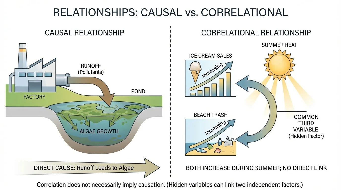
[Figure 1] When scientists study human impacts on the environment, they look for relationships in data. For example, they may compare the amount of plastic litter on a beach to the number of visitors, or compare water temperature to the amount of oxygen dissolved in a stream. Some relationships are true cause-and-effect links. Others are only patterns. Learning to tell them apart helps scientists make better decisions and avoid blaming the wrong factor.
Environmental problems are often complicated because many factors happen at once. A river may be affected by farming, weather, factories, road salt, and changes in land use. If we jump to conclusions too quickly, we might design a solution that does not work. For example, if a town assumes that fish deaths are caused only by trash floating on the surface, it might organize cleanup days but ignore harmful chemicals washing in after storms.
To monitor environmental conditions means to measure them over time in a careful, organized way. Monitoring can include taking water samples, counting species, measuring noise levels, or tracking the amount of smoke particles in the air. Good monitoring helps scientists see whether a problem is getting worse, staying the same, or improving after a solution is put in place.
Why evidence matters for solutions
A solution should match the real cause of the problem. If car exhaust is causing poor air quality near a school, planting flowers alone will not solve the main issue. But if measurements show that traffic is strongly linked to spikes in air pollution during drop-off time, the school could test carpool lanes, no-idling rules, or walking zones and then monitor whether pollution levels go down.
Scientists therefore ask two major questions: What patterns do we observe? and What is actually causing those patterns? These questions sound similar, but they lead to different kinds of scientific thinking.
A causal relationship means that one factor directly changes another. In science, this is often described as cause and effect. For example, if extra fertilizer containing nitrogen washes into a pond, it can increase algae growth. The fertilizer is a cause, and the algae increase is an effect. This example contrasts a real cause-and-effect chain with a pattern that simply occurs at the same time.
A correlation means that two things change together in some way. If beach trash increases on days when more people visit the beach, those two variables are correlated. That pattern is useful because it suggests a possible connection. However, it does not prove that one variable is directly causing the other. Maybe strong winds also blow in trash on the busiest beach days. Maybe trash cans overflow during holidays. More evidence is needed.
In science, both kinds of relationships matter. Correlations can help scientists notice problems and ask better questions. Causal relationships help them explain what is really happening and decide what actions to take.
Causal relationship means one factor produces a change in another factor.
Correlation means two factors vary together in a pattern.
Variable means anything that can change in an investigation, such as temperature, amount of rainfall, or number of insects counted.
Think of it this way: a correlation is like seeing two dancers move together. A causal relationship is knowing which dancer is leading, or whether music is causing both to move at the same time.
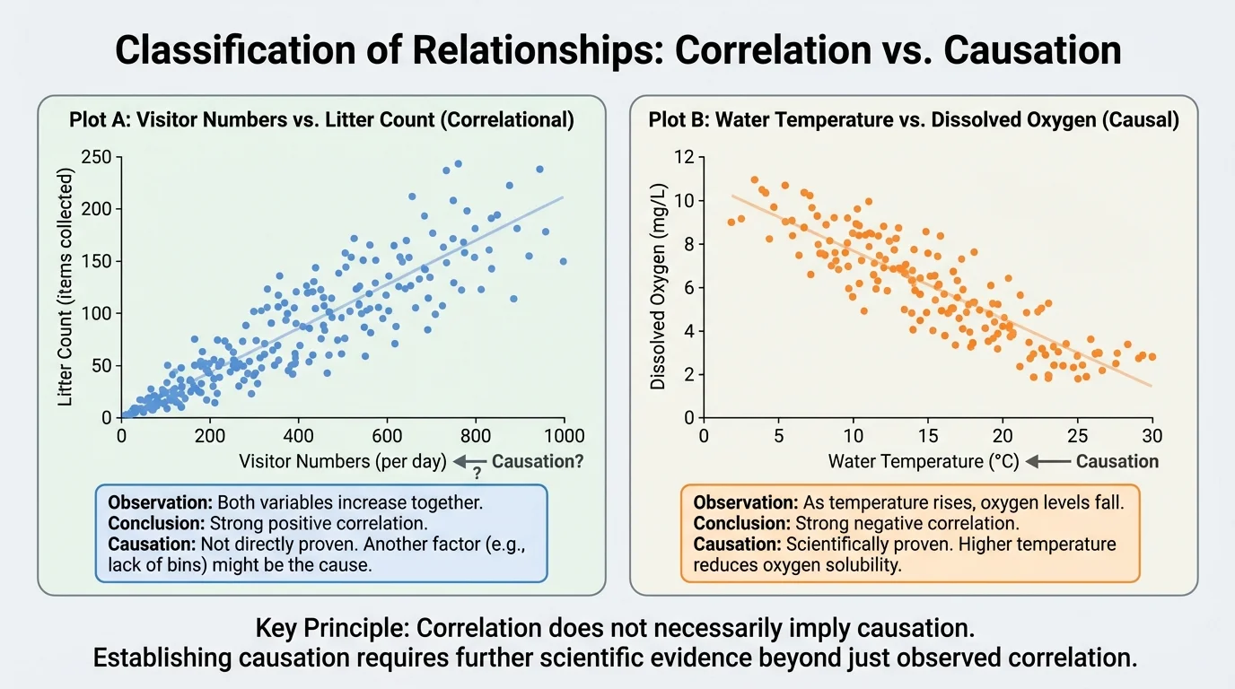
Scientists often display data in tables or graphs because patterns become easier to spot. As [Figure 2] illustrates, a correlation may be positive, negative, or weak. In a positive correlation, both variables tend to increase together. In a negative correlation, one variable increases while the other decreases.
Suppose a class studies litter in a park. On days with more visitors, they count more pieces of litter. That is a positive correlation. If they also measure the number of birds seen and notice that bird sightings drop as noise level rises, that is a negative correlation. These patterns can point to important questions about human impact.
Here is a simple comparison:
| Situation | Variables | Type of pattern |
|---|---|---|
| Busy beach days and amount of litter | Visitors and trash amount | Positive correlation |
| Water temperature and dissolved oxygen | Temperature and oxygen | Negative correlation |
| Rainfall and muddy runoff | Rain amount and turbidity | Often positive correlation |
| Random shoe color and local ozone level | Shoe color and ozone | No meaningful correlation |
Table 1. Examples of different types of relationships that students might observe in environmental investigations.
Sometimes scientists describe a relationship with a rate or ratio. For example, if a stream has \(12\textrm{ mg/L}\) of dissolved oxygen in cool weather and later drops to \(8\textrm{ mg/L}\) during hotter weather, the oxygen level changed by \(12 - 8 = 4\textrm{ mg/L}\). That change may suggest a relationship between temperature and oxygen, but by itself it still does not prove temperature caused the entire change.
Warmer water usually holds less dissolved oxygen than cooler water. This is one reason heat waves can be stressful for fish, especially in streams already affected by pollution.
Looking at [Figure 2] also reminds us that a clear-looking graph can be persuasive, but appearance alone is not enough. Scientists still need to test whether the pattern makes sense, repeats over time, and can be explained by evidence.
This is one of the most important ideas in science: correlation does not necessarily imply causation. Two things may happen together for several reasons.
First, the relationship may be a coincidence. This means the pattern happened by chance. If a school tracks recycling rates and notices they rose during the same month that the cafeteria changed its menu, the menu change may have nothing to do with recycling.
Second, there may be a third variable, also called a hidden factor. For example, ice cream sales and beach trash may both increase in summer. That does not mean buying ice cream creates beach trash directly. The hidden factor could be warm weather, which brings more people to the beach and increases both sales and litter.
Third, the direction of the relationship may be unclear. If scientists notice fewer frogs in places with more road construction, road construction might be harming frog habitat. But it is also possible that the areas chosen for construction already had fewer wetlands and therefore fewer frogs. To sort this out, researchers need more data.
Fourth, the evidence may be incomplete. One day of measurements is rarely enough. Environmental systems change with seasons, storms, droughts, and human activity. Strong conclusions require repeated observations.
Case example: Park litter and bird numbers
Students count litter and bird sightings in a city park for two weeks. They notice that when litter counts are high, bird sightings are low.
Step 1: Identify the correlation.
The variables change in opposite directions, so this is a negative correlation.
Step 2: Ask whether litter must be the cause.
Not necessarily. Noise, time of day, weather, or the number of people in the park could affect bird sightings too.
Step 3: Decide what more evidence is needed.
Students could measure noise level, weather, and visitor numbers at the same time and compare several park locations over many days.
The pattern is useful, but it is not enough by itself to prove that litter causes fewer birds to appear.
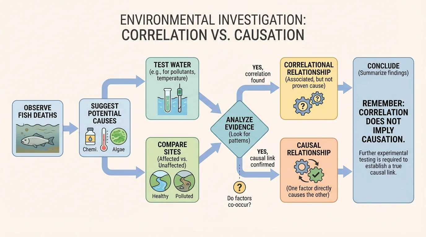
[Figure 3] Good science is careful science. It respects patterns, but it does not treat every pattern as proof.
To investigate cause and effect, scientists often use a controlled investigation. They begin with an observation, suggest possible causes, test variables, and compare results. The key idea is to change one factor while keeping as many other factors the same as possible.
For example, if students want to test whether fertilizer runoff increases algae growth, they might compare two containers of pond water under the same light and temperature conditions. One receives a measured amount of fertilizer; the other does not. If the algae grow much more in the fertilized container, that is stronger evidence of causation than simply noticing that green ponds are often near lawns.
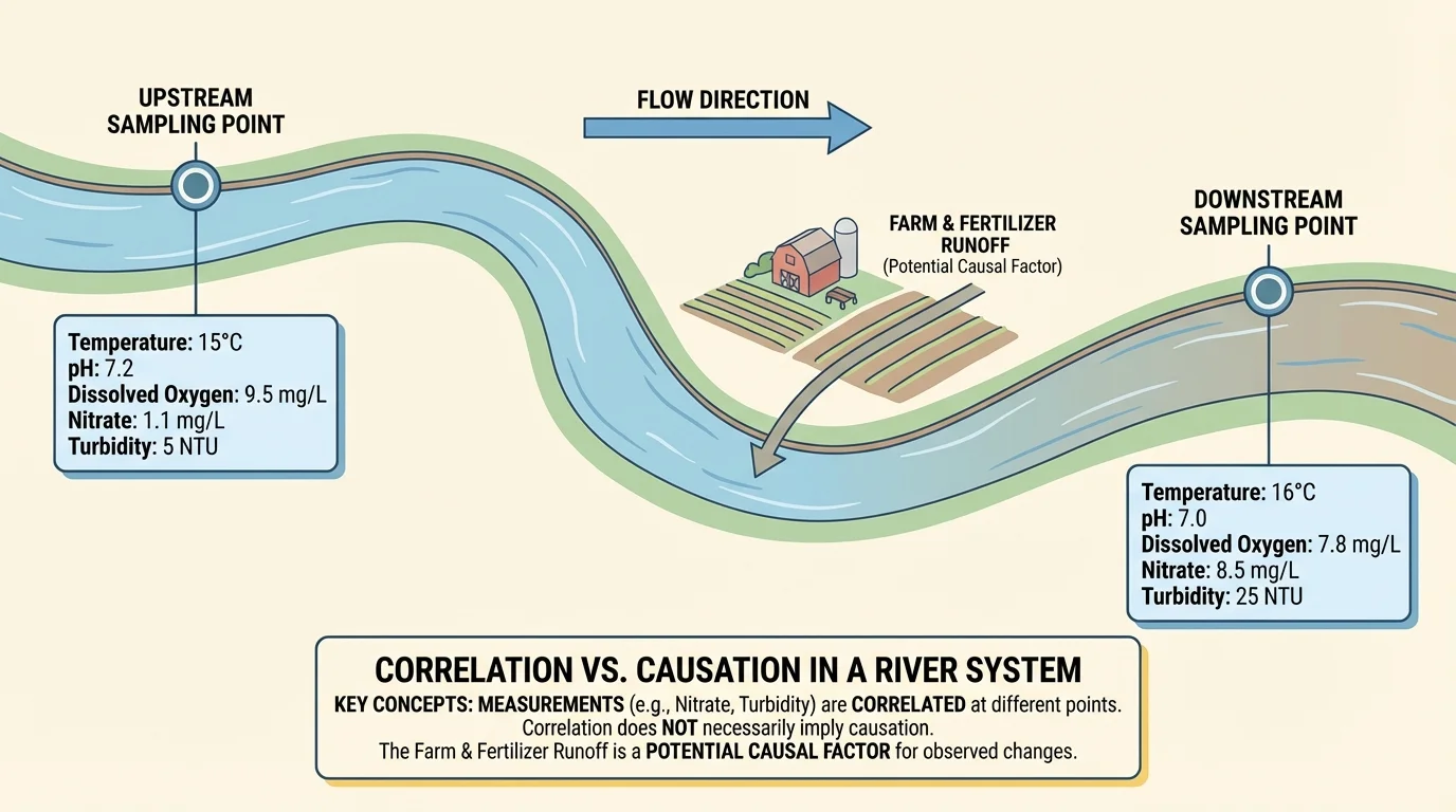
Scientists also use comparison sites. In a river, they may sample water upstream and downstream from a factory. If pollutant levels are low upstream but much higher downstream, that gives stronger evidence that the factory discharge is involved. Repeating the measurements over time makes the conclusion more reliable.
Another important tool is replication, which means repeating tests or collecting many samples. If a result appears only once, it may be an accident. If it appears again and again, confidence increases. Scientists also check whether the proposed cause makes sense based on what is already known. For instance, if nitrate levels rise after heavy rain in farming areas, that idea fits known patterns of runoff.
When scientists make a fair test, they try to keep most variables the same and change only one main variable at a time. This helps them see whether that variable is likely to be the cause of the observed effect.
The flow in [Figure 3] is not just for professional scientists. Students can use the same logic: observe, question, test, compare, and revise.
Environmental data become much more useful when they are collected systematically. In stream studies, for example, scientists may measure temperature, \( \textrm{pH} \), dissolved oxygen, nitrate level, and turbidity at the same points each week. Measuring upstream and downstream can reveal whether a human activity is linked to changes in water quality.
Suppose a team measures water quality at two locations. Upstream, nitrate concentration is \(2\textrm{ mg/L}\). Downstream near farm runoff, it is \(7\textrm{ mg/L}\). The increase is \(7 - 2 = 5\textrm{ mg/L}\). This difference suggests a possible impact from farming, but scientists would still want repeated measurements, rainfall records, and perhaps samples from other streams before claiming a definite cause.
Air quality studies work in a similar way. If particle levels near a busy road are \(35\textrm{ \u00b5g/m}^3\) during morning traffic and only \(12\textrm{ \u00b5g/m}^3\) late at night, traffic is a strong possible cause. But weather matters too. Wind can spread pollutants, and temperature can affect how air moves. That is why scientists track several variables at once.
Plastic waste can also be monitored. A beach cleanup team might count the number of plastic bottles found in a \(100\textrm{ m}\) stretch each week. If the count drops from \(45\) bottles to \(18\) bottles after more recycling bins are added, the decrease is \(45 - 18 = 27\) bottles. This is encouraging evidence, but scientists would still ask whether storms, tourism levels, or seasonal changes also influenced the result.
Now return to the river with dying fish. Scientists notice three things at once: the weather has been hotter than usual, a nearby field was fertilized before a storm, and construction upstream increased muddy runoff. All three are correlated with the fish deaths. Which one is the cause?
The answer might be more than one factor. Fertilizer runoff can increase algae growth. When algae die and decompose, oxygen in the water can drop. Warm water also holds less oxygen. Muddy water can block sunlight and affect habitats. A complex environmental event may have several interacting causes.
Scientists would collect evidence such as dissolved oxygen, water temperature, turbidity, nutrient levels, and the timing of rainfall. They might compare sections of the river and examine whether fish deaths happened only downstream from certain inputs. The upstream-downstream setup in [Figure 4] helps organize this type of investigation.
River investigation example
A team measures dissolved oxygen in two parts of a river.
Step 1: Record the measurements.
Upstream dissolved oxygen is \(9\textrm{ mg/L}\). Downstream dissolved oxygen is \(4\textrm{ mg/L}\).
Step 2: Calculate the difference.
The drop is \(9 - 4 = 5\textrm{ mg/L}\).
Step 3: Interpret carefully.
The lower oxygen downstream suggests a problem, but more evidence is needed to identify the exact cause. Scientists should also measure temperature, nutrient levels, and turbidity and repeat the test over time.
This investigation gives stronger evidence than a single observation, but it still requires careful interpretation.
Environmental science often works this way: patterns first, deeper testing next, and causes identified only after enough evidence is collected.
Once scientists have stronger evidence about cause and effect, they can design methods to reduce harm. If runoff is the main cause of poor water quality, one solution is to plant buffer strips of vegetation near streams. The plants slow water, trap sediment, and absorb some nutrients before they reach the river.
A good environmental plan has two parts: monitoring and minimizing impact. For example, a school trying to reduce litter in a nearby creek could create a method like this: choose three sampling sites, count litter once a week, sort items by type, install covered trash bins and signs, then compare litter counts after several weeks. If average litter per site drops from \(30\) items to \(12\) items, the reduction is \(30 - 12 = 18\) items.
But even here, students should be careful. Was the change caused by the bins and signs? Or did fewer people visit because of rainy weather? A stronger design would compare similar sites with and without the new bins, and track visitor numbers too.
Strong designs reduce uncertainty
The best environmental methods do not just collect numbers. They are built to answer clear questions. A strong design identifies the variable being tested, collects repeated measurements, uses comparison sites or times, and checks whether the proposed solution really reduces the human impact.
This is why understanding correlation and causation is so powerful. It turns data collection into evidence-based action.
People often make mistakes when they look at graphs, headlines, or social media claims about science. A graph may show two lines rising together, but that does not automatically mean one caused the other. Before accepting a claim, ask a few smart questions.
What exactly was measured? A claim is stronger when the variables are clear. How often was it measured? Repeated data are better than a one-time sample. Were other variables considered? Hidden factors can mislead us. Was there a comparison group or comparison site? Without one, it is harder to test causation. Does the explanation make scientific sense? A good claim fits both data and known science.
"Patterns are where science begins, but evidence is what turns patterns into explanations."
When you hear that two things are linked, be curious rather than convinced. Correlations are clues. Causes are conclusions earned through careful testing.