A weather app predicts tomorrow's temperature, a car dashboard estimates remaining fuel, and doctors use models to track the spread of disease. None of these tools sees the future directly. They rely on representations: numbers, equations, graphs, and computer models that turn messy reality into patterns we can study. That is one of the most powerful ideas in science and engineering. A good representation does not merely store information; it helps explain why something happens and what is likely to happen next.
In science, a representation is a way of expressing a phenomenon so that it can be analyzed, tested, and communicated. The phenomenon might be the motion of a bicycle, the cooling of hot coffee, the change in a population of bacteria, or the energy use of a building. A representation might be a table of measurements, a graph, an equation, a scale drawing, a spreadsheet, or a computer simulation.
Representations matter because they make hidden relationships visible. If a runner's distance increases steadily with time, a graph can reveal that pattern instantly. If a chemical reaction uses matter without creating or destroying atoms, an equation can represent that conservation precisely. If many factors interact at once, a computational model can handle more complexity than mental reasoning alone.
Mathematical representation is a description of a phenomenon using numbers, symbols, equations, graphs, ratios, or geometric relationships.
Computational representation is a description built with logical steps, algorithms, data processing, or computer-based models and simulations.
Model is a simplified representation of a system that helps explain a phenomenon, predict outcomes, or test ideas.
Scientists use these tools to support explanations, not replace evidence. An equation is useful only if it matches observations. A graph is meaningful only if the data are reliable. A simulation can be powerful, but its assumptions must still be checked against the real world.
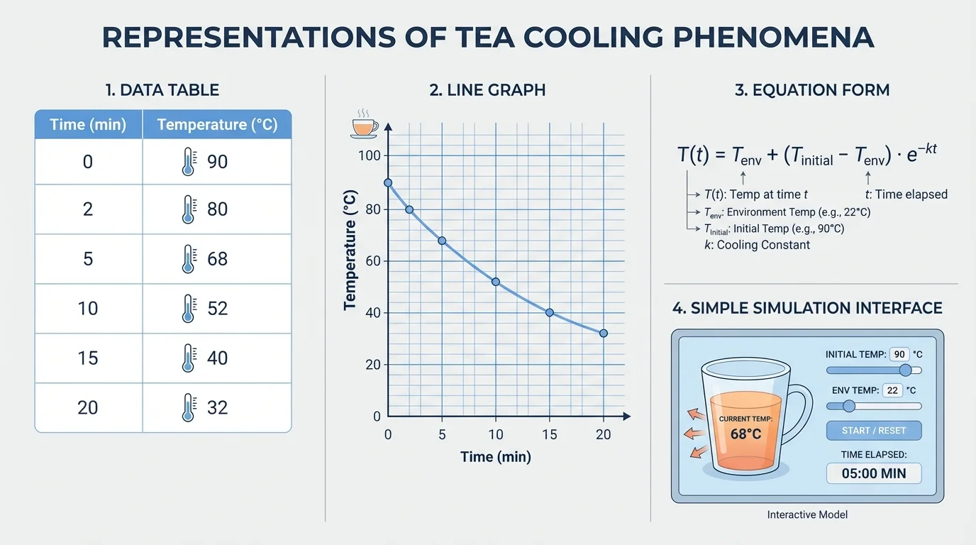
One important idea, shown clearly in [Figure 1], is that the same phenomenon can be represented in several ways at once. Suppose you are studying a cup of tea cooling on a desk. You might record temperature every two minutes in a table, plot those values on a graph, write an equation that estimates temperature over time, and build a simple computer model that updates the temperature step by step.
Each form highlights something different. A table gives exact measured values. A graph shows the overall pattern. An equation expresses a relationship compactly. A computational model can repeatedly apply the same rule and produce many predicted values quickly. None of these forms is automatically "best" in every situation.
Common mathematical representations include ratios, proportions, rates, linear equations, area and volume formulas, probability models, and conservation relationships. Common computational representations include spreadsheets, coded rules, simulations, iterative calculations, and decision algorithms.
A strong explanation often connects several representations. For example, in motion studies, a table may list time and distance, a graph may reveal whether speed is constant, and an equation such as \(d = vt\) may summarize the relationship if the speed is steady. When these match, confidence in the explanation grows.
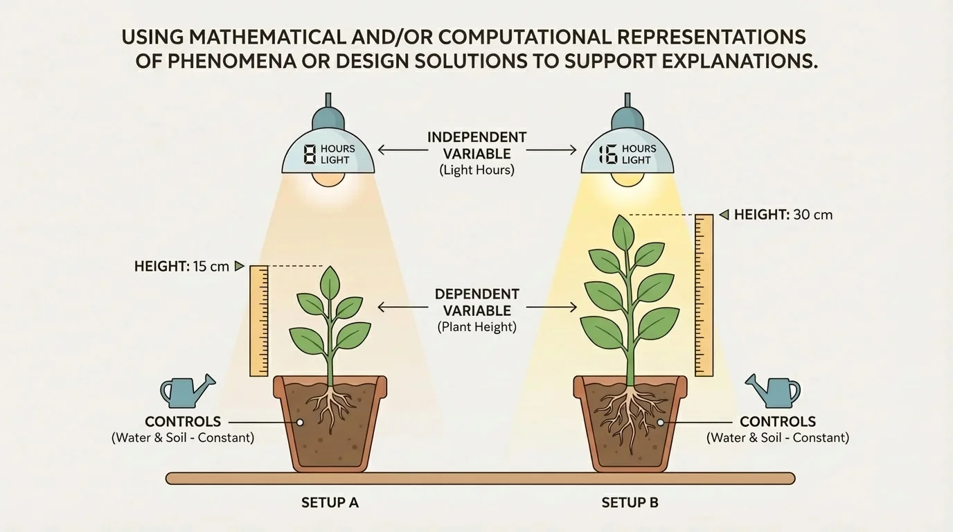
To build a useful scientific model, researchers first translate a real situation into measurable parts. As [Figure 2] illustrates, this means identifying a variable, deciding which quantity is changed on purpose, and determining which quantity responds. In an experiment on plant growth, the number of light hours per day might be changed, while plant height is measured over time.
The quantity that is deliberately changed is the independent variable. The quantity that responds is the dependent variable. Quantities kept the same are controlled variables or constants. If the amount of water, type of soil, and plant species remain unchanged, then differences in height are more reasonably connected to differences in light exposure.
Choosing variables carefully is essential because mathematics depends on clearly defined quantities. If time is measured in minutes in one trial and hours in another without proper conversion, the model becomes confusing or wrong. Good representations require consistent units, clear labels, and accurate measurements.
Once variables are defined, scientists look for patterns. Does one quantity increase when another increases? Does it double, level off, cycle, or decrease? These patterns suggest what kind of mathematical relationship may fit the data.
Remember from earlier math courses that a relationship can be linear, proportional, exponential, inverse, or more complex. The key question is not just whether two quantities are connected, but how they are connected.
If a car travels at constant speed, distance and time have a linear relationship. If the side length of a square changes, area changes according to \(A = s^2\), which is not linear. If bacteria reproduce rapidly, the pattern may be exponential for a period of time. Different phenomena require different representations.
A mathematical representation begins with quantities and the relationships between them. Some relationships are based on direct measurement, while others come from known scientific principles. For constant speed motion, the relationship is
\(d = vt\)
where \(d\) is distance, \(v\) is speed, and \(t\) is time. If a cyclist rides at \(6 \textrm{ m/s}\) for \(50 \textrm{ s}\), then the distance is \(d = 6 \times 50 = 300 \textrm{ m}\).
Rates are especially important because many phenomena involve change over time. Speed is the rate of change of distance. Population growth can be the rate of change of number of organisms. In chemistry, reaction rate describes how fast reactants become products. In environmental science, the concentration of \(\textrm{CO}_2\) in the atmosphere changes over time and can be graphed and modeled.
Proportional relationships are common. If force and acceleration are directly proportional for a fixed mass, doubling force doubles acceleration. A proportional relationship has the form \(y = kx\), where \(k\) is the constant of proportionality. Not every straight-line graph is proportional, though. A graph with equation \(y = 2x + 3\) is linear but does not pass through the origin, so it is not proportional.
Why equations support explanations
An equation is not just a calculation shortcut. It states a relationship between quantities in a form that can be tested. If measured data fit the equation well, the equation supports the explanation. If the data do not fit, the explanation may need to be revised.
Conservation laws are another major source of mathematical representations. For example, in a closed system, total mass remains constant during a chemical reaction. In the reaction \[2\textrm{H}_2 + \textrm{O}_2 \rightarrow 2\textrm{H}_2\textrm{O}\] the balanced equation represents conservation of atoms: \(4\) hydrogen atoms and \(2\) oxygen atoms appear on both sides. The representation helps explain why matter is rearranged rather than created or destroyed.
Some systems are too complex to describe with a single simple equation. Weather, ecosystems, traffic flow, and disease spread involve many interacting variables. In these cases, scientists often use computational models. A computational model follows rules step by step, often repeatedly, to estimate how a system changes.
Computational thinking includes breaking a problem into parts, identifying patterns, designing rules or algorithms, and testing those rules with data. An algorithm is a precise sequence of instructions for solving a problem or carrying out a process. A spreadsheet formula that updates values row by row is a simple example of an algorithm in action.
Suppose a pond loses \(5\%\) of its water volume each day due to evaporation during a heat wave. A computer or spreadsheet can start with an initial amount, multiply by \(0.95\) each day, and generate values for many days quickly. That repeated process is called iteration. Computational methods are especially useful when many iterations are needed or when the rules change over time.
Modern climate models divide Earth into many small regions and calculate energy transfer, wind, water movement, and temperature changes repeatedly. Even supercomputers still approximate the system because the real atmosphere is incredibly complex.
Computation also helps analyze large datasets. Instead of hand-calculating the mean of thousands of measurements, software can sort, graph, fit trends, and compare models. This does not remove the need for thinking. Students and scientists still must decide whether the output makes sense.
Graphs reveal relationships quickly, and [Figure 3] shows why they are so powerful: a single line can display both a starting value and a rate of change. On a distance-time graph, the slope tells how quickly distance changes with time. A steeper slope means greater speed.
If a line passes through points \((0,0)\) and \((10,50)\), its slope is \(\dfrac{50-0}{10-0} = 5\). This means distance changes by \(5\) units for each \(1\) unit of time. In physical terms, the object's speed is \(5\) distance units per time unit.
The intercept is also meaningful. If a graph crosses the vertical axis at \(y = 3\), then when \(x = 0\), the quantity already starts at \(3\). In real contexts, that could mean a tank already contains \(3\) liters of water before filling begins, or a person has a starting balance before adding more money.
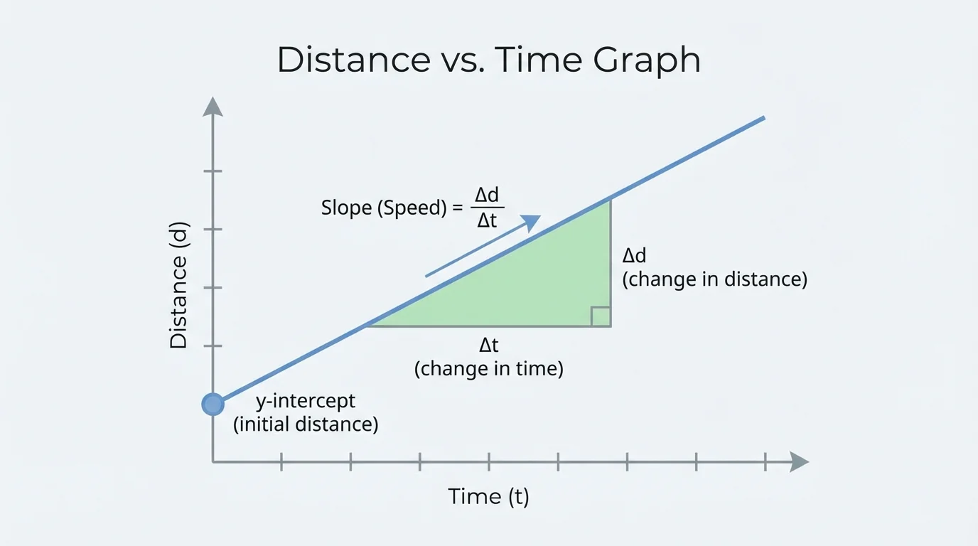
Not all trends are linear. Curved graphs may indicate changing rates. A flattening curve can suggest saturation or cooling toward room temperature. A rapidly rising curve may suggest exponential growth. Correlation also matters: if two variables change together, that does not always prove one causes the other. Additional evidence is needed.
Later, when deciding whether a design is efficient, students often return to the same graph ideas. Engineers look at slope as a rate, intercept as an initial condition, and curvature as evidence that a simple linear model may no longer work.
Mathematical and computational representations are not only for explaining natural phenomena. They are also essential when designing solutions. As [Figure 4] suggests, engineers often compare competing goals such as cost, safety, efficiency, weight, speed, and durability. A design is rarely about maximizing just one thing.
Suppose a team is designing insulation for a house. Increasing insulation thickness usually decreases heat loss, but it also increases cost. A graph can compare these trends, while a spreadsheet can calculate yearly energy savings for several thicknesses. The "best" choice may be the one that provides large energy reduction without excessive extra cost.
This is called optimization: finding the most effective solution under given constraints. Constraints may include budget, material limits, time, environmental impact, or safety rules. Good design explanations use evidence from models, not guesses.
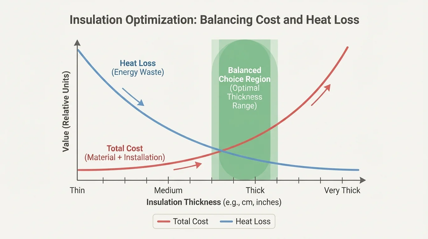
Computational tools are valuable here because they allow rapid comparison of many possibilities. An engineer can change a variable, recalculate outcomes, and test sensitivity. If small changes in one input cause large changes in results, the design may need extra caution.
Design comparison example
A water bottle company compares two materials. Material A costs $1.20 per bottle and loses heat at \(18 \textrm{ J/min}\). Material B costs $1.60 per bottle and loses heat at \(10 \textrm{ J/min}\). If performance matters twice as much as cost, a weighted score can help support a choice.
Step 1: Define a simple scoring method
Let lower heat loss be worth \(2\) points of importance for every \(1\) point of cost importance.
Step 2: Compare the differences
Material B costs $0.40 more, but reduces heat loss by \(18 - 10 = 8 \textrm{ J/min}\).
Step 3: Interpret the trade-off
If performance is weighted more heavily, the reduction of \(8 \textrm{ J/min}\) may justify the extra $0.40, especially for products designed to keep liquids hot for longer periods.
The math does not make the decision automatically, but it makes the reasoning transparent and defensible.
Design models can also fail if they ignore important factors. A bridge design based only on average load may overlook wind, vibration, or temperature expansion. That is why representations must include relevant variables and realistic assumptions.
No representation captures every detail of reality. A model is useful because it simplifies, but simplification always leaves something out. When students use equations, graphs, or simulations, they should ask what assumptions were made. Is friction being ignored? Is temperature treated as constant? Is a population assumed to mix randomly? These choices affect conclusions.
Uncertainty is also unavoidable in measurement. If a thermometer reads to the nearest \(1^\textrm{C}\), then measured temperatures are not infinitely precise. Small errors can affect calculated slope, averages, or predicted outcomes. Strong explanations acknowledge this rather than pretending the model is perfect.
Outliers require attention as well. A point far from the general trend may be caused by experimental error, unusual conditions, or a genuinely important discovery. The right response is not to erase inconvenient data automatically but to investigate it.
"All models are wrong, but some are useful."
— George Box
This famous statement does not mean models are unreliable. It means every model is a simplified version of reality. Its value depends on whether it helps explain the system accurately enough for the purpose at hand.
In epidemiology, graphs and computational simulations estimate how quickly an infection may spread. A simple model may track the number of infected people each day and compare outcomes when transmission rates change. Public health decisions often depend on these comparisons.
In physics, mathematical representations explain motion, forces, and energy transfer. A falling object can be described by position, velocity, acceleration, and graphs that connect them. In chemistry, balanced equations and concentration data represent how substances change during reactions, such as \(\textrm{HCl} + \textrm{NaOH} \rightarrow \textrm{NaCl} + \textrm{H}_2\textrm{O}\).
In environmental science, data tables and trend graphs track changes in temperature, rainfall, ocean acidity, or \(\textrm{CO}_2\) concentration. In engineering, computer-aided models test structures, circuits, and product designs before physical prototypes are built. These representations save time, reduce cost, and improve safety.
Choosing a representation depends on the question
If you need exact values, a table may be best. If you need to see a trend, a graph may be best. If you need to express a relationship compactly, an equation may be best. If many variables interact over many steps, a computational model may be best.
That is why the same system is often shown in multiple forms. Earlier, [Figure 1] compares several representations of cooling. Scientists move among these forms because each reveals something the others may hide.
These examples show how mathematical and computational representations support explanations, not just answers.
Worked example 1: Linear motion
A cart moves at a constant speed of \(4 \textrm{ m/s}\) for \(15 \textrm{ s}\). Find the distance traveled and explain what the result represents.
Step 1: Choose the relationship
For constant speed motion, use \(d = vt\).
Step 2: Substitute the known values
\(d = 4 \times 15\).
Step 3: Calculate
\(d = 60\).
So the distance is \[60 \textrm{ m}\]. This supports the explanation that constant speed produces a linear increase in distance over time. If plotted, the graph would be a straight line with slope \(4\), matching the graph ideas introduced with [Figure 3].
Notice that the calculation and the explanation work together. The number \(60\) is meaningful because it fits a model of steady change.
Worked example 2: Population growth by iteration
A bacterial culture starts with \(200\) cells and increases by \(30\%\) each hour. Estimate the population after \(3\) hours using iteration.
Step 1: Write the update rule
Each hour, multiply by \(1.30\).
Step 2: Apply the rule repeatedly
After \(1\) hour: \(200 \times 1.30 = 260\).
After \(2\) hours: \(260 \times 1.30 = 338\).
After \(3\) hours: \(338 \times 1.30 = 439.4\).
Step 3: Interpret the result
The model predicts about \(439\) cells if fractional cells are rounded to the nearest whole cell.
This iterative computational representation shows how repeated percentage growth creates a nonlinear pattern.
Here computation is useful because repeated multiplication over many time steps becomes easier and less error-prone when automated.
Worked example 3: Comparing design efficiency
A solar charger design produces \(18 \textrm{ W}\) and costs $45. Another produces \(24 \textrm{ W}\) and costs $66. Compare power per dollar.
Step 1: Compute the first ratio
For Design A, power per dollar is \(\dfrac{18}{45} = 0.40 \textrm{ W per dollar}\).
Step 2: Compute the second ratio
For Design B, power per dollar is \(\dfrac{24}{66} \approx 0.364 \textrm{ W per dollar}\).
Step 3: Compare and explain
Design A gives more power for each dollar spent, even though Design B has greater total power output.
This comparison supports an explanation about efficiency, not just raw performance. Depending on the design goal, an engineer may still choose Design B, but the representation makes the trade-off visible.
These examples show a pattern: identify variables, choose a suitable representation, calculate carefully, and then explain what the result means in context.
Different tools answer different questions. The table below compares common choices.
| Representation | Best use | Strength | Limitation |
|---|---|---|---|
| Table | Exact measured values | Precise and organized | Trends may be hard to see quickly |
| Graph | Patterns and trends | Shows change visually | May hide exact values |
| Equation | Compact relationship | Supports calculation and prediction | May oversimplify complex systems |
| Computational model | Complex, repeated, or multi-variable systems | Handles many steps efficiently | Depends strongly on assumptions and input quality |
Table 1. Comparison of common mathematical and computational representations used in science and engineering.
The most skillful scientific thinkers do not ask, "Which representation is always best?" They ask, "Which representation helps explain this phenomenon most clearly and with the right amount of detail?" Often the answer is a combination.
When you evaluate a model or create one yourself, ask four questions: What are the variables? What relationship is being proposed? What evidence supports it? What are the limitations? Those questions turn representations into tools for reasoning rather than just decorations around data.