Every day, apps, scientists, businesses, and athletes make predictions from data. A streaming service predicts what you might watch next, a coach estimates how training time affects performance, and public health researchers track how quickly a disease spreads. Behind many of these predictions is a simple but powerful idea: if data show a pattern, we can model that pattern with a function and use the function to answer questions. The challenge is not just drawing a graph through points. The challenge is choosing a model that actually matches the situation.
When two numerical variables are recorded together, we often display them on a scatter plot. Each point represents one pair of values. For example, a point might show a student studied for \(3\) hours and scored \(82\) on a test, or a city had a temperature of \(24\) degrees and sold \(310\) iced drinks that day. A scatter plot helps us see whether the variables seem related.
If the points form a visible pattern, we can often describe that pattern with a model. In this topic, a model is a function chosen to approximate the relationship between the variables. Because real data usually contain variation, the points do not all lie exactly on the graph of one function. Instead, we look for a function that fits the overall trend well enough to be useful.
Fitted function is a function chosen to represent the pattern in a set of data. A good fit captures the main relationship between the variables without pretending the data are perfectly exact.
Scatter plot is a graph of paired numerical data points. It helps reveal trends, clusters, and unusual values.
Fitting a function is valuable because it lets us do more than describe the data. Once we have an equation, we can estimate unknown values, compare rates of change, and solve problems in the context of the data. But a model is only useful if we understand what kind of relationship the scatter plot suggests.
Different scatter plot shapes suggest different kinds of functions, as [Figure 1] illustrates. If points lie around a straight path, a linear model may work well. If the data rise slowly at first and then more quickly, or fall by a constant percentage, an exponential model may be better. If the pattern bends and has a highest or lowest point, a quadratic model may be appropriate.
A scatter plot can also show whether the association is positive or negative. A positive association means that as one variable increases, the other tends to increase. A negative association means that as one variable increases, the other tends to decrease. Some data show little or no association at all.
Besides trend, we also look for outliers, which are values that lie far from the rest of the pattern. An outlier may come from a measurement error, an unusual event, or a genuinely rare case. It can strongly affect the function we choose, so it should never be ignored automatically.
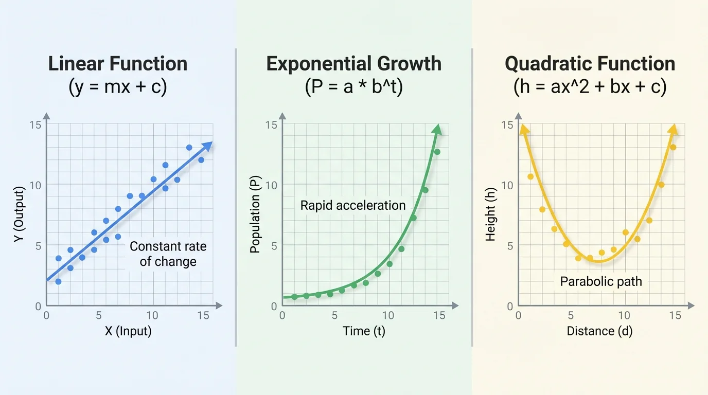
Context matters too. If a bacteria population doubles every hour, an exponential model makes sense because the change is multiplicative. If the relationship is distance traveled at constant speed over time, a linear model is more reasonable. If the data describe the height of a ball over time, gravity often creates a parabolic pattern, which leads to a quadratic model.
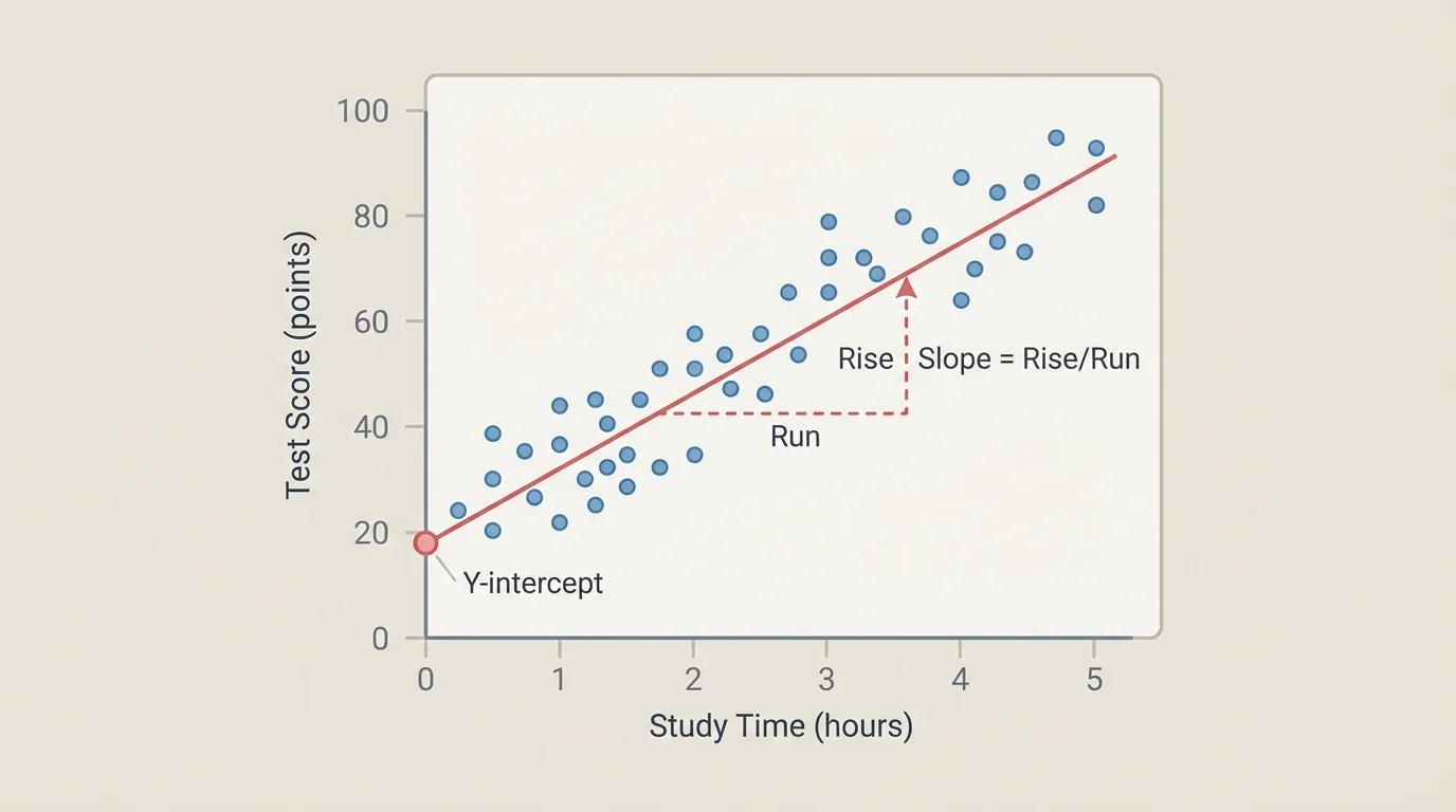
[Figure 2] A linear model is often the first model to try, especially when the scatter plot follows an approximately straight trend. A linear model has the form \(y = mx + b\), where \(m\) is the slope and \(b\) is the y-intercept.
The slope tells how much \(y\) is expected to change for each increase of \(1\) unit in \(x\). In context, that might mean "test score increases by about \(4\) points for each extra hour studied" or "cost increases by about \(\$2.50\) per mile." The intercept is the predicted value of \(y\) when \(x = 0\), but it is only meaningful if \(x = 0\) makes sense in the situation.
When fitting a line by eye or with technology, we usually choose a line that balances the points, with about as many above as below. The goal is not to force the line through every point. The goal is to capture the center of the trend.
Suppose the fitted line is \(y = 4x + 68\). Then \(68\) is the predicted score when a student studies \(0\) hours, and \(4\) means each additional study hour is associated with about \(4\) more points. If a student studies \(5\) hours, the predicted score is \(y = 4(5) + 68 = 88\).
Not all relationships stay straight. In many real situations, the rate of change itself changes. That is when nonlinear models become useful.
An exponential model often has the form \(y = ab^x\) where \(a\) is the initial value and \(b\) is the growth or decay factor. If \(b > 1\), the function grows. If \(0 < b < 1\), the function decays. Exponential models are common in population growth, compound interest, and radioactive decay.
A quadratic model often has the form \[y = ax^2 + bx + c\]. A quadratic graph is a parabola. Quadratic fits are useful when data rise and then fall, or fall and then rise, such as the height of an object over time or the area of a shape under changing dimensions.
Choosing a model from the shape of the data
If equal changes in \(x\) produce roughly equal changes in \(y\), think linear. If equal changes in \(x\) multiply \(y\) by about the same factor, think exponential. If the graph curves and has a turning point, think quadratic. The data pattern and the real-world setting should agree.
Technology can calculate a regression equation, but mathematical judgment still matters. A calculator may produce an equation, yet you still must ask whether that equation makes sense for the data and the context.
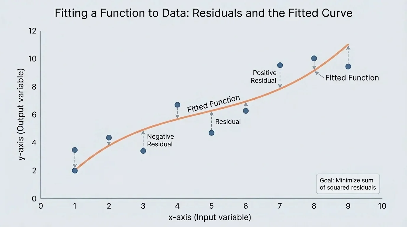
[Figure 3] A model is not judged only by whether it looks smooth. We judge it by how well it follows the actual data. One useful idea is the residual, shown by vertical distances. A residual is the difference between the observed value and the predicted value: \(\textrm{residual} = \textrm{observed} - \textrm{predicted}\).
If residuals are generally small, the model fits well. If many residuals are large, the model may be poor. If residuals show a pattern, such as mostly positive in one region and mostly negative in another, that suggests the chosen function type may be wrong.
Another important idea is interpolation, which means using the model to estimate a value between known data points. Interpolation is usually safer than extrapolation, which means using the model beyond the range of the data. A model may work well inside the observed interval but fail badly outside it.
For example, if a shoe company models sales for sizes \(6\) through \(12\), using the model to predict sales for size \(9\) is interpolation. Using it to predict sales for size \(20\) is extrapolation and may be unreasonable.
As we saw earlier in [Figure 1], the overall shape of the scatter plot matters. A line fitted to clearly curved data can give misleading answers, even if it seems close to some of the points.
A school tracks the relationship between hours studied and quiz score for several students. The scatter plot suggests a linear trend. A fitted line is \(y = 5x + 60\), where \(x\) is hours studied and \(y\) is quiz score.
Worked example: interpreting and using a linear fit
Step 1: Interpret the parameters.
In \(y = 5x + 60\), the slope is \(5\). This means each additional hour of studying is associated with about \(5\) more points on the quiz. The intercept is \(60\), which is the predicted score when \(x = 0\).
Step 2: Predict the score for \(x = 4\).
Substitute \(x = 4\): \(y = 5(4) + 60 = 20 + 60 = 80\).
Step 3: Answer a reverse question.
If a student wants a predicted score of \(90\), solve \(90 = 5x + 60\). Then \(30 = 5x\), so \(x = 6\).
The model predicts a score of \(80\) after \(4\) hours of study, and about \(6\) study hours for a predicted score of \(90\).
This example also shows why context matters. The line may be useful for study times in a normal range such as \(0\) to \(8\) hours. It would be questionable to use the same model to predict what happens after \(20\) hours of studying.
A biologist records the number of bacteria in a culture. The count is about \(200\) at hour \(0\), \(300\) at hour \(1\), \(450\) at hour \(2\), and \(675\) at hour \(3\). The ratio between consecutive values is about \(1.5\), so an exponential model is reasonable.
Worked example: building and using an exponential fit
Step 1: Identify the initial value and growth factor.
The initial value is \(a = 200\). Since each hour multiplies the count by about \(1.5\), the growth factor is \(b = 1.5\).
Step 2: Write the model.
The fitted function is \(y = 200(1.5)^x\).
Step 3: Predict the count after \(4\) hours.
Substitute \(x = 4\): \(y = 200(1.5)^4 = 200(5.0625) = 1012.5\).
Step 4: Interpret the result.
The model predicts about \(1,013\) bacteria after \(4\) hours.
This model makes sense because the bacteria count grows by a nearly constant factor, not by a nearly constant difference.
If we compare this with the pattern types from [Figure 1], we see why exponential data often start modestly and then rise more sharply. That growing steepness is a clue that a straight line is not the best fit.
The height of a thrown ball is measured at different times. Projectile data often form a parabola, and the peak on the graph represents the maximum height. Suppose a fitted model for height in meters is \(h(t) = -5t^2 + 20t + 1\), where \(t\) is time in seconds.
Worked example: using a quadratic fit
Step 1: Find the height after \(1\) second.
Substitute \(t = 1\): \(h(1) = -5(1)^2 + 20(1) + 1 = -5 + 20 + 1 = 16\).
Step 2: Find when the ball reaches its maximum height.
For \(h(t) = at^2 + bt + c\), the time of the vertex is \(t = -\dfrac{b}{2a}\). Here, \(a = -5\) and \(b = 20\), so \(t = -\dfrac{20}{2(-5)} = 2\).
Step 3: Find the maximum height.
Evaluate \(h(2) = -5(2)^2 + 20(2) + 1 = -20 + 40 + 1 = 21\).
The ball is \(16\) meters high after \(1\) second and reaches a maximum height of \(21\) meters at \(2\) seconds.
The coefficient of \(t^2\) is negative, so the parabola opens downward. That matches the context: the ball rises, slows, reaches a highest point, and then falls.
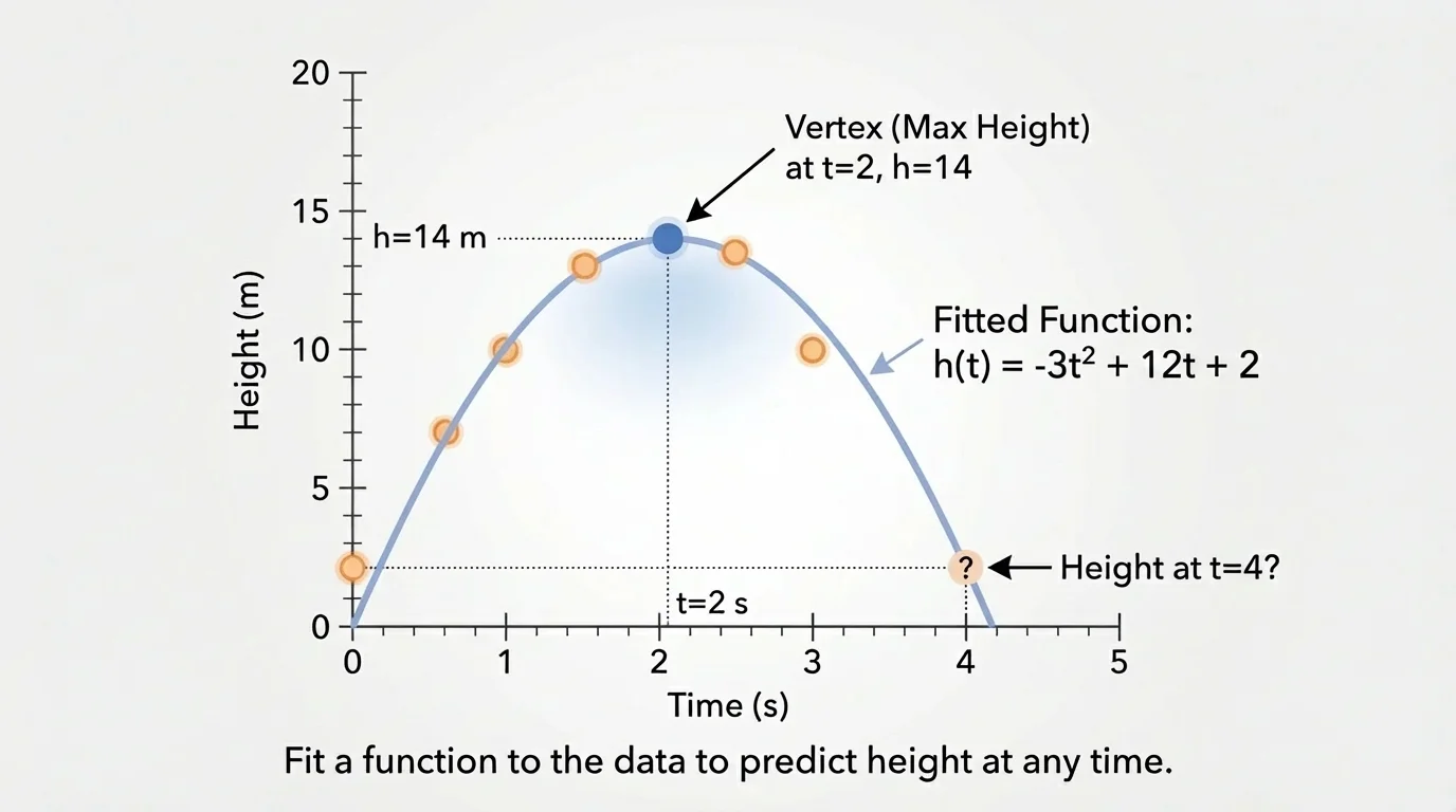
Later, if we want to estimate the height at \(1.5\) seconds, we are interpolating from the model. If we tried to use the same model far beyond the time the ball was in the air, we would be extrapolating and would get unrealistic results.
Fitted functions turn data into decision-making tools. In medicine, doctors may model how a drug concentration changes over time. In economics, analysts may model how demand changes as price changes. In environmental science, researchers may model how temperature relates to electricity use. In each case, a scatter plot reveals a pattern, a function represents that pattern, and the model helps answer practical questions.
For example, a utility company may use a linear model to estimate how much energy demand rises with temperature during summer. A wildlife researcher may use an exponential model to track a fast-growing population of invasive species. A sports scientist may use a quadratic model to study the arc of a basketball shot.
Professional sports teams use mathematical models built from large data sets to estimate shooting efficiency, player fatigue, and even the best angles for passes and shots. The underlying idea is still the same one used in a classroom scatter plot: find a pattern and model it responsibly.
As shown earlier in [Figure 2], interpreting parameters matters just as much as computing them. A slope is not just a number. It represents a rate of change in a real situation. A maximum in a quadratic model is not just the top of a curve. It may represent the highest height, largest profit, or greatest area in context.
One common mistake is choosing a model only because it is easy, not because it matches the data. Another is forgetting units. If \(x\) is measured in hours and \(y\) in dollars, then the slope has units of dollars per hour. Ignoring units makes interpretations weaker and sometimes wrong.
A third mistake is believing a fitted function is exact truth. Real data come from measurements, experiments, and human behavior, all of which include variation. A model is an approximation, not a guarantee.
It is also important to check whether the independent variable values make sense. A model for children's height versus age may be useful from birth through adolescence, but not for ages far beyond the collected data. This is why extrapolation, discussed with residuals and fit quality in [Figure 3], must be handled carefully.
Good modeling habits include examining the scatter plot first, choosing a function type that matches the visual pattern, interpreting parameters in context, checking whether predictions are reasonable, and stating limitations clearly.
| Model type | General form | Typical clue in data | Common contexts |
|---|---|---|---|
| Linear | \(y = mx + b\) | Points follow an approximately straight trend | Constant-rate situations |
| Exponential | \(y = ab^x\) | Values change by a similar factor | Growth and decay |
| Quadratic | \(y = ax^2 + bx + c\) | Curved pattern with a maximum or minimum | Projectile motion, optimization |
Table 1. Comparison of common function types used to fit quantitative data.
When used thoughtfully, fitted functions let us move from raw data to insight. They help us estimate, compare, explain, and solve problems. The most important skill is not memorizing one equation form, but learning to connect the graph, the algebra, and the context.