A scientist does not usually rely on only one kind of information. A weather report may include a written explanation, a satellite image, and a graph of temperature changes. A science article about animals may include a paragraph, a labeled diagram, and a video clip. When you learn to put these pieces together, you become much better at understanding what is really happening. That skill is called integrating information, and it is a big part of how scientists and engineers obtain, evaluate, and communicate information.
Written text is powerful because it can explain ideas in detail. But sometimes words alone are not enough. A diagram can show the parts of a flower much faster than a long paragraph. A chart can help you notice a pattern in data. A video can show movement, such as how lava flows or how a robot arm works. Each kind of source gives information in a different way.
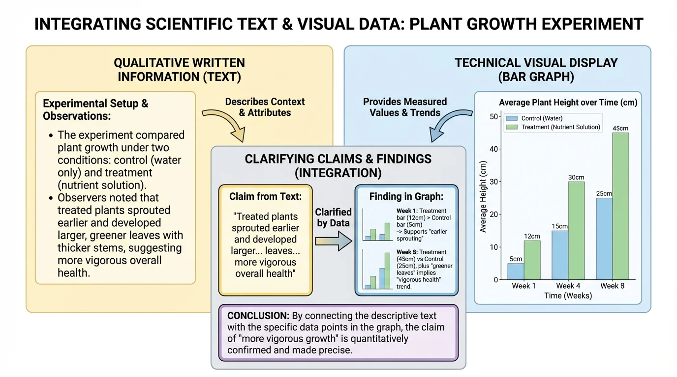
When you combine information from text and visuals, you can clarify ideas. To clarify means to make something easier to understand. If a paragraph says that a plant bent toward a light source, a picture or time-lapse video can help you see exactly what that means. Together, the sources help explain the claim more clearly.
Claim is a statement that says something is true, such as "Plants grow better with sunlight."
Finding is a result discovered from observing, measuring, or testing, such as "The plants near the window grew taller."
Qualitative information describes qualities or characteristics using words rather than measurements, such as color, shape, texture, smell, or behavior.
Visual display is information shown in a visual form, such as a chart, graph, table, diagram, map, or photograph.
Media includes ways of sharing information such as videos, animations, audio clips, and digital presentations.
In science, not all information is made of numbers. You might read that a rock is rough, dark, and layered. Those are descriptions, not measurements. This kind of information helps people notice important features. Scientists often use both descriptive information and measured information together.
A scientific text might be a short article, a lab report, directions for using a tool, or a page explaining how something works. A technical text usually gives information about machines, materials, systems, or steps in a process. To understand these texts well, look for the main idea first. Ask yourself, "What is this mostly about?"
Next, notice the supporting details. These are facts, examples, and explanations that help prove the main idea. Suppose a text says that insulation keeps heat inside a house. Supporting details might explain that insulation traps air and slows the movement of heat. Those details matter because they show why the claim makes sense.
It also helps to pay attention to signal words. Words like because, therefore, as a result, and for example often show relationships between ideas. In technical writing, numbered steps, warnings, and labels are especially important. If a set of directions says to connect one wire before turning on a battery, the order matters.
As you read, look for a claim and the evidence that supports it. Evidence may include observations, examples, test results, or explanations. Good readers do not just notice what the text says. They ask how the writer knows.
[Figure 1] Visuals can communicate a lot in a small space. To read them well, start with the title, labels, symbols, and key. These features tell you what the visual is about and how to read it. If you skip the labels, you may misunderstand the whole display.
A diagram often shows parts and relationships. For example, a diagram of the human digestive system can show where food travels and which organs are involved. A chart or table can help compare information side by side. A photograph can provide evidence of what something looks like in real life. A video can show a process over time, such as a seed sprouting.
Different visuals do different jobs. A diagram explains structure. A chart helps organize information so patterns are easier to see. A table is useful when exact values or categories matter. A video or animation is especially useful when something changes over time or when movement is important.
Media should also be examined carefully, even when it is not presented as words on a page. In a science video, ask what the camera shows, what the narrator says, and what details you can observe for yourself. Sometimes music, fast motion, or exciting images can make something feel important, but you still need to ask whether the information is accurate and clear.
When you study a graph or chart, be careful with labels and scales. If one bar is taller than another, it may show more of something, but you must know what is being measured. Even when a lesson focuses on qualitative information, visuals may still include small amounts of measurement, such as time labels or categories. Good readers connect both kinds of information.
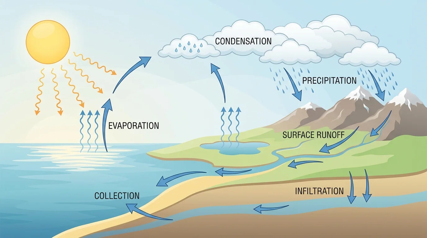
[Figure 2] One of the most important science-reading skills is connecting what one source says to what another source shows. A written explanation may describe a process, while a picture makes the same process easier to picture. A diagram can make a written explanation clearer because it shows relationships that are hard to hold in your mind from words alone.
Suppose a text explains that water from oceans, lakes, and rivers warms up and turns into water vapor. Then it says that the vapor cools, forms clouds, and later falls as rain. A student might understand the words, but a water cycle diagram helps connect the stages. Arrows show movement, labels name each stage, and the whole process becomes easier to follow.
When you integrate sources, ask a few important questions. What idea appears in both sources? What new detail does the visual add? Does the media source explain something the text leaves out? Does the text explain something the picture cannot? Strong understanding happens when you notice how the pieces fit together.
Sometimes text and visuals are not exact copies of each other. That is normal. A paragraph may explain that clouds form when water vapor cools. A diagram may not explain cooling in words, but it may still show vapor rising and clouds forming. You have to combine the ideas, not expect every source to say everything.
Integrating information means building a fuller picture. Instead of treating each source as separate, readers combine them. The text may tell what happens, the visual may show where it happens, and a video may show how fast or in what order it happens. Together, they make the claim or finding easier to understand.
This skill matters in many subjects. In science, you may read about erosion and then study photographs of riverbanks. In technology, you may read instructions for a device and then follow a labeled drawing. In health, you may read about exercise and then study a chart showing heart rate changes. In each case, understanding improves when you compare sources instead of using only one.
Good readers do more than collect information. They also evaluate it. That means they check whether the information is clear, trustworthy, and sensible. Sometimes a text and a visual agree strongly. For example, a paragraph may say that desert plants have thick stems to store water, and a photo may clearly show those thick stems.
Sometimes one source adds details that the other does not include. A written passage about penguins may say they live in cold places and use their feathers for warmth. A video might add that penguins huddle together to save heat. That extra detail does not disagree with the text. It extends it.
Sometimes sources may seem to conflict. If a diagram looks different from the paragraph, slow down and investigate. Maybe the picture shows only one stage of a process. Maybe the text is discussing one species while the image shows another. Maybe the scale or angle of the photo makes something look larger or smaller than it is. Do not assume one source is wrong right away.
Evaluation also means asking whether the source is complete. A single photo of the sky does not prove a climate pattern. One short video of an animal does not tell everything about its behavior. Scientists look for repeated observations and more than one kind of evidence before accepting a conclusion.
Some of the most important scientific discoveries became clearer only after scientists created visual displays of their data. Patterns that were hard to notice in paragraphs became obvious when shown in graphs, maps, or drawings.
Another part of evaluation is noticing the source of the information. A science textbook, a museum website, a class experiment, and a random online post are not all equally reliable. Trustworthy sources usually explain where the information came from and often include observations, research, or expert review.
Science is not just about gathering information. It is also about sharing it clearly. After you read a passage and study a visual, you may need to explain what you learned in writing or speaking. When you do that, include evidence from more than one source. You might say, "The article explains that roots absorb water, and the diagram shows the roots spreading through the soil." That kind of response is stronger than using only one source.
Clear communication also means using precise language. Instead of saying, "The picture is cool," say what it shows. For example: "The photo shows that the metal bridge has rust on the surface, which supports the text's claim that iron reacts with oxygen and water." Specific language makes your explanation more scientific.
You can organize your explanation in a simple way. First, state the claim or finding. Next, explain what the text says. Then, explain what the visual or media source adds. Finally, tell how the sources work together. This pattern helps your ideas stay focused and easy to follow.
Using two sources in one explanation
A short article says that bees help flowering plants reproduce by moving pollen. A labeled picture shows pollen stuck to a bee's legs as it flies from one flower to another.
Step 1: State the claim.
The claim is that bees help plants reproduce.
Step 2: Use the text.
The article explains that bees carry pollen between flowers.
Step 3: Use the visual.
The picture shows pollen on the bee's legs and the bee visiting different flowers.
Step 4: Connect them.
Together, the text and picture make the claim clearer because the text explains the idea and the picture shows how it happens.
When you write about science, use the details that matter most. Choose evidence that directly supports the idea. If the claim is about how animal camouflage helps survival, focus on details about color, pattern, and blending in with surroundings. Do not include unrelated facts just because they are interesting.
Weather reports are a great real-world example of integrated information. A meteorologist may make a claim that a storm is moving toward a coast. The written forecast explains wind and rain, a radar image shows the storm's location, and a map helps people see which areas may be affected. When these sources work together, the message becomes much clearer.
Plant investigations also use this skill. A student may read that plants need light to grow well. Then the student may study photographs of two plants, one healthy and one pale and weak, and compare a class chart showing days of growth. As the water cycle example showed earlier, a visual can make a process or result much easier to understand than words alone.
Technical information often depends on both text and visuals. Suppose you are learning how to build a simple electric circuit. Written directions might tell you to connect a wire from the battery to the bulb and another wire back to the battery. A circuit diagram makes those steps much easier to follow because it shows the complete path that electricity travels.
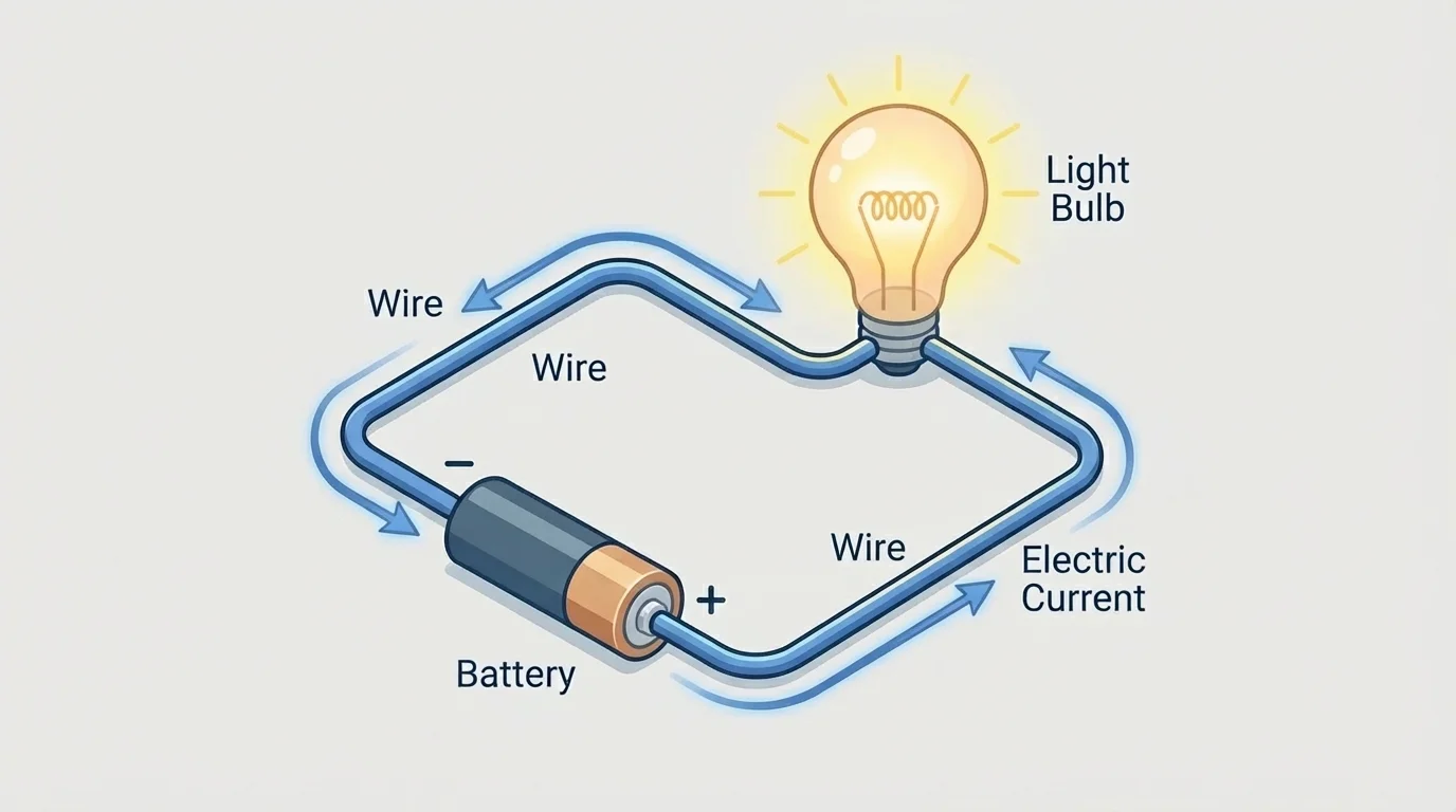
If the circuit is not complete, the bulb will not light. The written text may explain this idea, but the picture shows the gap or the closed loop right away. That is why engineers, electricians, and builders often use both written instructions and diagrams. In real life, combining sources helps people work more safely and correctly.
Another example comes from health science. A booklet might explain that washing hands helps stop germs from spreading. A sequence of pictures can show each step: wet hands, add soap, scrub, rinse, and dry. The text explains why the steps matter, and the visuals help people perform them correctly.
| Source Type | What It Does Best | Example |
|---|---|---|
| Written text | Explains ideas in detail | An article explaining why leaves change color |
| Diagram | Shows parts and relationships | A labeled flower showing stigma, anther, and petals |
| Chart or table | Organizes information for comparison | A table of animal habitats |
| Photo | Shows real appearance | A close-up image of frost on grass |
| Video | Shows action and change over time | A clip of a volcano erupting |
Table 1. Different source types and the kind of information each source shows best.
One common mistake is looking at a picture quickly and thinking you understand everything. Visuals need careful reading too. Titles, arrows, keys, and labels matter. As [Figure 1] reminds us, a graph or diagram can be misunderstood if you ignore these features.
Another mistake is using only the text or only the visual when answering a question. If the task asks you to integrate information, you must combine both. A strong answer often includes a sentence about what the text says and another sentence about what the visual or media source adds.
A third mistake is confusing observations with conclusions. Seeing dark clouds in a photo is an observation. Saying that rain will definitely happen is a conclusion. The conclusion may be reasonable, but it needs support. Good science thinking separates what is directly shown from what is inferred.
Students also sometimes miss the difference between a claim and a finding. A claim is a statement being made. A finding is what was discovered through evidence. For example, "Exercise improves health" is a claim. "Students who exercised for twenty minutes had faster pulse recovery" is a finding from a particular investigation.
Strong readers of science and technical information have habits that help them understand more deeply. They slow down. They ask questions. They compare sources. They notice whether a visual adds evidence, gives an example, or explains a process. They do not just gather facts. They build understanding.
When you learned to find the main idea in reading, you practiced identifying what a text is mostly about and which details support it. This lesson builds on that same skill, but now you also connect the text to diagrams, charts, photos, and media.
One useful habit is annotating, or making notes as you read. You might underline the main claim in a paragraph, circle an important label in a diagram, and write a short note about how the two connect. Another habit is asking, "What does this source help me understand that the other source does not?" That question leads to stronger thinking.
It also helps to use evidence in complete sentences. Instead of writing, "The graph and text match," explain how they match. For example: "The text says the seedlings near the window were taller, and the bar graph shows those seedlings had the greatest height." Clear explanations show that you truly integrated the information.
Scientists and engineers do this kind of work all the time. They read reports, study images, compare results, and explain findings to others. When you learn to integrate qualitative scientific and technical information in written text with information in media and visual displays, you are practicing an important real-world skill.