A volcano can seem quiet for years and then suddenly erupt. A river can stay calm for months and then flood in a single weekend. These events may look random, but scientists know that many natural hazards leave clues in data before, during, and after they happen. When those clues are placed into graphs, charts, maps, and images, patterns become much easier to see. Those patterns help people predict danger, prepare communities, and design technology that saves lives.
Data are pieces of information collected through observation or measurement. For example, a scientist might record daily rainfall, earthquake magnitude, wind speed, or the number of storms in a year. A pattern is something that repeats, changes in a regular way, or shows a clear relationship. Patterns help us answer questions such as: Where do most earthquakes happen? When is flooding most likely? How does storm strength change over time?
Raw numbers can be useful, but long lists are often hard to understand quickly. If you saw rainfall amounts written as \(12, 15, 18, 47, 50, 52\) millimeters over several days, you might notice that the values rise. But a graph makes that increase much easier to see at a glance. Visual displays turn separate measurements into shapes, lines, clusters, and comparisons that our brains can recognize more quickly.
Pattern means a repeated feature or a relationship that can be identified in data. Trend means the general direction of change, such as increasing, decreasing, or staying about the same over time. Forecast means a prediction about what is likely to happen in the future based on evidence and data.
Scientists use patterns for more than description. They use them to explain causes, test ideas, and make forecasts. If a river usually rises after several days of heavy rain, that pattern can help communities prepare for flood risk. If most strong earthquakes occur near tectonic plate boundaries, that pattern can help engineers decide where stronger buildings are most needed.
The same set of measurements can reveal different ideas depending on how it is displayed, as [Figure 1] illustrates. A table is useful for exact values, a bar graph is useful for comparing categories, a line graph is best for showing change over time, and a map is excellent for showing where events happen. Choosing the right display is part of good science.
A table organizes information into rows and columns. It is helpful when you need exact numbers. A bar graph compares amounts in different groups, such as the number of hurricanes in different years. A line graph shows change across time, such as daily temperature before and after a storm. A pie chart shows how a whole is divided into parts, though it is less useful when changes over time are important.
Maps are especially powerful in Earth science. A hazard map can show where wildfires happen most often, where fault lines are located, or which coastal areas are at greater risk from hurricanes. Satellite images and radar images also count as useful visual data. These images may show cloud movement, flood spread, ash plumes, or changes in land over time.
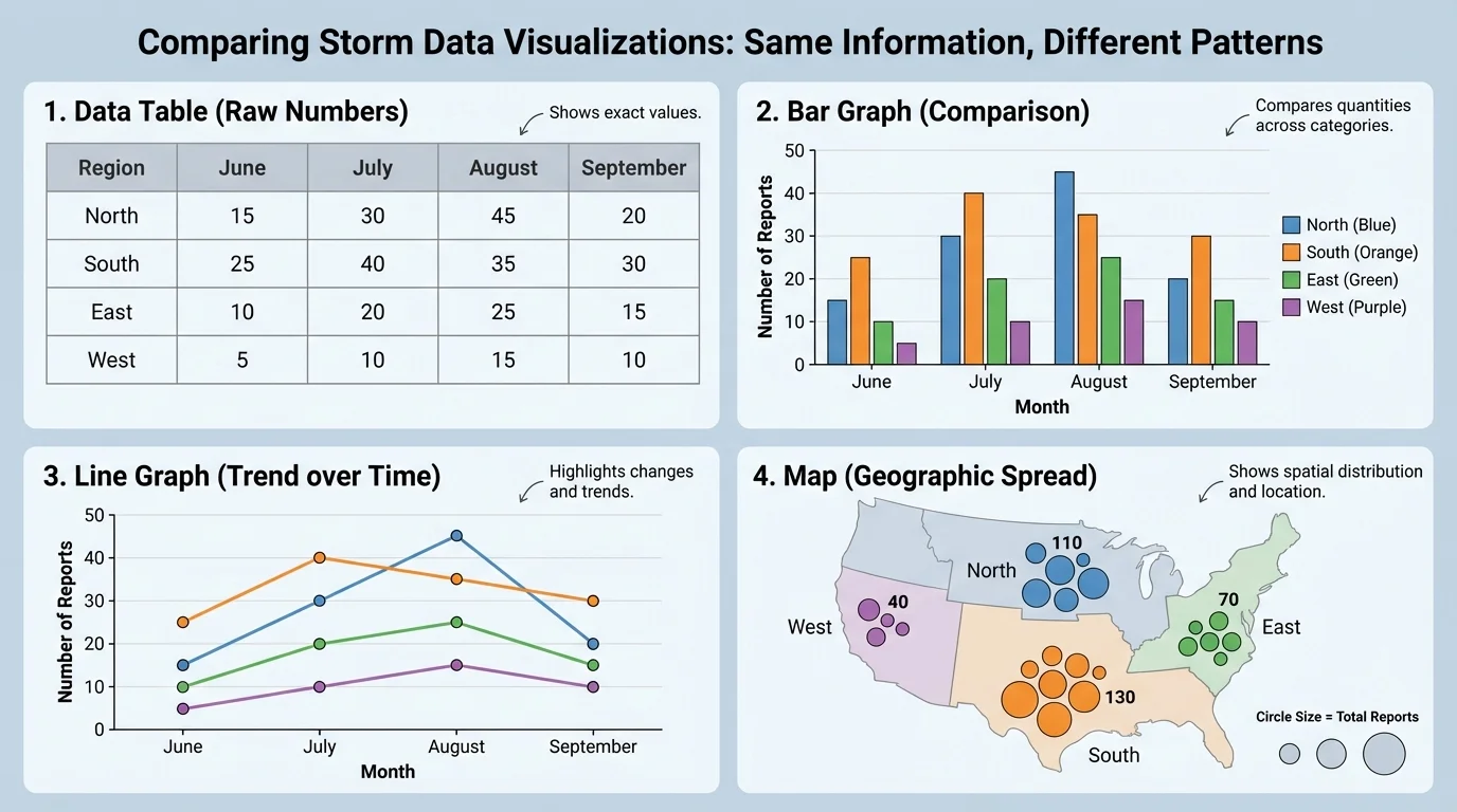
Images can show patterns that are not easy to express with numbers alone. For example, a sequence of satellite images might reveal that a hurricane grows larger over warm ocean water. A map of wildfire burn areas may show repeated fires in dry regions. In science, an image is not just decoration; it can be evidence.
| Data display | Best use | Example |
|---|---|---|
| Table | Showing exact values | Daily rainfall amounts |
| Bar graph | Comparing categories | Number of earthquakes in different regions |
| Line graph | Showing change over time | River height over one week |
| Pie chart | Showing parts of a whole | Percent of disasters caused by different hazards |
| Map | Showing location patterns | Volcanoes near plate boundaries |
| Image | Showing visual evidence or spatial change | Satellite image of storm clouds |
Table 1. Common data displays and the kinds of patterns they help students identify.
A graph communicates clearly only when the reader interprets the labels and scales correctly, as [Figure 2] shows with a river-height graph. Before deciding what a graph means, check the title, the axes, the units, and the scale. Many mistakes happen when people look only at the shape of a graph and ignore what the numbers actually represent.
The axis is one of the lines used to organize a graph. On most graphs, the horizontal axis shows time or categories, and the vertical axis shows the measured quantity. The scale tells how values increase along the axis. If the scale jumps by \(1\), \(10\), or \(100\), the graph may look very different even when the data are the same.
Units matter too. A rainfall graph measured in \(\textrm{mm}\) tells a different story from one measured in \(\textrm{cm}\). A temperature graph in degrees Celsius is not the same as one in degrees Fahrenheit. A map may also use a key or legend to show what different colors or symbols mean. Without the key, a reader can easily misinterpret the display.
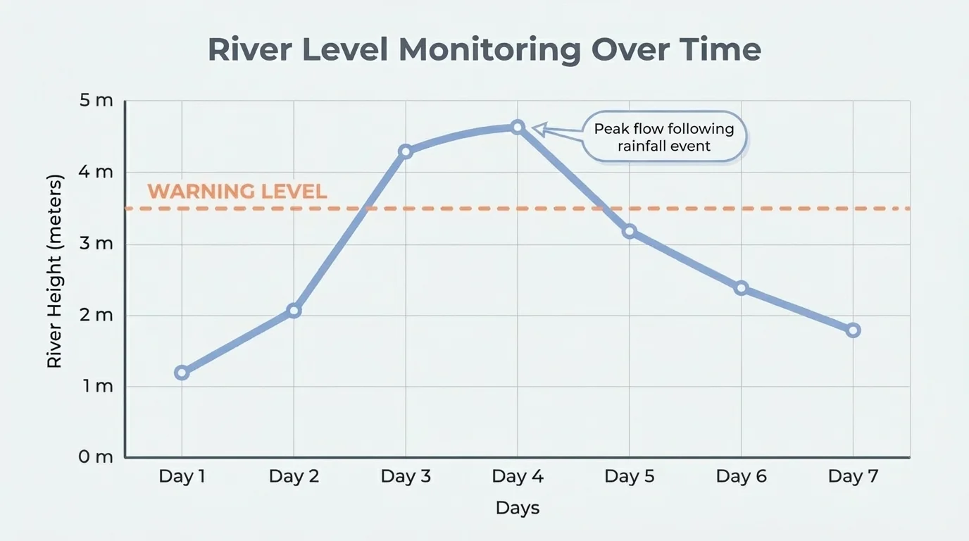
Careful readers also check whether the graph begins at zero or a different value. Starting the vertical axis at a number above \(0\) can make a small difference look huge. This does not always mean the graph is wrong, but it means the graph must be read with attention. Scientists try to make graphs honest and clear because decisions may depend on them.
You already know that measurements compare quantities. When you read a graph, you are really comparing quantities across time, place, or category. The same skills used to compare lengths, temperatures, or amounts in math class are useful in science graphs too.
Suppose a river rises from \(2 \textrm{ m}\) to \(3 \textrm{ m}\). The increase is \(3 - 2 = 1 \textrm{ m}\). If the flood-warning level is \(3.5 \textrm{ m}\), the river is getting closer to danger, even though it has not crossed the warning line yet. A line graph lets people see that the river is trending upward and may soon become hazardous.
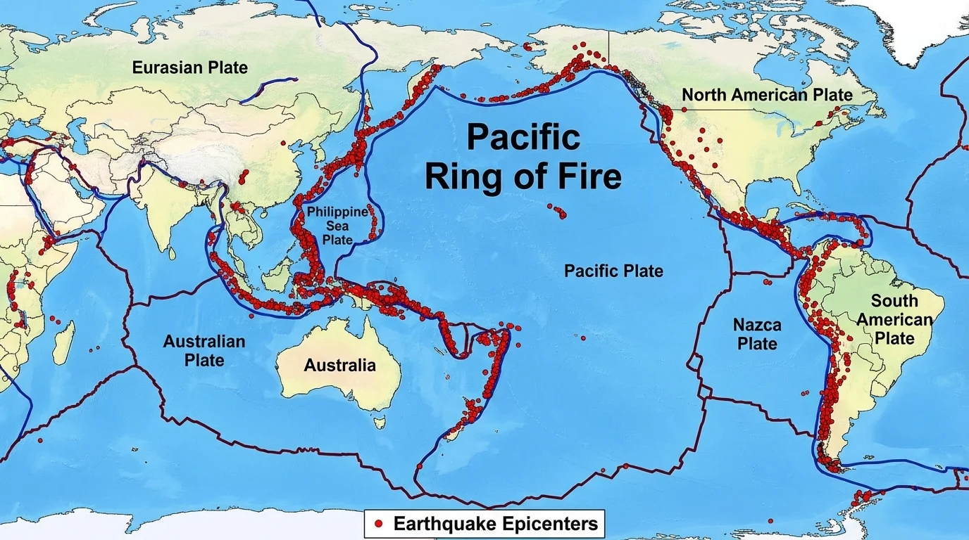
Natural hazards often leave patterns in both time and place. Earthquake locations form visible clusters rather than random dots, as [Figure 3] illustrates. When scientists map many earthquakes, they find that most occur near tectonic plate boundaries. That pattern tells us something important about how Earth's crust moves.
Volcanoes show a similar pattern. Many are found along the edges of tectonic plates, especially around the Pacific Ocean in a region often called the Ring of Fire. When earthquakes and volcanoes are mapped together, the overlapping pattern gives stronger evidence that these events are connected to plate movement.
Floods also show patterns, but they are often related to rainfall, river systems, land shape, and land use. Areas near rivers, low-lying coasts, or places with paved surfaces may flood more easily. If a chart shows several days of increasing rain followed by a sharp rise in river height, scientists can identify a cause-and-effect relationship.
Hurricanes and tropical storms follow patterns too. They form over warm ocean water, usually weaken over land, and tend to move along paths shaped by wind systems and ocean conditions. Droughts show longer-term patterns in rainfall, soil moisture, and temperature. Wildfires often occur in dry seasons and spread more quickly when vegetation is dry and winds are strong.
These patterns do not mean every event happens the same way. Nature is complex. But repeated patterns give scientists evidence they can use. The more reliable the pattern, the better the forecast can become.
Patterns do not mean perfect repetition. In science, a pattern is useful even when it is not exact every time. A river may usually flood after several days of heavy rain, but not always. Scientists look for relationships that happen often enough to be meaningful, then test those relationships with more data.
Another important idea is frequency. If a place has many small earthquakes and only a few large ones, that pattern matters. If a coast experiences more hurricanes in late summer than in winter, that seasonal pattern matters too. Identifying patterns is really about finding order in many observations.
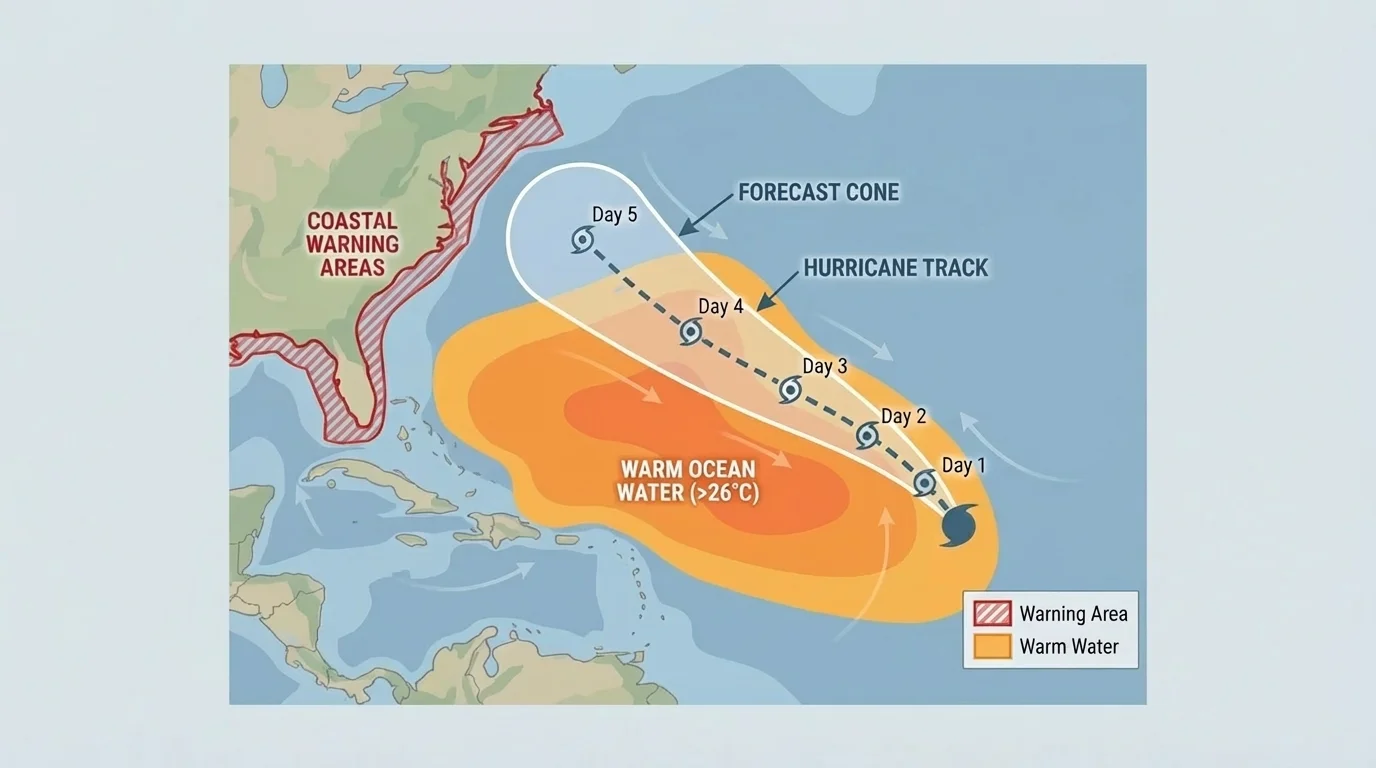
Forecast maps help communities prepare before a storm reaches land, as [Figure 4] demonstrates. Forecasting means using current observations and past patterns together. Scientists do not claim to know the future exactly, but they can estimate what is likely based on evidence.
Meteorologists study air pressure, wind speed, sea-surface temperature, humidity, and satellite images to track storms. If current conditions match patterns seen before major hurricanes, forecasters can warn people earlier. The projected path of a storm is often shown as a track or cone on a map, helping people understand where the storm may move next.
Earthquake forecasting is more difficult because earthquakes are harder to predict precisely. However, patterns still matter. Scientists know which regions are at higher risk because of plate boundaries and fault lines. They also monitor smaller tremors, ground movement, and stress in rocks to understand changing conditions.
Flood forecasting uses rainfall data, river gauges, weather models, and land information. If a forecast predicts \(80 \textrm{ mm}\) of rain in a short period and rivers are already high, flood risk increases. If a drought has already dried the soil so much that water cannot soak in well, flash flooding may become more likely in some places.
Worked example: spotting a flood pattern
A town records river height for four days: Day \(1\): \(1.8 \textrm{ m}\), Day \(2\): \(2.2 \textrm{ m}\), Day \(3\): \(2.9 \textrm{ m}\), Day \(4\): \(3.6 \textrm{ m}\). The warning level is \(3.5 \textrm{ m}\).
Step 1: Look for the trend.
The river height increases each day: \(1.8 \rightarrow 2.2 \rightarrow 2.9 \rightarrow 3.6\).
Step 2: Compare the last value with the warning level.
Day \(4\) has \(3.6 \textrm{ m}\), and \(3.6 > 3.5\).
Step 3: Interpret the pattern.
The river crosses the warning level, so flooding risk is high and alerts should be sent.
This example shows how a line graph of the same data would make the upward pattern easy to recognize.
When students hear the word forecast, they sometimes think of a guaranteed answer. Science works differently. A forecast is a best estimate based on patterns, measurements, and models. Better data usually lead to better forecasts.
When patterns in hazard data are understood, people can build systems to reduce damage. These systems are called mitigation technologies or strategies because they lessen harmful effects. These can include warning sirens, stronger buildings, flood barriers, emergency maps, and smartphone alerts.
For earthquakes, engineers use hazard maps and shaking data to design buildings that bend instead of breaking. For hurricanes, satellites, radar, and aircraft collect information that improves storm forecasts. For tsunamis, sensors in the ocean detect changes in water and help warning centers send alerts to coastal communities.
Even simple technology can matter. Rain gauges, river gauges, weather stations, and cameras all collect useful data. A graph from a river gauge may look basic, but if it shows a dangerous rise, it can trigger decisions that protect many people. The earlier a pattern is noticed, the more time people have to act.
Some volcanoes are monitored with instruments that measure tiny changes in the shape of the ground. A small swelling of the land can be a sign that magma is moving underground.
Evacuation planning also depends on data displays. A map may show which roads flood first, which neighborhoods are in danger zones, and where shelters are located. The same map becomes more useful when combined with current weather images and real-time measurements.
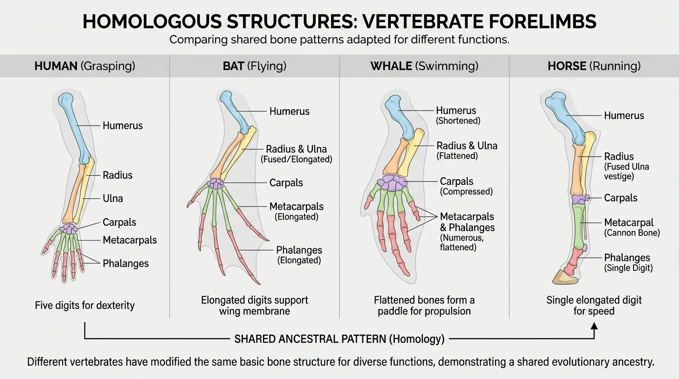
Scientists also use images to identify patterns of similarity among organisms and fossils, as [Figure 5] shows with shared structures. Pattern-finding is not only an Earth science skill. In life science, scientists compare body structures, fossils, and DNA evidence to look for patterns that show how living things are related.
For example, the forelimbs of different vertebrates may have similar bone arrangements even if they are used for different purposes. A bat wing, a whale flipper, and a human arm all contain corresponding parts. That pattern suggests a shared evolutionary history. Fossil layers can also reveal patterns of change over long periods of time.
This matters because science often works by comparing. In Earth science, we compare storm tracks, earthquake maps, and rainfall graphs. In life science, we compare structures, species distributions, and fossil evidence. In both cases, patterns help scientists explain the natural world.
Images are especially useful when relationships are visual. A photograph of rock layers can reveal repeated sediment bands. A fossil series can reveal how a feature changes gradually over time. Just as the earthquake clusters in [Figure 3] help scientists identify active plate boundaries, shared body structures in organisms help scientists identify deeper biological relationships.
Not every graph or image helps people understand data fairly. Some displays are misleading. A bar graph with uneven spacing, a line graph with a strange scale, or a map without a key can confuse the reader. That is why scientists and students must evaluate displays critically.
One common problem is missing labels. If a graph does not say what is measured, or if units are left out, the information loses value. Another problem is too little data. A pattern based on only \(2\) or \(3\) observations may not be reliable. Scientists prefer larger sets of data because they show whether a pattern really repeats.
It is also important to remember that two things changing together do not always mean one causes the other. For example, if ice cream sales and thunderstorms both increase in summer, that does not mean ice cream causes thunderstorms. The season affects both. This idea helps students avoid jumping to conclusions when viewing charts.
Case study: reading a storm graph honestly
Two graphs show wind speed before a storm. One graph starts at \(0\), and the other starts at \(70 \textrm{ km/h}\).
Step 1: Compare the scales.
The first graph shows the full range from calm to strong wind. The second graph zooms in on high values only.
Step 2: Notice the visual effect.
The second graph makes the increase look more dramatic, even if the actual change is the same.
Step 3: Decide what to trust.
Both may be mathematically correct, but the reader must check the axis carefully before drawing conclusions.
This is why graph-reading is a scientific skill, not just a viewing skill.
When a display is well designed, students can quickly answer questions like: What changed? How much did it change? Where is the danger greatest? Is the trend increasing or decreasing? Clear visuals support accurate reasoning.
Consider a drought-monitoring map. Areas may be shaded from light to dark to show increasing dryness. If the dark areas spread over several weeks, that image shows a worsening pattern. Farmers, water managers, and city planners can use that information to make decisions.
A wildfire map may show repeated burn areas year after year. That pattern can guide controlled burns, forest management, and emergency planning. A hurricane track map, like the one in [Figure 4], can help schools decide when to close and when to reopen. A river-height graph, like the one in [Figure 2], can help local leaders decide when to issue flood warnings.
Even outside hazards, pattern recognition matters. Doctors read charts of patient temperature and heart rate to spot illness. Athletes track lap times to improve performance. Music apps analyze listening patterns to make recommendations. In every case, visual data displays help people make sense of many measurements quickly.
Science becomes more powerful when evidence is organized in a way humans can interpret. Graphs, charts, maps, and images turn information into visible relationships. That is why they are such important tools for understanding Earth, life, and the choices people make in response to both.